Park / [H2H8/8] Toreador
-
 27-October 18
- Views 6,188
- Downloads 599
- Fans 0
- Comments 12
-
![Park_4252_[H2H8/8] Toreador](https://www.nedesigns.com/uploads/parks/4252/logot.png)
-
 69.38%(required: 65%)
 Design

Cocoa 80% bigshootergill 75% chorkiel 75% Liampie 70% Ling 70% Scoop 70% csw 65% G Force 65% Iron Rattler 65% posix 65% 69.38% -
 No fans of this park
-
 Full-Size Map
-
 Download Park
599
-
 Tags
Tags
![Park_4252 [H2H8/8] Toreador](https://www.nedesigns.com/uploads/parks/4252/aerialm4038.png)

![park_4230 [H2H8/8] Celtic Legends](https://www.nedesigns.com/uploads/parks/4230/aerialt3992.png)
![park_4253 [H2H8/8] Rot](https://www.nedesigns.com/uploads/parks/4253/aerialt4039.png)
![park_4249 [H2H8/8] Mongo Tropica](https://www.nedesigns.com/uploads/parks/4249/aerialt4040.png)

![park_4217 [H2H8/8] MS Office Suite 2003 Resort](https://www.nedesigns.com/uploads/parks/4217/aerialt3972.png)
Round 5 | Match 2
Tropical Storms - Toreador
Illuminati - Rot
Voting Rules
- You should only vote if you have viewed both parks in game.
- Take your time to reflect on each park. The poll stays open for three days, not three minutes.
- Everyone but players belonging to either team in the match may vote.
Kind of sad there aren't more comments for these already.
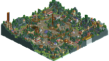
Toreador is really nice, super classical terrain woodie - a little slow at times but all around just really damn solid. The splash boats are really scenic and fit perfectly too; everything is just very well-framed. This definitely feels very H2H1 also, which is cool. Super impressed with your late season showings, TropicaLL Storms.
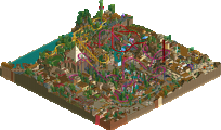
Rot is wild to me. Saw someone say on discord its like Wit's End.. which I guess I can see with all the mushrooms? But its a pretty wild park. There are bits that look less detailed like the dam area, but overall its a neat story. The trackitecture throughout is solid too. Sorta wish there was a readme just to clarify things a bit... but thats not a negative. Just hopefully one of the builders later on explains all that I might be missing.
Toreador is amazing... huge fan of it. As Ling pointed out this felt like an old H2H park for sure. Im a huge fan of the element after the first drop.. the 360 or whatever you call it. The splash boats interact well too. The church and the station for Toreador was well done too. Really cool queue and architecture.
Toreador: fantastic layout, great atmosphere. Excellent integration of the river ride around the coaster. I think this submission encapsulates the purpose of the contest very well.
Rot: I love the theme, and the execution is pretty good. Great landscaping and buildings.
Tough call on this one, both parks deserve to win. But my vote goes to Toreador, even though Rot is typically the kind of park I salivate over.
Decent parks. Toreador very safe established style with mild personal takes on it. Rot, while somewhat impressive, a bit too ambitious, at times too randomly crafted, and not super pleasant to look at.
Dang, nice close vote! Hopefully we can see a few more cast before the deadline!
I have yet to vote! Am getting around to that real soon now. Just tackling my RCT thingies one by one.
finally getting around to some well-deserved reviews around here
Rot
firstly, I love the story/concept. Felt a bit more unique than the usual modern city vs shantytown feel, because it had a well-told backstory to it. the giant mushroom is sick too. I wasn't such a huge fan of the invert layout, but the archy in the back bit of the shantytown was awesome. I'm gonna steel that olive green glass vibes. the modern city was fine also, not as impressive but still good. the flyer layout was definitely better, and the landscape it used was quite cool. well done, all up
toreador
wow I absolutely love this. maybe no surprise that this is right up my alley. medieval themes are a dime a dozen but this one is just so lovely and elegant. the layout is superb, especially with the station centered like that and just great swooping curves everywhere. the interaction is phenomenal, and theres so much to see and admire in just little scenes. possibly my favorite of the contest! up there with ms office suite. one of the best LL designs in quite a while, for sure.
Winner:

Tropical Storms vote count: 6 (46.15%)
Illuminati vote count: 7 (53.85%)
Toreador was made by RWE.
Rot was made by Ling (55%) and Ride6 (45%).
holy crap guys, we won
EDIT: I wrote this up a few weeks ago, I might as well post it. Sorry it didn't get included with the release - as many have noticed, Rot was fairly... rushed at the end.
---
I started concept work on Rot literally as soon as I signed up for H2H8/8, and started working on a rough sketch of the terrain in the first week of the contest (put on hold to throw Firestorm together in time for the R1 deadline).
The general idea/concept was that to take a serene, lush forest scene, with all of these rivers and waterfalls pooling into a huge overgrown basin, with a prosperous wealthy city on a large natural land barrier and a slightly less prosperous but still thriving industrial town on the cliffs nearby, and twist it. Through unspecified causes, the water supply becomes contaminated with something that starts changing the landscape and flora, spreading an organic layer on the ground, conditioning the soil, killing the old and sprouting new, gnarled and diseased foliage. The city detects this and starts erecting measures to save their water supply - filter dams go up in several places. Meanwhile the shanty town, which rested on one of the most heavily corrupted supplies as well as sitting along the calmer waterfront of the basin, becomes overrun and starts falling to ruin.
It’s now an unspecified amount of time later - long enough for the infection to cover a large portion of the land and grow incredibly large mushrooms in places. The giant central mushroom was one of the first ideas I had and I knew I wanted it to play a role in the “third act” of the flyer. The idea for a water filtration plant came later, and I sketched out what I wanted and Ride6 built it. Basically the city pulls water from the upper water table, through filter dams, but the dams are failing, and water flow is seriously stifled. The river beds are made to look like the water level is very low. The water treatment area also serves as the finale/sort of station for the flyer, so it got named accordingly. The invert’s finale takes place in the shanty town’s decimated waterfront market.
It’s not totally clear whether the corruption afflicts people or whether it just destroys the land forcing them to relocate. Either way, the city’s response is to barricade the gateway between the two areas from the outside. A full cemetery can be seen on a hill overlooking the cemetery, and the corruption can be seen slowly working its way through the walls and into the graves. Whatever happened - both cities are empty now.
Ride6 took interest fairly early on and did a bunch of work while I was doing Firestorm for R1 and later on while my inspiration was very slowly coming back. When we got word that we might be able to still enter R5 if we threw something together, I sprinted through the last 20% or so to get it “done”. Unfortunately the unfinished-ness shows in places - missing ride names, some patches where foliage is incomplete, and an errant piece of ghost train track.
I did the concept work, terrain, all of the foliage, the rough versions of both coasters, the dams, as well as the bottom corner (when opening the park). I also did the giant mushroom, the architecture around the flyer’s launch and everything around the invert’s station. Ride6 did all of the rest of the architecture, the treatment plant, as well as the final designs of both coasters.
Very great matchup to close this great contest! Congrats on the win, ][lluminati! Your park was a great example of creative and special LL!
I'm also very proud of what i have achieved though. Toreador has been started at the very beginning of the contest and not much changes of the concept have been done throughout the contest. The story began with me wanting to do a typical swooping LL terrain woodie, inspirated by Panic and other great LL builders. I really committed onto building a great layout showing i can build them and don't need to copy them :P By the looks of it i very well achieved that goal.
The theming idea came from a trip to Barcelona and Catalunya i had some years ago. I looked at some pictures i took back them and thought a catalan theme could be a good idea for a terrain-y woodie. After some trial and error and some inspiration from the database i quickly found some techniques and building styles to go on with and i also got a lot of motivation to build, since LL really made me have fun with RCTing again after that terrible experience H2H8 partially was. Playing LL with all the landscaping and building made me feel like a marble artist.
The only thing that really was changed in this was that at the beginning it was planned to involve more hacking. Bulls raging down the streets and all kind of broken stuff in the village have been the key words back then. Due to some time issues and due to the fact i already was kind of content with the map how it was, that have been cancelled though. I must say in the end i'm really happy i made that decision, cause it resulted into a map that was built without using any ZC, Codex or any other kind of hacking. Even all the signs, windows etc. have been placed manually by me and they aren't copied.
To conclude i'm really glad i was a part of this contest and this really brought LL to me again. I might do more LL again in the future! Looking forward to see the next reviews!
Btw: I wrote this while i was busy, so sorry for bad language!
congrats RWE, you didn't snake the win but it was close and I loved your park. Probably my favorite thing from you yet.