Park / [H2H8/8] Emerald Heights
-
 16-October 18
- Views 6,062
- Downloads 603
- Fans 0
- Comments 11
-
 61.88%(required: 60%)
 Silver

RWE 70% bigshootergill 65% chorkiel 65% Cocoa 65% G Force 65% Ling 65% Scoop 60% csw 55% Iron Rattler 55% Liampie 55% 61.88% -
 No fans of this park
-
 Full-Size Map
-
 Download Park
603
-
 Tags
Tags
![Park_4250 [H2H8/8] Emerald Heights](https://www.nedesigns.com/uploads/parks/4250/aerialm4037.png)
![park_4249 [H2H8/8] Mongo Tropica](https://www.nedesigns.com/uploads/parks/4249/aerialt4040.png)
![park_4217 [H2H8/8] MS Office Suite 2003 Resort](https://www.nedesigns.com/uploads/parks/4217/aerialt3972.png)
![park_4229 [H2H8/8] Valle Del Amanecer](https://www.nedesigns.com/uploads/parks/4229/aerialt3993.png)
![park_4252 [H2H8/8] Toreador](https://www.nedesigns.com/uploads/parks/4252/aerialt4038.png)
![park_4230 [H2H8/8] Celtic Legends](https://www.nedesigns.com/uploads/parks/4230/aerialt3992.png)



Voting RulesRound 5 | Match 1
Tropical Storms - Mongo Tropica
Florists - Emerald Heights
- You should only vote if you have viewed both parks in game.
- Take your time to reflect on each park. The poll stays open for three days, not three minutes.
- Everyone but players belonging to either team in the match may vote.
MONGO:
I was enchanted by the park, healthy harmony, a nice silence, loved it.
It was so good that I do not need to comment on anything else.
EMERALD:
Park beautiful, makes you want to be in it (hehe), soft colors and well combined.
Liked the details on ice and DragonSlayer.
Sugar Rush got simple nice and perfect for me.
Attached Thumbnails
I just wrote an entire review, but I lost it, fuck. I'll try to summarise my thoughts. B&M invert: takes cues from Nemesis, but does it own thing too, and does it well. Three corkscrews, but no one cares. First drop is amazing and swoopy. Drop out of the MCRB is cool too, facing the waterfall. Great path interaction here too. Arrow coaster has a decent layout too but not too interesting. Hate the teal supports, tried other colours, almost any other colour looked better. Nice compact theming, and that goes for the whole park. You tried to put something on every tile. That approach doesn't always make sense or work, but in Mongo Tropica it does. Corner across from the arrow has some good theming. Mint green walls look great, lovely waterfall section and cool seating area. Virginia Reel is another layout highlight. How does one make a good Virginia Reel? Can anyone picture what a good VR looks like, aside from the standard realistic layout? You made an original layout that yet somehow looks typical for a VR. Great job. Theming is great too, with the iron walls and vertical stuff on the invert side.
General: I love how dense and chaotic it is. In several places I got Twisted vibes, mostly in the building between the first invert cork and the scrambled eggs (featured in the advertising screen). Also good job with varying the style a little in all the subareas. It didn't always work though. Almost every instance of grey castle walls looked bad. Hedges in archy is a bad idea too. Because I want to end on a positive note: I love the invert station building complex, especially the bit with the elevated seating area, and the roof made of hat stalls looks really cool.
In short: some things don't work, some things work, some things work well, and some things work GREAT.
Shorter: nifty little park
Even shorter: good park
Even shorter: park
Even shorter: yes
Emerald Heights review will come later.
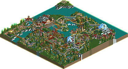
Hmmm. Emerald Park has charm on its side, and it has it in spades. From the peepability to nearly all of the rides having music, creating a vibrant atmosphere, to the strong presence of bright colors without feeling outright like fantasy. When I first opened it, I was inclined to think this was made to feel like a scenario with added detail, but as I looked further I think it's more developed and mature than that - a bustling park that is vibrant where it needs to be, and spacious where it can be. It takes the things that make us nostalgic for the early days of the game, when we were all still unsure what the next scenario we opened would look like, but is modern and refined with a sense of purpose and composition that could only have come from over a decade of shared community effort. The coaster designs are nothing special and most of the rides not being named is a little disappointing but these are minor criticisms. Overall it does feel a little more empty than perhaps a round 5 park should, but I find it very hard to argue with just how well spaced everything is.
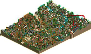
Mongo Tropica seems to be a true return to the tried-and-true H2H format of a central + supporting design. The exotic setting is visually interesting, and the sheer elevation changes on display here are really impressive when you step back and view it as a whole. It's certainly nowhere near as clean as Emerald Heights, but I do not think it would work if it was. There are some oddities, like the one-off "jungle track" side friction coaster that just kinda... is there next to the path (is it supposed to be a platform? an extension of the path? a railing?), and the bridge over the finale of Galzuu Khulgana is really poorly placed. That design is one of the best in the contest, though, and carries this entry almost entirely on its own. I like the sand valley floor winding through the park - made for a nice visual break that wasn't just more water. I think it would have been fascinating to see this square up against Age of Dinos in W4 - there are a lot of stylistic similarities and I think when all is said and done they will score similarly too.
I haven't made a decision yet, but what a W5. Lovely parks, and on the whole a delightful contest.
Emerald Heights:
Very cute park. The colors were great and everything seemed very bright and cheerful. I agree with Ling that this felt like a "scenario with added detail".. but thats not a negative at all.
The suspended coaster was good.. not amazing, but again, I loved the colors.. it really stood out. The Schwarzkopf was a better layout I think.
I also get the sense this was rushed/unfinished with the unnamed rides and staff.
Mongo Tropica:
Definitely a H2H park.. wow. This wouldn't have seemed out of place a few months ago in H2H8!! The architecture for a jungle theme was great.. I especially enjoyed the area along either side of the river/waterfall.. namely the water towers.
The plaza around Tung-Ak was great. The centerpiece fountain was cool... and the pathing had life to it. Only thing that was off to me was the virginia reel. But then again the virginia reel I built in Mount Playstack was an odd fit.
emerald heights
lovely work. Felt like an advanced versions of what the original scenarios could be, if they had slightly more of an eye for aesthetics. It felt like the coasters were mostly made from one angle but other than that solid job. I liked the ice under the path btw. Lovely colors, archy is simple but cute and pops well. very interesting use of textures too.
mongo tropica
another great park. A darker atmosphere and a lot of heavy layered textures. I really enjoyed the invert and the verticality of the landscape it dove through, great colors too- although i may have hidden every other support on the lift hill or something. the archy was pretty good- some buildings were excellent while others felt a bit overdone and hard to read perhaps. the one with the ladder near the invert was great. in the end this one won me over with more content and depth. oh i also liked the bumper cars on wires over the ditch. cool effect!
Emerald Heights
FINALLY, a single wide paths park! I was expecting that the whole contest and I'm glad it happened at last. At first glance it's quite an attractive park layout, with the two green peninsulas and the friendly colours on all the rides. Let's explore the park counter-clockwise.
The are surrounding the merry-go-round and the Sugar Rush coaster instantly stand out, more than in the rest of the park did you try to use single wide paths in a way that you can still space things out as if it's wide path, with the big planters and the stuff. It works very well here, the street leading up to the merry-go-round is super cute. I'm not sure why the buildings are dark wood with grass roofs, but it added some teletubby vibes which I guess is not a bad thing here. Cute bridge, btw. Simple but effective. Alpenbahn is the same, simple but effective. I like the drop at the end, parallel to the path and train, against the rocky cliff. Simple but effective. The landscaped corner of the map is very pretty. Tiny cliffs, a tiny waterfall, a miniature railway, very nice stuff. Now we're getting to Dragonslayer, the eyecatcher of the park. The first half of the layout lacks flow, and it's a bit tame, but I like the overall look of this coaster and this area. The peninsula the station sits on is so wonderfully scenario-esque!
I think I can summarise my thoughts with these words: cute, warm, scenario-esque, colourful. It's not one of the most technical parks this season, but it's done in a way that it's a virtue, not a flaw. As a result this is easily one of the most charistmatic parks of H2H8/8 and perhaps even the year. Great job!
I'm voting Mongo Tropica, and I think the best way to illustrate my reasoning is by playing a game of fuck, marry, kill:
Fuck: Mongo Tropica
Marry: Emerald Heights
Kill: n/a
Time to close down this vote before 2019 ... and let's get all these H2H8/8 parks to Accolade Voting...
MORE COMMUNITY & PANELIST'S VOTES!!!
Winner:
Tropical Storms vote count: 12 (85.71%)
FLLorists vote count: 2 (14.29%)
Mongo Tropica was made by bigshootergil (85%) and G Force (15%).
Emerald Heights was made by Merzbow666 (70%) and shnupz (30%).
Great matchup Merzbow & schnupz! You did some fantastic LL work here!
The basic story behind our park is G-Force put this main coaster layout together near the beginning of H2H8/8 and it just sat there for weeks. When I was finishing up Blizzard Bay I just started playing around with some funky landscaping and tossed up some buildings around the station... and it grew into this beautiful park. G-Force did all the coaster layouts and a minor smidge of themeing. It's probably the most collab NE will ever see from the 2 of us since our styles are so different, but I loved the end result.
Overall, it was a great/fun contest, the interest even died off near the end like a typical H2H tourney
Let's get a few more community votes for these parks so they can hit the panel!
Congrats TropicaLL Storms! Awesome work all around though. Loved the hell out of both of these parks.
i really enjoyed mongo tropica!! it was a bit dense with textures but i enjoyed how vibrant it is. it definitely sold the tropical theme!
i also like how stripped down and minimal emerald heights is. it felt like an answer to the question "what would rct scenarios look like if they were made with an artist's eye?"