Park / Knightmare
-
 21-October 18
- Views 1,617
- Downloads 511
- Fans 0
- Comments 7

-
 Description
My first LL submission. Just a test, don't judge it competitively.
-
 No fans of this park
-
 Download Park
511
-
 Tags
Tags
![park_4141 [H2H8 R5] A Far Cry From Home](https://www.nedesigns.com/uploads/parks/4141/aerialt3872.png)
![park_4179 [H2H8 Grand Finals] Zerzura](https://www.nedesigns.com/uploads/parks/4179/aerialt3930.png)
![park_4084 [H2H8 R1] Dig Site 4](https://www.nedesigns.com/uploads/parks/4084/aerialt3816.png)

![park_4074 [H2H8 R1] Wit's End](https://www.nedesigns.com/uploads/parks/4074/aerialt3814.png)
![park_4160 [H2H8 Semifinals] Mobray's Illusions](https://www.nedesigns.com/uploads/parks/4160/aerialt3927.png)
The rides are well interacted with each other
I liked the architecture of the park
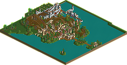
I really liked the coaster layout.. I feel like you've always made good wooden coaster layouts going back to Faastopia. Nice interaction with the castle area. Its super colorful and I liked the use of the lemonade stands as scenery.
The grey castle was pleasant as well. The queue overlooking the drop and then the castle wall with the walkway over the water enclosing the drop was great interaction as well.
I did notice that Guinefear boats sometimes barely moved.. one boat was stuck for me.
Great first LL park!!!
That layout is so good, god damn. The crescent-shaped "park" layout doesn't quite work for me. I also noticed some polish stuff, like a lot of path objects being broken. If the plaza/village area were a bit bigger I think this would be clear Design material, even though it's small. I expect it'll be close though.
sorry, should have replied to this way sooner, because its really lovely. the main castle courtyard area is phenomenal, especially with the way the woodie works its way around it. very pretty. the back grey castle is less good, a bit more "noobish" LL- but still has some nice moments. just the environment and interaction doesn't come near the main courtyard area. great atmosphere and liveliness!
btw it really reminded me of the Renaissance fair i used to go to as a kid which is a fond piece of nostalgia for me
Just wanted to vote on this, and then I realised it's a non-competitive submission. Regardless, my thoughts:
I really liked this.The coaster has a great layout, the pre-drop turns are beautiful with a smoothness that is impossible in RCT2. Nice interaction with the queue. The theming around the coaster is so lovely even though it's very simple. You don't need much more, you found an excellent combination of colours and textures and you left it at that. The only thing I don't like here are the purple ghost train bits, and the foliage is a bit rough in places. Overall super atmospheric though.
The water coaster was okay, I think the map as a whole would've been stronger without it. It's just not as effective, less refined, and it had little in common with the wooden coaster area. Still enjoyed it.
Would've voted a generous 65%. Single wide path parks need to make a comeback, and maybe you're the person to do it one day. I would adore a full sized park with content like the wooden coaster and its surroundings here, and my vote would probably be quite a bit higher than 65.
This is a nice throwback single wide park that would not have been out of place in H2H8/8. I liked a lot of the ride placement and the little intricacies that you created with the single path layout and castle layout intertwined. There were some elements of Roomie and later Ozone stuff but plenty of personal touches as well; I liked the ghost train stuff you were experimenting with. I was left wanting a little more than we got here, especially with the foliage on the edge feeling more like filler than anything.
Sorry, I didn't quite like it as much. I understand you're building parks like this for fun, and it certainly does look like fun. But with just a little more care, especially in the foliage, this could've been a lot better. I think the gold standard for single-wide parks is Thoughts, and this fell short of that. I do like to see submissions like this, though. Any LL is a good submission in my mind.