Park / Moonbeam
-
 18-October 18
- Views 2,835
- Downloads 689
- Fans 1
- Comments 14
-
 68.50%(required: 65%)
 Design

Kumba 90% Jaguar 75% robbie92 75% RWE 75% Scoop 75% CedarPoint6 70% Cocoa 70% CoasterCreator9 65% csw 60% G Force 60% Xeccah 60% Liampie 55% 68.50% -
 Description
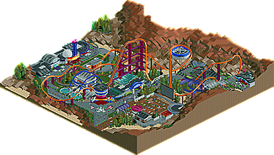
Dive into the Space Age.
-
1 fan
 Fans of this park
-
 Full-Size Map
-
 Download Park
689
-
 Objects
185
-
 Tags
Tags


Good piece of NCSO Terry! Cool and colorfull park. It has some nice details which I like (the virgina haspel slide, drive-in cinema, lazer-blast).The architecture is nice at some places. Good trackitecture overall, especially at the domes.
I think the layout is a bit weird. Doesn't feel like a dive-coaster because it's missing some inversions I think. Though the flow is good and that's a nice compensation. I love the supports. Maybe the ones at the lifthill could've been a bit more subtle but they do really help working out the theme.
There's been said a lot about the landscape. I have to say that it looked worse at the screenshot. At least it looks like it's from space lol.
Keep going Terry! I love your work!
02) This ability to work the tracks in different ways is nice.
03) I like the big tubes in purple, gives an impression of super structure to support weight or immense gravitational force it is cool.
04) Haaaa now I saw better MARTIAN, had not understood the screen, ok, I liked it has entrance, including the _CRASHED as ornament/roof was nice.
05) _arch was very good.
06) I loved the Plan NE Space passes the image of something spatial cool.
07) The pool _SPLASHDOWN as if the wind was on the water, I liked it.
08) Loved the pool at the entrance of the MOONBEAM and the staircase combined with the pool.
09) The fences are good, imagination details nice.
10) The building where the _TUTLENECK is was excellent.
11) DRIVE on the ground between cars parked good idea.
12) _FLOOR that I used at various points in the park I loved it.
13) Well done _loops like arch, this adds a special touch.
Really lovely stuff here terry, perhaps a bit over board on the monorail trackitecture but I see why. Coaster was probably the least interesting aspect of it to me, which for a design submission isn't ideal.
Archy and especially the drive in theater were fantastic though, lots of great ideas, can tell you really had fun with this.
Absolutely great archy. Really enjoyed it. The drive in was really neat too.
The rocketship next to the lift hill for the dive machine was a cool little detail.
The layout could've used another inversion I think. It looks fun to me, and I think the supporting work you did with the color layering was unique.
I gave a 70% for my community score!
Maybe I am missing something that others are seeing, but I see so much technical complexity for complexity's sake here. The tower next to Moonbeam's station is so visually noisy and it doesn't really make any sense. So much cloning of objects and pieces of rides to make simple paths - it kind of defeats the purpose of using NCSO in my mind. The foliage is okay but is lacking development. Half of the map suggests we are to believe this is in the high desert or on another planet, the other half suggests it's a normal, pseudo-realistic themepark.
The queue area and station for Moonbeam are the best parts of this. Supports are cool and unique, the queue roof looks nice and the interaction is solid. I just feel like the composition on a grander scale is really missing, though. Maybe I am just missing the context that would make all of this click for me, but right now it just seems like an overly complicated study in "realistic" NCSO architecture.
I should probably explain the setting because that in turn would explain the abnormalities of the landscape. This isn't set in space; it's based on the landscape near Gallup, New Mexico (more specifically, the Red Rock State Park). I chose this location intentionally because it resembles that of a foreign planet while not being devoid of lush foliage.
As for the architecture, it's a variant of the googie style of the 50s/60s influenced by the Space and Atomic Ages, which prominently features unusual curvature. The colors, meanwhile, were chosen to allow the map to resemble an 80s arcade. I wanted to capture both 50s and 80s Space nostalgia because I believe they complement each other beautifully regarding retrofuturism. It is set in present day, and guests are meant to experience the future the way it was perceived in the latter half of the 20th century.
This was very much an artistic experiment, though I did also prioritize giving it a realistic theme park setting, but I hope I was able clear up the ambiguities and give you the context that you were looking for. There is far more to it than just "complexity for complexity's sake" when you know what you're looking at.
I absolutely adore your NCSO style and it's just incredible to find out what types of objects or any other texture you've used as an alternative to CSO. I never knew space style path looked that good when used properly, and holy shit the dive loop supports look fantastic.
With converting CSO to NCSO textures things might look a bit overkill at times. The amount of trackitecture is breathtaking, but it's near the limits; you managed to keep it fresh and easy to read whilst still using a limited amount of objects. Foliage looked pretty much up to par with parks like Blue Oak and other great NCSO benchmarks. Shotguns might have slightly popularized and revolutionized NCSO, but your approach of said style seems to seriously redefine NCSO standards. Your skillset will definitely bring you a bright future on the site. Keep it up!
the roundness you've managed to create with ncso is remarkable. kudos on that- all the buildings are smooth and flowing and interesting. especially that round tower near the station is incredible. I quite liked the layout, at least the first half, and I like the dive through the queue- that would be very exciting IRL. the back half is just a bit strung out, which seems to be a recurring problem of yours! anyway, decent atmosphere on the map, especially that drive in movie theatre. that sets a great 1950s-ish sci fi vibe. the landscaping and foliage weren't perfect I think, the sort of regular green and boring trees nestled into more hardcore red rock stuff felt like a strange compromise. I would have liked the california/arizona desert feel to have been really pushed more i think. maybe some focus on landscaping and creating from references is your next step!
anyway, all up a good park and worthy of design.
Excellent technical work, but I'm not sold on some of the bigger things, like the coaster layout, color choices, and landscaping. I love the hacks and overall idea, and the buildings were pretty good in general. Quite torn on the design vote.
Genuinely surprised by those scores (90% from Kumba? What??), but congratulations Terry on getting Design.
Congrats Terry! I think this was definitely really refreshing and special, good job!
Kumba? High vote? Never.