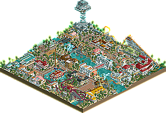
Park / iOps Resort
-
 07-October 18
- Views 1,775
- Downloads 576
- Fans 0
- Comments 8

-
 Description
I just signed up to this page to show you one of my parks I have build over last couple of years.
Hope you enjoy and let me know your opinion about it :) -
 No fans of this park
-
 Download Park
576
-
 Objects
347
-
 Tags
Tags


Supports of the roller coasters got good and I like that style of path you used.
Well built buildings with colors in harmony.
In particular I loved the giant wheels and the detail in the glass.
Waterfalls and bridges detail was nice.
Great work
The overview looks pretty wild. Looking forward to seeing it up close when I get home in a few days.
Damn, I love this park. Rides and scenery all look really good!
This looks like it must have been fun to build. Also impressive that you finished the entire thing in year 34.
Ride and building interaction was the strong point of this park. The buildings would have been decent on their own, but the rides seamlessly weaving through them is what causes the architecture to stand out. Kazumbo is especially well-crafted for interaction, and that interchange involving the corkscrew and helixes dancing around the log flume while the building emerges from the cliffside might actually be the strongest second half of a coaster I've seen all year.
The landscaping, by contrast, left much to be desired. Not only is most of the map on desert sand, but the foliage seems consistently random throughout the whole park almost as if it were an afterthought. The sparseness and overall lack of form gives the impression that the trees and bushes were placed aimlessly rather than thoughtfully, and aside from a handful of painted gardens scattered around, most of the flowers only use the default colors, which don't blend particularly well together in general. A few open grass areas might have also further enhanced the resort scene.
If the foliage were as carefully planned as the architecture and coaster layouts, I would have been thoroughly impressed with this park. Work on the landscaping aspect, and you will be building 5-star resorts around the world!
this reminds me a lot of older rct2. early jkay era stuff. I really like the vibrancy and the tropical theme. while not every building hits the spot for me, there were a few quite nice ones- the top spin building, the food court, the giant obervation tower thing, the station for kazuma were all quite good. possibly varying the roof color so much made the theme a little harder to read. You can usually get enough variation with a few textural changes and wall color changes and keep rooves more duller, natural tile-y colors. Depends what you want though, I guess!
anyway, welcome to NE. always great to see new people and parks!
Super old school vibe to this.. wow. Theres such a mixture of textures and colors that its a lot to process! The layouts are all a bit wacky.. but then they all interact really well with the buildings and paths and other rides. Kazumbo is such a wild layout.. but it still looks pretty good and I enjoyed its station building.
This was very great. Agree with everyone saying this feels very old school. It also just feels like a lot of fun looking at all the different colors, interesting object choices and structures. This really well manages to bring a vibrant and bright feeling to me. Also cool to find some german stuff in this, always a bonus point from me.
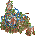
Kazumbo was a very interesting choice for a main ride. The layout was kind of weird in one way, but in another way that also kind of fit into the park and it was still very much fun to watch the goaster going. Also some good interaction with the flume over there, good job on that!
Limit felt kind of similar to me, though over here the execution and interaction was a bit weaker. Also the weird feeling i had about the layout was much bigger over here. Foliage and Landscaping also weren't that strong for me, they felt a bit too random and uninspired.
All in all a great first release, i have seen much worse! Definitely worth an accolade in my opinion. Looking forward to see your future submissions.
Good to see this old-styled park. It gives me the right vibes. You have showed a great use of deco blocks. I think Kazumbo was the best area of the park. Fuck it that the layout isn't the best, the interactions with the paths and scenery were great. Too bad almost every buildng is white, I think it needs a bit more variation.
More of this please! I almost can't wait