Park / Deurklink's Forest Frontiers
-
 30-September 18
- Views 2,279
- Downloads 617
- Fans 1
- Comments 8
-

-
 51.00%(required: 50%)
 Bronze

Cocoa 55% csw 55% G Force 55% Liampie 55% Camcorder22 50% CedarPoint6 50% robbie92 50% RWE 50% Scoop 50% Xeccah 50% Coasterbill 45% posix 40% 51.00% -
 Description
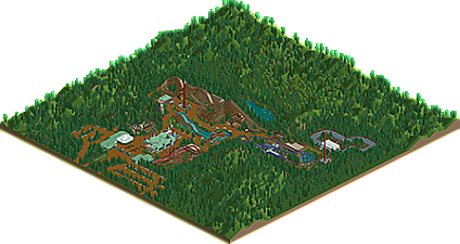
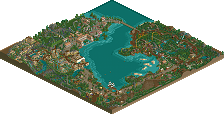
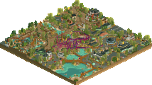
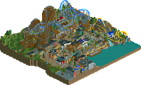
This entire park was built on the original Forest Frontiers scenario. I did expand the available land a bit, in order to turn it into a full-fledged theme park!
Uses tons of little NCSO tricks, and I even hacked the cars a bit so they would get parked a bit more to the back than they normally would. I wanted to make it look like it's actually in a forest, so I made the foliage around the park a lot more dense.
I finally decided to stop adding stuff to the park so here it is!
Original release: https://www.reddit.com/r/rct/comments/9k8twb/deurklinks_forest_frontiers/e6x89rk/ -
1 fan
 Fans of this park
-
 Download Park
617
-
 Objects
177
-
 Tags
Tags
Nice little map Deurklink, probably my favorite "realistic" work of you so far. Good atmosphere and ride selection, with enough detail to keep you interested. Definitely an accolade worthy map to me. Hope to see more stuff like this.
I say this as a compliment "the simple sometimes gets very good" (understand what i say)
nice to appreciate
I loved your park
huh, the atmosphere in here just took me back to loudoun castle, a super weird park in scotland that I went to a few times with family. I think its gone now... dang
well done in that regard. I quite like the entrance infrastructure. its a bit samey throughout but still nice and charming. possibly a bit of variation in foliage would have taken it heaps farther.
It's not a mindblowing park, it's just a simple ncso park in a forest without any surprises. It's so technically well done though. Everything is clean and smooth and carefully laid out...
Some of my favourite things are the supports for the Schwarzkopf, the atmospheric pond behind the woodie, and the water ride.
Great work.
Very simple but also cute and it looks like you had a good time building this.
I'd like to see a "little" more detail and perhaps more landscaping and foliage work from an accolade perspective but you nailed the fun factor.
I agree with everyone that the park is simple yet very pleasant to view. Some nice merged track elements with Cannonball.. and the custom go kart track was nice. Really enjoyed the wooden coaster as well. I really like the ride selection. Would've been good to see more underbrush and a larger mixture of tree textures.
This is very simple and clean. Very good to look at. The woodie area you've showed off on the screen is really great, i also like the Schwarzkopf.
All in all i think it was a bit too simple for me though, it almost felt a bit lifeless and boring, quite the opposite of the creative style i've used to see from you when you've joined the site. But i guess this is not the kind of park for it. But a great submission for a little fun project!
Lovely logo and tagline as well.