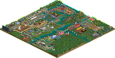
Park / Children's City Park

Park_4232 Children's City Park

10 Comments

  • Comment System%s's Photo
    comment below
  • MrTycoonCoaster%s's Photo
    Thank you who voted :)
  • bigshootergill%s's Photo

    Hopefully you'll get some solid reviews for this park soon! It's massive and you showed a ton of creativity in putting it together. I'll jot down some of the positives of the park, and some areas that you could work to improve on for your next park.


    Highlights:

    + Just the determination to finish such a large park is impressive

    + Such a wide variety of bold objects used in unique ways in different sections of the park, such as creating a very unique foliage/landscape for the park's surroundings. Probably my favorite feature of the park was seeing all the fun ways you executed this.

    + You were obviously going for quirky and fun, so the coaster layouts weren't overly strong, but they achieved your goal

    + For a new builder, you also were able to mix in quite a bit of trackitecture, either for buildings, scenery, water features etc. That's a great skill to learn early on in your building repertoire.

    + Pacman sign & building

    + You had 100% fun building this park, which is the most important thing with RCT! :D


    To improve (I'll just give you 3 things for your next park):

    - Your pathways were very straight and really long, try to add a variety of angles to breakaway from the RCT-grid

    - The foliage could be more bunched together, using grass, bushes, flower & rocks underneath and around the clumps of trees

    - Buildings are a bit massive and repetitive, try to learn to add more variety to your buildings

    (You can check out other parks to see how these 3 things are achieved)


    Overall, lots of fun to look at it. I'd expect this to hit a bronze accolade, or a chance of nabbing a silver, which is excellent for the experience you have in the last few months of building.

  • MrTycoonCoaster%s's Photo

    Hopefully you'll get some solid reviews for this park soon! It's massive and you showed a ton of creativity in putting it together. I'll jot down some of the positives of the park, and some areas that you could work to improve on for your next park.
     
    Highlights:
    + Just the determination to finish such a large park is impressive
    + Such a wide variety of bold objects used in unique ways in different sections of the park, such as creating a very unique foliage/landscape for the park's surroundings. Probably my favorite feature of the park was seeing all the fun ways you executed this.
    + You were obviously going for quirky and fun, so the coaster layouts weren't overly strong, but they achieved your goal
    + For a new builder, you also were able to mix in quite a bit of trackitecture, either for buildings, scenery, water features etc. That's a great skill to learn early on in your building repertoire.
    + Pacman sign & building
    + You had 100% fun building this park, which is the most important thing with RCT! :D
     
    To improve (I'll just give you 3 things for your next park):
    - Your pathways were very straight and really long, try to add a variety of angles to breakaway from the RCT-grid
    - The foliage could be more bunched together, using grass, bushes, flower & rocks underneath and around the clumps of trees
    - Buildings are a bit massive and repetitive, try to learn to add more variety to your buildings
    (You can check out other parks to see how these 3 things are achieved)
     
    Overall, lots of fun to look at it. I'd expect this to hit a bronze accolade, or a chance of nabbing a silver, which is excellent for the experience you have in the last few months of building.


    I liked your comments, you are right I felt like a kid creating this park, funny that this is a game, maybe it is strange to say that, it brought me childhood memories this park.

    I agree the paths are very straight, and the buildings still have difficulties in making them different from each other.
    In the vegetation I am now beginning to use + grams + stones even in the trees.
    Yes, I'm studying other parks for the new project Playcenter.

    True I fought a lot for a bronze, I have consciousness that it is not a "NE", but I think it was so cool, hehe.

    Thank you very much for the comments, were very helpful and nice :)
  • Cocoa%s's Photo

    sorry for the late review!


    love to see you progressing at the game. I can tell you are playing more with terrain, foliage, and themed buildings more like a real theme park. It pays off for sure. My favorite bit on the map is the building which contains the "super circle" rides and the bright tan path around it. Good vibes there. Your themed areas are still super strange, and I have no idea what prompts you to put rides or giant pieces of scenery where you do put them. But I like not understanding things sometimes, and its nice that you're maintaining some of the weirdness from when you were just starting out even while improving other things! 


    The next things I would suggest working on for you ride layouts and positioning. I think you could have more flow and natural interactions in your rides, especially rollercoasters. Use them to frame areas and give the coasters space to move around in, not just be confined to one little area. They can go over and under paths, other rides, etc. Try not to use too much straight track and tight turns, and keep it feeling like a nice curve. Its sort of like calligraphy/ fancy writing I guess. Plenty of good coasters to check out in our database! Most spotlight parks have good ride design.

    On a similar note, thinking of how you place smaller rides is important. If you just put them in the middle of wide paths, it can make your park look like a travelling fair. If you give each ride a little room to breathe and an area of its own, with a queue, exit, some foliage, some themeing, whatever, it'll help your park flow. Especially if you use it to break up the straight chunks of path and get some more natural curves going.


    So I guess my advice to you is: curves are great! Mastering this game is sort of similar to mastering using curves properly. I'm eager to see what you can do!

  • MrTycoonCoaster%s's Photo

    sorry for the late review!
     
    love to see you progressing at the game. I can tell you are playing more with terrain, foliage, and themed buildings more like a real theme park. It pays off for sure. My favorite bit on the map is the building which contains the "super circle" rides and the bright tan path around it. Good vibes there. Your themed areas are still super strange, and I have no idea what prompts you to put rides or giant pieces of scenery where you do put them. But I like not understanding things sometimes, and its nice that you're maintaining some of the weirdness from when you were just starting out even while improving other things! 
     
    The next things I would suggest working on for you ride layouts and positioning. I think you could have more flow and natural interactions in your rides, especially rollercoasters. Use them to frame areas and give the coasters space to move around in, not just be confined to one little area. They can go over and under paths, other rides, etc. Try not to use too much straight track and tight turns, and keep it feeling like a nice curve. Its sort of like calligraphy/ fancy writing I guess. Plenty of good coasters to check out in our database! Most spotlight parks have good ride design.
    On a similar note, thinking of how you place smaller rides is important. If you just put them in the middle of wide paths, it can make your park look like a travelling fair. If you give each ride a little room to breathe and an area of its own, with a queue, exit, some foliage, some themeing, whatever, it'll help your park flow. Especially if you use it to break up the straight chunks of path and get some more natural curves going.
     
    So I guess my advice to you is: curves are great! Mastering this game is sort of similar to mastering using curves properly. I'm eager to see what you can do!


    np Cocoa, I understand there are other things to do.
    bigshootergill and your comments are now + full very good.
    You can put into words what happens and know how to make good comments/analyzes.
    I can already see another better perspective for my parks.
    I need to lose this habit of doing strange big things, and long straight paths.
    What is exciting is the challenge of getting there, be it real life or even a game.

    thank you very much :)
  • Liampie%s's Photo
    There's so much stuff going on in this park. Everywhere I look there's flashing lights, blown up video game characters, buildings that don't resemble buildings, ridiculous rides. You remind me of RuyataxRCT in that department, his Club Roy park also has as much random content stuffed onto the map as possible. It works for him, and it works for you, in a different way. I don't think this park is going to win any awards or accolades, but it's so much fun to see, because it's obvious that you had fun making this. It's similar to contageous laughter.

    The best looking thing is definitely the water cycles with all the purple crap and the sharks. Sharks, why not?

    Cool stuff, Mr T!
  • MrTycoonCoaster%s's Photo
    Liampie you were right when you passed me some guidelines.
    Remember? right at the beginning when I registered, I did not understand the concept of NE.
    But it's ok now I understand.
    Cool was to live the whole experience and hope to one day make a worthy Park that really is a CHILDREN'S CITY.
  • Coasterbill%s's Photo

    Very nice!


    While I don't know if it's accolade worthy it's still a ton of fun. The use of bold color and weird rides (that monorail is probably the most thrilling ride in the park) is a blast to watch.


    It's pretty rich for me of all people to talk about bold, weird objects but while in general I don't want to discourage it I would put a little more thought into some of them. That bright yellow sign and giant black ball for example... what even are those? lol


    I also wish this park didn't feel so square. Breaking the grid a bit could go a long way.


    That said, I still really enjoyed this. The fun factor overpowers many of the flaws and honestly I'd rather view a park that someone clearly had fun building than a copycat park with perfectly manicured everything just desperately trying for an accolade.

  • MrTycoonCoaster%s's Photo

    Very nice!
     
    While I don't know if it's accolade worthy it's still a ton of fun. The use of bold color and weird rides (that monorail is probably the most thrilling ride in the park) is a blast to watch.
     
    It's pretty rich for me of all people to talk about bold, weird objects but while in general I don't want to discourage it I would put a little more thought into some of them. That bright yellow sign and giant black ball for example... what even are those? lol
     
    I also wish this park didn't feel so square. Breaking the grid a bit could go a long way.
     
    That said, I still really enjoyed this. The fun factor overpowers many of the flaws and honestly I'd rather view a park that someone clearly had fun building than a copycat park with perfectly manicured everything just desperately trying for an accolade.


    haha I also laugh at my own parks after I finish, because it is possible to see what was strange, what was bad, what is funny and cool.
    So when I'm building I'm imagining, "If I were in a park like this? and if I had that would? I like it?" Of course I also look for inspiration in other parks, but +or- I think so.
  • MrTycoonCoaster%s's Photo

    haha I also laugh at my own parks after I finish, because it is possible to see what was strange, what was bad, what is funny and cool.
    So when I'm building I'm imagining, "If I were in a park like this? and if I had that would? I like it?" Of course I also look for inspiration in other parks, but +or- I think so.


    Haaaa this?, so I thought about making an ornament hehe

    Attached Thumbnails

    • Attached Image: Ball.png
  • 43.00%(required: 50%)  Spotlight Submission
    Percentage of vote: 43%
    bigshootergill 55%
    Cocoa 55%
    RWE 55%
    Scoop 50%
    CoasterCreator9 45%
    posix 45%
    Coasterbill 40%
    G Force 40%
    robbie92 35%
    saxman1089 35%
    Liampie 30%
    Ling 30%
    43.00%
  • Description

    I hope this park you enjoy, of course, please imagine that everything is for children

    I looked for a real park (city of childrens or in portuguese cidade das crianças), but then I ended up improvising.

    These parks also helped in my work, (I did not copy), my park has nothing to do with these other parks, but I looked for inspiration in the atmosphere and the rides, I think it was cool.

    »» Park / Mario Kart: All-Cup Tour

    »» [H2H8 R4] Incident at Billy Wonka's

    The actual park if you want to check it out would be this http://www.cidadedacriancasbc.com.br/

    **The Cookie Boy with skate is a tribute at the time that we could play on the street safely.

    ** SPACE INVADERS and PACMAN to remember good times Atari

  • No fans of this park
  • Download Park 520
  • Objects 602
  • Tags

Members Reading