Park / [H2H8/8] Subdued Thought
-
 22-August 18
- Views 7,608
- Downloads 546
- Fans 6
- Comments 31
-
 49.38%(required: 50%)
 Spotlight Submission

chorkiel 90% CoasterCreator9 60% Jaguar 55% Cocoa 50% pierrot 50% Poke 50% Iron Rattler 45% RWE 45% Liampie 40% Scoop 35% 49.38% -
 Description
By the fLLorists.
-
6 fans
 Fans of this park
-
 Full-Size Map
-
 Download Park
546
-
 Tags
Tags
![Park_4204 [H2H8/8] Subdued Thought](https://www.nedesigns.com/uploads/parks/4204/aerialm3961.png)
![park_4718 [NEDC5 - 06/10] Javan Tiger](https://www.nedesigns.com/uploads/parks/4718/aerialt4588.png)
![park_4250 [H2H8/8] Emerald Heights](https://www.nedesigns.com/uploads/parks/4250/aerialt4037.png)



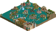
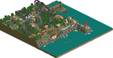
Voting RulesRound 1 | Match 1
The fLLorists - Subdued Thought
TropicaLL Storms - Parco Romania
- You should only vote if you have viewed both parks in game.
- Take your time to reflect on each park. The poll stays open for three days, not three minutes.
- Everyone but players belonging to either team in the match may vote.
Two very different approaches but with comparable results. Our team's park came together very well and I'm really enjoying the Micool vibe the fLLorists' park has with the stream of consciousness style.
keeeeen
fLLorists
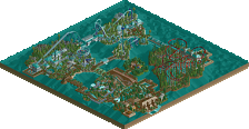
Love a good weird park, there's never enough of them to go around. The park seemed filled with a lot of angriness and sadness and emotions and stuff. I vibe it. The park seems like a sort of get-your-emotions out sort of dumping ground, which is cool - love a good 'release'. Some of the islands were pretty neat, others a bit more random. The maze in particular was really well done with the brown paths overhead, very aesthetic. I also liked the pagoda island, the castley bits, the one with the launcher, and the poem corner. The whole park doesn't particularly mesh as anything but thats cool too
tropical storms
Man this feels old. (nice). I admire the choice to go with purple walls and the city-texture, bit underused I reckon. Overall the park felt a bit square and rigid, probably because of how the cliffs are shaped. I like the lighthouse on a peninsula though. anyway, you don't get much more 'basic' LL than this, but I like it anyway coz I'm having a great time in this silly contest
fLLorists
I can feel where this park comes from, like the maze and the little things like the train and naming different rides after thoughts. It feels original, but also for me a little bit to much. A little bit to random, I'm not sure how to look at it.
Tropical Storms
It gives the feeling of a comfort zone and you don't really come out of it. It feels on some areas kind off flat and uninspired. I really liked the mast, was a pretty good design choice. Did not feel so much for the waterride. Other than that solid approach and I still kinda like it.
Really nice parks from both teams. Great how we've already explored 2 different sides of classic LL in the first match. I don't really wanna delve too much into criticism and stuff, I feel like that's not the vibe H2H8/8 is about. Will take another look at the parks later to decide who I'm gonna vote for. Good work guys!
Parco Romania:
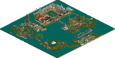
Really simple but cute park. The coaster layout is nice.. albeit a bit slow at times. I really liked the rocky run-up to the corkscrew next to the buildings. Looked neat. The water ride looked unfinished to me though. Loved the colors of the buildings with the addition of the purple. The peninsula with the firetower was cool.
Subdued Thought:
This park is wild. Not sure how to view this park like Rofl said. Definitely can feel the emotion and anger in the park. There's some really good architecture and ideas here. The flow of the maze and the story it tells is nice.. just a bit disconnected at times. The first island that the maze appears is nice.. so is the one with the brown path/yellow supports and the brick towers. Some of the abstract areas were nice. The island for "my life" was really cool.
Subjugated Thought:
I liked the objects used with lots of water, I love water in Parks.
Ride Racky Booster with the end of the invisible track has become really cool.
The overall structure high ground and low and square shape with its details made it nice.
"A moment of peace" I loved and sincerely for me this park has an atmosphere of peace and joy, the look was beautiful, I think the flowers and the colors gave that special touch, I appreciate the strange structures it is cool and different the visual .
Parco Romania:
Loved the ship with the cannons and enjoyed many barrels in the go kart, the ride DONAR was good.
The lighthouse pleased me and I liked the idea of the mushroom in the chairs.
Quiet, calm, serene atmosphere, I liked that.
Just The water ride looked unfinished, and Loved the colors of the buildings with the addition of the purple.
Overall: interesting match to start with! Not the two most earth-shattering parks, but there's plenty to like and to talk about. Definitely a lot of water.
 Milo said Micool, and there's definitely Micool here, but it's more ivo I think. You can say what you want about Taboo, you can say it's random garbage, but I think it's pretty clear that there is some artistic integrity to it. With Subdued Thought it seems a bit forced, for example all the intentionally offensive texts. But on the other hand, it's as much a reflection of your inner workings as Taboo is of ivo's, so it may be an equally sincere moodboard. Anyway, let's talk about what's actually on the map other than things that make my eyebrows rise. The arena-esque building: cool, surreal. Skatepark: actually really cool with some good ideas worth stealing. Hedge maze with bridges: cool. Castle architecture: if you want to build castles so bad, just make an actually castle-themed park? It looks nice. All the emotional shit in the park: I hope you'll feel better soon. Part of it is just a phase in life I'm sure. You can take my first point about the sincerity with a grain of salt now, you convinced me somewhat.
 Will think about it more before I cast my vote though.
Florists
Did we really have to start this contest with something this weird?
Tropical Storms
Very different stuff. Looks very simple and straightforward, and that's not a bad thing. In this contest, after H2H8, it's very welcome. First of all, it looks like an RCT2-player's first steps in LL. In a lot of places in the park, it shows an RCT2 mindset, worries about the level of detail. These seatings need umbrellas, so they get toadstools. Are these arches detailed enough, or are they too plain and cliche? Let me add banners to that. This wall is too bare. Let's put a fence against the wall. Some details are definitely good additions though. The wooden track under the go karts bridge, the barrels as tires, and the white water against the cliffs. Other things I really liked were: the little castle-like building (very unique looking), the stairway down do the docks, the first drop on the coaster, the drops on the splash boats, the tunnel on the coaster. Things I didn't like: the squareness of the landscape, the fact that you barely used the cliff, coaster colours, the ship looked very rushed, and the theme could be more clear. Is this Roman themed? Is it Italian? Is it Germanic? All in all a very pleasant park. Much better than my first LL creations.
Also remind me to make a tutorial on how to make go karts run without peeps.
The Verdict
The more time I spend with Subdued Thought, the sadder I get. You get points for getting the emotion across, and for some of the nicely executed ideas, but in the end I have to go with Parco Romania, partially because it's just more pleasant to look at, and partially because it didn't tell me that I suck.
Parco Romania is what I guess most of us expected in this contest. Subdued Thoughts is what I'm really glad to also see in this contest. Good job TropicaLL Storms.
I certainly appreciate the creativity of Subdued, but its a bit hard to read for me. Good effort for sure. I sort of wish our park would have had a bit more of a unique atmosphere, but for the time it was built it is a nice little map.
Interesting first matchup.
Parco Romania
I feel in many ways this is a great park to start the contest with. I agree with Liam that this park does look like it was built with an RCT2 mentality somewhat with its overall composition. Donar's integreation with the map is definitely a plus, but it's pacing definitely holds it back some. My favorite section of the park is probably the archy on the cliffs by the lighthouse and Donar's station. The grey walls above the cliffs were a nice touch, and I wish that it had been extended further down along the cliffs. The splash boats were probably the weak point of this park for me, they seemed just kind of stuck on the cliffs and looked awkward. A nice pleasant entry to start the contest off though.
Subdued Thoughts
Now this is a much trickier park to properly review. My first impression is that this park is the RCT version of those paintings people make when they're tripping. Just in terms of the total stream of consciousness style, and all the ideas thrown together. But on a closer look this does seem to have a lot of planning and personal connection to it. Where this park loses me some are the forced edgy bits like the signs near the entrance area. Which is a shame since that castle area is probably my favorite section of the park. The islands vary in quality for me, some don't make a whole lot of sense to me, but the "My life" island is pretty poignant in it's message. The park is definitely pretty dark, and powerful in some places, but I don't think it comes together as well as it could. While there were a lot of aspects of this park I really enjoyed, overall it doesn't quite mesh well enough to get my vote.
As much as I am a big fan of traditional LL and its aesthetics, as shown in Parco Romania, the absurdity and surrealistic aspect of Subdued Thoughts made it a more interesting park for me - and thus gets my vote.
Parco Romania:
This park felt very safe and kind of unfinished in some spots. I would have like to to see a bit more content even if the builders only had a few days/week. As far as whats there, most of it is really easy on the eyes. The layout of the coaster is pretty enjoyable. The barrel roll up to the mid course is a bit slow however. The corkscrews are pretty interesting and I kind of like them. Most of the architecture feels a bit samey, maybe not in color or style, but in shape. A little more variance in that department would have been nice. I like the idea of an island far above a sea or ocean That was done fairly well. What looked like a lighthouse was a cool idea but it looks really strange, mostly due to the colors.
Here are some things I really loved about the park.
This was by far the best building on the map. Really looked awesome.
Second best building. It took me a second to figure out how the wall texture works.
Another great little scene.
Great first park from this team and I'm excited to see whats next. 50%.
Subdued Thoughts:
When i opened this park until I looked deeper into it I thought to myself. What am I even looking at. Once I figured out that it was more artistic rather than anything that was supposed to resemble anything close to real life it ended up feeling like a weird mashup between Thoughts and Taboo. I think that might be a popular opinion by many people. Some of the ideas are cool I suppose. I'm not a huge fan of taboo so this doesn't really tickle my pickle all that much either. I'm also not a fan of how dark it is as far as the meaning goes. To the builder: If any of this is how you feel, please please please seek help. If not, well then it's not cool to joke about these kinds of things. I did enjoy what looked like a Japanese/Chinese style shuttle looper.
There were a couple cool things that caught my eye however.
This area of archy looked sooooo cool to me. Really helped hit a string that the rest of the park couldn't.
Even though this isn't really conventional in any kind of sense, I really liked the look of it.
Again, really just not my cup of tea as they say, but I am looking forward to the rest of the teams releases as I am all. If I had to give this park a rating, if that's even possible it would probably be a 35%.
To conclude I will end up going with Parco Romania. It just felt more like something I can wrap my head around and it also just felt more cohesive and well crafted. Sorry if my review is a bit harsh for subdued thoughts, but I think that park is supposed to be a filler park in a sense. Can't wait for the next round.
fLLorists - Subdued Thoughts
Makes me feel things. Which makes me super excited about the game!
You win 1 vote!
TropicaLL Storms - Parco Romania:
Seems okay, but the layout drags (holy hangtime batman!) and the landscaping and architecture seem forced. This is a week 1 park, so it makes sense that it would be rushed, but it seem uninspired next to it's competition. Probably could've won a round against something that didn't hit me in the feels.
I'll get to serious reviews, but I love that the first three signs I clicked on in Subdued Thought said "heroin is fun", "nobody reads this shit", and "penis".
I will say I spent far less time with Parco Romania than I did with Subdued Thoughts, though I'm not really sure I can say I liked Thoughts. Also I thought it was against the rules to divulge the builders? I don't remember seeing that explicitly, guess I just assumed it was a carryover from modern H2H. But there are touches that clearly show skill and what appears to be targeted ideas for artistic representation, as well as a bunch of stuff that just reads like song lyrics and random space filling. There are some highlights, like the small house and the entrance island, and the maze island is visually incredible in its weirdness, but so much of the rest feels like intentionally weird/quirky color choices and rides that don't work or at least don't do anything interesting, and not much more. I think I get a sense of the "message" or "emotion" here but I don't know that I can say this succeeds by any metric, as thought-provoking reflection of life, as theme park, or as ideas on a blank canvas.
Parco Romania is, as others have mentioned, almost exactly what someone would probably expect from this contest and especially this first round, with only a week or so to build, and many players being new to LL. The go karts were a poor ride choice in a map without peeps, and the ship mast doesn't really... work as a ride. I think that portion of the map would have been better served with a trackitecture ship along rather than another ride that looks out of place. The cliff faces are striking and the foliage is good but it's hard to shake the feeling that this is just a 45x45 map stretched out to be 60x60 just because that's the max size. The architecture is really nice and pleasant. Donar's pacing is a real shame considering it has to pretty much solely carry the park.
I think I have to go with Subdued Thoughts on this one. I'm bothered by how much it bothers me, but that's more of a reaction than I had to Parco Romania - but at the same time, this contest should be all about experimenting, doing whatever is fun, and not sweating too much over raw quality. As NE's first (to my memory) explicitly "casual" contest, I think we're off to a pretty fantastic start.
Opened Romania first. If there's a particular Romania theme going on here I didn't really feel it; a couple of the buildings look like they could be a castle and some emblematic town architecture but nothing matches a cursory google search for landmarks. The cliffside seating area is cool! The natural landscaping behind the cliffs is also quite nice imo, though the cliffs fall a little short. Not very impressive height-wise, a little too samey throughout and a little too uniform at the top. It's okay to exaggerate in LL and have some fun with the landscape tool! I also really enjoyed the amount of path interaction the coaster has; it strikes a good balance between zipping around in the woods and soaring over the walkways. That said; not a really strong layout and focuses more on the wow element of the split-S, but hey - that's early NE style for you.
------
Oh boy, concept park. These always step away from the usual RCT judging criteria a bit and get more into art criticism, or at least it feels that way to me.
Possibly not period-correct? I don't think people really got into exploring this introspective, borderline-dadaist RCT abstract expressionism until a little later. The park as a whole paints a grim picture, but it's presented in the typically over-saturated cheery theme park dressings of LL. Are the thoughts subdued because the creator is running away from them, or subdued because they've been neatly compartmentalized? Is the fractured "islands of thought in a sea of consciousness" presentation trying to tell us these are insignificant isolated pockets, or are these the tips of icebergs and the "subdued" thoughts are underneath? It's all a little too open-ended to be a strong concept-driven exploratory park like Basics of my Brain, the most direct comparison that comes to mind. It lacks structure or narrative. A few of the islands feel like this started out as something similar to BoMB, with a very clear latticework of "here's the things I think about grouped thematically," but somewhere along the line the Subdued Thoughts islands lost that concreteness. Maybe this is too obvious a solution, but a ride stringing all the islands together with some kind of "follow my journey through my internal demons" plotline could have anchored this free-for-all into something more digestable.
Subdued Thoughts - Sorry, I didn't get it. Hope whoever made it is alright though.
Parco Romania - Nothing terribly exciting here either, but there were a few nice moments. I really liked the go-kart track and coaster color but I feel like so much more could have been done with the coastline.
Vote goes to Parco Romania
like i know it's all subjective and whatever, blah blah blah, but like all these 'i don't get it' comments are such a childish and stupid way to respond to art. to put all that effort into something and to just get immediately discredited because they 'don't get it'? like, come the fuck on.