Park / Roller Coaster Park
-
 08-September 18
- Views 2,232
- Downloads 575
- Fans 0
- Comments 9

-

-
 43.50%(required: 50%)
 Spotlight Submission

Scoop 55% Cocoa 50% RWE 50% bigshootergill 45% Coasterbill 45% posix 45% CoasterCreator9 40% G Force 40% Ling 40% saxman1089 40% Xeccah 40% Liampie 30% 43.50% -
 Description
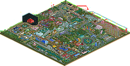
I looked for inspiration in a real park called "Playcenter" (São Paulo-City), this park is 100% flat, good times in my childhood.
I looked for some ideas in other fantastic parks on this site, and also the tip of several members helped me a lot, because in this park I really dedicated myself.
I have conscience I do not expect silver or gold, but I wonder if I can win a bronze with this work.
If it is not possible, it is ok, the challenge will continue.
Contains:
42 rides
30 mechanics
68 handyman
102 security guards
83 (shops & stalls)
70 (Facilities)
Feel free to make sincere comments.
Work hours:
34 days in row, on average 2 to 3 hours per day, including weekends -
 No fans of this park
-
 Download Park
575
-
 Objects
618
-
 Tags
Tags


Hello. Congratulations on completing the park. It's interesting.
First of all you can see that you made every effort to be just "beautiful" and it is. A few elements of architecture could be used and it would surely come out beautifully with certain modernizations.
I like fountains with floral motifs - you have a flair for them.
A park full of smiles, you're getting better quickly. A little less of the same type of attractions next to each other would be good.
I think that your style could be described as "trendy". Regards.
While i'm not a fan of the squareness of your work and some of the stuff in this park have been really weird, i really enjoyed looking at this. Some things like the 4D Coaster or the woodie just made me smile instantly and it really shows the fun you had building this, which should be the most important thing!
Your style is so unique and uncommon, this inspired me more than a lot other parks we see these days and i hope you will stay building things your own way! As a tip for improvement i would say you should focus more of giving every individual object a reason and don't go for lazy choices, like the foliage under the 4D coaster. If think the oldtimer ride is a good example to what cool stuff your style can lead to, when you put that effort into it.
Also i would recommend you to work more with elevations. I've seen that the inspiration for this is "100% flat", but i think your style could really develop itself more if you would go for something more mountainous next time. I at least would definitely look forward to see your unusual object choices and your crazy ideas in such an environment.
To end, good job and thank you for the experience i had on this park! Curious to see your next one!
I agree with RWE on the squareness of the park... theres a lot of it. Look at the layout of the dueling coaster (which wasn't set to synchronize with adjacent station).. the footprint is a giant square!
You are definitely improving.. I'd say the highlight of your building right now is your foliage. It's unique and I haven't seen someone use roof 1/4 pieces as edging along a riverbank.. that was really neat.
It's tough to view a park when it's best layouts are pre-loaded with the base game. Touchwood and Time Twister definitely took away from the park IMO.
Your ideas are unique.. and please keep going at it. My suggestion is to slow down and focus on the finer details. HAIRYPLANES was missing a lot of supports for example. Maybe do a smaller park next time?
Alright, finally got around to checking this one out. Definitely full of a lot of weird stuff, and a bit of charm. I think I actually enjoyed the weirdness and overall structure of your last park a bit more, possibly because it felt more consistent- this one was a bit more "random" and no real themes came through.
weird stuff:
-incredibly long and straight wooden coaster
-residential houses within the park?
-star wars ships in backlots that peeps can access
-absolutely gigantic black wall
-you should own your border land using 8cars or something
-HAIRYPLANES
-in fact, all your coasters have such long, straight chunks of track
I really liked the "green square" and the water feature there, to pick a particular spot. the landscaping in the center was pretty nice too.
Thanks for the tips, I'm trying it is very difficult to develop "NE", when I think I've reached +or- near, so I see I'm still far, but ok.
Sometimes I laugh at my own work and sometimes I cry hehe.
One thing needs improvement, sometimes it is too lazy to do something better.
Your comments are important to me, I enjoyed talking the truth. Also thank you for the things all liked.
And now I understood the strange things better, it helped me to have another vision.
"-residential houses within the park?" haha, I laughed a lot, I did not think of it, THX
This was an interesting park... the strongest section imo was the custom supported wooden rollercoaster, despite having a ton of straight sections. It kind of reminded me of those beejer parks: clean, very large scale, and full of strange objects.
The palm tree pond area was also great, and the red spaceship was interesting but felt extremely out of place with the ~150 foot tall space backdrop.
I think the biggest problem was a lack of cohesiveness and consistency. You have potential and definitely creativity... if you centered a park around one clear theme instead of going wild (not that that's a bad thing as it's fun to do that), I'm sure something great could come from it. I also agree with RWE... build something mountainous lol.
Otherwise, I liked this, it's certainly not something you see on NE very often, and I can tell you had fun making this.
The flying saucer really got very high up the wall, I thought I'd get the idea of outer space hehe, and when I finished I confess I found it strange, I tried to make a flying saucer "NE", I laugh at myself.
THX for your comments, you are always welcome
Most of this park feels exactly like your last park but I love Space Age.
If you want to stick to this style I suggest you just keep adding crazy, bold, totally unique things like that everywhere.
By the way, Hurricane breaks every rule and I sort of like that too.
Although I enjoy parks with incredible realism, I will try to keep things crazy, sometimes it is cool.