Park / El Encierro
-
 20-January 08
- Views 16,475
- Downloads 3,172
- Fans 12
- Comments 63
-
-
 88.75%(required: none)
 Design

Sulakke 100% 5dave 95% chorkiel 90% Liampie 90% MCI 90% Xeccah 90% FredD 85% Louis! 85% posix 85% Cocoa 80% 88.75% -
12 fans
 Fans of this park
-
 Full-Size Map
-
 Download Park
3,172
-
 Objects
452
-
 Tags
Tags
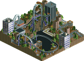
![park_2810 [PT4 R1] Los Sueños Gardens](https://www.nedesigns.com/uploads/parks/2810/aerialt2474.png)
Btw i love the design!
Geewhzzez Christ, what an awesome mini park! Best thing NE has seen in years imo..
I love all the realistic touches this park has, really innovative.
The best and most inventive thing were the working station queues with those sorting fences AND sunken entrance/exit buildings.. I've never seen them working like this before, so props for that! But...... How did you do it? Does it just work if you sink the entrance and exits, or do you have to do some other hacking too? Also loved the people counter/turning bar.
Nice use of the thrill lift to lift the rapid boats like that! It's an awesome effect, and nice to see it lines up every other 2 boats! But what did you do with Levis' thrill lift? Is it just a merge?
I loved all the diagonal architecture in this park. And this little pavillion wrapped around the rapids course is really nice..
The architecture also was pretty detailed and refreshing. What I loved about that screen is that criss-crossed use of the slanted deco pieces. Also loved that diagonal passage on the lower building in the screen.
Great attention to detail, with the façade having a fake backside, but the fence hiding it for the guests.. Also loved the custom clock.
As been said, love the fact to see that this area is part of a full scale park by using the trams to pretend they are travelling out of the map.. But... How did you do it?
Best rapids station ever imo! The roof of wooden coaster parts is neat and so is the moving circular wheel (hacked monorail) that holds the boats when people must get in..
Very nice design, and I think it's on the same level as Arch Angel.. And that says a lot coming from me as I thought it couldn't be matched.
So congrats!
SF
IMHO, this just demonstrates that there is still much to show and that RCT2 is not even close to bing dead!
SF summed it up for me. Big time props to you two!
James - rctnw
I'm not sure I could even think about competing with this stuff.
Congrats geewhzz and disneylandian!!
That custom queue line is brilliant btw
It seems that it is, yes. I know exactly what you mean, I feel the same way you do. There's no way I could compete with this. Every now and then a park comes along that makes you feel really inadequate. This is one of those. In a good way, though. I'm glad to have seen it. Six Frags, you beat me to it.
The park felt so alive, because of all the moving things!
But how did they made the path?
after some discussion with gheewzz he came up with this way of making it work for him, I did the same thing in CP6's solo before and in Breezing Spritis. The trick is difficult if there is theme above the entrance or exit and it requires some rewriting of the memory, cause gheewzz didn't succeed in that he found another way with lowering the old ones and replacing it by new invisible ones (where I delete the old ones).
The thrill lift is actually the same as I made it, only cause he only needed 1 to go up he could use a coaster track and synch that with the station of the rapids, I was playing with this idea for some time already only cause I never tought up using the thrill lift of a single ride but always wanted a whole train it sounded almost impossible to me cause you had to synch a lot of things, but because he only needed 1 it was fairly easy (still very difficult to do cause it still requires a lot of hacking).
As I told you before the release, I thought it was amazing and probably the best design i'd ever seen and I stand by that now that i've seen it in all its glory. When you sent me the layout for the first time I didn't realise just how far it could go. That is by no means an insult, but it never crossed my mind it would evolve into this jaw dropper.
The design itself is a 'more then meets the eye' invert. It looks average upon first glance but when you study the layout and the pacing it becomes evident that this has been thought out thoroughly and not just thrown together. There are so many great elements to it but I especially love the drop into the valley and then into the batwing. If only batwings could be diagonal in-game eh
The Architecture is something i'm very mixed on. It's great that you have both put in a lot of effort into the details and somehow your styles mix but unfortunatly the themes don't. The mexican theme of the area is only shown through the signage and colours. Additionally it was easy to spot the difference in Gee's and Disney's style.
The landscaping and foliage were both excellent and very well incorporated. You are still the best flower arranger I know
And now onto my best bits:
The station: Simply the best station i've seen but only becuase it was peepable. Love the baggage racks!
Rapids: The layout worked well with the design. The riders of both could watch each other and the guests wandering around could watch both too!. The vertical lift was done very well although I didn't like the mechanism housing. Its nice to see that you are able to show all the little details of how this would work but its not something i'd want to see, its too industrial looking for something in the middle of a themed environment.
Details: Signal lights for the trams, the bridge, boneyard, construction car, photo booth,test seat, coaster netting, lift hill gearbox et al, the gate in the fence by the batwing, etc
And now for the bits in-between:
Rapids Station: Now its not really the station but just all the trackitecture overwhelms the structure. I think it would have looked better with a scenery roof and the moving platform.
Facade: The construction is well executed but i feel like it is still visible from the pathway so perhaps an extra facade is needed.
Diagonal construction: Now I love diagonal construction but I feel that the coaster and the architecture can sometimes clash. Maybe some of the implemntation needs tweaking but it can be a strain on the eyes in 1 or 2 places. For example:
However all of the above don't detract enough to make this any less then one of the (if not the) best design.
RCTFan
or are we gonna show 1 a 2 screens per person every time ?
Tho not me I already did the page review and my walkthroughts are to violent
Maybe in a week or so.
But amazing design, The architecture is flawless, and that rapids ride would be awesome in real life.
I honestly haven't gotten around to looking at this yet, but... fuck, a walkthrough for a design? obviously you guys know something I don't.
*scampers off to look at it *
The layout was strong and supporting was sweet. Archy was great and gave off great atmosphere. Kudos to which one of you done that entrance building.
The diagonal paths were a tad too much, but diagonal buildings & coaster was great.
Well done, and a definate hopefull for 2008 Best Steel Coaster.
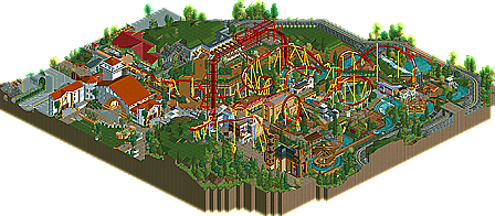
Disneylhand was a great inspiration to work quickly on this for me as the ideas never stopped flowing from him. Although I think one of the weakest points of the design is establishing a theme and easily translating that to people who view the park. It is hard to do because all RCT gives you are 3D signs. This is one area I hope to improve greatly in my next works. The theme is supposed to be the Running of the Bulls in Pampalona, Spain if you didn't catch that from the logo or our weak way of explaining it in the design. We wanted to give the effect that there was something beyond this section with more to offer the guests and I feel we pulled that off as best as possible. It has 4 rides which can accompany about 700-800 guests and then the lines start getting a bit long. Oh and if you're still wondering, yes it started off as a train and changed to trams since they wouldn't look stupid going backwards. In the end I think that the trams fit the idea a hell of a lot better.
There are still quite a few little things that haven't been found or mentioned yet, so happy hunting.
Also a big thanks to 5dave for the logo. It was a total surprise coming from you and when I saw it my jaw dropped. It is perfect, thanks again.
Would love to still hear thoughts from a certain few people here.
t00dles..
disneylhand Offline
zburns: I can't really speak for geewhzz, but I know that all diagonals built on my part (found mostly in the buildings) weren't really built for the sake of having diagonals. It's more that I'm not a fan of sharp edges when it comes to architecture clusters.
RCTFAN: The facade was a very difficult aspect of the building, as we didn't want to hide too much of the backstage area. The way I see it, backstage areas can be seen even at Disney parks.. So I choose to look at it as actually a realistic detail =]
And thanks to everyone who said something nice.
And I would still like to hear from some of you who showed your interest earlier in the thread... and some others.
To everyone who had something to say about the themes, I live in a town in which nearly every good sized building is of Spanish/Mexican influence, so that's where I got quite a bit of inspiration from while building. Especially the big white one; I've been wanting to build it for quite a while now.. All other things of mine (and I think geewhzz's as well maybe) were inspired by pictures of Pamplona, Spain. I do see however that we didn't really give of "The Running of the Bulls" theme other than the name of the ride.. But to tell you the truth, I'd rather have something like this that could possibly be found in a real park than have a bunch of cheesy tie-ins all over the place like, say. . . a giant bull sculpture.
I'd like to thank geewhzz for asking me to go at this with him. It's funny, though he came to me looking for ideas in the first place, if I'm not mistaken this running of the bulls idea came from him. A really good one at that if you ask me. I really learned so much over the course of the project--in regards to both parkmaking as well as the RCT community in general. It's opened so many doors for me.
I would gladly take working on this over an anticlimactic round two loss in the Micro Madness any day!
Yes! I'd really like to see one of these done, it'd make me happy. Wonder if someone could find them all... I wouldn't be surprised if there are even a few I don't know about =]
-disneylhand
Edited by disneylhand, 03 February 2008 - 07:37 PM.