Park / El Encierro
-
 20-January 08
- Views 16,477
- Downloads 3,172
- Fans 12
- Comments 63
-
-
 88.75%(required: none)
 Design

Sulakke 100% 5dave 95% chorkiel 90% Liampie 90% MCI 90% Xeccah 90% FredD 85% Louis! 85% posix 85% Cocoa 80% 88.75% -
12 fans
 Fans of this park
-
 Full-Size Map
-
 Download Park
3,172
-
 Objects
452
-
 Tags
Tags
![park_2810 [PT4 R1] Los Sueños Gardens](https://www.nedesigns.com/uploads/parks/2810/aerialt2474.png)
<3.
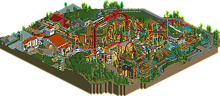
The coaster layout is perfect and interacts with the landscape amazingly. Although there is plenty of other stuff to keep your attention, it is obvious the main focus is the coaster. The diagonal lift works perfectly to make it the centerpiece. And the buildings are amazing as well, not overdetailed, but look realistic and beautiful still. Also, I was amazed how exactly the brake run looked like Silver Bullets and how it was exactly the right speed for a diagonal brake run to work. And the rapids too, I saw barely any glitching which is an achievment for that kind of ride and the realistic details were great. So much to see in just this one park, I can see why it took 200 something rct years. Hope to see more from both of you.
The only thing I didn't like was the fact it was all a bit messy, but I guess that fits the theme well, so, well done!
Great work, guys!
I loved the whole thing - the layout, the rapid ride, the architecture, the landscaping, the trams, the hacks .... all of it!
Well done, and if there was a spotlight NE Design category, this definately would be one!
Looking forward to more!
"MFG"
Your work is incredible detailed and complex, which I liked a lot. The foilage was great the layout of the coaster really good - even though I think the batwing was a little fast.
The interaction of the rapid and the coaster was a highlight for me together with the great queueline for the coaster.
However I do not agree with the words "best design ever".
I am still not sure if I like the way your styles mix together. It was pretty obvious for me who was working on which parts of the design. They sort of worked together here, but didn't show as much harmony as I was hoping for.
What kept this one down the most for me was the fact that the theming didn't really come clear to me. You work going for something spanish, but it looked like a mixture of a disney plaza, a mediteranean villa some industrial buildings, a modern restaurant and classic geewhzz style - not very spanish to me at all - and as already mentioned a little unaestetic.
Also work on the glitches as those are really annoying to look at.
Still great work you two.
Looking forward to the next one.
Magnus
1. El Encierro by geewhzz & disneylhand
2. Fright Nights by Phatage
3. Fire Dragon by Phatage
4. Arch Angle by Titan
5. Hawkeye by SloB
6. Genus: Carcharadon by me...
7. Quest for the lost Mountain by Jazz
8. Salga by geewhzz
9. Mountaineer by CP6
10. Nagas by Posix
Not like it owns Phatage's designs, but imo it edges em out...
The other cool thing is that this looks like one of those things that people would take half a year on to get just right but you guys finished it in less than 2 months.
Great work guys... look forward to your next works.
Alright, that water ride was bad ass. Nicely done with that. Trams, bad ass nicely done with that. The fact that this park was peep friendly, damn right priceless.
Design- 10/10
Supports 10/10
Scenery- 10/10
Foliage- 10/10
Hacks 10/10
+ 10 for being peep friendly.
Final- 60/50= 120%
Well done guys.
-JDP
This is almost as perfect as it will ever become (although I sincerly wish it isn't that way). We just had the 2007 awards and a whole year of building ahead of us and I already know who get the the 2008 awards for best design/steel coaster and the 'where did that come from' award. I have no clue where you got this as good as flawless design from... I just hope the pacing *****es stay out of this.
Again wow... I really need to work more, this is inspiring.
I'm glad you took the challenge of learning hex editing and tried the invisible station hack and the thrill lift. altough yours is a lot easier I learned something of it also when I learned it to you
about the design.
the archy is nice ideed altough some things aren't my taste
the foilage is very good and the coaster seems alright to.
all by all a very solid design
...and Gee, you're not too shabby yourself.
Full review tomorrow. But at the moment. Oh shit.
It definitely is my favorite design released since I've been here. It was a little bit messy but that is my only complaint. I've never seen so many hacks thrown into such a small area and for them to work so perfectly together.
Definitely my favorite release since Watkins Woods, and now I'm really looking forward to your Sea World park disneylhand.
The Coaster itself was great. fast, perhaps alittle too fast, but had a nice combination of different elements. towards the end seemed very concentrated in one area, which looked alittle congested, but it worked well with the scenery. the very end it sped, into the break section very fast. i would have made it slower there, but i realize the issues with the diagonal track. the stationg was awesome.
the water ride was great as well. the hack with the elevator was too cooL! the station was nice, although it looked like a tree, which didnt work with the area, but it was nice. the hacks on the water ride were top notch. though not the most exciting it worked well in the park.
The Archy, and scenery itself was perfect, my only problem being that the park had so many conflicting themes. the giant castle, barn type thing felt very spanish. but then the station for the coaster was more modern, the strip of buildings underneath the chain hill had some haunted mansion looking stuff, some deco, some italian. it worked somehwhat, but it just seemed like so many differnt locations were used for the buildings. it was all great, i just think the more spanish features needed to be empasized.
overall it was fantastic. great coaster, great archy, great water-ride. congrats on the design.
FK
I have only a few little things I didn't like
-I thought the queues were a bit lackluster. They were pretty flat and were located in the areas of the park with nothing but grass.
-The brown and white custom steps would have looked better as one color I think.
-The Diagonal was a little much I thought (the paths and some buildings, not the actual coaster). To me, it just seems like a whole lot of extra effort for very little effect.
Anyway, really, really great design.