Park / Libertine's Dorothy
-
 26-August 18
-
 Libertine's Dorothy
- Views 2,478
- Downloads 602
- Fans 1
- Comments 9
-
 56.50%(required: 65%)
 Design Submission

Jaguar 65% robbie92 65% G Force 60% posix 60% RWE 60% CedarPoint6 55% CoasterCreator9 55% Cocoa 55% Liampie 55% csw 50% Scoop 50% Xeccah 50% 56.50% -
1 fan
 Fans of this park
-
 Download Park
602
-
 Objects
303
-
 Tags
Tags
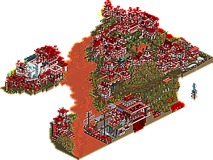
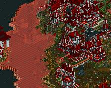
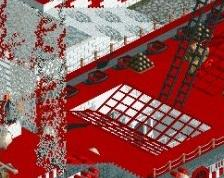
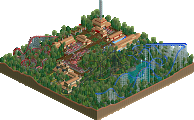
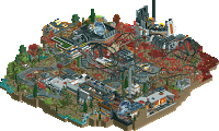
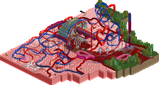
Red water harmonized with the ambiance, but the ship this one got very nice.
I researched Libertine's Dorothy on the Internet to better understand your work.
I observed every corner of the map, every detail, I think it must have taken a lot of work.
And sincerely dispenses + comments, I will summarize saying "TRUE MASTERPIECE", this is my opinion
I really liked this... it reminded me of a newer, more refined version of The Doomed Domain... we need more atmospheric 2010-2012-esque fantasy parks like this. The huge brick structures, especially the white church castle thing, also almost give me a Roman Vice vibe for some reason.
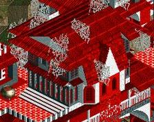
The scenery usage in some areas was a bit strange, e.g. using spider webs as sails for the ship, but that somehow worked. And speaking of the ship, I didn't like part of it was off the map. Maybe it was intentional or maybe it was a mistake in planning, but that's one of the few things I don't like about this. I do like the usage of orange water, however... it actually looks better than red water for the portrayal of blood, surprisingly enough.
The architecture is monochromatic and a bit repetitive but does a great job at setting an atmosphere. The layouts, especially the looping coaster, were not all that great imo but on the bright side they do an excellent job at interacting with their terrain. I am disappointed by the lack of names and did lol at the pumpkin sign stating "Dinghy Slide 1"
I think this is a great park, it's clean, atmospheric, and deserves an accolade imo. I also find it pretty impressive that it was made in vanilla RCT with 8cars instead of Open. It looks like you put a lot of effort into this and it shows, so I hope to see more releases from you.
This park is crazy!! wow. It's so bright and vibrant but also so very dark in tone. It's a cool contrast. It was a mess of stuff but even so I really kind of enjoyed it. Most of the architecture was really similar but I think it's ok seeing as what kind of park this is. I don't really know what else to say about it honestly other than how much it just hits you in the face when opening it. That's not a bad thing though. Maybe you could have toned down the colors a little bit just to make it a little less jarring. There are a couple of really cool ideas. Like the skulls underneath the water on the edge of the map. I can also get behind the whole name criticism since there are some rides that could use some context. All this being said I also have some smallish details that caught my eye.
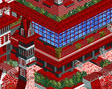
Interesting facade and a nice little pop of color with the window panes.
Nice little quaint scene for such a crazy release.
Cool building shape.
This boat is also pretty snazzy.
not sure why it's floating but it looks cool.
Seeing as this isn't really a typical release for NE it's a little harder to give it a score, but I do think it is at least bronze even if it is a bit of an obtuse concept and execution. Just such a different style than we normally see. Saying that I will give it a 50% just enough to get a bronze accolade. hopefully we can see some more from you some day.
I downloaded this, saw the korean naming in the park file and instantly started to smile and know that this is going to be a very interesting experience. I'm always a huge fan of unique and special submissions, so the comments i have seen about this and the screens made me definitely excited too, also seeing a fantasy submission is also always a very nice thing:
The strongest aspects of this definitely have been the dark and apocalyptic atmosphere and the nostalgic feeling i also kind of got viewing this for me. As said parts of the architecture have been repetitive and similar, but that sort of helped to get the atmosphere you wanted, so i can understand that. This also had some pretty cool details and technical things in it, i for example really liked what you did with the ferris wheel over there and the skulls under that water, as well as the ship have been great.
The ride design put it down a bit for me. I wasn't really sure what their purpose in this were and i think you lost an opportunity to create some movement with them over here, which i generally missed at some places of the park, i'm sure you can improve your future work a lot by looking more into this!
All in all i think this is accolade worthy for me, although it's definitely quite difficult to vote on... Can't wait to see what you're going to do in the future!
Love a good korean release, I wish we got these more often!
Overall, weird but interesting. I wish there was a bit more variation in colors, so much white and red- it really got a bit blurry. (also, open your rides!)
Some of the structures were good though, especially the rapids building and the ship with vines as ragged sails was a great idea. I quite like the little lava pond with the island and boat, and the cutaway blood/lava/water views with skulls
Maybe next time, jsg49?
yeah this was a design? what
Honest question: sorry to bump but do you think this should be changed to a bronze?
I feel like it was submitted for design as a mistake.