Park / Club Roy 97 Beilui West
-
 14-August 18
-
 Club Roy 97 Beilui West
- Views 7,113
- Downloads 799
- Fans 9
- Comments 26
-
-
 81.92%(required: 70%)
 Gold
Gold

Poke 90% no bigshootergill 85% no csw 85% no Jaguar 85% no Kumba 85% yes RWE 85% yes ][ntamin22 85% no CoasterCreator9 80% yes G Force 80% no Liampie 80% no posix 80% yes Scoop 80% no Steve 80% no Cocoa 75% no Faas 75% no 81.92% 26.67% -
 Description
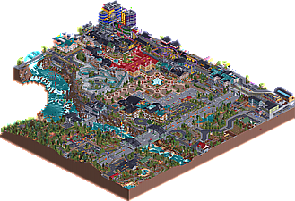
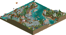
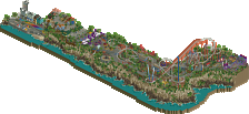
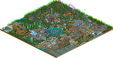
Beilui West is a fictional amusement park in a rocky valley. It can be reached via railways, airlines, highways, exclusive shuttle buses or on foot. In neighboring to a large city, the park offers plenty of options for a busy day, such as 2 specially designed Club Roy roller coasters and a breathtaking air race flight spectacle for everyone, and much more. Dont miss it!
I can finally present my latest solo Project. I hope you guys enjoy this one, have fun!
I recommend using the latest Openrct2 version, to prevent errors.
Download the CUSTOM1,2 here (Google Drive): https://drive.google.com/file/d/11nniURAEck5Wuf_IHElGMpq0_Qfqhz4E/view?usp=sharing
(Was too big to upload it here) -
9 fans
 Fans of this park
-
 Full-Size Map
-
 Download Park
799
-
 Objects
581
-
 Tags
Tags
![park_3324 [H2H7 R1] Circus Circus & Adventuredome Atlantic City](https://www.nedesigns.com/uploads/parks/3324/aerialt2970.png)
Happy belated birthday, Roy. Some people will call for spotlight. I don't think this park fits the spotlight accolade, but there's no denying that there is a lot of quality here. You've progressed so much over the past year, it's incredible. Stellar work. Hopefully I can review the park soon.
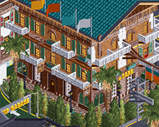
Gee must have given a lot lot of work, trains, planes, cars, buildings, houses, shops, swimming pool, colors, details, stations, hillside, underground, parking, scaffolding in the building that I loved.
I'm not an expert, but for me everything is very real it is a complete city for me.
I liked everything harmony and charm congratulations.
Okay have you guys just come off an intense H2H season or what? Where the hell does this come from? We've been having good releases every day for almost a week and this definitely takes the cake.
Your mix of macro and micro is totally unique, making it possible for me to take in many more details than I otherwise can in this style. There is a strong fun spirit everywhere in the park, like you enjoyed building every little corner. The composition with the indoor rides and huge amounts of architecture is super complex, but works surprisingly well here, even if then it does become a bit difficult to take in the park. Still very impressive work.
And most of all: it's so unique looking. Like a cross between 5dave and Lagom. Uniqueness for me is the decisive spotlight factor. I'm not fully decided yet but am eager to see what the panel will give to this.
Like Posix said, this does seem very Lagom-like and yet it's paradoxically both clean and very overwhelming. There's so much motion everywhere, so many small details here and there. This park isn't too large but I'm going to spend a long time looking at it nonetheless.
I can see how people wouldn't vote spotlight on this given that there's not much of a themepark... it feels like a non-park with coasters thrown in, at least to me, but that doesn't take away from it at all. The architecture and landscaping are especially well-done... this is a great balance of micro and macro.
I guess a few things were off... not sure how I felt about gorillas and tigers sharing the same exhibit on the Safari ride and really there's a lot of odd object choices (like those crystals that seem to be your trademark object) but the small details are quite interesting and well-executed. I'm glad more people are experimenting and actually making expansion pack stuff look good, which is no easy task.
This is honestly one of the best city-scapes in the game and while I'm still deciding on what I would rate it, I would certainly be surprised if this got below 80%.
Your style is just such a delight. It's wildly unique and an absolute blast to explore. It's great fun; managing to combine a larger more macro scale while still being able to wow the viewer with little treats here and there. Above all; it's just so uniquely "you" - something I want people to be able to see with my parks someday, very inspirational. I honestly hope that in the future
when I get off my ass and build things I want to buildpeople can look at my work and get the same feeling I get when I look at your parks - such a distinct style and identity.Is it a park? Is it a city? Still don't know.
Are the coasters all that sensible? No - but I really don't care; they fit with everything else in such a perfect way. Everything is a little real and a little surreal. I love the way everything is integrated together and how the focus is on the entire thing as a whole rather than a park and a city with some wilderness. It has a real sense of cohesion and experimentation, and it's just plain fun to check out.
This'll be an interesting panel vote. I think this deserves Spotlight, but only just so. It may be a little small, but it's packed with variety and enjoyable content. It's far from a perfect product - but that's what makes it so wonderful.
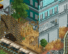
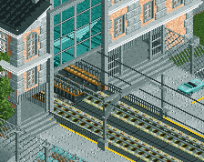
Here are more than just a few things that really stuck out to me.
I love this swimming pool. It works really well.
Probably my favorite building on the map.
What a great facade.
The way the fountains frame this little arch way just looks so cool.
To me this looks really coney island/ nostalgic. I love it.
One last cool little building.
I'm sure there are plenty of things that I missed and will find with time while revisiting the park which I'm sure I will. As far as a score I don't think it's quite an 80% but it is really dang close. Probably 78% if I could, but as usual I will round up
wow this park is so weird and very good. I just have conceptually no clue what its supposed to be, which isn't a bad thing. Its just this weird mix of sort-of-themepark, city infrastructure, landscaping, etc. Its super dense and sort of feels like a video game map or Jappy's model train basement/dungeon.
The archy is pretty great (and huge) throughout, even if I can't place where or when this is meant to be set. I especially love the japanese street even if it doesn't make any sense with the european buildings or ski-lodge architecture elsewhere. the coasters are both decent, commendable custom woodie supports although they're super dense. I love a lot of the outside infrastructure- train lines, briges, chairlifts, etc. really well done and very vibrant (and very weird too). I liked the escaped zebras in the field although you make some weird landscaping choices- pink grass objects and grey rock bits stand out a lot to me. And why is the raw sewerage dumping into the river? why is there a 'boat bridge' (hilarious idea). Not that any of it is bad. Just strange.
Anyway, I really like it. Nice work and amazing productivity- its always nice to see youtube series and stuff eventually released.
First of all, thank you guys for your thoughts, i really appreciate them!
Park or City & Bartolomeo?
I see why people tend to say its a city rather then a park. But i imagined the park being build neighboring to a city, as an amusement park.
But i guess the problem is the city-esk theme that makes it feel like the two parts are mergin and in the end it looks like a city. The Railway (BWRails) pretty much shows the border between the city and park.
This idea also led to the problem that the Bartolomeo coaster feels cramped in and has no space to breath. Yes thats true, but i imagined building a coaster in such a dense area, riding through skyscrapers and on roofs, would lead to it being how it is now.
Clash of architecture? )
)
No, this parks architecure may be connected to different cultural origins, but its not connected to the boundries that would not let any of them merge together. The people who would question such desicions dont exist in this fictional world.
The same goes with the "mighty sense" some questioned. I´ll recommend everyone who explores this park, to free themselfs from their imagination of perfect sense. (Just whilst watching the park, you can have it back later
Attached Thumbnails
i'm... more confused now
love it
I love this. I disagree with Liam this shouldn't be a Spotlight, I think it's well deserved here. I'm liking the realism with a twist concept here. Will leave a full review later, gotta catch up with those soon...
It's still quite good though, went with an 80%, all the additional content and materials you've developed for the park was the tiebreaker between 80 and 75 to me.
Hope to see something with a bit more focus on the theme park aspect in the future from you.
This is a wonderful park so much detail. It will take some time to see it all. i hope this gets arating that it deserves.
There's so much movement!
This is a gleeful little world. It's clearly the kind of park you can only make without a lot of pretense of trying to fit a mold, be that an NE standard format or a real-life park recreation. The kind of park where you think "hey, that would be cool!" and in it goes.
There's pros and cons to that. This is a total blast to explore, because there's no dead space and everything is covered in multiple layers of attractions, infrastructure, and architecture. On the other hand, everything is covered in multiple layers of attractions, infrastructure, and architecture. This is like the Toy Cars Rug of RCT (you know the one). It's a great playground. Everything's here- there's a train station, some planes, an illegal street race, a fancy hotel, a zoo! The fun factor mostly outweighs the crowded style, but I'd love to see some of these elements given more space to live on their own. The hotel/resort concept, the downtown recreation district, the wildlife exhibits could all be entire parks. Here's hoping you make them!
Sorry for delay in replying.
This park is amazing RuyataxRCT. One of my favourite releases in a long time. Its so different and fresh. Some of this reminds me of RCTNW work on resorts and architecture but taken to the next action packed level.
There is just so much going on and movement everywhere. So many little touches that while they may not make realistic sense (Giant underground runway for example) are so much fun.
Neither of the big coasters are amazing but are just about realistic enough and fit the setting well.
Some of the architecture around the park entrance is stunning and the whole infrastructure is another level. The blue bridge in the corner is gorgeous as is the whole river/canyon section, The swimming pool is amazing.
Like Julow i love a good train network and the train and tram system here is great. Its on a Grand Central level of cool.
In short this is one of my favourite parks in a long time. And despite its flaws IMO should be a spotlight hands down. Unfortunatly I'm not on the accolade panel but this is something to be very proud of congrats.
Happy to have finally had a chance to check this out. What a great release, as I thought it would be from all your awesome YouTube videos (everyone should check your channel out if they haven't).
The park is just fun. It's dripping with fun, every square is just oozing with it, and it makes for a great experience. I could explore this park for hours on end and not get bored. My only real criticism is that the metropolis portion gets really dense and hard to read. I wish you had separated the buildings a bit and widened up the streets for some more street-level scenes and details.
Great job with this, and no matter what score it gets, spotlight or not, be proud of it!
First I want theres so much movement going on!
I enjoyed following the fighter planes racing across the map.. so much detail went into that ride and it paid off!
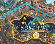
Since people already pointed out the front of the station for Nordkette.. I loved how awesome the rest of the ride looked!
The custom supports were great and the castle element along the lift was really cool. So much character.
Then all the infrastructure everywhere.. geez. Amazing how much detail went into parts that weren't an amusement park.. like a car factory I'm guessing?
Bartolomeo was a neat layout.. great interaction with the buildings and terrain.. which i'm guessing was "man-made" since its on top of a building?? But I wanted to highlight this part of the layout because your usage of the crystal object throughout the park added little bits of color that were nice.
Wonderful park.. amazing still how much detail was packed into this.
Looking at the usage of little details, architecture and composition this definitely is a submission that stands out. I think that also some of the unusual decisions you made for example looking at the foliage partially really helped and improved this. Also some crazy unrealistic things like the Safari that got mentioned in other reviews were something I personally enjoyed, because they made me smile and have fun viewing this, same goes for the awesome opening scene that definitely deserves a lot of credit.
All in all this was a very unique and great viewing experience for me. Sometimes unusual stuff was on the edge to being weird for me, which is probably why I went with the vote I did and not something very high, but all in all I think you should definitely keep the habit of using unusual objects and techniques, because that gives your work something refreshing and I would definitely love to see that habit in a more park-ish setting in the future! Keep it up, bro!