Park / Maverick
-
 10-August 18
- Views 3,753
- Downloads 657
- Fans 0
- Comments 8
-
 51.50%(required: 65%)
 Design Submission

CoasterCreator9 60% Cocoa 60% Coasterbill 55% Liampie 55% Poke 55% bigshootergill 50% G Force 50% Jaguar 50% posix 50% Camcorder22 45% Sulakke 45% Faas 40% 51.50% -
 Description
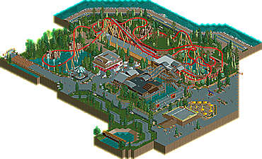
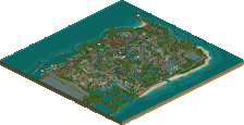
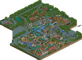
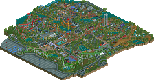
Here's my attempt at recreating Maverick from Cedar Point. Leave as many suggestions as you would like. I'd love to get as much feedback as possible. Hope you guys like it! :)
-
 No fans of this park
-
 Download Park
657
-
 Objects
268
-
 Tags
Tags
Really sad I'm not going to be able to look at this before I'm traveling next week, looks like a completely solid debut from you from the overview!
Good stuff. It's not an easy ride to re-create, especially on that second half because it performs such insane elements that even attempting to put them into RCT is a non-starter. You did the best you could though.
Aside from that, I'd really like to see you break up the concrete more with some detail and foliage.
Overall though, this is really great work and you clearly have a ton of talent. I really hope you stick around and continue to build.
Thank you very much. I have a couple other projects that I've started on, but school starts up soon for me so I won't have as much time as I did this summer. Thanks again for the suggestions.
I think this is really quite good. A solid recreation from what I can remember, you seem to have mostly nailed the coaster although I may have handled the hill after the launch differently.
Most of the archy was pretty solid- I think the station needed maybe a couple more ticks of height- it was slightly squat and the roof a bit overpowering and flat. Otherwise, I'd say the next thing to focus on would maybe be foliage- trees felt a bit randomly placed without much underbrush/ planter formation. That said, this is still quite high quality! very nice work.
oh one more thing, your car ride could be curvier/smoother if you use a single rail coaster type as the rail instead of deco pieces. hope to see more from you for sure! (millennium force next? never seen a good one in rct )
)
Wow, this is quite good for a first release, well done! I can't say much for how good a recreation this is as I'm not very familiar with it but I thought the layout was okay. The station and queue were decent but very grey and brown, could have used some more colour here. The other buildings were quite nicely done, but it still seemed very grey overall. The foliage could have been better I thought, and the static cars and train looked out of place next to the moving coaster. I will say though that for a first submission this is great stuff and some of the details like the custom signs were fab. Looking forward to more stuff from you.
I would’ve liked to have seen more color and more height to your buildings. Instead of 4 unit tall floors, do 5-6. Also the turn and drop over the water after the second launch could’ve been more flowy. That’s my favorite part of the ride IRL!
The recreation itself is very solid. A few things here and there that could be changed (minimally) to make it more accurate such as the positioning of the horseshoe and some banking etc but that's not worth the nitpicking. The surrounding architecture is accurate but I think it could have been tweaked a little bit to be more aesthetically pleasing from an RCT2 standpoint. People have already mentioned most of what I would say, but working on your landscaping/foliage as well as your buildings is a good place to start. This is a really impressive first submission, and I'm eager to see more from you.
Kudos for recreating a CP coaster, and overall one of the better coasters in the world. Always good to see CP in RCT Recreations are always hard and I think you did a good job on the lay-out. Some things I'd do differently but OK, it's not easy to translate a real coaster into an environment with multiple limits.
Your architecture isn't too bad. I think the general shapes of the buildings are good. They need more refinement as in texture and detailing. I echo Cocoa that the station should be a bit higher and less squat.
Landscaping is the same thing. It's not that bad but some touches here and there would lift it way up. Watch out with those LOTR rocks for example, the ones after the launch are ok but that one in the water looks just weird and lost.
I know CP is a park with wide concrete paths, but that doesn't work at all in RCT. That has to be broken up more. I suggest looking at some of G Force's parks. He's master into making paths interesting yet keeping the (ultra)realistic vibe to it.