Park / Magiska Dalen
-
 09-August 18
-
 Magiska Dalen
- Views 1,949
- Downloads 564
- Fans 2
- Comments 15
-

-
 61.00%(required: 65%)
 Design Submission

Kumba 70% bigshootergill 65% Jaguar 65% Liampie 65% Poke 65% Camcorder22 60% csw 60% Faas 60% posix 60% CoasterCreator9 55% Cocoa 55% Sulakke 50% 61.00% -
 Description
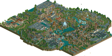
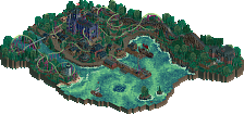
My first design submission. I really tried to focus on the foliage and atmosphere for this park, I think it turned out great. The archy was inspired by a combination between Copenhagen and Sweden. I'm glad to have finished this park in only 4 weeks. I hope you like it!
-
2 fans
 Fans of this park
-
 Download Park
564
-
 Objects
349
-
 Tags
Tags
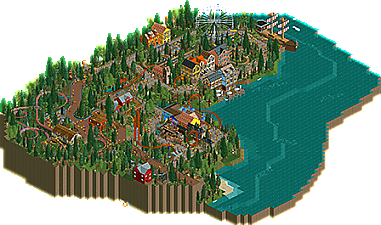
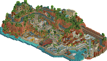
I really like the colors. The use of elevation changes is the real strength here, I think. The atmosphere is super cozy, and the relaxed designs help with that. Rides the line between Design and Park, though - neither layout is really intense enough to stand on its own but they are both well-thought-out and look like they belong in the space.
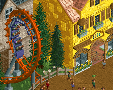
I think this submission would be best as a park, not a design. I like the Arrows coaster and how it interacts with everything. The building between the two loops was neat.. hides the riders' view of the second loop which is unique. I'm bummed that the station is underground.. kinda takes away from the ride as a design submission.
The mine train coaster was cool. Liked the station for it. Very simple layout though like the Arrows.
The rest of the park was very scenic and well done. Great colors and details. The car ride was cute and the village surrounding it was well done.
Overall, I'd say 55%.
Loved the idea of the boat museum and the visitors coming in
The buildings are beautiful and the foliage was well distributed
I love the roller coasters going underneath, between houses and foliage
Water is indispensable, helps balance the atmosphere
I loved the paths/fences in particular stone style
Excuses, but the entrance to the roller coaster should be exposed, I think it would be cool.
Well, sincerely great work for me
not a bad park at all. the buildings were definitely the highlight for me, as well as the diagonal ferris wheel- can't believe we hadn't seen that before. landscaping was overall pretty solid also, although I'd say the shoreline was slightly sloppy and maybe a bit more underbrush variety/denseness would be appreciated. the coaster was good for what it is, which is quite simple. I liked the corkscrew over the water a lot and the loops were neat, although peeps could absolutely fall into the first drop . I've always felt that stations hidden underground are a bit of a cop-out though. all up, not bad- probably not design quite, but the archy and general skill is up there.
Took a look at this last night, and it was nice. The diagonal ferris wheel was a nice unique touch, and archy was really great. Colors were also awesome. The atmosphere was also wonderful too.
Now, for the elephant in the room. The main coaster just doesn't stand out enough for me to think of this as a design. It's well done for a small cork layout, the interaction with everything was really good as well, but it blends in with the map a bit too much and just doesn't feel like a focus of the map unfortunately. A 60% from me, which would put it high bronze, low silver territory if it was a park, but unfortunately a miss on design.
That all being said, I think it's time to see another full scale park from you! You've obviously improved from Aetatum Auream, and I think you've got a gold in you for sure if you take the kind of content on this map and get it on a full map with a good park layout.
Nice submission MK, great atmosphere in this. The coaster layout was okay and had some nice interaction with the path but it's just too short. It's a shame the station was underground as well and there isn't really much queue interaction. Could have had it wrap around the waterfall perhaps? The buildings looked rather pretty and had great colours, and the foliage was decent throughout. Good landscaping too! The diagonal ferris wheel was really unique, though I thought it looked a little strange. Awesome idea though, along with the NE boat museum. I agree with the above comments that the coaster didn't really stand out much from the map and as a result this feels a bit confused. Nevertheless this was a lovely piece of work.
This is a great park, almost certainly Silver. As those above me have already noted, it doesn't seem to fit the category of Design. I was surprised to see that I was going to be voting on a Design submission when it came to panel voting.
I feel very bad for this submission because it misses out on a park accolade. This is definitely not a design submission like so many other people have already told you. I'm going rate it like a park and as a design for this reason. I really do like the map as a whole it's very fun and atmospheric and I can tell you had a lot of fun making it. The corkscrew coaster was pretty good, but again way too short to be a design. It kind of reminds me of the big bad wolf from Busch gardens a bit just because of how it interacts with the village buildings even if it's not a purely for themeing. The setting is nice and the foliage is pretty good except for those weird trees with no leaves on them. they take away from the foliage imo. A lot of the architecture feels a bit to samey and could use a bit of diversity, mostly in the separate clusters though. The only ride that really needed a bit more was the disko. It was there and it was bare. I think the station for it could have been improved upon and there was nothing to really support it as far as any themeing.
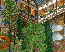
Here are some cool details.
This is the best area of the park for sure.
This is ALMOST really cool, but its just a bit to stout. great effort though.
When it comes to giving this park a rating I would probably give this a 50% as a design submission just because it has potential but doesn't encapsulate what a design is supposed to be, but then I would give it somewhere in between a 55 and 60 to be a high bronze. It's a great step in the right direction for you and it's definitely your best work so far. Keep it up.
Thanks for all the reviews guys. I think I need to explain why I submitted it as a design. I already said this on Discord but ofcourse not everyone could read it. It was planned to be a design from the first idea I had. I started with the layout and from there on I built the landscape and the mine train coaster. Maybe I got a bit too enthousiastic when I decided to add a whole new area to the map. I made the old timers and ferris wheel as some extra's to make the map a bit more special. I really thought of making it a park but I thought it should be bigger. There was no room for expansion since it's planned to be a design. Reading your comments now it might be the wrong decision but I'm here to learn, right?
Shame you submitted this as a design, as it doesn't feel like a design. There's no main focus on one of the coasters. This could and would have won a bronze, I think.
+ The architecture around the waterfront is lovely. Those new Fisch windows are so useful.
+ The loopings separated by a wall is quite unique and looks cool.
+ I really like the setting of the pirate ship. Well done.
+ The lifthill of the corkscrew coaster is really nice somehow.
+ The waterfall scene is pretty cool.
- The disk-O coaster and everything around it looks really bare.
- The boat felt underdetailed compared to the latest boats on NE.
- The ground floors of some of the buildings looked really empty and could have used columns, racks, etc.
- Some of the dead trees were pink, red or green?
Lovely park snippet. I would have liked to see this with a proper entrance and submitted for a park accolade, but that's up to you really. I really enjoyed how well the attractions were embedded in the surroundings, particularly the title coaster. Great use of height variation in the landscape to separate the two path syles and play with some slight theme variations in the architecture. Good stuff! Fitting foliage mix as well, applied very nicely if maaaybe a bit too evenly for my tastes. Glad I didn't overlook this one!
this would have been a perfect bronze-silver park. I suppose design is in some sense more prestigious (typically gold-ish quality) so its a shame it missed it but reasonable.
Thanks for all the votes and comments! Too bad it didnt win an accolade but expected. I learned so much from this park, that's incredible. I won't make the same mistakes again. Next project is already up and running!
nice. Can't wait to see it.
Can't help to notice the diagonal ferris wheel first, that's just incredible. But right next to it, I can't also help to see the boat which is pretty underdone compared to the boats we see at NE lately. I think you could definitely do better on that.
Overall it's a pretty solid submission, there's a nice atmosphere due to lovely archy and lovely foliage. I think missing out on an accolade is pure to choosing the wrong sort of accolade sadly... For a design it has too many flaws. This could easily be a bronze or maybe silver park.
The coaster itself was just OK. I did like the placement of the loops, rest of the lay-out wasn't anything special imo.