Park / Castello Ferarri
-
 02-August 18
- Views 1,583
- Downloads 510
- Fans 0
- Comments 10
-
 Description
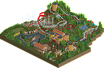
Entry for RC&F Defunct Cycle 2 Round 1 competition.
Dueling coaster themed with a castle. -
 No fans of this park
-
 Download Park
510
-
 Objects
198
-
 Tags
Tags

![park_4102 [H2H8 R3] Castles-n-Coasters](https://www.nedesigns.com/uploads/parks/4102/aerialt3848.png)
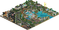
I thought this was quite nice, not much content there, but what i see looks not bad. Coaster dueling was fun to watch, archy was solid. One problem i had with this is that the 'park part' is basically just one square and except for the coaster, there is no other ride to watch, the broken down go-karts are a fun detail though.
All in all nice little thing, not yet design-worthy for me though! 55%.
hey nice little park here. If I had one complaint, it would be the size- I wish there was more to really sink into! It reminds me ton of that wes anderson short film/ad about the racecar driver who pulls into a small italian town.
the coasters are decent- maybe a bit slow. I wish they dueled better in the middle portion of the ride. the station is pretty great I'd say, but I wish there was more to the town and some smaller, more varied archy. the two towers are a bit odd but the one with windows is better. anyway it seems this was for a contest so I'm sure you did well given whatever rules there was!
Glad to see this uploaded here! You got all my comments during the voting, so I won't repeat them here, but I liked this entry a lot!
Not bad, but I think it has some issues with the park layout. The paths consist of only one square and the coaster is barely visible from the path, that's something you want with a dueller! The dueller itself looked nice but indeed could've duelled a bit more. The foliage looks fine though I would break it a little more up with dark greens. The best part of the park is the restaurant. Cool building! 50% from me.
P.S. you should've named the Go Karts to Max Verstappen's broken car
@RWE: definitely agree about the park part. It was not the focus at all when building this!
@Cocoa: If this was for a design score, I would've done more with the surroundings.. the 40x40 map limited what I would've included.
@saxman: Thanks again for the comments!!
@MK98: I'll work on foliage colors in the future.. definitely something I'm working on getting better at.
Lovely stuff as I commented in my review. H2H seems to have really upped your game. Looking forward to what you do in the future. 55%
I don't think the lack of supporting rides is fair criticism to a design submission. What was there was good but just not good enough to warrant design.
The coasters did race but there was always an obvious winner (white). The architecture was fun but it would be cool if the tower in the coaster turnaround had a purpose for example.
Good effort, I scored it 55%.
I really loved looking at this. That neat corner with the poplars and vineyard, that non-functional Go-Karts (and what looks like some sort of oil hazard on the middle of the track but was actually a pothole ) and especially that building housing the food and drinks. Looks like some old villa being used as the location of a long-table Tuscan picnic or wine-tasting occasion. Great simplistic archy, and I really loved it a lot.
Speaking of archy, 'Castello Ferrari' was really awesome as well. The forms on that castle/station look so good from every angle. I wish the towers had a bit more depth to their shape, perhaps, as the two lone towers end up looking weak when noticed alone without a castle to elevate them.
The entrance was pretty great too, small and effective, as this entire park is.
Wasn't feeling the foliage as much though in its tree placement. I also think the Ferrari red/white tire combo was slightly overplayed, particularly when it came to the stuff outside the Go Karts track.
Loved this anyhow and would happily rate it border-line 60 if it was larger in scale and the concept was allowed room to be explored a little more. With contest limitations I suppose this couldn't be helped, but now I wanna see more cool stuff from you man.
Nice work, limited by the size but still good. The coaster layouts were quite nice, though the racing was only really exciting near the end. Loved the broken go karts and the little story you had going with it. The castle looked nice but the towers could have used a bit more detail. Other than that, good stuff.