Park / The Legend of Ching Shih
-
 29-June 18
- Views 2,182
- Downloads 633
- Fans 1
- Comments 8

-
 61.00%(required: 65%)
 Design Submission

Dr_Dude 75% WhosLeon 70% bigshootergill 65% Jaguar 65% Camcorder22 60% CoasterCreator9 60% Cocoa 60% csw 60% Poke 60% Faas 55% Liampie 55% Sulakke 55% 61.00% -
 Description
I originally made this for the June 2018 Reddit contest on /r/rollercoastercontests.
Original release:
https://www.reddit.com/r/rollercoastercontests/comments/8otm1t/submission_thread_june_2018_contest/e1iuy3q -
1 fan
 Fans of this park
-
 Download Park
633
-
 Objects
187
-
 Tags
Tags


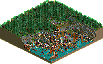
![park_3601 [NEO16] Lóng Hégu](https://www.nedesigns.com/uploads/parks/3601/aerialt3218.png)

Hey man,
Great little design, did you win the contest?
I liked the first half of the layout, and adored the waterfront architecture, very atmospheric and clever use of objects.
The second half of the coaster was a letdown though, layout-wise as well as theming wise. The random black single tile path elevated there looked bad, and I don't like the big underground part of the coaster.
Great effort though!
all the waterfront work is really really solid. If I remember right, you weren't allowed to modify the landscape? which is a bummer because the sort of clean smoothness of the rocks are bringing the vibe down a bit. but all the archy and stuff especially on the lower levels is sick.
Holy crap, I didn't know you were active on Reddit Xtreme97. Cool to have you participate in one of my contests. You already know I loved this.
Modification of the terrain was allowed, but the point of the challenge was to make use of the landscaping (which was intentionally weird). From the rules:
Modifying the existing terrain is permitted, within reason. No flattening the park or making significant changes to large sections, but modifying it to accommodate rides, buildings, path, etc. is all acceptable and expected. The ride(s) need not interact with any specific part of the park, how you use the terrain is up to you.
My primary complaint about this was the foliage on top of the plateau. The waterfront is so richly detailed that it looks odd by comparison, but I understand the intention of making one portion bland so you focus on the rest.
I liked this. The village itself was really nice. Most Asian stuff in RCT wants to do the same as Lijiang IMO and this doesn't. I admire that it's more colourful and dares something new.
This was however far from flawless. The akward position on the map, the rushed foliage.... If this was made with the same care as the other part, this could've been so much more interesting. I think however you can still be proud of this even if it's not groundbreaking.
Faas: Thanks! Yeah, this did win Glad you liked the waterfront, I'm really happy with how it turned out.
Liampie: Thanks man, appreciate the comments!
Cocoa: Yeah we weren't allowed to change too much about the landscape unfortunately. Glad you liked the lower level stuff though!
Ling: Haha, I think I entered one of them a few years ago too. Tbh I'm glad I had this cliff-like landscape because I've been wanting to do this chinese pirate cove idea for a while and this was perfect opportunity so thanks!
Jappy: Thanks! Yeah, I would like to have spent more time on the foliage up top but I'm happy you liked the village.
Somehow I missed this one.
This is a close one! I loved the waterfront and most of the coaster. Obviously the top of the plateau was a little same-y as far as foliage is concerned, but I think the rest is pretty lovely.
Nice work