Park / Kingfisher
-
 01-August 18
- Views 2,917
- Downloads 654
- Fans 1
- Comments 12
-
 63.00%(required: 65%)
 Design Submission

Jaguar 70% Faas 65% G Force 65% Liampie 65% Poke 65% posix 65% Xeccah 65% bigshootergill 60% Camcorder22 60% CoasterCreator9 60% Cocoa 60% Steve 55% 63.00% -
 Description
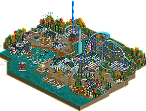
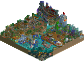
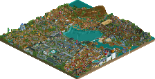
Come and visit our new area: a New England harbor village Oldport featuring 4 new rides, including our newest major addition: Kingfisher!
This B&M dive caster takes you up high above the ground to let you dive like a real kingfisher does. -
1 fan
 Fans of this park
-
 Download Park
654
-
 Objects
339
-
 Tags
Tags
![park_3790 [NEDC4 2/15] - Ghoul](https://www.nedesigns.com/uploads/parks/3790/aerialt3443.png)
The houses are beautiful I liked the shark and the seals, it was nice.
I love those roller coaster dives and passing between houses and buildings.
It gets really cool, and the boats were good.
I like the wood-style path
seeing you blossom as a parkmaker, getting better with your ride design, and losing your overall awkwardness and rigidity.... it's fantastic. this is a major step up for you from fuck and terra ventura, even if the final score ends up not reflecting that fact well.
still, you're not there yet. this park definitely, to be blunt, feels like a poor man's ghoul, lacking the nuance and attention to atmosphere to really make this stand out on its own. the spatial placement of things, the foliage, the facades, and the color composition leave a lot to be desired. don't take too much offense to this though; teleology shows you're definitely going in the right direction.
I really enjoyed this, FredD. I thought it was tasteful and well done, and gave me the New England vibe well enough. It felt like Ghoul, but different at the same time. Coaster layout was pretty good, but not perfect. The second tunnel under both the inlet and an entire building seemed a little off, and the little bunny hill right before the brake run was just a bit weird. Otherwise, the interaction was nice, and I did like the dive through the lighthouse.
The architecture was all pretty good, but nothing mindblowing. It seemed a bit repetitive at times. I think my favorite was the coaster station. The foliage was okay, and the weird colored trees aren't bothering me much, except for the dark red colored pine trees, they stick out in a bad way. You had some nice details on the map too, my favorite was the hanging great white shark sculpture and the whale in the water. Overall a very nice release from you!
not bad. My favorite bit was probably the boat as the queue entrance- that was a really neat detail. the layout was good but not mindblowing, although i do like the drop down the lighthouse. the atmosphere was better than in some of your other work but still a bit... stagnant maybe? Its a bit hard to describe what the issue is but it didn't quite pop out to me like it could have. the archy was mostly fine, possibly a bit 'squat' and blocky in bits but passable for sure. the church and giftshop were probably my favorite buildings, and I quite like that grey color you have. I wish you hadn't used the dreamport boats and some of the custom ones, especially the diagonal boat, were very fat and underdetailed. finally, the tree coloring didn't quite work, possibly because you made every tree of the same type, the same color.
anyway that probably came off as quite critical, it is a nice park all up. I think its just that you have a lot of potential and skill to unlock but it keeps feeling just a bit... stale maybe? I can tell you have real quality building skills and you maybe just haven't hit that compositional groove yet.
Congrats on finishing this dude! Overall this is a good park with a nice atmosphere. Feels really like a fishing village to me. The buildings with the black roofs and white details everywhere really reminded me of the FUCK-park you're working on right now. The whale was very cool, and the lighthouse on the waterside too. The paths are supporting the atmosphere nicely and the stalls you placed really worked for me.
I'm generally positive about the park, though I have some cons: The layout itself was nice, but it felt a bit oversupported to me. A bit less supports could've bring some more piece to that section. The lighthouse right after the brake section seemed a bit short to me. I know there wasn't enough space, so I would've made it a ruin so it seems like it was a bit longer. I also don't really like the boats. I've seen the standard ones so much right now and the custom ones look a bit (I hate to say this...) fat. The blue one on the right has the best size. Keep that size for all the boats. At last I don't really like the foliage. I get the idea but it doesn't work for me. Only dark green with yellow trees? You should've given it a bit more variation I think.
Overall a solid entry and good to see you build!
Not a bad little design here FredD. Great job finishing this up. Overall I think you accomplished your goal of creating a New England fishing village. The atmosphere was there but a little underwhelming. It didn't necessarily hit that vibe for me. Also the foliage was a bit lack luster. The archy was good for the most part. A bit boring is some cases but overall definitely design worthy. That church is fantastic. There are some great little details such as the boat queue, and the whale and shark. Great work there. As for the coaster, its not bad, not spectacular, but it gets the job done.
You're improving. The parkmaking and composition of this is some of your best stuff. Keep at it. 65% for me
I like the fall colors but some of the trees don't really sell it. The wharf architecture is really nice and isn't something we see often enough. The underwater whale is awesome.
Overall I think this is borderline design and I voted accordingly. You deserve it.
Good and bad things:
+ I like the entrance area of the coaster, with the dive under the queue entrance.
+ I liked the whale watching boat ride.
+ Layout was fine.
- I didn't like the boats. The ones you made yourself looked bad and the jk boats are just lazy.
- Too much white picket fencing.
Super nice work Fred ! My favorite thing on the map was the Whale tour with the little boats, very cute. The dive coaster was nice but too bad there was too many white fences around the queue that it makes it difficult to appreciate. It might be my second favorite stuff from you, just behind your NEDC5 entry.
Great stuff Fred! I thought the layout was pretty decent, it had some nice interaction and that entrance boat is a lovely idea. The architecture throughout was fairly nice, more so in the town area than elsewhere I thought. Loved the lighthouse dive drop and the whale and sharks were neat.
I think my biggest issues with this were the overuse of the picket fence and the tree colours, which you went a bit overboard with. I get that those are fall/autumn colours but they just stuck out in a bad way for me unfortunately.
However on the whole I really enjoyed this. Looking forward to FUCK 2.
Wow Fred, This is a huge step up from your previous work. Your finally getting somewhere after all these years. The composition was really nice and there were plenty of small details to really fill the map up. I'm glad that you made the train operable. Adds atmosphere when a ride like that still works even if it's not on the whole map. There were a couple gripes I had with the map however. For one the white picket fence is way too much. I think if you chose something else for the queue and kept that fence type limited to around the coaster that would have been enough. The layout itself was pretty good. The only real problem with it is that the drop right before the splashdown is way too steep and would cause whiplash.
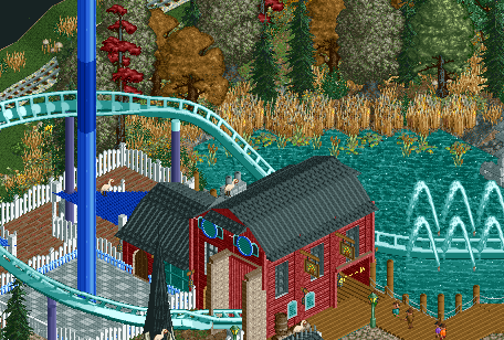
Making a gradual slope would help with this problem.
Here are some details that I liked.
This entrance sign was really cool.
This scene is the best part of the map imo and might also be your best work too.
Cool shark also.
All in all I would definitely give this a design. I'm not sure if it's being voted on or not, but I do think that it will be a borderline vote if it is. 65% from me. Keep up the improvement.
Tough no win Fred, thought this was pretty much on the nose 65%. I quite liked the queue entrance with the mast and the bridge over the drop being a boat, probably my favorite thing you've ever done in a park, love stuff like that. The 2nd drop into the lighthouse was also nicely done, probably some of your best archy, along with the other lighthouse.
Overall the archy could of used a bit more variety and cleanup I think, probably one of the weakest aspects of the park considering all the buildings were almost the same. The boat ride and diagonal boat were pretty sloppy too. Probably could of used a different fence type or two to give the park more depth as well.
Nice work though, keep working off of this and you'll move in the right direction.