First off, congrats on the September VP Runner Up.
Secondly, the logo is okay I guess but I'm not too fond of it. It actually looks extremely similar to your last logo for "Poseidon's Fury", I think it was.
Finally, on to the park. On the whole I liked it a lot. I could definatly tell you put some strong effort into it and I commend you for that. Your architecture was amazing, with excellent use of the 1/4 tiles. The style reminded me of like a "mini JKay" in many ways.
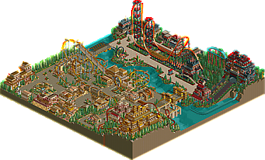
"Arabian Day" was probaly what was the stronger of the two areas in my opinion. I liked the entrance area, that was quite absorbing. The inverted coaster had some good interacting elements (the sea serpend roll over the wide paths below and the inline twist arching over the paths come to mind) but the color of the track was a bit too ugly IMO to go well with its surroundings and the pacing was below average. At the end, the coaster was just about out of speed and power, and just made it through the final corkscrews. If there's one thing that bothers me, it's poor pacing. Anyways, the corkscrew coaster that goes through the temple was unique to say the least, the archy was excellent and I liked some of the ideas you had going. The drop off the terrain into the loops were good, the ending was intense but powerful. My only complaint I had with the coaster was the choice of track...I don't know, but a corkscrew coaster kind of didn't go well there...I know you had a steel twister somewhere else but I think that may have fit in better. Maybe you were going for uniqueness, I donno.
I don't have as much to say about "Arabian Night", but here it goes. The splash boats around the haunted temple thing was very nice. It was a tad bit glitchy (I think?) but nice, again, awesome archy over there. The rocket was decent, but not my favorite. The coaster was okay for a rocket I guess, but I did like the supports on the top hat quite a bit.
I think that's more than you need to hear, but good effort, good park, I enjoyed looking at it.
thank you. i made it with low tech MS paint and my low tech photo editing skills. please, comment on the park and not the logo. coasterforce, thank you for your well thought out post. ECC, screw you
Eh, it looks much bigger/better/more organized in screens. It's really not that good IMO and it's not that you didn't put in the effort, it's more that there is no sense to the way the objects are arranged. It looks like you got a workbench piled high with detailed sceanery and piled it into random manifestations called buildings. The colors worked well in both areas though and the custom supports on the invert and the rocket were very nice on all accounts.
Quit trying to jam in so much into such a small space without an ounce of planning, it just looks sloppy. If this park was about 130X130 and everything had been given due space then it might be very, very like-able. The color and texture combination leads me to believe that you started out with an are that looked kind Voodoo-ish and then changed to something different for the end. The invert was okay but I don't personally like it all that much and the rocket thing was just fine too. The corkscrew coaster was a disaster though, it just seemed very out of place and confused; like you desided you needed another coaster and that you were going to make it fit in that area.
You've got tallent, now work on channeling it into something organized and you could have a NE runner up next time insted of a VP wanna-be.
ride6
EDIT: I wasted my 1111th post on that pile of negitivity!? How pathetic I have become.
Fantastic park SFGadvKing, can see how it beat mine. Colours from the screens look excellant and that launched coaster looks brilliant. Unfortunatly i cannot download it at the moment 'cos my RCT2 is totally mashed...
But anyway, congrats on the win. So glad you are part of RCT-Revolution!
It was a very nice park, but I think there wasn't enough space for all the detail you put into it. I really think the Arabian Day area was the only good part. Arabian Nights didn't suit my personal tastes, but that's my problem not yours. I think it could have been better, but it was still a very nice park to look at.
Dude, you do appreciate that a lot of the VP winners/runner-up parks are actually better than a lot of NE runner-up parks?
Accully I'm perfectly willing to admit that this park and many other VP runner ups have been better than some ne runner ups. In fact if the material contained on this map was more organized and spread out on a 125X125 map insted of the 100X100 it was on I think it could've easily won over here.
Ne and RCT2.com have different "standards" to what "good" parkmaking is. RCT2 is more open to lack of organization as long as the skill is there, here you're more likely to win if your park is organized even if it isn't excessively detailed.
8 Comments
yeshli2nuts Offline
the rct2.com September VP runner-up, Arabian Times in now released! you can click the logo above to download the park. please leave some comments!
screens - http://forums.nedesi...=5&t=8355&st=20
download - http://www.rct2.com/...ion=file&id=139
ps. can a mod please pin this?
CoasterForce Offline
Secondly, the logo is okay I guess but I'm not too fond of it. It actually looks extremely similar to your last logo for "Poseidon's Fury", I think it was.
Finally, on to the park. On the whole I liked it a lot. I could definatly tell you put some strong effort into it and I commend you for that. Your architecture was amazing, with excellent use of the 1/4 tiles. The style reminded me of like a "mini JKay" in many ways.
"Arabian Day" was probaly what was the stronger of the two areas in my opinion. I liked the entrance area, that was quite absorbing. The inverted coaster had some good interacting elements (the sea serpend roll over the wide paths below and the inline twist arching over the paths come to mind) but the color of the track was a bit too ugly IMO to go well with its surroundings and the pacing was below average. At the end, the coaster was just about out of speed and power, and just made it through the final corkscrews. If there's one thing that bothers me, it's poor pacing. Anyways, the corkscrew coaster that goes through the temple was unique to say the least, the archy was excellent and I liked some of the ideas you had going. The drop off the terrain into the loops were good, the ending was intense but powerful. My only complaint I had with the coaster was the choice of track...I don't know, but a corkscrew coaster kind of didn't go well there...I know you had a steel twister somewhere else but I think that may have fit in better. Maybe you were going for uniqueness, I donno.
I don't have as much to say about "Arabian Night", but here it goes. The splash boats around the haunted temple thing was very nice. It was a tad bit glitchy (I think?) but nice, again, awesome archy over there. The rocket was decent, but not my favorite. The coaster was okay for a rocket I guess, but I did like the supports on the top hat quite a bit.
I think that's more than you need to hear, but good effort, good park, I enjoyed looking at it.
Peace.
ECC Offline
yeshli2nuts Offline
Ride6 Offline
Quit trying to jam in so much into such a small space without an ounce of planning, it just looks sloppy. If this park was about 130X130 and everything had been given due space then it might be very, very like-able. The color and texture combination leads me to believe that you started out with an are that looked kind Voodoo-ish and then changed to something different for the end. The invert was okay but I don't personally like it all that much and the rocket thing was just fine too. The corkscrew coaster was a disaster though, it just seemed very out of place and confused; like you desided you needed another coaster and that you were going to make it fit in that area.
You've got tallent, now work on channeling it into something organized and you could have a NE runner up next time insted of a VP wanna-be.
ride6
EDIT: I wasted my 1111th post on that pile of negitivity!? How pathetic I have become.
mantis Offline
X250 Offline
But anyway, congrats on the win. So glad you are part of RCT-Revolution!
-X-
tracidEdge Offline
Ride6 Offline
Ne and RCT2.com have different "standards" to what "good" parkmaking is. RCT2 is more open to lack of organization as long as the skill is there, here you're more likely to win if your park is organized even if it isn't excessively detailed.
ride6