- Views 2,617
- Downloads 548
- Fans 0
- Comments 6
-
 57.00%(required: 50%)
 Bronze

Dr_Dude 65% Camcorder22 60% CoasterCreator9 60% Cocoa 60% Jaguar 60% Faas 55% G Force 55% inthemanual 55% Liampie 55% posix 55% Sulakke 55% WhosLeon 55% 57.00% -
 Description
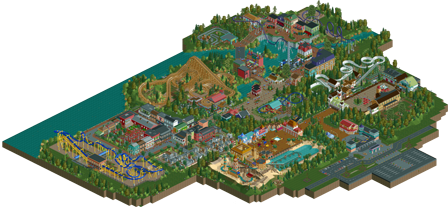
Welcome to Elburwood! My first solo project I began during h2h7 and put on hiatus while I left rct for awhile. When h2h8 was announced I began practicing on this park with the goal of completing it. It is something I really enjoyed building on and I really just wanted to get on a map a mixture of ideas I've had over the years. I hope you all enjoy viewing it!
-
 No fans of this park
-
 Full-Size Map
-
 Download Park
548
-
 Objects
1
-
 Tags
Tags
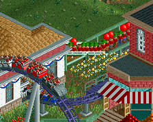
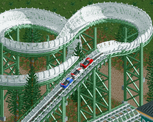
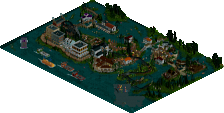
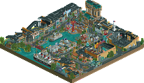
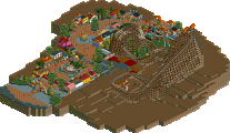
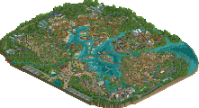
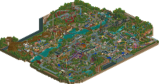
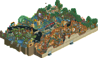
Archy was the strong suit here. I enjoyed viewing this, but the layouts definitely needed work (I think the bobsled was the best, I liked that a lot actually. And was that junior coaster a copy of the one in Baker Lake?? Nice layout on that too though) and the park layout was kinda poop.
Overall it was cute and I think it would be worth a low silver
I thought this park was good fun to look at. There are some interesting concepts here, including the Bioshock stuff in the back, but especially the bazar. I loved the French Quarter and the Standard B&M invert looks spot on. The only coaster that I though looked strange was the GCI, but I will not fault you on this because I'm not sure If I've had enough exposure to judge.
Really the only problem that I've got is that, but again, will not hold it against you, good work!
I really liked this park actually. My favorite area was the Patriot's waterfront area, with the little buildings looking out over the first drop of the coaster. It was nice! That coaster had some pacing issues (especially in the loops). I also really liked the cemetery area and ride, and good to see those Knoebels trains getting some use!
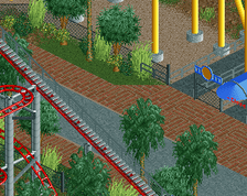
I thought the park layout was fine, maybe just needed some connecting paths between the backs of areas; there are a few dead ends now. The area over by the invert felt a little closed in, I wish you had widened the paths up there a bit, made things feel a bit more open.
All in all, a nice submission!
happy to see this finally released! I think you've improved a lot in h2h, but this park is still a solid first real release. It sort of straddles this weird mix between a classic, small realistic park and wanting to have more ambitious themes, but I get the vibe that you sort of just built whatever you wanted, which is totally fine. I'll say some things I liked then some specific things I reckon you could improve on if you like
-lovely entrance plaza, especially those curvy lanterns
-train ride through cemetary, super weird but I dig it (nice station too)
-some good vibes and views in the arabian/log flume area
-kiddie coaster in the barn is great
-the fink buildings is also fantastic
-nice to see a bobsled
Things to improve:
-some of your areas are sort of boxed in to little squares, especially the arabian and swiss areas. laying them out a bit more organically in a way that complements the themes could help a lot. eg for the swiss area, having sort of some curving planters with colorful flowers and pine trees and maybe a little brook would do wonders, and then have the path sort of fill in around those to get a more curved, natural vibe broken up with the bobsled and then some of the architecture.
-in the Hurricane ride, you made the back of the cafe du monde stones with a waterfall- that would have been an excellent place to have the cafe have a lovely view and interaction with the coaster. Its always a massive plus and one of the most important rct skills to have all the buildings and infrastructure really complement each other in a non-contrived way (eg covering up the back to make 'new' themeing, instead of letting it all work together)
-maybe some scale issues, especially in colombia
-probably a few more flats would really make the park feel more 'full'- it has a lot of tracked rides atm. You can use flats to really fill up space and make the paths and layout more organic, and get some really nice viewpoints out of them too.
awesome stuff though, really enjoyed having you on our team this h2h
@cocoa: thanks sir for the review! Also thank you for the list of things to improve on.. they are definitely things I can work on. And it’s fefinitely been fun building with Team Strangelove!!