Park / [H2H8 R5] Romon U Park
-
 12-June 18
- Views 21,746
- Downloads 806
- Fans 1
- Comments 65
-
![Park_4134_[H2H8 R5] Romon U Park](https://www.nedesigns.com/uploads/parks/4134/logot.png)
-
 77.50%(required: 70%)
 Gold
Gold

Coasterbill 80% CoasterCreator9 80% Dr_Dude 80% inthemanual 80% Kumba 80% Poke 80% bigshootergill 75% chorkiel 75% Cocoa 75% Sulakke 75% Xeccah 75% G Force 70% 77.50% -
1 fan
 Fans of this park
-
 Full-Size Map
-
 Download Park
806
-
 Tags
Tags
![Park_4134 [H2H8 R5] Romon U Park](https://www.nedesigns.com/uploads/parks/4134/aerialm3926.png)


Ill edit the original post
I’ve been really quiet on the site and on Discord the last few weeks, amongst other life stuff going to shit my laptop died a week before the round5 deadline
So here are some notes on the park to add to what Avanine already said.
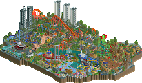
Along with the park shape/structure, the reflections concept was entirely Avanines idea and it was one he brought up early in the contest. I knew instantly it would be amazing to try and these are some tests I did in the first week or so I think:
Because of having to work around what can and cannot be reflected (banked turns on coasters for example), and making sure the spiral park structure was clearly defined, it meant planning had to be very anal from the start. Here’s a couple of screens:
Cocoa - you’re right in your critique of the park having too many grandiose structures. We wanted to have more low-key structures (as around the log flume) in order to blend everything together but basically ran out of time.
Anyway, great work by Rene, Avanine + Bio in stepping up to finish this to a really high standard in the final week!
Wonderful.
I loved Romon U park. I'm shocked that there aren't more Lotte World style parks. It's such a fun concept and you pulled it off brilliantly.
I liked Mandala a lot also. It seemed lighter on content but it's nice to see an H2H park with some breathing room that's not just a total mess of content crammed into every single corner of the park. In the end I probably prefer Romon U park but that may just be because I absolutely love the concept.
Mandala
It’s rare that one great idea can carry a park as far as this one does. But these reflections are something special. It actually took me a while to find other ‘little things’ because I spent so much time enjoying the reflections and the technical skill that was required to put these together. It’s pretty impressive that you were able to find the right angles that worked in a flipped version. From a coaster standpoint I expect that’s probably harder than it seems since there aren’t things like outward banked corners to work with. With that being the case, it’s kind of surprising that the landscape flows as well as it does and doesn’t feel forced.
The overall park aesthetic is the thing that’s done best with this park and why I’m talking about that before any of the rides or architecture. The green of the mazes juxtaposes very well with the majority brown supporting structures and the warm colored buildings. The lack of trees isn’t even readily apparent and even still I’m not certain they are necessary. The different levels works really well too with the majority of main path being 4-5 tiles above the mazes. It helps provide some depth to everything and gives the water more to reflect.
It’s a pretty nice selection ride-wise. I actually really like the flying coaster. It’s a pretty unique layout to be sure, but have some excellent elements and a good flow even if it is atypical. I’m not a fan of the pretzel at the end, but the rest works very well. It is missing a fair number of supports towards the end, though. The spinner feels a bit like filler more than anything, but it’s a nice color and the semi-enclosed lift is pretty neat. The log flume has a nice classic feel to it with the reasonably long sections of straight track and then there’s the interesting spiral lift mixed in the middle of it. Normally I wouldn’t be a fan of that sort of thing, but the way it circles the building looks great. Lastly, I really like the dark ride building with all the balconies and porches. It’s great to see the vehicles crisscrossing on both levels.
Architecturally the park is very strong as well with a lot of the more odd deco and detailing pieces fitting right in with the theme. Structures like the restaurant, the central temple, and the dark ride really stand out among the rest and create a nice setting for all the other details to get layered in.
Here are some of the details I liked:
I could have picked any of the reflections, but we’ll start here. It’s cool to see the underside of ceilings and things you don’t normally get to look at.
I love these arches over the maze.
The rope bridge is pretty cool.
This statue is impressive.
The step well is pretty cool.
I’m not necessarily sure what all is going on here, but I like the general look of the lift.
This diagonal bridge with the curved element is near, along with its reflection.
The dark ride building is one of my favorites.
I love how the log fume interacts with this building and how the queue wraps around the building and then down to join the track.
This is a fantastic element.
These star structures are pretty cool.
Not sure what exactly this is… meditation class? But it’s a nice touch.
It took me a little bit of time to get into this park, but once I did I really enjoyed the subtleties of the design and appreciated the difficulty these reflections must have been to pull off. I like that it’s not just a beautiful park—there’s content with it too. This one was a lot of fun to explore. Great work.
Romon U-Park
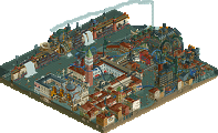
My enjoyment of obscure Asian parks finally paid off in that I was very familiar with the source material when the was released. It’s not a place I would have expected for a recreation, but I’m certainly not complaining—it’s done very well! The real park is not exactly pretty and I wouldn’t expect this to be either. But as I’ve said before, there’s a certain beauty in the representation of this level of detail and the execution in RCT.
The coasters are very strong and nice representations of the real thing. It’s too bad you couldn’t squeeze the inline twist onto Euro Express, but I am impressed the tiny little two car train manages to make it around the layout. The theming looks great, however, with the Tower Bridge sort of architecture and the various other European sort of architecture. The Maurer is my favorite of the two coasters, but I’ve always liked this one in real life too. Like Euro, it’s a shame that top hat couldn’t be inverted, but there’s no pieces to do that on this scale. The hack is the real star here. I generally understand how these things work and I’m still having trouble wrapping my head around this. One of the coolest things I’ve seen all contest.
I like all the other custom rides you managed to squeeze in as well. The flume has some nice interior scenes with the drowning sailors, and the diagonal swinging ship looks great. I’m impressed at how you managed to squeeze a rapids ride into about 2 tiles across out there. It still looks very good, although a little monochromatic with those rocks. Nice to see all the peepable round rides too, which gives the park some life. Would love to see that rockin’ tug running too. I had thought Romon had a dark ride, but it looks like just a walk through. Would be cool to see that made too, but you may have run out of room.
Architecturally the park looks pretty close from what I’ve seen. Some nice recreations of the existing stuff. Chinese theme park architecture is all over the place from the weird themes to the crazy flooring patterns to the wild colors. You’ve been faithful to this look even if it does mean and ugly and product. I get the complaints about the façade, but I also can’t fault you for it. I think it’s fine.
There’s some great details in the park. Here are a few:
Great use of the pyramid scenic and the monorail to make a good stage. What you have is pretty accurate for a Chinese theme park show: too many actors and general confusion.
Diagonal ship is great.
I love the interaction on the real thing and it is faithfully recreated here.
Cool little scenic cutaway.
I do like this entrance theming despite the rest being plain.
The 7-11 is a fun detail.
What a cool coaster. And such an amazing hack. I like the support work as well.
This castle is pretty neat. Very detailed for being so small.
The little wheeled pirate ship thing feels very Chinese.
The colored patterning on the floor turned out great.
I see you Crabs logo.
Everyone knows I like realistic parks, so it’s not a surprise I enjoyed this. Recreations are really difficult in my opinion because you’re bound by so many more things in recreating the original. But it turned out really well and helped teach some people about a park not many know about.
Rediscovering Rediscovering H2H8
I started this a year ago, time to finish it.
Rediscovering H2H8
It's been a while now. Time to re-view the H2H8 parks with a fresh eyes and not clouded with emotion. I'm going to view every H2H8 park and post one focused screenshot that stood out to me or that I think deserves more love.
I love these steps:
Cool diagonal swinging ship:
edit: Ha, screens nearly identical to CP6's.