Park / [H2H8 R5] Romon U Park
-
 12-June 18
- Views 23,868
- Downloads 926
- Fans 1
- Comments 65
-
![Park_4134_[H2H8 R5] Romon U Park](https://www.nedesigns.com/uploads/parks/4134/logot.png)
-
 77.50%(required: 70%)
 Gold
Gold

Coasterbill 80% CoasterCreator9 80% Dr_Dude 80% inthemanual 80% Kumba 80% Poke 80% bigshootergill 75% chorkiel 75% Cocoa 75% Sulakke 75% Xeccah 75% G Force 70% 77.50% -
1 fan
 Fans of this park
-
 Full-Size Map
-
 Download Park
926
-
 Tags
Tags
![Park_4134 [H2H8 R5] Romon U Park](https://www.nedesigns.com/uploads/parks/4134/aerialm3926.png)


WE GOT TO TWO PAGES!
Yay for two pages! We can always review each other's parks at this point to get some more activity going.
Romon U
I really liked the colourful floor indoors and how the small rides were embedded in the rockwork. Oh and that Spacecrabs sign was lovely
Mandala
Ohhh wow was I blown away when I saw what was going on here. Brilliant. A very calming and atmospheric park with great, warm colours.
Great park
Mandala:
Great park
(I will post a real review later
I voted for Mandala, but I feel like the other park is really unlucky not to get my vote. I think it was probably one or two levels above, skill-wise, but ultimately the reflections idea meant that I had to vote for Mandala.
The other park is one of those intentionally ugly parks based on a real life park, I guess... I can understand what you're going for, but I just can't really buy into this style i'm afraid. Nothing against the builders at all, just not for me.
Space crabs, I get the context, I just dont think it translated well into rct.
Time for my belated reviews
Romon-U
When this matchup first got posted I had no idea about this park, which was quickly rectified with an rcdb binge. Then I decided I needed to keep binging on chinese parks, so thanks to you guys for indirectly leading me to roomie's great fb page vhcoasters which has all this sort of info. I was really excited to open this park, and I think perhaps I was let down just a little, mostly in a bit of inconsistency of execution. Some buildings/landscaping were a little undercooked and less-detailed, or maybe even rushed. If I have anything constructive to say, it would probably be to have made the main building a decent bit smaller to bring out more atmosphere since it feels a bit empty atm, and to give more room for the surrounding water/context of the outside bit. Small criticisms aside, the park was still lovely. Neat coasters, and its always exciting to see a solid recreation, especially for such a strange park. A lot of the archy outside felt a lot more atmospheric and vibrant, and there were tons of little spots throughout to really get into. Congratulations on finishing off an amazing round robin, really all of your parks have been fantastic and I am so nervous to be facing you guys in the semis... maybe we should have thrown our match too
Mandala
ok firstly, you obviously know that the reflections are incredible. kudos on one of the most original ideas I've seen in rct for a long time. Into the park, which is almost fantastic. I'll start with my small cons, and then finish up with the compliments. I think that the builder I'm sure worked on this has a bit of a habit of having big, colorful and symmetric buildings surrounded by a lot of quite square/blocky path. If you surrounded each one in a 20x20 grid and called it a micro, I'd think its incredible. Each building feels like an awesome focal point. But, when you put it all together, you get a park where every building is competing for being the maps focal point- nowhere is happy to just set atmosphere and vibes, its all "look at me!" And then you get the rest of the park connected with big chunks of straight path- really some diagonals and curves would go so so far. I'm finding it hard to put into words why the composition of this park feels weird to me. Maybe its the essential lack of any trees or tall/lush foliage? maybe its because the coasters sprawl so much instead of interacting more meaningfully with a section of the park? I get the impression that others may agree with the macro issues too because other than that, there is just so much to love here and I think it would be one of the best parks of the contest if those things were as good as the small things in this park. At some point I'd love to make a beautiful small screens compilation of this park- there are so so many little areas that I absolutely love. Small bridges over seating areas, dark brick walls beside the log flume, little curves and details. Ramanujan's math palace, the ganesha statue- theres so many small bits of atmosphere and detail that I love here, and than won my vote. I'll definitely remember this park and probably steal things from it at some point. fantastic work, and congrats on a great season. don't let the sour ending spoil it, you guys have been ridiculous and should be proud.
Ultrarealists:
 .
.
Great park, the reflections look awesome. Amazing how quickly you get used to them. Flying coaster was also fantastic. Highlight for me was the spiral lift on the log flume, that looked fun.
This is a clear winner for me, a shame I can't vote
Get them in while you can.
Voting Closed

Ultrarealists beat Team Spacecrab
Team Spacecrab vote count: 18 (40.00%)
Ultrarealists vote count: 27 (60.00%)
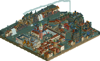
Romon U Park was made by Faas (40%), Saxman1089 (40%), ][ntamin22 (15%), and Camcorder22 (5%).
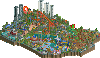
Mandala was made by alex (40%), rene (30%), AvanineCommuter (20%), and zxbiohazardzx (10%).
you're telling me fk didn't build on this?
wtf
Since Alex won't really be back and able to properly post about this for a few days, I figured I'd mention some things about the building process and the last few days' events.
Congrats Ultrarealists!
We basically built this park in two weeks. I did everything on the outdoor island, most of it in a week. We knew we needed to hand in a finished park to go through to the playoffs (we didn't realise then that one douchebag would take if upon himself to decide it).
The fake ugly LOTR rocks are intentional, after all the real park also uses a shitload of fake plastic rocks.
I would like some more reviews on the parks here, instead of on discord.
A brief history post as far as I can remember, ][ntamin can chime in and correct anything I get wrong.
We essentially started out wanting to do some kind of indoor/outdoor park, inspired by Lotte World and Romon U. A couple of themes were tossed around, and we eventually landing on doing a semi-rec of Romon U.
We were a little behind on this park from the beginning, but it started to really get scary about two weeks before the deadline, when the park looked like this:
Faas had made really good progress on the outside, but almost nothing was done on the inside. ][ntamin was supposed to do most of the building on the inside, along with help from myself and Disneylandian. Unfortunately, real life stuff got in the way of both of them working on the park as much as they would've liked in the next week, leading to a more scary picture of 1 week before the deadline:
Shortly before that picture, I started working on the inside, trying to get as much done on the side opposite from Euro Express, while ][ntamin worked on the side with Euro Express. I started getting some good work done, Faas was finishing the outside and then planned to come work on the inside. At this point, we brought Cam in as well, to do odds and ends, and Disney's work (a building or two) was deleted, because irl stuff kept him from working on the park at all. It was still a mountain to climb to finish this park in basically 1 week, but we knew that if we finished it to a decent quality, we'd make the playoffs by just drawing a few votes away from the UR park, which we expected to be really good. I eventually built most of the inside, with ][ntamin unfortunately getting sick and being sick for the 2-3 days before the deadline.
Here's a gif of the overall progress from the earliest saves I have to the final save:
And the dot map. Not reflected: ][ntamin did both the layouts (I think), and Cam primarily did the building facade between the indoor and outdoor sections, the bridge, and the street there. The hack on Dragon Legend was ][ntamin and I's brainchild. I attempted to do it myself, but I had some difficulty with it and eventually Spacek stepped in to help us out. As someone pointed out earlier, there is indeed a clone of the entire layout above the original layout with an invisible zero car, which controls the stopping and movement of the train along the launch track.
I'm glad that this park was received pretty well. I would classify it as a semi-rec, because various rides are missing from the indoor area, and a few things are invented (such as the interior of Poseidon Adventure) or modified from the original (the Euro Express queue). Faas came up with the idea to make staff members with NE members broken into a Chinese-like spelling (his contribution was Li Yam Pi), and then I horribly executed it (some of them are terrible, like really really really terrible). The randomly capitalized ride names was an idea stolen from Romon's website, as it seems sometimes things were capitalized and sometimes not, so we just went for it and made it over the top ridiculous. The ride names themselves are just as ridiculous. Although we didn't have a visible place for the bumper cars, we had to include them just because they were called "Romatic Bang Bang." As rushed as we were, I had a good time working on this park.
Informational post now available!
sorry
I contributed a small part to this park: the hack on Dragon Legend. Originally, Saxman was assigned to work on the shoestring. I came up with my own system which used brakes and a complex layering of three or four rides to get the ride to pass over the boosters both coming and going, but use the boosters when the ride launches. The brakes made the train slow down in a somewhat jerky fashion, and ][ wanted the ride to reverse without using the spike.
Saxman was called to work on the scenery, so I took over the shoestring. As Saxman mentioned, the final ride uses invisible zero cars on the invisible clone that was built above the original. The ride uses a vertical spike to slow down the cars, which is similar to the shoestring in Metropolis, and is why the riders scream when the train reverses. Originally I wanted a sort of X-shape where the invisible car would go up one side, use a track at the top to reverse, then go down the other side of the X to help the boosters. I ended up not doing this because I was not confident the invisible car would end up in the same place every time. The vertical spike was not quite powerful enough to slow the car, so some brakes were added on the invisible track to help slow the train down before it reached the spike.
The final arrangement of the launch track I am pretty proud of. I have illustrated the concept in the drawing below. Follow the red dashed line from right to left to understand the path the train takes.