Park / [H2H8 R5] Romon U Park
-
 12-June 18
- Views 21,746
- Downloads 812
- Fans 1
- Comments 65
-
![Park_4134_[H2H8 R5] Romon U Park](https://www.nedesigns.com/uploads/parks/4134/logot.png)
-
 77.50%(required: 70%)
 Gold
Gold

Coasterbill 80% CoasterCreator9 80% Dr_Dude 80% inthemanual 80% Kumba 80% Poke 80% bigshootergill 75% chorkiel 75% Cocoa 75% Sulakke 75% Xeccah 75% G Force 70% 77.50% -
1 fan
 Fans of this park
-
 Full-Size Map
-
 Download Park
812
-
 Tags
Tags
![Park_4134 [H2H8 R5] Romon U Park](https://www.nedesigns.com/uploads/parks/4134/aerialm3926.png)


Round 5 | Match 2
--- POLL CLOSED ---
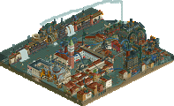
Romon U Park (RCT2)
VS
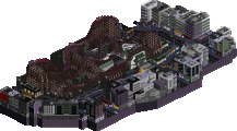
Mandala (RCT2)
Voting Rules
First impressions:
Romon U
- I'm gonna have to dig into this deeper, but I like it so far. Clear inspiration is cool.
- Felt like the outside was weaker than the inside.
Mandala
- Wow, what a unique trick.
The reflections are both mindblowing in concept and in execution... just WOW.
This is outstanding. Mandala may be one of my favorites of the season.
The hack on Dragon Legend is genius. The station fly through is clever and a nice little hack but the reversing back to the station took me a while to figure out how you did it but I'm assuming you are using an invisible zero car on the hidden clone of the ride?
If so thats very clever.
I enjoyed both these parks a lot. Romon is a near perfect interpretation of the real park but suffers slightly from the fact some of the original park is quite bland. For example the outside walls of the building are spot on accuracy wise but the building in real life is ugly.
Mandala is also really solid and i love the huge mazes. The reflections are also very very clever and well done. I'm not a huge fan of the coasers but they are better than many this season and the colours used aren't really my cup of tea. However the archiecture in places is really well done and its a lovely piece of world building...
Another tough one for me.
Didn't have time for a proper look yet, but after a quick peek. Wow, these parks are insane. The reflection stuff in UR is just unreal, really impressive work! I can't imagine the effort that must have gone into that. The spacecrabs park is almost a polar opposite and is very cute, which I also kinda like. Will write a bigger review once I had time to really look at the parks in depth.
Both very strong parks. Leaning towards Spacecrabs because I find the reflections visually annoying and I find Romon U way more fun and charming but I don't know, they're both so immersive in different ways. It's a tough vote!
Initial reaction is that I really enjoy Romon U. I think its very colorful and a very cute park. Based on images I've seen on rcdb, it looks like a great recreation/semi recreation. Comes across to me as a bit more playful compared to Lotte World and CnC. Thats possibly due to the colored path perhaps.. just so much of it. Just wish you guys got a little bit more creative with the exterior. Not a big issue for me though.
The reflections in Mandala was a definite wow factor. Not too many parks this season made me think that immediately upon opening the park. The flyer is a really cool layout and I enjoyed watching it flow over and under all the structures. The mazes were also very pleasing to look at. The architecture was really cool throughout. Favorite bits were the little 1x1 towers that would have multicolored crown molding awnings.. nice way to add more colors.
Very well done guys! Awesome matchup.
Bumping this to note that the poll is open.
I think there's two really cool parks here. Not at all what I expected from the Crabs, especially seeing their previous work this year, but it's a welcome surprise.
Really hard vote, but I went with Romon-U park.
Romon-U;
+Very nice architecture, love the variation, nothing gets boring, colorful and detailed.
+Little custom ship on wheels
+Colorful paths
+Dragon Legend, nice layout and very cool execution with the drive through braking system that uses the LSMs to slow it down and reuses the energy
+Theming on Euro Express
+Theming in general, really gets the cheesy Chinese real-life park atmosphere across, from what I've gathered
+/-Flat rides. All done well, although most have been done before and are literal copies, for example Fisch' Riverland ferris wheel. Getting a bit tired of seeing it tbh..
-Park/indoor building border, would've been a lot nicer if the giant boring walls weren't on the edge and there would've been a bit of space there
-Overuse of those ugly LOTR rocks. I don't get why so many parks just spam these ugly rocks throughout the park. It doesn't look rct-ish and what's wrong with the regular landblocks?
-Indoor building's wall. I get it's like that in real life, but it could've been done a bit more aesthetically pleasing imo, with some windows (real life building seems to have some windows) and more deco stuff here and there to polish it a bit more.
Mandala;
+Reflections. Really clever and innovative reflections. Made for a nice wow moment when opening the park. Must've been a pain to construct that.
+Custom music, sets a nice atmosphere
+Brahman's interactions. I like how it's diving under paths, through buildings.
+Nice statue in the corner
+/-Brahman's lay-out is ok-ish, nothing really mindblowing, but does its job.
-Big maze. I felt it was a bit distracting and didn't really serve a purpose. If it did, maybe you could've used the readme to explain it a bit more..
-Color Scheme; Somehow it doesn't work, all those browns blend too much I think, and it all gets a bit monotone
-Other than the initial wow-moment of the reflections, I felt there wasn't much content to keep me hooked. I was bored pretty quick.
-It felt like you ran into time issues, with most parts having supports on the coaster and some don't. Bit sloppy and inconsistent. Missing staff names also made me feel it was rushed in the end. If it was not it was a missed opportunity to tell the story a bit more..
Attached Thumbnails
Great concept, great execution, great ideas, great theme. The reflection is a little distracting, but it fits with the theme very nicely. The fractal map shape is great, and the hedge mazes are really nice. I love the elevated walkways, and the overall architecture is very impressive.
Spicecrabs, I really enjoyed the vibrancy of your park. The execution of it was great, and I don't really have anything bad to say about it - large walls included. Just not my favorite of the two parks.
Nice work both teams!
Romon U
This park reminds me a bit of Circus Circus & Adventuredome. I love semi-indoor parks like this and it fits well within the available map space. Some stuff I liked and disliked:
+ Indoor Toytrain was cute
+ The diagonal swinging ship and theming was outstanding
+ Architecture and flat rides on the indoor part were great.
+ Euro Express queue and theming/architecture was insane.
+ Dragon Legend rollback after the station was really cool.
+ Legend drop station was really nicely made.
- Rockwork near the river rapids was not very repetitive and overall just not really my taste, looks a bit rushed, maybe you guys ran out of time?
- Why are all the ride names in all caps? It annoys me.
- The two coasters were extremely similar to each other besides that one had a lift hill and the other had a launch, I think two different types of coasters would have been nicer.
- Poseidon adventure rockwork could have been better, also the ride was kind of hidden and didn't really catch my eye, at first I did not even notice there was a ride there, the cutaway scene in the wall was cool though.
Mandala
+ Holy crap the reflections! Insane work. Only thing that would have made it even cooler was if the coaster trains were also reflected in the reflection. But that's a very minor nitpick.
+ Architecture was downright stunning, and the reflections made that stand out even more.
+ I really liked the maze, thats a ride that isn't used that often.
+ The golden statue was crazy.
- Only downside to this park is that everything is very brown/gold/red. There could have been more colour in the park imo.
I think both parks are really great, but for me the win goes to UR, the reflections are just downright insane and it really accentuates the architecture which is also just insane. I just think it beats out the spacecrab park.
Romon U-park
More than anyone, you nailed that cheap, plastic atmosphere Asian theme parks are known for. Wacky ride names and the combination of entertainers on the stage (Aragorn, Lancelot and Jack Sparrow) and things like that pushed it over the top, which is kinda fitting, but also a bit over the top. I did enjoy it though.
The park is full of content. Lots of rides, lots of individually designed buildings, and a decent amount of little details. Also a lot of rocks. And shit, they're hideous! They may be fitting/accurate or whatever, but they're painful to look at. Glitchy in places too. Park in general is quite glitchy, but not enough to really hurt the experience. Things I really liked: yellow building with blue roof, the spacecrab mural, the psuedo-Disney castle, the pirate boat on wheels, and the toy train.
All in all, recreating this park was a bold choice that did not pay off completely, but it's definitely a good effort. Win or lose, a good park to cap off a pretty good Round Robin with, Crabs!
Mandala
Well, this is interesting stuff! Seems you like you had two excellent ideas and combined them: the Mandala-like park layout with Indian architecture, and the reflections.I really like both of these aspects, but obviously the reflections take the cake. Brilliant idea, perfectly executed. I don't think it was distracting, in fact it was very interesting. I loved relating the reflections to the buildings above, and it was great in general to literally see RCT content from another perspective. For the first time, I'm finding out what the underside of an RCT bridge looks like, or what the peeps would see if they looked up. A shame the coaster train didn't have a reflection. I'm sure you could've synced that, Winkelheim did a similar thing.
The rest of the park is very nice I think. A mix of Carreira da India and Archelaus, with a hint of Garden of Light. Brahman is a tad too long but I liked the whole layout. Architecture had enough variation to make me want to explore every building, although the quality varied from lovely to just okay. The mazes were a super cool background feature. Sadly not a lot of 'llittle things' to make the park come alive though. Most of the fun really was looking at buildings in the reflections. Missed opportunity.
In the end, even though Romon U-Park kept my attention for longer, I enjoyed Mandala most. It won't end up in my list of best H2H8 parks, but it's definitely one of the most memorable parks so far. Brilliant work, UR.
Both parks were quite enjoyable, and it really came down to splitting hairs for my decision.
Romon U Park
It's no secret (at least, it shouldn't be) that I'm quite the fan of this style of Asian park. It's a unique and diverse region when it comes to parks that really hasn't been explored to a significant extent in RCT, and I'm very glad to see representation in H2H8 with both Tubiao and now Romon U Park. First things first; it's a spectacular recreation. It's extremely recognizable and the builders obviously did their research. Everything from the unique braking system on the launch coaster to the mini-Europe inside the building - really amazingly done. Architecture on the interior of the large building was really fantastic. A highlight for me was the multi-level nature of the park, as well as that pyramid show area - that was really cool. I thought it was a little funny to see my light colored path objects in there - I designed them to be used in an indoor park, and here they are in an indoor park. Also, pedestrians stopping for traffic - wow, not sure how you did that, but I love it.
Things I wasn't so impressed by; the rockwork, particularly around the rapids and the splash coaster. Although technically accurate, I didn't think it looked very good in these two areas. I thought it was great around the swinging ship and such, but it came off a little messy and crammed into the corners with respect to these other rides. While this may only seem like one issue, it's pretty prevalent through the park. There are also a few other spots around the park that felt a little messy due to space constraints, but that's not all worth listing out.
Mandala
Elephant in the room - those reflections. They have some pretty major wow factor at first glance. Really cool to find when you first open the park. After a few viewings, a little distracting and gimmicky - but it's super worth noting, amazing idea. The park really oozes atmosphere, the music choice helps set a serene and beautiful atmosphere. I loved the flying coaster, really suits the park swooping over the water and the (equally great) "fractal" mazes. I think I can tell what you guys were going for, and the mazes help sell it a little better. The spinner was less effective. Architecture was also well done. There are a few buildings that stood out in an odd way, but in general that's a nitpick and not that important.
Something does confuse me though. In a park where nearly everything is chosen in such an artful and thoughtful manner...why is there a default colored launch tower named Wooosh!!...? That struck me as a particularly odd decision. Kinda detracted a little bit from the aforementioned atmosphere. I dunno, maybe I'm thinking about it too hard, but it really stuck out.
My vote goes to the Spacecrabs - I can see this going either way, but Romon just barely edged this one out as my favorite park of the two.
Those reflections are probably the best completely new RCT idea in the last five years, can't remember the last time I was so impressed. They were so well done that I honestly didn't notice them at all at first. This is going to be copied over and over.
Romon U:
It was colorful and vibrant and lively and atmospheric. I liked it better than Tubiao if that's a somewhat fair comparison. Nonetheless I did not know it was a recreation and did not understand why you'd build such an 'ugly' park. I'm not a fan of the on purpose ugliness thing.
Mandala:
I like everything about it. The colors, the atmosphere, the rides, the aesthetics. And I loved the park as a whole. It's a flawless execution and combination of two ideas. The mandala theme in itself was already really good but the reflections made it outstanding. The blue also worked as a bit of a contrasting color to the otherwise brown/red-heavy colors in the park.
I somewhat agree with chorkiel about Romon U. I don't think the whole park looked bad in rct, but a lot of it did (mainly the infrastructure of the indoor section, but not the scenery inside it or anything). Its a very unique and interesting park and an extremely well done recreation though, so I did rather like it and I thought all the facades and scenery etc was splendid. Loved the coasters too. I think my favourite bit might be with the diagonal pirate ship, I'm not sure I could really put why that's the case into words though.
I definitely prefer Mandala, and it isn't just the reflections thing. Its a cool gimmick, but I've seen it before. What makes it good is that the park is just fucking beautiful and I loved to look at it. The gimmick didn't make the park, the builders did, and they did an excellent job. I really did feel like I was looking at a serene painting or picture, or in this case, an actual mandala. Maybe I should have nuked everything with the remove scenery tool after viewing it, for the full effect.
Bravo to both teams. UR gets my vote, but both were excellent and this was an incredible matchup.
Another 'archy that i prefer vs sick concept' match up ultimately end up chosing for Romon U