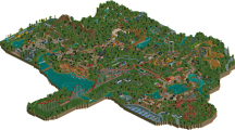
Park / [H2H8 R5] Disney's Frontierland
-
 10-June 18
- Views 16,245
- Downloads 883
- Fans 1
- Comments 55
-
![Park_4129_[H2H8 R5] Disney's Frontierland](https://www.nedesigns.com/uploads/parks/4129/logot.png)
-
 74.00%(required: 70%)
 Gold
Gold

geewhzz 85% inthemanual 80% Liampie 80% Poke 80% Jaguar 75% Sulakke 75% bigshootergill 70% Camcorder22 70% chorkiel 70% Cocoa 70% Dr_Dude 70% Xeccah 65% 74.00% -
 Description
-strangelove
-
1 fan
 Fans of this park
-
 Full-Size Map
-
 Download Park
883
-
 Objects
1
-
 Tags
Tags
![Park_4129 [H2H8 R5] Disney's Frontierland](https://www.nedesigns.com/uploads/parks/4129/aerialm3870.png)
![park_3796 [NEDC4 4/15] - Wildfire](https://www.nedesigns.com/uploads/parks/3796/aerialt3454.png)
Metropolis -
- First off, the coaster - Soulmates - is brilliant. Beautifully hacked, so interesting to watch, and to know that it eventually crashes is darkly humorous. The moment of the crash when the incessant jungle music suddenly stops was QUITE the moment... Highlight of the park, as it was meant to be, I'm sure.
- Architecture really embodied an older style of building that we haven't seen in a while, but there were some really interesting forms in there I haven't seen before. The hexagonal faceted facade was neat, as was the Netflix and Chill theater. However, the overall composition of where the buildings were placed was confusing, and the park's layout is quite the mess. No clarity in direction or idea of what is going where and why it is there.
- Foliage overall is pretty awful. Not much thought put in here.
- Blue balloons? Green balloons? Strange that they are just out in the open, and if there was a joke here, I didn't get it.
- Swipe right / Swipe left = awesome idea, nicely done!
- The pedestrian bridge was nicely done.
- I don't understand Static and what the idea was behind this.
- Staff naming convention was a cute touch.
Overall, a crazy idea that has some potential... but this time the content wasn't enough to back it up. Whereas Billy Wonka's had dozens upon dozens of great clever moments and tricks, this park had only but a handful. There needed to be more content in general - I wish there was less focus on the "metropolis" idea and more focus on the modern dating idea. Some of the rides like Liberation didn't really further the concept of these two urban lovers, and there weren't enough rides or ideas that did, besides Soulmates. In the end, there wasn't enough to support the concept and the park fell a little flat to me - most likely due to the park being less than 100 years of work... EDIT: feels like a colorflood situation to me. Not sure if that's right or that's just me thinking too much.
65%
Frontierland -
- Entrance is sooooo brown and squat. Colors are your friend, not your enemy...
- Foliage is beautifully done throughout, though it looks like Steve took it a little too far here.......
- I enjoyed the custom palette giving you poop-brown rocks, it works really well with the woodsy frontier look
- Docks are empty... missed opportunity for details / a ride?
- Frontier architecture is simple and effective.
- A spanish mission, in the middle of all this western architecture... the way it's squeezed into the corner is a little out of place. The building itself is beautiful though.
- The boat is nice, has a unique shape.
- Expedition Denali was wonderful except for the beginning. Having the block brakes stop the car for 30 seconds underground hidden from view is just not very nice. But the layout is flowing and smooth, and the colors were nice. I did not like the station though, it was way too small, too brown, too dark, and looked way out of scale to the ride. The whole area also lacks contrast which makes it hard to read.
- Steamboat was a bit blocky.
- Splash mountain is also a little out of place... the rockwork was messy and the whole area stood out like a sore thumb. The placement and scale also seems a little strange in relation to Expedition Denali.
Overall the park is nicely done with some questionable ride choices / placements, and didn't offer much to keep me invested in exploring. It reminds me a lot of New Fantasyland in that it takes Disney ideas and tries to make a new thing out of it, but is unconvincing in the end due to the lack of refinement and some questionable choices. This is definitely not a bad park by any means, but I think it was a little middle of the road in terms of ideas and execution from a macro perspective - in placement and selection of rides, in colors / forms of major buildings like entrances and stations. Still a great effort from the parkmakers, and it gets my vote in the matchup.
70%
Vote for Strangelove
OK i've not been great at reviewing parks, so i'm gonna do them as I first look at them, see if that helps.
Heaven's Kitchen - First impressions, very clean, very nice. Oh, this coaster's going to go backwards, that's cool. Oooooooh, it's split. That's very cool. I've never built one of these, due to being shit at hacking and stuff, but I know it's difficult. I really like how you have to really follow both trains all the way around the park. It's very clever how you use the downward momentum to pull the other half up the other way and visa versa, very nicely done.
Jen's left swipe on gee is harsh, but it is kinda funny.
Honestly the architecture isn't really doing that much for me.. very repetitive. Not really my style, i'll admit. There's enough to stop it getting really boring, but there's not enough identity between each building I think.
Just found Jen's right swipe. So I get it, it's more of a story coaster. And they end up being soul mates. I like that, it's a really intangible concept to try and make into a theme, but it's kinda nice. I really LOVE the last element where the two halves of the coaster "kiss". That's really clever.
Overall it's maybe slightly too conceptual for me, very clever, but more of a design than an H2H park. Other than the overall concept of soulmates, there's not very much actual content there. Think you could have had a ton more "dating" or "love" references in there and it wouldn't have ruined the overall concept. Nice work, though, the coaster is a winner.
Disney's Frontier lands - Been a while since i've seen a really good Disney park (the Port Disney one wasn't really TOO Disney), so i'm looking forward to this. Really nice entrance, although it is VERY brown. Not sure how you'd rectify that, though. Fits the theme I guess. The architecture either way up from the entrance is really good, quaint but so believable. There's a little more colour here too, which I like a lot. The water works so well too, really frames the huge mountain nicely, I can imagine looking up at it.
I've gone right, just because, to a kinda wharf area. I'll come back to the Spanish mission building, but goddamn that looks good. The wharf is really nice, not a ton of content here, but everything is given space to breathe, it's layed out very nicely. The steam boat is nice, but it's a weird shape and i'd have preferred a traditional paddle steamer I think. Hard to make it small enough, though. OK, back to the Spanish building. Jesus, that's a really awesome building. The tower is magnificent. Really nice queue, the ride is small but nicely done. Weird teleportation thing, guess you ran out of room.
OK, over to the big mountain mine train. Landscaping is really nice, possibly too busy though... Very hard to see what's going on with all the brown, and the brown track. Honestly I find myself enjoying the area, but not that interested in watching the coaster all the way through. Very interesting thing you've done with the black walls where stuff goes underground, I actually really like that effect. I can see that being stolen an awful lot. The station is very nice, maybe slightly too brown again, but I can't really get mad at that. Again, lovely architecture, and OH! There's a traditional paddle steamer. Very nice, I take it all back.
Now over to the pink rock place, three/four little themes all nicely on one map, this is what I meant content wise. The landscaping isn't my personal cup of tea, but it does look interesting. Very cool air vents with the cogs, I can see that being stolen as well. I notice that the final drop of the log flume goes underground, that might be cool but you lose the crowd interaction... I really like having a place guests can interact and get splashed, but I guess you don't have to have that. No denying it'd be cool to ride. Again, the architecture is excellent, so believable, very Disney. Everything fits perfectly.
Overall, such a high quality Disney park. I would have loved to have seen the mine train push the boundaries a little more, that would have made this into one of the best H2H parks ever. Even so, it's definitely up there for the best park this season, skill wise. I'm sure i'll come back and look at this one more.
Two great parks, both very different. Looks like voting isn't open yet, but i'm pretty sure I know who i'll be voting for.
Uh.
Am I seeing things?
Def a lot of thinking behind my vote here.
Metro was super creative and interesting and had a lot of smile moments, but the quality left a lot to be desired despite being nostalgicly lovely.
Frontier was a decent twist and in a style which I prefer, but didn't feel nearly as groundbreaking in the sense that it sort of feels like everything here has been seen before.
Missed the poll, now i've voted. I voted for the Disney park, I liked it a lot better overall.
Although it should be said that the other park reminded me of Mantis in a way that no park ever has, so very high praise for that I guess.
It says ''select your favourite park''
If it asked "which park is best" (as it did in past H2H's), would you have voted differently? Sort of curious.
In this case HG made salmon with strawberries. Could have been awful, turned out delicious.
if i could ban quartertile landscaping i would
Difficult decision, the 2 park are amazing
Metropolis without a doubt ! The direction was clear. It was executed with taste even if it's not the park of the century. Nice work ! 65%
Sorry Strangelove but this Disney park was quite depressing for me to be honest, souless and very doubtful overall !
On the other hand, I really like gimmicks so I voted for HG.
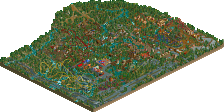
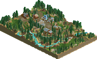
Frontierland was really nice and had a beautiful riverfront setting. It has a cool aspect that it's a section of a larger park, and doesn't let the map size limit dictate its construction. The wide river, spaced out areas, nothing was packed in to force content - all these aspects appealed to me. The fort entrance to the area was great. Interestingly enough, I'd tried experiments for a Frontierland fort and yours is way better. The use of the colored rocks in with the palette was a highlight for this area, and throughout the park. The little strips of period buildings were very nice by the entrance. The Haunted Mansion was fantastic and probably my favorite architecture in the park. I wasn't sure on the theme connection to the rest here, or I could just be uninformed, but I genuinely didn't care. It still looks great. I'm indifferent on the hack in Haunted Mansion, it's cool but could get a little distracting with dark ride cars whipping around. The true waterfront/riverfront area I thought had some fantastic atmosphere going and great architecture. The boat here with paddles on each side was awesome.
I loved Expedition Denali, definitely sufficient to serve as the park's flagship ride. Great layout and it fit in with the mountain really well. I really like the two diagonal airtime hills at two different inclines the layout had. I did feel this area felt a pretty empty. I'm not sure if that's a function of the foliage not having full areas of thick trees or not, but this way of doing trees can look a little sparse without other content behind it. I do find an overabundance of quarter tile landscaping to come out as lego-ish, and I think the mountain especially could've used some more areas of full tile fluid landscaping. Splash Mountain was a cool rendition. The drop underwater was pulled of nicely here, and the rockwork was so cool. I loved how it had many different colors (including a non-colorable one) and fit together so well. I would have considered adding a little more height to give it a little greater presence, but it still did it's job well.
In general, just a good solid park that took a risk with dialing back the content and relying on the look of the overall area and I enjoyed that. For me to call it a spectacular park, I think it was missing a little bit of the character Disney can give everything - the kind of giving the theme an extra 10% exaggeration could've been welcome here in some of the architecture, street level details, and in terms of signage and naming. One random thought I'd had is about the tile paths in the backstage stuff - it sort of looks like bathroom or kitchen tile and I might've considered a different texture. But, yeah, great park and a great addition to the season and Disney RCT parks.
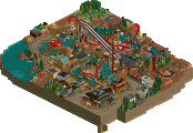
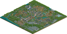
Metropolis was really unexpected here: a ProTour-era style park, built in a sort of loose and not serious theme was a real curveball. I'm not sure I completely 'got' the theme and am curious to hear the intentions behind the park from the builders. The Soulmates coaster was really awesome. The dueling was great, the little cliffhanger was great, the planned crash was great, really it was all just great. Here's a good example of a completely fantasy layout executed well. I'm not sure how completely necessary the palette was here, not that I ding a park for it, and I do enjoy having the option of many palettes moving forward. It did make the sand look really cool, though. And I liked how the 'base' of the land was all the sand, really neat.
The architecture is really the other main thing to comment on here, which I found hit or miss. The best one was the big wavy looking building which was excellent. The view from the cutout of the buildings in the back was also great, and reminded me of something Janus would've built, which is quite something. Other builders were just tall glass walls with steel block floors, and some were nearly just deco block outlines, another was repeated block circle openings. I could see these sort of things working in a park that is only constructed in this sort of way, but with a mixture of more solidly (figuratively and literally) constructed buildings in there too, the others stood out in a kind of bad way. The whole thing did have a pretty cool setting, with the sand bottom and pseudo-jungle foliage; it almost felt like the whole thing could be in an enclosed biosphere - like someone's watching modern dating culture live on its own in an aquarium.
I really appreciated the unique, fresh feel of Metropolis. It had some awesome moments and idea, but I think they failed to come together. Given that it had a throwback-y feel, it really needed to match that with better composition. The coaster was fun and clever, but in a contest all hopped up on content, this felt like less. Wasn't as much a decider for me as others, but contributed.
Frontierland, on the other hand, had a fair amount of content and really created a lovely atmosphere. As had been said, nothing here felt innovative in any way. But, I think the odd-ball ness of Metropolis wasn't enough to overcome the more traditional, if safe, content of Frontierland. In addition, Frontierland felt better composed.
I voted Frontierland.
Voting Closed

Strangelove beat Heavens Gallery!
Heaven's Gallery vote count: 14 (25.93%)
Strangelove vote count: 40 (74.07%)
Metropolis was made by Liampie (50%), Steve (40%), Ultro (10%).
Disney's Frontierland was made by G Force (70%), Stoksy (15%), Jappy (10%), Ottersalad (5%).
What, no Roomie?
Also both captains blow their last chance to build on a match with low stakes. Interesting.
So wow, didn't expect this large of a win, even after I saw the HG park. Cheers to Liam and Steve for producing something so... peculiar. Really liked the coaster and the interesting idea behind it, wished you could of expanded upon it more but oh well
Thanks to Stoksy for hanging through with all my flip flopping and producing some really nice work, Jappy and Otter too for helping finishing the park. It wasn't perfect but hey nothing ever is. More to come later...