Park / [H2H8 R5] Disney's Frontierland
-
 10-June 18
- Views 16,245
- Downloads 879
- Fans 1
- Comments 55
-
![Park_4129_[H2H8 R5] Disney's Frontierland](https://www.nedesigns.com/uploads/parks/4129/logot.png)
-
 74.00%(required: 70%)
 Gold
Gold

geewhzz 85% inthemanual 80% Liampie 80% Poke 80% Jaguar 75% Sulakke 75% bigshootergill 70% Camcorder22 70% chorkiel 70% Cocoa 70% Dr_Dude 70% Xeccah 65% 74.00% -
 Description
-strangelove
-
1 fan
 Fans of this park
-
 Full-Size Map
-
 Download Park
879
-
 Objects
1
-
 Tags
Tags
![Park_4129 [H2H8 R5] Disney's Frontierland](https://www.nedesigns.com/uploads/parks/4129/aerialm3870.png)
![park_3796 [NEDC4 4/15] - Wildfire](https://www.nedesigns.com/uploads/parks/3796/aerialt3454.png)
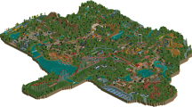
Round 5 | Match 1
--- POLL CLOSED ---
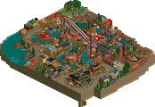
Disney's Frontierland (RCT2)
VS
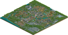
Metropolis (RCT2)
Voting Rules
- You should only vote if you have viewed both parks in game.
- Everyone but players belonging to either team in the match may vote.
- Voting will be monitored to improve fairness, and anyone found to be abusing votes in any way will be punished.
Reminder
Parks are anonymous until the match ends, and therefore no speculation on who created this park is allowed. Even when you could deduce who worked on these parks by looking at the team's schedule. Discuss the parks, not the creators! Any post mentioning or discussing who built these parks will be censored or removed.
holy hell did i build that
bold AF to resubmit the worst h2h park of all time
I suggested both "Errors of America" and "Areas of America" but for some reason was not taken seriously
Alright, there's a lot to talk about here.
Metropolis:
I enjoyed it except the for the landscaping and foliage. (river was nice though) They stood out so badly that I just couldn't get into it. A Pro Tour throwback is bold and i think the builder(s) worked well with the bench to get the most out of it in a nostalgic but also aesthetically pleasing way in the architecture, and I loved the coaster and idea behind it. It just didn't work though, in the end. It's a shame, I want to love this park, but it just doesn't hit the mark.
I love the story the coaster tells, and that was executed perfectly in my mind.
Frontierland:
Its good. Things got a little tense in discord when I pointed out my criticism, but I'll make it clear: I enjoyed this park enough to vote gold on it. The architecture was lovely, I especially loved the entrance area with all the saloons and such. The park definitely suffered from the H2H size limit (why is this still a thing, again? I imagine it wouldn't be there without a reason), the area transitions weren't so smooth with denali and splash mountain. This is outside of the builders hands to an extent (I guess simply doing a different park is the only real solution in this case, but then we wouldn't have this park, and its pretty cool)
When it comes to Disney stuff I tend to judge harshly. I wasn't a fan of Arendelle outside of the town, Port Disney felt somewhat lacking (also suffered from size constrains). I don't have any love for Disney irl or anything, but I feel that since they have a very distinct atmosphere and feel I'll judge based on that as much as how pretty stuff is. I think every part of this park had a Disney feel except for Expedition Denali, which while an accurate representation of Mount Denali, did not seem like it would fit into a Disney park. As a company they are focused on making everything accessible to kids, and they do this in their parks by making things stand out. They've created worlds of wonder and imagination, and a big part of that is how recognisable the rides and areas are. Denali seems to be based on both EE and California Screamin, but doesn't take any of their design philosophies into account. The ride is too hidden. EE has barely visible track but a very iconic and intense facade people can see from a good distance, and California Screamin is so imposing and stands out so much I can't really put it into words. I guess I'm nitpicking, it wasn't a terrible ride, but it would have fit better into a different park, I guess. I loved the summit, I just wish the rest of the ride had that same feel.
I'll be voting for Frontierland, congratulations to everybody involved <3
i'd actually say that denali draws a lot on grizzly mountain at HK disney, so take a squizz at that if you feel like being a disneycritique™
nah fair criticism tho. I love HG btw, really awesome vibe and so unique- full review eventually
edit: why fontsize
After a first look im not a FAN of either park, but I do find plenty things to like in both. I'm leaning Strangelove at the moment. Review will follow
Whilst the Strangelove park is more my cup of tea, I just want to point out that HG's park was amazing as well. That shoestringing was just superb and the details were amazing!
Right now it's a hard choice and I wonder who will win this round. But still, great work from both teams! Keep it up.
Strangelove:
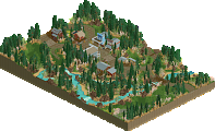
Summary: Technically not bad, but boring, lifeless, and too watery (literally and figuratively).
I liked the dark ride building, but I didn't like the weird trick you did. I don't believe that it is because of lack of space, because you made almost 50% of the park water. I don't mind a lot of water if water plays a big role in your park, but to me it just felt like a way to hand in a finished park in time.
The two main rides were not bad, but again felt a bit too safe for me. I don't know stuff about Disney because I hate Disney, so maybe some references were lost on me, but that's the risk you take when you make yet another Disney park (I'm getting a bit sick of them).
65%
Heaven's Gallery:
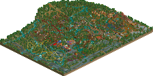
Summary: Touching modern love story, with a sauce of awesome colourful, impressionism.
I loved this park. A bit unrefined, but weirdly beautiful. I applaud you guys for taking a risk and I think it paid off. I liked the shapes and use of verticals especially. That mint green had me in awe for a while, I love it!
The love story read like a modern short story, and I shed a small tear at the kiss. Beautiful scene with the waterfall.
Maybe it's because of the situation I'm in myself romantically (without Tinder, fuck that app), but this park touches me on a personal level.
Some more skill, and a bit more thought in the foliage (although I didn't hate it) would have elevated this even more, but this is the clear winner for me.
75%
Again, the palette change serves to enhance (in both parks) than distract. Which I really enjoy and support.
Nice work!
HG park is...interesting. It didn't appeal to me personally, but it's well done and quite unique - great job!
It's nice how Frontierland was so gimmick free. Just a park actually trying to be a park, and to execute a theme. Very calm and unassuming which I liked.
are we supposed to vote for the better park or the park we like better?
I'm Definitely voting for Frontierland. Very solid all around and I paticularly thought the landscaping was great!
Unfortunately, I found very little to like in Metropolis. Nice effort nonetheless!
The poll is now open.
I can appreciate all the work that clearly went into Metropolis, but it just is not my cup of tea in that particular matchup.
My vote went to Frontierland.