Park / Practice Park
-
 23-June 18
- Views 1,270
- Downloads 485
- Fans 0
- Comments 5
-
 Description
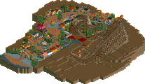
First park since picking the game back up - relearning tools/design
-
 No fans of this park
-
 Download Park
485
-
 Objects
1
-
 Tags
Tags
![park_4141 [H2H8 R5] A Far Cry From Home](https://www.nedesigns.com/uploads/parks/4141/aerialt3872.png)
![park_4120 [H2H8 R4] Ruigrijk](https://www.nedesigns.com/uploads/parks/4120/aerialt3860.png)
Ok here's a rookie mistake: A lay-down coaster starts with the guests laying down on their backs, but should really travel suspended under the track for most of the duration of the ride, to make the guests feel like they're flying. You should look up some videos of real flying coasters and you'll see what i mean.
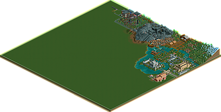
Why is the map only a quarter full?
Some interesting stuff here, but just not a lot of it.
hmmm there was some interesting stuff here, I think you're only going to keep improving and it will be really cool to see that happen. You seemed pretty eager to take feedback and use it to get better on discord, so I'm curious to see how you'll go.
I think the two main things I'd suggest you focus on are your coaster layouts and landscaping. The scenery work was basic, but you've shown a fundamental understanding of the objects in play that I think you'll simply improve naturally.
For landscaping: Avoid using the mountain tool to make mountains. Big slopes don't look good in rct, break them up with cliffs and verticality. The extremely jagged landscape with a seemingly random pattern around the rocky area is also really unrealistic.
The layouts are also bad, but its not something to be discouraged over. learning layouts takes a lot of time. RCT is a limited game and roller coasters irl are pretty complicated in their manufacturer differences and stuff.
The best advice I can give you is to look at what people on this site have built and maybe try and emulate things you see to start with, it is without a doubt the fastest and funnest way to learn.
For working without custom scenery, I recommend taking a look at the works of (screenshots and parks) the following members: Shotguns?(don't get intimidated by Blue Oak, and make sure to check out the older stuff too!), Jonny93, nin and IonZer0. There are more notable players out there, but that's a pretty solid range of different styles and reference points to work from.
As for layouts, check out the Design accolades. They range from hyper-realistic recreations to extremely bizzare fantasy, but for the most part you can guarantee they'd have a decent layout since a central coaster is the focus. Another incredible tool to use is the Rollercoaster Database (https://rcdb.com/) where you can look up parks and coasters from around the world to get a look at them more closely, I'd also suggest checking out POVs of those rides on youtube too! You'll learn the manufacturers in time, especially from using rcdb since it tells you who built it and which model it is. When you see a new manufacturer or model you can just click on the name of it to see more of their stuff in rcdb and eventually you'll just get the hang of it over time.
looks like you bit off more than you can chew here!
I like the general park flow- the castle in the center, and the rocky jagged stuff before the future hollowed-out area. felt a bit more organic than the usual first-park vibe. I especially liked the hazard area, and i'm always a sucker for wooden paths over water even if its just so basic. hmm maybe i have an idea brewing
good to see new releases from people picking the game up again and seeing what they can do! I think you did a nice job
This shows promise. Reminds me a lot of what I used to build in the past. Keep at it and you'll develop a distinct style in no time - don't be afraid to try out smaller projects when you're first getting started and learning from the advice given on those!