Park / [H2H8 R4] Incident at Billy Wonka's
-
 29-May 18
- Views 20,223
- Downloads 889
- Fans 2
- Comments 78
-
![Park_4119_[H2H8 R4] Incident at Billy Wonka's](https://www.nedesigns.com/uploads/parks/4119/logot.png)
-
 77.50%(required: 70%)
 Gold
Gold

Fisch 90% Kumba 85% chorkiel 80% Cocoa 80% Jaguar 80% Sulakke 80% Xeccah 80% CoasterCreator9 75% G Force 75% Faas 70% geewhzz 70% Poke 70% 77.50% -
 Description
Plagued by jealousy, candy tycoon Billy Wonka ran some controversial formula-breaking experiments, in a desperate attempt to beat his more succesful and charismatic brother in producing the ultimate candy. Not very succesfully so. One day, a loud explosion was heard and a blue mushroom cloud rose over the factory. Since then, more and more strange things started happening in the area... Is the real disaster yet to come?
-
2 fans
 Fans of this park
-
 Full-Size Map
-
 Download Park
889
-
 Tags
Tags
![Park_4119 [H2H8 R4] Incident at Billy Wonka's](https://www.nedesigns.com/uploads/parks/4119/aerialm3859.png)
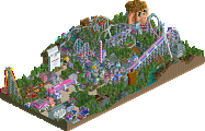
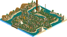
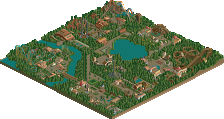
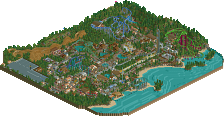
I found it really difficult what to vote for. Here is a list of pros and cons per park, followed by one general summarising sentence:
Ruigrijk:
+ The area with the boats, plus the buildings around it. Great architecture, and lovely boats, really good!
+ Diorama + building. I love it. Diorama is one of my favourite places in the real Efteling. Did you know you can get married there? It has a bar.
+ Halve Maen and surrounding town. Good efteling vibes, although I've never ridden the real thing.
+ I actually like Vliegende Hollander, and that cluster of buildings it twists through, something real Efteling could do.
+ Panorama, great execution.
- Baron and surroundings. Reminds me nothing of the original, also waaay too cramped and heavily built for my tastes. Should have just used a station building and cool lift tower, all the stuff around it could have been dropped if you ask me.
- Foliage on that side of the park (Baron). If you make an Efteling inspired park, I think your foliage needs to be top notch. The foliage behind Baron was particularly ugly.
- Foliage in general, I think this park needed 40% more room to breath, why not add some more natural wooded areas? I think it would have really elevated the level of this park, and helped with the real Efteling feel.
Summary: Great work on the cityscape part of the park, but the back half was lacking, especially failing to bring over the Efteling vibe. 75%
Billy Wonka's:
+ Cotton candy men. So simple, but those never fail to make me laugh. I always make weird surprised guys of the cotton candy stall too.
+ Mentos + coke ride. Great idea and execution, allthough a launch tower would have made more sense.
+ Gumball machines, cool idea, but maybe a bit oversized.
+ Almond production line. Reminds me of the sewer ride in Zippo's, so kudos!
+ Lollypop tower, cool little detail.
+ Pea farmer, fun idea
- Area around The Formula. Too dense and sickening if you ask me. Not a good exectution.
- The architecture in general was a let down. You could have done more with the cool industrial architectural elements. Since the factory is the base on which the park rests, it brings the whole park down a bit.
Summary: Great collection of ideas, of which most are executed well, but the general underlying skill and quality was a bit lacking. 70%
My vote goes to Ruigrijk.
Ruijgrijk:
Version 1 is correct (once in a while this can happen) that this misses the Efteling atmosphere, however maybe that’s not what you were going for, and that’s fine. Despite the inspiration/recreations, this park has it’s own character and in general it’s very good. I agree with others that the white details are dominating and contrast too starkly with the dark brick textures. Perhaps one of the custom palettes with a pale beige would’ve worked well? Except for this, the execution of the Amsterdam streets and canals were excellent. I only wish you had composed them differently, especially directly infront of the entrance. It’s like there is this huge wall as soon as you enter. Would’ve been made more sense to me to turn the two blocks of buildings 90 degrees and have the canal and two streets running from the entrance out. Also since you copied some signature Efteling structures, it’s a shame you didn’t attempt to recreate the entrance. I’d imagine it’s super hard to execute so would’ve been a daring move that could’ve been awesome if pulled off. Joris en De Draak’s layout was great, Baron’s wasn’t. Cool theming around both and it’s nice to see some unusual texture choices. I loved the inclusion of Panorama, my only criticism is it’s spinning too fast. Diorama was a super charming detail. In general I like all the individual parts of this park. My main issue is I found the composition awkward. Especially the entrance like I said before, but the park in general had a very unbalanced density.
Love this match so much, tough call again. Too burnt out right now to give both parks the reviews they deserve, sorry!
Incident at Billy Wonka's was clearly the more charming and attractive park from first glances. There were so many neat details to keep you busy in the long run as well, which made it an enjoyable view. All the 'candification' was pulled off so creatively! Sweets growing on trees and in the farm field and the flower patch in one dude's backyard; the candy man on break (ha); gummy bears and regular bears; even those neat police cars at the front; that sick conveyor belt and much much more. There's just strokes of genius everywhere here that make this park keep up with its competition more than I expected. Having the fast-tempo broken Carousel music in the background was fucking amazing. It starts on such a great melody too, really hits home that something comically went kaput haha
With that though, I wish the park had some better architecture. There were one or two neat buildings here though, like a house at the end of the street close to the fields and the Factory Cantina. Wish more care could have been given to this stuff, especially the untouched bits of the factory and all the houses, since those are the less fantasy bits on the park and we've come to expect non-fantasy archy to look pretty good. Such a great idea for a park though that I really wanna vote for this whenever I open it.
-
And so it meant that Ruigrijk would be the more traditional warm and mellow coloured archyfest I usually like a lot. The park's archy and stellar foliage was what very much so kept my attention, as there are no 'little things' similar to Billy Wonka's. Just good old parkmaking done incredibly well. And I really do mean that in the best way possible, as I think some moments in the park are genuinely spotlight quality. I mean just look at that dragon! Still, kinda tried going for people's attention based on pure technical spectacle, eh? I guess you guys clearly knew what you were making, and kinda set the tone for what the park should be when you thought not to include the usual easter egg stuff and what-have-you. Don't care what Efteling looks like, this park has enough unique charm to not need any intro to it for sure. It's just a Dutch park with Amsterdam and some medieval looking stuff and a countryside castle-y thing and that's all I needed to know to love it <3
I didn't like how the areas were placed for the most park, I think. Some of the vistas didn't have breathing room even though they looked incredible and kept making me think they deserved better positioning in the overall park. Also, maybe the archy got a little too overwhelming for me, especially in the park matchup screenshot you guys went with. Mostly has to do with how the ship looks in its surroundings, I think.
-
Well, in the end it's been pretty hard to decide for sure. I really tried to overlook the weak archy and general scenery skill at display in Billy Wonka's, but it's something that couldn't escape me. The ideas behind the park carried it with grace but their execution was just almost there. Shit, man. Fantasy is hard! Ruigrijk's idea (which I'm not too aware of in the first place) didn't seem to stand out as much to me, but the standard execution was really really good and very thinly edged out for me on the vote. Won't be surprised if the vote is a little close. Awesome parks from both teams!
Voting Closed
Heaven's Gallery beat The Replacements!
Heaven's Gallery vote count: 32 (51.61%)
The Replacements vote count: 30 (48.39%)
Incident at Billy Wonka's was made by bigshootergill (35%), Liampie (35%), Roomie (15%), and CHE (15%).
Ruigrijk was made by WhosLeon (45%), Pacificoaster (45%), SSSammy (9%) and GammaZero (1%).
congrats everyone! another phenomenal close match. really such a good season so far.
incredible work from pac going two weeks in a row, never guessed that!
nah he voted for nin again
checkmate, atheists
we did it Reddit!
?
Whitehawk Offline
dont forget to vote for the other rounds or they'll start questioning again
Whitehawk Offline
Whitehawk Offline
Who are you
Why are you
kinda was.
Damn. I did NOT expect to win. I thought Ruigrijk was absolutely stellar, one of the very best parks of the season so far I think. Can't say it was robbed since the majority obviously thought otherwise, and rather than a difference in quality it's the difference in approach that won us the round. I think everyone agrees that Ruigrijk was easily the superior park on a technical level.
 We shelved the idea, but revived it later after I became available around the time of Feira's release. I would lay the park out and be in charge of its concept, which was the Chernobyl variant. We had 3-4 weeks at this point. It didn't seem like we would be able to deliver a polished end product but it miraculously came together in the last week. At some point, the gumball just started rolling! A lot of the ideas are contributions by me, Roomie or the other team mates, but in essence this is very much a bigshootergill park. The 35% I did was more trying to enable the others, than trying to make this a personal park. Even though I imposed my own concept and narrative and strictly guarded that narrative. I'm glad it paid off, and I'm glad bigshootergill overcame his creative roadblock. And I'm glad that this troubled park managed to beat Pacificoaster and Leon, the latter of which I thought is one of the two most dangerous players this H2H (the other being Fisch), putting us into the playoffs... Those were four nerve-wrecking days though.
Short review: like many people pointed out you did not capture the Efteling atmosphere. Flaw? No! Not at all. I don't think you even set out to capture that atmosphere. The true Efteling style founded on the work of Anton Pieck is completely absent from this park, aside from maybe the tiny Diorama interior. You reinterpreted three modern age Efteling rides with the theming turned up to eleven. De Vliegende Hollander had all the architecture that captured my interest at first. There's not enough proper Amsterdam in RCT. While there's definitely a lot of fantastical stuff in this area, and inaccuracies like all the shutters, you also captured some Dutchness where most other attempts fail. It's clear you guys looked at Amsterdam, but you did not build Amsterdam. Again, a reinterpretation. Cool ships. Baron was simply fantastic I think. That lifthill structure is perfect. The conveyor belts are so well placed, like a couple thoughtful but quick brush strokes in an abstract painting. Joris and de Draak had a great layout except for some clearances issues (first drop). The cluster of track next to the lifthill looks pretty damn sick. Architecture was reminiscent of the disaster bench, but it wasn't out of place. It would look terrible in the real Efteling, but you did it very tastefully here. Lastly, I'd like to point out the E-shaped planter. Love it.
Our park was originally intended to go in round 1 or round 2, built in parallel with Durham, Knaresborough and Staithes. Bigshootergill proposed it and I was on board pretty quick. A park themed to candy sounds perfect for H2H! Sadly bigshootergill seemed to struggle with a kind of parkmaker's block, and the challenging concept had some problems. It just wasn't working out despite having a good amount of ideas we wanted to implement. I had some ideas for the overarching concept of my own, like a candy version of Chernobyl, or a battlefield between candy and dentists and vegetables, but it wasn't my park.
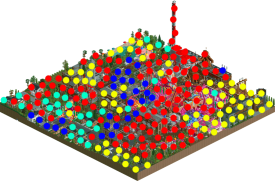
Here's who did what. It was a real group park with everyone building all over the map. Therefore it's also likely that there are some errors.
Red: me
Yellow: bigshootergill
Blue: Roomie
Cyan: CHE
Pac, Leon, Gill, Roomie, CHE, Sam, Gamma, well done all. Nin, your team is so fucking consistent. You absolutely deserve to make the playoffs!
What a match.