Park / [H2H8 R4] Incident at Billy Wonka's
-
 29-May 18
- Views 20,223
- Downloads 889
- Fans 2
- Comments 78
-
![Park_4119_[H2H8 R4] Incident at Billy Wonka's](https://www.nedesigns.com/uploads/parks/4119/logot.png)
-
 77.50%(required: 70%)
 Gold
Gold

Fisch 90% Kumba 85% chorkiel 80% Cocoa 80% Jaguar 80% Sulakke 80% Xeccah 80% CoasterCreator9 75% G Force 75% Faas 70% geewhzz 70% Poke 70% 77.50% -
 Description
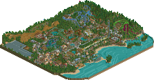
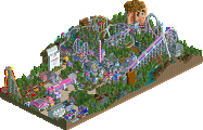
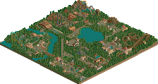
Plagued by jealousy, candy tycoon Billy Wonka ran some controversial formula-breaking experiments, in a desperate attempt to beat his more succesful and charismatic brother in producing the ultimate candy. Not very succesfully so. One day, a loud explosion was heard and a blue mushroom cloud rose over the factory. Since then, more and more strange things started happening in the area... Is the real disaster yet to come?
-
2 fans
 Fans of this park
-
 Full-Size Map
-
 Download Park
889
-
 Tags
Tags
![Park_4119 [H2H8 R4] Incident at Billy Wonka's](https://www.nedesigns.com/uploads/parks/4119/aerialm3859.png)


Ruigrijk - another classy park with impeccable execution. The dueler is probably the best ride thusfar H2H8. Was it just me or does the first drop intersect each other? The snaking portion right before the water turnaround was fantastic. Architecture is beautifully done, so were the canals. I'm not a huge fan of the trend of having open window shutters everywhere. Probably should have someone make a shutter object that's proportional to the windows lay flat against the facade instead of this, because it looks awkward. Didn't mind the white linings, it pops quite nicely. The dark atmosphere throughout was a nice change from what we usually see. Vligende Hollander (sp?) was too squished and could've been left out. Loved the Baron area, the intersecting trackitecture is beautiful and added so much dimension to the area with the diagonals. Love the structures too, though I would've liked to see the oversized round structures at the top of the lift instead of the little gears. Density was too much as others have pointed out, but it's understandable in a city-like environment like this. Wished there was less density of content like architecture, and more density of ideas like little things and details. Something to elevate the viewing, because I did feel like after 10 minutes of viewing I've seen everything there was to see. I think that could've been upped with a better conceptual basis. Nothing really stood out and made me go "wow" or "how did they do that?". Like others have said, beautifully done, but nothing we haven't seen before. 80%
On the flipside, Billy Bonka's is probably one of my favorite parks thusfar. Not sure which word describes this better: unique, out-of-the-box, incredibly creative, hilarious, engaging, clever, packed full of details. I have almost no critiques. SO MANY HIGHLIGHTS: The gumball machine and ride. The conveyor belt of mentos falling into the coke. The wingrider's COLORS - WOW. The hilarious staff names. The protestors. The music and the staff trying to fix the music. The pool of gum. The tesla coils. The roiling chocolate tubs. The exploded main factory building. All the dentist and cavity references. Loved the blast of color and fun in a drab and dreary town. I felt like I've viewed the park for 20 minutes and was still discovering things that made me laugh.
This is what I wanted out of H2H: out of the box concepts that are then executed to the highest quality.
Thank you parkmakers this round for finally breathing a breath of fresh air into the competition. 95%
Two high quality parks but the choice was never easier: one park that is impeccably built but had not much to show beyond the clean surface. The other that was a blast of creativity and color and fun and humor. Voted Heaven's Gallery. Brava boys. Beautifully done.
"out of the box concepts that are then executed to the highest quality" lolol sorry but I had to laugh at this. I kind of disagree, but it's an opinion.
I just don't get how people care more about the ideas rather than the quality of the ideas or of the park in general. It's strange.
Which is a critically better movie, Citizen Kane or Avengers? Which made more money?
So far I've given Ruigrijk 3 chances but I'm sorry, I just don't enjoy it. I simply did not find it aesthetically pleasing. The Baron area was my favorite, mostly because I liked the lift--hill supports and schachten on a micro level. The Joris area had a lot of potential but that was 80% wooden coaster and 20% unreadable brown buildings. The excess of white on the buildings in the 'entrance' area was probably my least favorite part. This park feels so lost in the details.
On the other side of the match is what I would consider a true H2H park. Something out of the box that we normally wouldn't see that often. It is packed with strong ideas. The colors in the park are so batshit crazy that I love it. The contrast with the village works really well in conveying how crazy it is.
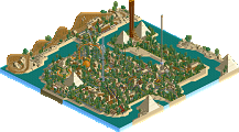
Ruigrijk
Never having been to Efteling, I had no idea the name of this park was the name of an area in Efteling. So when I found out, I was very surprised to see all these beautiful renditions of famous Efteling rides in there. A lot of them were beautifully done, and as a personal highlight for me, the park even had two renditions of Alex' and my freefall from Riverland (Dunkelschacht vs Oude Schacht AND Schachtlift).
As far as overall park atmosphere goes, it's interesting you took Efteling rides but made the park much denser than the original. To my understanding one of the characteristics of Efteling is that it's themed, yet really open and embedded into nature. Not saying your denser take was better or worse, who would I be to hate dense parks, it's just something I thought about while looking at this. The park is beautifully crafted though.
Great translations of these rides into rct. Panorama was just brilliant, probably even my personal highlight. Didn't think we'd see that ride in rct all too soon. Only wish it was peepable. Baron and Joris en de Draak are crazy well done. The dragon sculpture over the entrance is fantastic and the whole area around Baron is just beautiful. Joris en de Draak's station building is being dwarved in there, but I guess that can happen for a tight duelling woodie. Something I found a bit inconsistent about these two are the 3 tiles of backstage access for Joris en de Draak's transfer building, while Baron doesn't actually have a transfer track (or can I just not find it).
It's clear that whoever built this spent at least portions of their lives in the Netherlands. The white on the rooves is obviously bold, and a bit bright in rct but the overall dutch style definitely comes through so I have no issues with it. I also love some of the small statues, fountains, and ornamental gardens in general.
Back to the archy and the coasters, I think De Vliegende Hollander sadly lost out in this a bit when compared to the other coaster translations. The outside layout is still good but again from my understanding the dark ride part is a big thing for this which due to missing space you obviously sadly couldn't integrate. Bold move also with the lift - based on some of the things that have been said about realistic coasters or lifts for realistic coasters this season. I remember V1 mentioning the realistic spinner's lift in Ghibli ruining the coaster because the elevator wasn't clearly declared as such in a park that had trains running on water. So I feel like this could've been a big gripe. My bigger gripe isn't the lift though but generally that what was hidden under the building seemed to instantly be less thoughtful than the outside stuff. While JedD and Baron have great queue areas as well for example, DVH's queue just seems to be a connection to the nearest possible piece of path. There's no real feel of there being an actual realistic coaster station, reason seemingly being that it's hidden from first sight. Last thing I'm really missing here is the characteristic boat architecture that the real DVH uses near its rooves. Wish you had ventured into depicting that as a slight variant to continuing the classical Dutch style from the rest of the area.
The whole canals and the lower level warehouse stuff near the canals was also beautifully done. Both ships are great, it does feel however like they were done by different builders with the smaller one being quite a bit cleaner than the bigger one. Or maybe it's just based on this scenery ship vs trackitecture ship analysis that you kind of did here. I think dropping the mouse track would've really helped the bigger one.
Overall it's a really great park, technically clean, cool rides, great coasters, fun atmosphere. It's definitely something to be proud of as builders and as a team.
I think that if it loses the match then it's because the concept of Billy Wonka is potentially more suited to H2H with it being much more out of the box and it feeling much newer. Still, this is probably my favorite Replacements park so far. I'd love to see this style of park on a 100x100 map!
Billy Wonka's
Now as Cocoa said, I was almost certain that Ruigrijk would win this match after looking at it with it having cleaner archy and it looking like there's still more content when you zoom out. But damn, this park is so fun, it's crazy. When I first viewed it I was seriously stunned by all the jokes and ideas that were put into this!
So as a general setting we have the Billy Wonka's factory near a suburban residential area. And it's instantly clear something went wrong. There's stuff dripping out the factory walls, contaminating a house and its garden. There's press and police at the front door, as well as people protesting. All while who's potentially supposed to be lunatic Billy Wonka still opens a little bit of that security fence for guests to enter his factory. That's one of the best bits of frozen staff placement I've ever seen. So that was my first impression. I didn't even notice the dentist apointment in the suburban area till much much later.
All rides feel like they could be potential rides/experiences within the real movie's story. The rides are sooo soo creatively fit to their themes, I was in awe at that. Whipped and Confused where they're creating whip cream. I lol'ed at rapid tooth decay as well as the Chocolate Nuggets and Chocolate Logs named restrooms. Chocodipper is another perfect idea for ride placement and integration. Right next to it in the backstage there's that smoking staff member joke. At this point I was already in love with the crazy fun and colorful ideas, all while that high tempo carousel theme was playing to make it seem even more ridiculous.
Great use of that hypnosis object on Delirium, the conveyor belt for the almond ride looked great, although I'm not sure what that ride really does. But still it does look great and quite fitting. The Packaging Machine ride symbolizing the process of packaging a product was another awesome ride idea.
Twizztler I didn't care for that much although the idea for the ride choice is clear. It just could've done with a lot more twisting themed stuff. The formula's color scheme was really cool to see and fit the theme of the park perfectly! Loved that palette inclusion for once as it felt really meaningful here. The actual coaster I sadly didn't care for that much. I do get the theme and the factory being partially in ruins because they overdid it with the formula. The explosion objects before the Formula goes wrong, the lighning between those 2 gumballs and the staff member saying "Holy shit I'm losing my job!" are awesome! But the rest of the coaster could've done with more crazy ideas for little scenes alongside the track. Like what else the broken formula does or ruins. That said I guess that alive pink gum monster is awesome haha. So is the brown almond boy creature above that building btw which destroys one of the chimneys and potentially thus starts steaming itself because it has its hand over the chimney absorbing the smoke? Ideas everywhere! Overall really smart staff placement throughout the whole area again as well to clarify what some of the ideas were.
Now to my 2 favorite things. First my favorite coaster, the mentos coaster. I loved that idea and the way you used those football cars is sooo clever. It's funny that the launch track pieces actually fit the mentos drops theme with those white drops on the launch track. The idea for this again is just awesome, as is the spilled fallen over coke bottle. Twizztler could've done with more of this love. Last but not least there's the gumball depository slide that runs over nin. The ideas are just over the top and make up for what this may be lacking architecturally against its competitor. That public swimming pool being ruined by the gumball waste, with peeps getting stuck in the gumball infested water is insanely cool! It's clear that it is public too with the nearby parking by that field. Fun joke there with the farmer complaining about his peas being jelly peas.
Then we get back to the awesome dentist appointment ride (with 1 singular space ring representing the torture in the dentist's chair) and the usually more quiet suburban outskirts and I think we've made our way across the map. This is beautifully crafted as well although definitely a bit less technical and a bit less architecturally developped than Ruigrijk. But holy shit, did you go crazy on the ideas and ride integration. Like that part of this is soooo good which is why it gets my vote. It's one of my absolute favorite parks so far this H2H.
What a strong matchup once again and I feel like Ruigrijk would beat most other parks for me. But it's just lacking the same refinement in ideas that it has in architecture and coaster layouts when compared to Billy Wonka's. Hope both of these get the praise and time in the spotlight that they undeniably deserve!
Voted Billy Wonka's
trying to go through them again right now to determine which I think is better. some final thoughts/ things I noticed
rough empire:
-that tiny boat on flug's facade. brilliant.
-this park is so atmospheric, and alive. even when people frame this matchup as "concept vs. execution" I think that this park still feels incredibly interesting and vibrant.
-great dragon
-just so clean and nice and pretty. lots of tiny little spots to really dig into. especially by the waterside and in the canals, and nestled into the more 'medieval' feeling part.
HG
-the cylinder towers transition to whipped cream. brilliant. you did this with umbrellas elsewhere too
-coke and mentos, love it
-whoever ok'ed maybe a giant almond boy breaking a chimney, that was a bold move for an rct park
-"de-legged" nin
-still in awe at the conveyer belt
-candy cane path supports
-bubble gum coming to life
at least with CnC vs EVIL I knew which want I wanted to vote for, despite liking both. This time, I really don't know. I think wonka may be more memorable, but efteling2.0 is just so pretty and one of the best versions of dutch stuff out there.
Ruigrijk - The Replacements
This already deserves some additional info from me: You guys know of my hate for Europa Park World Showcase and this is similar in a way. I just don't think this park matches the charm, beauty, quality, atmosphere, etc. of the real Efteling. Now I am in the difficult spot of judging it as a Efteling semi-recreation or as a dystopian version of Efteling.
+ As already stated, the Baron 1898 area is very good.
+ Joris en de Draak, too, although I'm not sure about the grey station roofs.
+ Great Dragon
+ Cool boat I guess
+ Diorama is great
+ Panorama is great
+/- Not in love with the overall atmosphere and use of architecture
- De Vliegende Hollander is a let-down
- I don't like the dense and messy nature of it
Incident at Billy Wonka's - Heaven's Gallery
++ Smoking Candy Monster
+ COLORS
+ Gumball coaster is amazing
+ Reverse Freefall Coasters are underused
+ Colors on the Wing Rider
+ Cool industrial atmosphere where the park is industrial
+ Good humor in general
+ Dentist appointment
+ Mentos dropping into the Cola is amazing
- Park is a bit unreadable in areas
My vote goes to Heaven's Gallery
in the end, I was splitting hairs. I wanted to reward parkmaking that really pushed boundaries and made me smile, so I went with bonka. I think if rujirigak had been slightly more interestingly composed it could have got me, but thats always such an esoteric thing to describe
Ruigrijk by The Replacements
This might be a closer match than round three just because of the flip flops.
oh it's a race it's a race
voted for Billy Wonka's
For me it's mainly a combination of two things: Exchanging the absolute lovely and fitting natural appearance with a really dense kind of parkmaking and the overall darkness, mostly contributed by the dark graveyard brick.