Park / [H2H8 R4] Mount Haystack Ski Resort
-
 27-May 18
- Views 29,305
- Downloads 1,108
- Fans 8
- Comments 120
-
 80.00%(required: 70%)
 Gold
Gold

Fisch 95% no Faas 85% no geewhzz 85% no Kumba 85% no bigshootergill 80% no chorkiel 80% no CoasterCreator9 80% no Cocoa 80% no G Force 75% no Poke 75% no Xeccah 75% no Coasterbill 70% no 80.00% 0.00% -
 Description
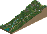
Mount Haystack Ski Resort first opened for the 1958-1959 winter season with a single ski run and lift, and a small log cabin at the base for warming up on cold days. Over the past 60 years, the resort has grown into a vibrant, bustling all-season mountain resort, with a mountain coaster, indoor water park, a full-size roller coaster (custom built by RMC and new for this season), and multiple lifts and trails. Stop in the village for shopping, ice cream, and great microbrews, and don't forget to check out the ice skating rink! We hope you enjoy your stay at Southern Vermont's premier mountain destination!
-
8 fans
 Fans of this park
-
 Full-Size Map
-
 Download Park
1,108
-
 Objects
456
-
 Tags
Tags
![Park_4118 [H2H8 R4] Mount Haystack Ski Resort](https://www.nedesigns.com/uploads/parks/4118/aerialm3883.png)
rate my park
I usually wait until after a match involving my team has ended to review the other park, but I still feel as though Grand Central isn't getting enough love. It's a nice park and it deserves some reviewing!
The main station is gorgeous. So lovely, great and clean use of trackitecture, and I like all the glass. The streets below the station are so full of fun details. The ice cream cones caught my eye especially! In this part of the park, the different levels are fairly readable, and it makes for a really neat effect. I also liked the dark ride, with nice theming inside. Now, moving over the iron works. Spiral lift hill! Something I never would've thought of, but looks really cool with a dive machine. The dive machine layout was pretty good, but I would've liked to see one of the dive loops made into an immelman, just for some more variety. The iron works archy was pretty good, but I would've liked to see more grunge and more dirt, it just feels a little clean for an ironworks. The sidings with parked trains and overhead conveyors are all really nice details and supplement the theme really nicely.
The back corner of the park wasn't as strong as the front, but still good. I liked the openness, but it felt a little too open and contrasted too much with the rest of the map. A few more buildings would've been great here, like maybe an extension of the little greenhouse that the diver goes through. The hopscotch was a fun little detail, made me smile. =)
Moving to the last area of the map. More solid archy, and I love the way the carousel is placed in the corner building. But.... the name of it is Carousel? I think you guys are more creative than that!!! =P High Speed Experiment was a really fun idea, and pretty well executed too. I like how it darts in and out of buildings, cliffs, tunnels, everything! The one nitpick I have is the one multicolored 1k rock tunnel. Gotta rotate those rocks more and place them a bit more randomly. It's also in this area that there's a bit of unreadability, mainly because some of the paths on different levels have similar colors and textures. I figured it out after looking at it for a bit, but it's kinda jarring at first. Also, at this point I have to mention the structures. All of them are really well done and look fairly realistic! A few of the bridges might be a bit on the thin side, but I'm just bitching about them because I look at bridges every day! The slums were pretty well done too, but suffered some of the same problem as the ironworks; they just weren't grimy enough.
And finally, a review of this park would be nothing without mentioning the trains! I love the trains, and how they move in and out of the whole map, carrying peeps to and fro. Really ties the map up nicely and integrates everything really well. Good job on this park guys, I enjoyed it thoroughly!
You could say the love our park is getting this round could be classified as strangelove.
i think we still have a chance
Voting Closed

Team Spacecrab beats Strangelove!
Team Spacecrab vote count: 56 (88.89%)
Team Spacecrab vote count: 7 (11.11%)
Mount Haystack Ski Resort was made by Saxman1089 (38%), Camcorder22 (38%), Coupon (17%) and Spacek (7%).
Grand Central was made by WouterVL (30%), Jappy (30%), roygbiv (20%) and ottersalad (20%).
Sexman you KILLED it on this! Nice work all
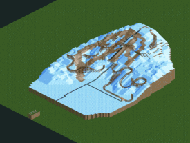
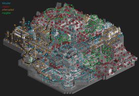
Well, surprise! I think most people were expected this to be a mostly Coupon affair, but Camcorder22 and I were kinda co-lead builders on this park. This writeup is gonna be super long, so bare with me…. This park was conceived really early on in our team’s history, I believe it was one of the first ideas that resonated with the skiers/riders on the team (myself, Camcorder22, Coupon, and spacek). A dot map showing who did what is below. It should be taken as approximate, because really we all polished up the whole park afterwards and lost track of exactly where everyone worked. I also included a gif of the construction process.
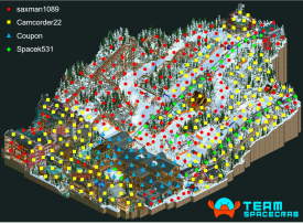
Surprise! Not a Coupon solo!
Yummy gif!
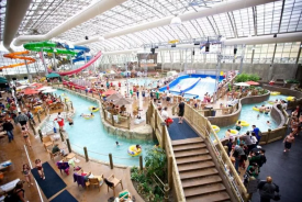
This idea was an idea that I personally have tried before in RCT2, but never finished or perfected due to the lack of good custom rides for representing skiers and boarders. We tossed around ideas on a ski park for a week or so, and then started coming up with a trail map and how to realize our ideas in RCT. Cam and I decided to set the resort in Vermont, where we both have lots of experience skiing and travelling. The original sketches of the park layout ended up being pretty close to the final layout. We originally had somewhat of an indoor amusement park in a building at the base, with a small coaster and some flats. As we realized we wanted to make the park more realistic and more focused on skiing, this was eventually changed to a water park, inspired by the Pumphouse at Jay Peak, a real VT ski resort. Our waterpark ended up being much smaller because of the map size restrictions of H2H, of course.
Jay Peak Pump House Indoor Waterpark
We decided that we wanted to include a large coaster on the map for a number of reasons. First and foremost, we just thought it would be cool to have a coaster interacting with the terrain and ski slopes. We also considered the realism somewhat, in that we really don’t see it being that much of a stretch for a southern VT resort to have a large coaster as a summertime attraction. We did not add it because we felt we needed a coaster, we just did it because we thought it was cool and on right on the edge of what was feasible for the real world. I brought up the idea of leaving the coaster closed about two days before the deadline, but we talked ourselves out of it and thought that it would be more fun to let it open, even if it wouldn’t realistically be operating in the dead of winter. The coaster went through various iterations, starting with a large terrain woody that stretched throughout all the slopes, to a much more condensed version that hugged the original indoor amusement park. I tried an RMC shortly after that, trying to balance having an interacting coaster with leaving a lot of the map untouched. An RMC was chosen because we felt their crazy elements would fit nicely in trying to make a coaster fit the mountain, and that RMC is generally a company that’s not afraid to take risks. This went through a few iterations, and with some advice from dr dirt, ended up as you see it today. Fisch had the idea to set the lift hill into a cliff, which reminded us of the Smuggler’s Notch pass, which the well-known ski resort takes its name from.
Smuggler's Notch Pass
Around the time we were working on the RMC layout and mountain terrain, we were also working on a layout for the village. We decided to do a large U-shaped hotel and put the waterpark inside, as well as putting the coaster station inside the hotel overlooking the waterpark. I took what we had been playing with up until that point and mapped out the rest of the village using land blocks. We also mapped out the shape of the mountain stream/waterfall at this point, and planned out the position of a mid-mountain lodge to overlook the waterfall. While we dropped the ball a bit on the origin of the stream and made it a bit too wide at the top, I really do like the rest of it, and I don’t think the water flowing is unrealistic at all (Vermont isn’t crazy cold). Up to this point, Cam and I had been working on the park, with Coupon making some progress on the lodge. Then Coupon got busy with irl stuff, and I got pulled away to work on Dig Site, Ghibli, and Winkelheim. Cam really took the ball at this point and ran with it, doing a ton of the archy in the village, and adding the mountain adventure coaster. These coasters are very common in the eastern US, and run both during summer and winter. They’re modeled after alpine slides, but have a cart fixed to a track rather than a cart roaming freely in a concrete trough. Cam will be posting with some of his inspiration for the village archy and his thoughts soon.
Appalachian Express Mountain Coaster at Camelback Mountain Resort, PA
After helping to finish Winkelheim, I came back to this park, and got to work. Cam had made great progress, and we wanted to keep it going. I put in a ton of hours on this park the two weeks before the deadline, doing all the foliage and rockscapes on the left half of the mountain and the custom RMC supports in about 3-4 days. We were not originally going to custom support the RMC, but decided that this park needed every bit of care to avoid it being seen solely as a CTR showcase. We eventually “finished” the park with about two days to go, and spent those two days polishing and revising stuff basically everywhere, trying to get the best park we could. Coups also finished up the lodge interiors at this time, which turned out really great and really look like the interior of a ski resort lodge. Cam also went to town on the village, adding detail everywhere, and doing lots of interiors. The interiors in the hotel that are not part of a cutaway (done by me) are lacking a bit because most of the hotel was constructed prior to interiors becoming a thing, and as such the building really wasn’t set up for it. Unfortunately, we didn’t have time to go back and make it better.
I’ll let Spacek talk more about the various CTRs he made for this park, but the skiers and snowboarders were truly amazing. While I disagree that this park would be nothing without the CTRs, these little guys zooming down the hill contribute a great amount of atmosphere and believability. There were multiple times during the building process that I had to pull myself away from just watching them go down the mountain, as silly as that sounds.
Any suggestions that CTRs should be banned from H2H are completely crazy in my opinion. ][ drafted Spacek particularly so that we could do ideas like this if we wanted to, and although Spacek’s contribution isn’t reflected in his builder’s share, this park would not be what it is without his work. He is an absolute powerhouse at making these rides, and should be respected just as much as any of the custom object and ride makers before him. He is changing the meta, just like has been done countless times in the past.
I need to thank a bunch of people for their help. Fisch, being a former ski instructor, was a great help in suggesting ski-specific details, and overall advice. He was our biggest cheerleader and we could not have done it without him and his ski/snowboard objects. Tolsimir and dr dirt also provided some objects and great feedback. And of course, the rest of the team were very helpful with feedback and support. Finally, thanks to ][ntamin22 for the trail map, which is amazing. You guys should see the absolute garbage sketch I sent to him to get things kicked off….
Strangelove, I thought your park deserved much more of the vote share. It was well done and I enjoyed it a lot, and I don’t think the vote distribution really reflects this at all. I really wish more people had commented and reviewed your park, and Team Spacecrab should’ve done a better job taking criticism about the RMC and letting it roll off our backs so people could get on to reviewing your park. As everyone who plays RCT at NE knows, sometimes it’s extremely difficult to hear criticism or dismissal of something you’ve worked so hard on over the past few weeks/months. However, that doesn’t excuse stupid gut reactions from being posted all over every medium everywhere.
To close, each of the Strangelove team members is featured somewhere on our map, I hope someone has found them all! Jappy, I need a goat yoga lesson ASAP!
IOU one review; I'm also an avid skier.
great writeup. how do you make those gifs?? I'd love to do them but its so hard by hand
Incoming long posts as well.
It's a pain, at least the way I did it. Open up each save, take a giant screenshot at the second zoom level, repeat (that's the painful part). Then, crop all the images the same (I used Lightroom because I can easily crop all the same and rename the pictures in sequence), and then use one of those online gif makers.
Grand Central is the kind of park that you don't like to see lose. Charming and heartfelt - if inconsistent technically. It's not that I didn't enjoy the areas where the technicality of the construction fell flat, but I do think in the context of H2H the dialing up of classic-looking rct for the sake of charm and at the expense of technical impressiveness makes for a hard win. However, it is weird in that as I look at the park I'm not really sure if it was inconsistent technically at all. As I thought about it, I think I realized that the right half of the park lost the same level of vision or inspiration as the left half. Look at the left half of the park - the grand central station, the whole brick industrial area in the back - it's all full of artistic vision. I obviously can't be certain of this, but I'd be incredibly surprised if I'm off on which side was built with a larger creative vision from the beginning.
That area was rather brilliant - the glass station itself was masterfully done, and the back brick area was probably my favorite part of the park. It had the coolness factor, everything tied in nicely - it looked as though it went straight from someone's mind into rct. It didn't have superfluous detailing or texture work just to "build good rct," but it stuck to it's vision and, in my opinion, nailed it. In this regard, none of the park really overextended itself - and I mean this in a good way. Even the grand central station area, which looked to have the most work put into it, always felt natural and never got caught up in detailing itself to death, even if it was very detailed. I appreciate this sort of thing in a park a whole lot. Side B of the park - far end of the main platform area and the hills with the diver & mine train, I got the sense didn't have the 'magic' of Side A. The hills area did indeed turn out bare, and I though the fencing was a little too much to make it truly open. Instead it kind of skirted a line between openness and sectioned off path. I did enjoy both the layouts and smiled at the train making the looping.
Also it's worth mentioning the use of elevation and levels of the park. Here, I think it ended up being hit or miss across the map where some areas worked well and others became a little out of focus and blocked the trains. The levels of the main area with the path on the buildings' roofs was great, if not really brilliant, then outside of that (maybe getting the transitions to work well?) started to either block easier shots of the train (like the lower bridge level) or did indeed overextend itself and turn out to be hard to read or end with big stairs/ramps. Overall, I appreciate the charm substantially - the concept of a nod to the beauty of trains and capturing them in the setting you chose is quite beautiful and I do like that. It makes me want to build a park about trains - and I know nothing about trains - and that's saying something. I've mentioned to my team and probably here before, but if I want to go and look up the backstory and history/mythology of something - I truly like it and will remember it. This did that.
I also feel it appropriate to comment on the remarks of the RMC, as I feel I have at least a small amount of skin in the game concerning it. Sax was working on the initial layout, wanting a terrain based RMC, and I supplied feedback and sketches for the layout and how it could work in the terrain. In the end, the first half of the layout largely ended up as the changes I'd suggested to Sax's original, so I don't it out of line for me to discuss it. Short answer - the comments around it (and a few other aspects of the park) were concerning to me and I have to strongly disagree with them. Call our team's reaction salty or whatever, but I'll be damned if I wasn't confused and also more than a little concerned at the direction critiques were going. First of all - the topics of 'coaster running in the winter', 'parks couldn't build/afford this', 'tunnels would fill with snow', 'water doesn't melt at the temp I believe is portrayed here', etc. - are all just incredible. Are we honestly supposed to be considering some of this shit when building realism? Does anybody? - because I'd argue a clear no. We can go back to every realistic park built thus far and point out random real-life considerations that weren't taken into account, and they shouldn't have been. May as well delete and retcon all of Snowdrift as the whole park is the above criticisms. These were just some armchair realism critiques, some of them unfounded to boot.
Then the use of an RMC in a ski resort dominated half the conversation - is any realism not founded in a real-life precedent 'bad' or 'unnecessary' or a 'shame'? How slippery of a slope this all was is more of the issue than our park facing some flack and us saltily defending - I think our team had a pretty good feeling we would safely win. This was an issue with us as something that we felt was damn well made just got dismissed and even bashed for some narrative that coasters don't belong where we don't like. It's a concerning thing, and I don't know if I ever felt happy about any of the reasons given for why it's bad. There's the construction of it argument that was never really articulated, I guess that's an opinion on it, but I find it off as I thought it was the best RMC supports we've seen and I wouldn't be surprised if they'll be gold-standard. The RMCs aren't in ski parks argument is just pretty wild to me for the reasons above. I'm not even sure where the hell a coaster apparently belongs now outside of a recreation.
This isn't so much of a discussion about our park, but on how we judge realism and, more importantly, how some things are immediately dismissed and a negative to a park, for what I gathered seemed like rather petty reasons that were just hidden behind some macro/conceptual critique veil.
I'm on the it's not realistic boat with the RMC, it didn't sway my vote for the match which is good for you guys, but even if you take the realism out of the question it still feels out of place and very forced. Kind of like the two coasters in mictlan did. more so forced than out of place but still. I do still think this park might be in the top 3 of the season so far for me though.
Good job to both teams for those great parks !
I really loved the ski park. Best ski park ever.
Saxman I'm so amazed you did almost 40% of this ! Sorry I don't have time to write a big review and to read what was said before, but congratulations Spacecrabs for the win !
Hands up to the person who plannified and was so careful about the composition of the park, it was so well done.
The landscape is amaaaazing. Loved the RMC.
I ended up making 6 rides, although only 5 were included. In order of completion:
- Doppelmayr 4-CLD (high-speed quad)
- Ski & Snowboarders
- Doppelmayr 8-MGD (high-speed gondola)
- Ice Skaters
- Mountain Coaster
- Advanced Ski & Snowboarders
The Advanced Ski & Snowboarders do tricks on banked track: on left-banked track the skiers do spread eagles and snowboarders do a board grab, and on right-banked track they do a twist. I did not finish in time to include them, but I will put them in a download after H2H concludes.
All of the rides, with the exception of the Mountain Coaster, have different cars in each slot and require vehicle hacks to use to their fullest, presented in order:
- The quad chair has 4 cars with different distributions of skis and snowboards
- The gondola has 2 cars with different placements of the skis and snowboard
- The Ski & Snowboarders has 4 cars: parallel "french fry" skiers, snowplow "pizza" skiers, regular-, and goofy-foot boarders
- The Ice Skaters has 4 cars: two different positions of regular skaters, a slower novice skater, and a figureskater in that order
- The Advanced Ski & Snowboarders has 2 cars for the skier and snowboarder
The default car for the Ski & Snowboarders is the parallel skier, and the default car for the Advanced Ski & Snowboarders is the snowboarder. The default car for the ice skater is offset to the left of the track a bit, so my apologies if you are vehicle hacks-challenged and want the skater to be in the center. The center skater was originally supposed to start skating backwards on banked track but I couldn't get the transition to look right, but I didn't swap it in as the default.
To place a variety of skiers and ice skaters, I went into ride.c in OpenRCT2's source code and added some lines in VehicleCreateCar that randomly selected a car with various weights depending on the application. I did the same for the quads and gondolas, albeit without weights on the random selection.
We had a number of rides we came up with as potentials for the park but were cut for various reasons:
- Drifting Coaster: in the original plan for the park there was a traveling fair, but the traveling fair idea was cut
- Helicopter: it was suggested a helicopter travel between the lodge and the summit, but it wasn't implemented
- Snowballing skier: it was suggested the skier that skis off the cliff makes a "bad landing" by timing this ride to it
- GravityKraft Timberliner: it was suggested as the E-ticket coaster type, but the RMC was built instead (this ride exists, download it in the Christmas pack)
The Ski & Snowboarders are powered vehicles, with a target velocity of 13 and a power of 30. The snowplow skier is the same, but it goes slower because by default, powered cars brake on downhills. I control the speed of the skiers by changing the mass: the more mass, the less effective the braking is; to make the parallel skier and snowboarders faster, I made them weigh more.
To make the Advanced Ski & Snowboarders do tricks, I modified the tool to create four new Animations in project_render_sprites and fill them with the models necessary to perform the tricks on banked turns. Since each pose is a single model, I didn't have to make it very complicated. Any time I saw a roll component set to BANK_TRANSITION or BANK, I replaced the animation object with the necessary new one and set the roll component to zero. I had a lot of problems implementing this even though I proved the concept really quickly, and didn't finish it in time to include it in the released park. Doing this has opened up possibilities for new rides with more complex animations.
As far as building, as the dotmap shows my domain was the lifts. I also helped out a little in the Snowville area and polished the ice rink.
Map time!

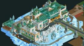
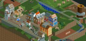
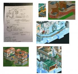
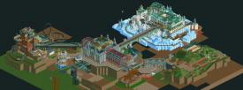
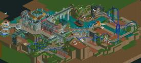

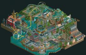
I think roy also made a few parts of the dive coaster but i'm too lazy to fix it.
Congratulations to Spacecrab! I personally liked our park more, but i mean, it's pretty obvious since i built so much on it.
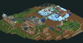
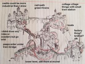
Originally, this park had a completely different layout:
The original idea behind the park was a crazy steampunk train/four seasons park. Because of all the crazy ideas involved in the park, the working title became "Magical Fantasy Train Fuck" - which you can still see in the palette name, since i never bothered changing it. Each season would have it's own island and it's own designation, and the transport between them would primarily be trains. I mean, Cocoa made waterfront archy, CC9 made a boat, so it's obvious the next thing would be Jappy building a train. He came up with the idea of the park and all the different islands.
Summer Island was going to be the main island, with lots of crazy art nouveau archy and a lot of entertainment for guests - such as restaurants and hotels. The big station in the center of the island was Jappy's idea, he really wanted to have a big central station as the main focus of the map, and it would be inspired by Antwerpen Centraal and it's curvy glass architecture. The island would also have a lower level for the "plebs" - this eventually became the slums area on the new map, and the lower level of the train station became the fair and all the buildings surrounding it (hotels, i guess).
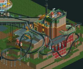
Autumn Island would be a factory with a crazy Baron 1898 inspired dive machine. As you can see from the screenshot it would become a very vertical building. I think Otter and roy mainly worked on this one, roy at least made the bridge leading to the island.
Winter Island was going to be a financial area. The goods from the factory could be sold here, for instance. Peeps could come here and trade with eachother. There would also be a stock market.
Spring Island would be a small English village, inspired by Staithes. Aaaaand then DKS happened. God damn you, Liam!
There were various other ideas that didn't make the cut on this iteration of the park layout. Jappy suggested each island create it's own produce, so the Autumn island would produce the weather. At some point there were going to be cloud machines and all sorts of other crazy things. I think the Spring island was supposed to produce trees and other foliage, there were going to be greenhouses and other farm-inspired buildings. The Winter island needed a few more things to make it interesting so there was a hot air balloon ride, and Jappy tried adding in a sleigh ride. There was also going to be spiral track for the trains, but this ended up not fitting in very well so it was cut. We did add spiral lifts to the dive coaster as a bit of a homage to the original concept.
The park layout was too much of a mess though. The Winter island had a lot of empty space where we couldn't really put anything, the Autumn island was too crammed, and we didn't have any real idea on what to do with the Spring island, especially since we couldn't do Staithes.
So... roy redid the park layout, i think together with Jappy. They let go of the four season idea and instead the layout was made much more compact, with all the different islands more close together in both distance and theme. Most of the original ideas found it's place into this layout, such as the factory, the train bridges, the slums, the financial winter castle, and the English village. And most of my original work was still kept on this map, which i was happy about.
At this point we had just over a month to finish the park, so there was a lot of pressure on everyone. Everyone wanted to take the park in their own direction (especially me, which caused some shit :r ), which lead to some interesting structures and things on the map. We didn't have time to work on the layout anymore, or focus on the theme or the creative direction of the park - we just had to build. All the concepts on the map were worked out a lot nicer in the first park layout, and since the only thing that was really kept from that is the main station area, that area ended up being up one of the stronger sides of the park. I can imagine why people think that half of the park is much better worked out than the other, since we were kind of in a hurry to work on the park, although i wouldn't say we had to rush any of it.
This is the park one week before it was finished. There was still a lot of work to be done on the park, village and castle area. We ended up scrapping some of the things that were there when the new layout was originally created in favor of some new additions, namely the fantasy buildings next to the castle and all the landscaping and foliage there. I took on a lot more work there but ultimately i think it paid off since it's one of the favourite things i built on this map. Also, notice how there's none of the frozen staff members and other things on the map, specifically the station area. Jappy added those in around this time to add more life on the park, and even though we had so little time left, he did a great job at bringing more life to the park, which it really needed.
I think in general, everyone did a great job at building things they're good at, even if that means the park is messy in a few places. Otter did a fantastic job at the buildings and the coaster in the factory area, and doing smaller things across the map. Roy worked on the mine coaster and i think he did very well at creating a coaster that sprawls through all the different park areas. Jappy's building style really worked well for steampunk/19th century style building and he did some awesome work on the village, the slums, and some of the buildings in the station area.
And then for me, i'm incredibly proud of the end result, i'm happy we finished it in the first place! This is the most substantial RCT work of me that's been released so far, and i'm very happy to see the comparisons to Robbie and Stoksy. Building on this park was a big learning process for me, and i think it taught me a lot about creating park layouts and detailed architecture. I got to work on a park that's really fit for my building style, as i've done this kinda stuff in the past, and i really ended up building something i'm proud of with the rest of the team.
A lot of thanks go to Jappy, roygbiv, ottersalad, G Force for giving me and the rest of the team the opportunity to build together on the park, and everyone else in the team for giving us feedback on the park.