Park / [H2H8 R3] Port Disney Hong Kong
-
 16-May 18
- Views 17,559
- Downloads 971
- Fans 0
- Comments 48
-
![Park_4108_[H2H8 R3] Port Disney Hong Kong](https://www.nedesigns.com/uploads/parks/4108/logot.png)
-
 70.50%(required: 70%)
 Gold
Gold

Fisch 75% G Force 75% geewhzz 75% Kumba 75% chorkiel 70% Cocoa 70% Poke 70% trav 70% Xeccah 70% bigshootergill 65% Faas 65% Liampie 65% 70.50% -
 Description
-strangelove
-
 No fans of this park
-
 Full-Size Map
-
 Download Park
971
-
 Objects
457
-
 Tags
Tags
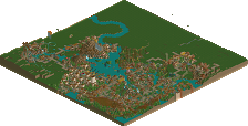
![Park_4108 [H2H8 R3] Port Disney Hong Kong](https://www.nedesigns.com/uploads/parks/4108/aerialm3852.png)
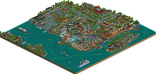
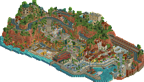
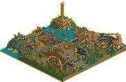
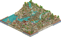
![park_4093 [H2H8 R2] Forgotten Mekong](https://www.nedesigns.com/uploads/parks/4093/aerialt3831.png)
We were gonna put you in the circus turtle, I can't remember if we forgot to or not though
Ha thanks Cocoa! I didn't look to see, sorry..
Surprise! Bet nobody guessed this one!
Oh.
Time for a bit of shipbuilding with CC9 (again; this really wasn't a surprise, was it?).
First off; yes - the slide goes through the stack. This is designed based off of the actual Disney Cruise Line ship, Disney Dream.
The funnels on these modern ships are only really limited to the smaller pipes running up them, so they like using them as a place to anchor things like water slides, zip lines, and other things beneath them. A lot of people mentioned that, so I thought it would be worth clarifying. It was a pretty unique task to fit the ship in a 3600 tile area while still managing to fit what Josh had planned up, but it was something we both really wanted to build and we were super excited about it. The end result (due to a shorter length) ended up being shorter in height than I originally planned.
Fun fact; I actually did calculations to make sure this would be as close to RCT scale as possible. The result wasn't a perfect shape, but I think it turned out well.
It's always fun to watch these ships come together. In my experience of building ships at this scale in RCT; they almost never look right until the decking is done. Something we really wanted to accomplish was a truly organic (if you can call it that; true to life may be a better word) shape for the ship - the Disney ships are very unique.
In the end, it's a hybrid of the Dream and the Magic; two rather different ships - but not outside the realm of possibility. Josh's direct access to reference images was a huge help. Maybe someday I'll build a totally perfect ship with full interiors; but that wasn't our goal this time around.
I was particularly proud of the lifeboats and that whole section of deck; it actually makes use of some perspective tricks! P.S. I was using your object saving tricks, Liam.
In the end, I knew the Icons were going to put out a tough park for us to beat - and I think they did. I anticipated a significantly closer vote than this. It brings me great joy to see people calling this one of the best ships they've seen in RCT - it was built piece by piece 100% by hand, and it was truly my goal to bring it to life as best I could.
Icons
It's a pity to lose but Scoop, Bill, RWE and V1, you guys sure may be proud on your work here. Never seen Frozen but I don't feel I need to when I view this park.
The archy in the villages is really good. It sets a good and fitting atmosphere. I also love the little boats everywhere and the boat entrance to Let it Go is genius (I'm stealing that idea). The village forms a perfect playground for the two big rides forming the huge background. I'm not really agreeing that the darkride and watercoaster are too big... mainly because it's a Disney park. I mean, they have built Expedition Everest! That's huge too! So imo it fits.
I really like the darkride, most of the times we see darkrides being built very small, I like this one takes the space it needs to have an amount of scenes that's closer to real darkrides than the usual RCT darkrides. I also like how extend the scenes are built. I also like the watercoaster and I do love the custom objects you made for this Bill! But I have a hand for weird looking objects (purple tree, orange tree, strange cars in TV...) so maybe I'm not so believable on this matter
There were a lot of fun details included. Pissing Mickey, the mountains of cash the gift shops create, HP stuff burning,... 80%
Strangelove
Well first thing noticing, you can't look around it... the boat! Wow... That is without any doubt the best boat NE has ever seen, and that will hard to beat. This thing is huge! Building this does need skill and also much patience. Respect. It is truly great on many levels and kudos for making the slides peepable and adding so much detail in it.
Looking beyond the boat, the village is quite good. I like the archy, it is clean and detailed however not too much. Jut enough to make it all work. My main issue with this park is the lack of movement... Tahendo Zoo also lacked coasters and rides, but had a certain atmopshere where it didn't need those. I feel this park does lack rides. I wish there were more in sight moving rides, it would elevate this park.
Congrats on the win Strangelove! You guys sure have a good park and it seems the makers really had fun with this. 80%
CC9, great freaking job on that boat! I went on a few Disney Cruises when I was younger (both on the Magic iirc) and your rendition was pretty much spot on; it made the nostalgia come flooding back. I didn't mention in my review, but I thought the lifeboats were masterfully done, those can't have been easy to pull off. Congrats on the win Strangelove!
Just wanted to say this was a fun park to build on. Although I didn't add much to the park in the end with just a couple shops, I did the best I could to follow the vision Josh gave for the park. I'm happy with how well CC9 and Josh collaborated and it was fun to see the project come together.. I think I echo their sentiment that regardless of if we won or not, the plan that was set was executed very well. Very happy people liked the Starbucks!
I can't quite speak for the Icons park and the vote disparity at all.. I thought the voting would be very tight. It was about time someone did a Frozen park, and even though I didn't see the movie, I easily followed what was going on in the park. Some of the criticisms of risking a park on a movie people haven't seen or don't like isn't an issue for me. What matters is making a good park which you guys definitely did. My only issue was the dark ride.. it was just too big! Great work on the castle Scoop, looked awesome. And The water coaster was great too.. the scene with the animated walls was definitely a wow moment.. definitely gave off an Expedition Everest vibe at first.
Like I said before, the goal for me was to build something fun that didn't fit the mold of a typical 'park'. I'm not a roller coaster purist, or feel like I belong to any sort of set style within this game. I've been toying around with the idea for a port, but never got it up and running. Obviously with me working for Disney Cruise Line (on the Disney Magic at the moment), I have access to unlimited reference images, and deck plans as needed. As luck would have it, G Force drafted CC9, who is a big boat nerd. Him and I immediately decided to pair up and work on a cruise ship park.
We thought about a few different scenarios and settings, but ultimately settled on an entertainment district - very similar to the Downtown Disney in Anaheim and Disney Springs in Orlando. Mostly because it would have been too difficult to fit a full scale ship and a full park onto a map, while still trying to get a believable port and terminal facility in between. Regarding the location, I wanted to base this in reality. With Disney having a few new resorts in east Asia, and the (unconfirmed) rumors of DCL announcing new Asian itineraries I'm the coming years when their 3 new ships arrive, I figured Asia would be the place to look. Tokyo was my first thought, but the location was too dense and didn't lend itself well to rct. Same with Shanghai. But Hong Kong on the other hand seemed perfect. Plenty of open land, an infrastructure grid of paths and walkways already in place, a straight waterfront, close proximity to the park, and the angle in Google Maps even lines up perfectly with rct.
I quickly decided that was where I wanted to put it, so I drew up this plan. Orange buildings for merchandise, Green for dining, Blue for entertainment, and Red for utility/service/hotel. Obviously I had to shave this plan down and condense a lot of it to be able to fit in game, but I feel like we made it work. The elevated walkways are meant to connect to the existing pathway promenade leading to the Disneyland Hong Kong park.
I wanted the hotel to be a much larger complex with multiple towers, parking, tennis courts, Mickey pool, etc but no space. Same with having to cut out the garages and road system. As I went on, I realized that this project would best be suited to a full map, but couldn't turn back.
I labeled everything on the map prior to building, and thankfully didn't have to change much from the original plan as the park progressed. The retail/dining/entertainment choices were made based on existing partnerships Disney has in place already, as well as what is already built in Disney Springs,etc. With the notable exception of the National Geographic store - which I wanted to build not only because it looks cool, but because Nat Geo is included in the massive 20th Century Fox purchase from last winter.
I mapped it out in game with land blocks, which was annoying to do but effective.
Here's a progress shot as construction was going on. As you can see, a lot of the retail shops were built first. Some I am happy with, some aren't as nice. But I felt like my quality of work improved as I continued building.
Regretfully, we weren't able to fulfill my original plan for the architecture style. I wanted to go very Art Nouveau for the marketplace retail area, but it just never happened. I based the main World of Disney Store on the one in Orlando. Instead of the Stitch character spitting water at guests, I decided to build Squirt from Finding Nemo. I wanted to get rid of the Sorcerers hat on the opposite side of the building, but never had time to replace it.
Here's a shot of the construction, as well as Otter's Lego building and his original idea for the RC car. I ended up rebuilding it so it would be small enough to be recognized as a LEGO sculpture - but the idea was entirely his. You can also see the ugly old Planet Hollywood building before I made it blue and replaced the globe.
As building progressed, I had a lot of fun adding little details in here and there. G Force and nin "leaking" in the bathroom stalls, Brian driving a forklift, Harambe gorilla animatronic in the Rainforest attraction, 'Frozen' street performer with a collection cup, kids splash fountain area, someone looking at a jellyfish tank in the Rainforest Cafe, a Disney Vacation Club kiosk and representative, wine bar, etc. Here's a couple fun ones.
During the construction process, I decided that I wanted to learn how to make custom objects. Turns out it's a lot easier than I thought - especially given my expertise in Photoshop and graphic design. First object I ever made was the glass tube waterslide. Didn't include the inclined piece because I didn't finish the other angles, but I might release it for you guys at some point. Would be useful for water parks! Also made a few curved objects for the ship, although I didn't have enough time in the end to finish them. Was able to make a custom ship officer peep and some custom text signs/logos though.
This version didn't make it sadly.
The aim with the palette initially was just to change a specific shade of purple so that the Sheriff entertainer would be wearing whiter clothes and look more like a ship officer. It worked, but we ended up switching it out later on. Decided to keep the blue for the water change and colors for the hotel/planet Hollywood restaurant though.
I based the park map design mostly on this one. Didn't have much time, but I think it serves the purpose.
Here is a breakdown of who did what.
I have a gif of it but it's too big of a file size for me to upload on ship Wi-Fi.
Overall, we are very proud of what we were able to build in the time given. We didn't expect to win at all, and are pleasantly surprised. I thought for sure my stubbornness not to include a rollercoaster in this map would be our downfall, but somehow we made it.
Cc9 was an incredible partner throughout this entire process, and we could not have built this without eachothers help. Otter contributed some fantastic ideas throughout (Lego RC car, Starbucks with the palm tree, Haagen Dasz, etc. G Force put up with my hard headed self and gave great feedback throughout. Cocoa also gave invaluable feedback (he's the reason I built the Star Wars tie fighter area). Maverix came in on the last week to make some additions to the hotel and little touch ups around the park. The rest of the Strangelovers also were great in their feedback and encouragement.
Thank you so much to the 3 of you who read this, I really appreciate it. Looking forward to stepping out of my comfort zone on the next one
Josh
These are two very weird parks for me to review, which is a large part of why it took me so long to review. Both parks had excellent pieces and details, but the parks as a whole didn't come together very well for me.
Arandelle
- I haven't seen Frozen in a long time so my memory is skewed, but I was initially surprised by how summary and warm the entrance area is. Still once I got over that personal issue I loved it, definitely the strongest area in the park to me. The architecture isn't overly detailed, and it comes together to make a nice lively village.
- The troll ride and the fixer upper ride, I liked this part, it was easy to recognize from the movie even for me.
- The castle is really good. At first I found it weird and squat, but I looked up a reference image from the movie and you got it exactly movie accurate, so well done.
- Frozen ever after. Not sure what the name of this ride type is, but it's always interesting to see new ride types tried out, and its also cool to see the movie's story told by interiors. I don't know if the risk quite paid off though, it's rather huge, and not the most aesthetically pleasing ride in the park.
- Let it go. This part was really hard for me to judge. There was a lot to like in this ride, the queue in the boat, the ending scene and loading platform were both great and felt pure Disney. The scene of her raising the castle was awesome, I thought I had seen it all with the ice overtaking the floor in Frozen ever after but this blew me away. However some of the object choices confused me, the yeti has been discussed already, and I wasn't sure why everything was flashing pink. My other big issue was it was hard to tell what was supposed to be interiors and what was supposed to be outside. I think enclosing the warehouses and allowing cutaway view to shine would have helped I think.
- The green rock walls also confused me.
- I think my two main issues with this park were the composition and the tone. Compositionally, the massive back overpowered the village in the front. Because the village was my favorite part of the park, I wasn't a fan on this. Also the contrasts between the green rocks, and the white ice walls was sharp and not a smooth transition for me.
- I also wasn't sure what this parks tone was it supposed to be, was it mocking frozen, serving as a tribute to Frozen, trying to be a disney park, or trying to satirize disney. It felt like it was all of these things at once, and it was a little confusing as a viewer.
- Overall this park had a lot of stuff I liked and stuff I didn't like it. I've definitely viewed it more than Port Disney Hong Kong, and it interests me more than PDKH, but the things that held this park back for me was just too much for me to vote for it. It's clear the builders had a lot of fun with it, and some of the object and ride names made me laugh a lot. Overall the high variance in this park makes it hard for me to rate, but if I had to give it a score I'd give it a high silver.
Port Disney Hong Kong
- Now this review will be influenced somewhat by the awesome summary posts that you guys made, as its clear that some of my critiques are things y'all are very aware of.
-Boat
- But seriously this thing is just so good. I've never been on a cruise but this seems just how I would expect it to be, I loved the slide, I loved the smokestacks, I just love this boat. It probably was the extra bit of quality that won this park my vote.
- I know you guys talked about how you decided against adding coasters or more rides, but I do think that hurt the park for me, this park could have used more to hold my attention.
- I think peepability of this park could have improved, a lot of areas like the bar by the water were almost completely devoid of life, and made for a less interesting viewing experience than it should have been. But while I'm talking about this area that National Geographic magazine is super cool.
- I also really like the tie advanced fighter.
- Some of the buildings are great. I loved the inside of cirque de soleil, and the inside of the rain forest ride is awesome. The spiderman mural is great too, though it took me a while to remember he's actually Disney now. Honestly the more buildings I look at the more I want to compliment, maybe not the wizard mickey hat though.
- However nothing about this park screams Hong Kong to me, the location does feel a little generic for what you were trying to do,.
- Overall it feels like I have a lot less to talk about on this park, which is probably true. This park probably held my attention a shorter amount of time, but what this park tried to do it did really well. It's hard to find too much fault with what is there, and what isn't there clearly didn't fit into your vision. That probably was a factor in my vote, while this type of realism and architecture heavy park isn't generally what I like, this park accomplished its goal better than Arandelle for me. I would probably also give this park a high silver rating also.
Although this seems to be have been regarded as one of the weaker matches, I think there’s a whole lot of really interesting stuff to look at between these two parks. I enjoyed them both.
Port Disney Hong Kong
This park really feels like a map where the ship was built and everybody looked at each other and said “huh, what else?”. That’s not to say the Disney Village area is bad by any means, but that ship is absolutely the star of the map. It’s easily one of if not the best ship I’ve ever seen in game. The details are just so nice—from the lifeboats to the stacks to the pathway inside the restaurant/mezzanine level to give it some movement. Interiors would have been super cool, but I think you’d maybe run into scale issues so I’m sort of glad you didn’t try that. As it stands, the thing is just so good. Well done for it.
Oddly the 2nd thing I noticed after the ship was the water. I really like the look of this blue—not just for the water, but also the glass. As I’ve said before, I’m a fan of custom colors and this one works really well. Looks good on the buildings too.
I like the semi-themed buildings of the Village which really pull a lot from Disney Springs and the others. You’ve covered a lot of the standard bits and I appreciate that you picked some things which can support rides or something more interesting than just scenic. The Void VR was a good call and that façade was great with the little details like the speeder, tie fighter, and BB8. The flume in rainforest café felt maybe a little forced, but I like the scene created with the giant mushroom out front. As it stands, though, this is really the only ride aside from the water slide on the ship (which is awesome especially with the clear tube).
While the portion of the hotel did turn out nicely, I almost wish that you had tried something else with some more movement or rides. Perhaps that miniature golf course could have had some more theming—though nice job on the custom holes there. It is very nice for what you did with it. In the end, you have a map that’s technically good and has some super nice areas (ship, Star Wars building, winery to name a few) that also ends up being a bit sparse. I appreciate that you’ve layered in some good details like the staff naming to increase view time. I don’t think a tracked ride like a coaster would have made a ton of sense from a theming standpoint, but I also felt myself wanting *something*.
Here are a few little things:
I love back of house equipment. This high reach is great.
I could really pick any part of the ship so I just did a slice down the middle. So many great details and layers here.
Spiderman and the Avengers logo are great.
This is set up very nicely. Not overdone, but tasteful theming.
RC is fantastic—as were all the little models in this park.
Another Toy Story reference with nice boxes too.
Love the detail on Disney’s Magical Express. Extra points for making it an access point for guests on the map.
I really enjoyed this restaurant theming.
I like that you have the lower area here with the raising stage.
The details around the Star Wars building is just fantastic. Some of the best stuff on the map.
I enjoyed the more unique approach for a realistic map. It is a cool idea and I would love to see what this would look like on a larger map without the space and time constraints of the contest. There were some really awesome details in here and I bet with a little more freedom and the ability to stack even more in there this could be a top tier concept.
Arendelle
There was a lot more dislike for this park than I thought was deserved. It’s unorthodox and rough in some areas, but I did like a fair amount of it. To start, I really like Frozen as a movie so off to a good start there. It’s one of my favorite Disney movies despite plot holes you can drive a truck through. I think the challenge the park ran into is that the map is over half dedicated to just 2 large rides. The scale may be a bit big for RCT, but I respect the detailed interiors. It may have been suited for a larger map rather than H2H however. But I’ll take this in two parts: These two rides and everything else.
The everything else had a bunch of nice architecture in it. It gets maybe a little repetitive, but I like the forms and I like the colors. The fountain show is probably unneeded or could have done with a bunch more infrastructure like the big sections of equipment of World of Color. I’d have almost rather seen this set up with some photo spot opportunities looking across the lake to the water coaster drop. It’s an incredibly nice vista with the ships on either side and would have been neat to see that utilized. The kids’ coaster has the first taste of these questionable objects that don’t seem to line up texturally with the rest of the things. I’m not sure how you’d convey it otherwise, though. Nice work on the meet and greet on the opposite side of the map.
There’s a lot going on with these two major rides. The plaza for the omnimover is excellent. I really enjoyed the castle façade. Inside the omnimover we again have some more of these pretty garish objects (sorry Bill!), but also some super cool stuff like the color changing floors. I’m surprised omnimovers really haven’t caught on more by now, but I’m happy you did one. It’s a shame the loading process is so long, but it can’t be helped. I love the details in the back, though I don’t understand why there are windows on the walls of the building. That doesn’t make much sense.
The water coaster is huge and has a ton of wasted space, but it’s a great use of those gorgeous boats and I think the track was done reasonably well. The ice castle didn’t get enough acclaim—that’s an excellent piece of massive architecture. Around the first lift I had trouble figuring out what was meant to be inside cutaway and what was meant for outdoors. The cliffs kind of threw me off initially, but they grew on my over time and I kind of like them now. You really don’t see massive rides like these in game anymore since they are a little bit out of scale, but I’m glad you guys gave it a shot.
Here are little things for Arendelle:
Boat storage area has some great detail.
Fantastic architecture for using only 1 color.
I like the frozen fountain.
I like the entrance hall for the ride especially the parts of the ceilings above.
The humor in this park was pretty enjoyable.
Aside from the trolls, I like the layout of this area.
The splashdown through the broken ship is very nice.
These objects were super cool.
Meet and greets! I like that you have guests queuing for this.
Great job on something a little off the wall. I feel like you might have sidelined some potential fans early on by picking an IP, but thankfully I happen to like this one. I appreciate the giant rides and some of the general craziness here. Nicely done.