Park / [H2H8 R3] Port Disney Hong Kong
-
 16-May 18
- Views 17,598
- Downloads 973
- Fans 0
- Comments 48
-
![Park_4108_[H2H8 R3] Port Disney Hong Kong](https://www.nedesigns.com/uploads/parks/4108/logot.png)
-
 70.50%(required: 70%)
 Gold
Gold

Fisch 75% G Force 75% geewhzz 75% Kumba 75% chorkiel 70% Cocoa 70% Poke 70% trav 70% Xeccah 70% bigshootergill 65% Faas 65% Liampie 65% 70.50% -
 Description
-strangelove
-
 No fans of this park
-
 Full-Size Map
-
 Download Park
973
-
 Objects
457
-
 Tags
Tags
![Park_4108 [H2H8 R3] Port Disney Hong Kong](https://www.nedesigns.com/uploads/parks/4108/aerialm3852.png)
![park_4161 [H2H8 Semifinals] Disney's Fairytale Kingdom](https://www.nedesigns.com/uploads/parks/4161/aerialt3928.png)
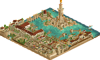
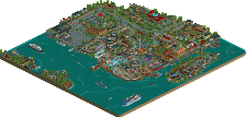
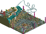
Port Disney was technically very well done ! It was a bit missing of soul at some parts but overall it was well executed. Some of the archi was a bit questionable though but nothing alarming. Boat was great and i know it's a recreation but I kinda wished it to surprise me more than it did, like integrating some rides and a roller coaster on it for example.
Really liked the log flume in the Rainforest café by the way.
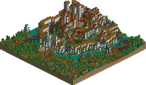
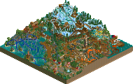
Arendelle gave me a warm and nostalgic feel, reminding me those old NE parks that uses awful custom scenery objects (sorry haha) like all the frozen animatronics for example. Also the whole ice land with the water roller coaster is so old fashioned but in a good way. Really appreciated this park overall and I thought the rides were good. Thank you for that !
Stating with Port Disney Hong Kong - yeah, the cruise ship is a home run. Really, really awesome work on that. I really love the work around it too from the dock to the bus dropping of passengers to the walkway onto the ship and the main building. The little curved top on the tower is a nice little touch. Delving into everything, it's actually a rather amazing park. What I like most is every building has its own identity and nothing was really built according to a paradigm in the construction. There are some real flashes of brilliance throughout this thing - the hotel is awesome, cirque building and the tension wires up top is so cool, the wood docks area, the turn of the flume at the front of rainforest cafe. Lots of really great stuff. My first impression was the park did look quite small, but I think on second look it's due to the little uptick in scale. I think this is fine though, as it allowed the buildings to reach their identity and stand out, so it worked for a park like this.
The one thing I wasn't quite getting was a connection to Hong Kong, or am I the only one who didn't really see it? To be honest, I think the name could've just been Port Disney. I don't know if the qualifier that it's in Hong Kong really benefitted, but it's also not really something that's a true negative for me. Partially, I think the simple Port Disney is punchier and gives it a bit more of an authoritative branding on the concept across RCT parks. But yeah, this is more of a me thought than anything. Great park, though of course, I feel that it could've used maybe a little more time to really continue to push the level and refine everything so it's all pure brilliance rather than feeling like a large collection of those flashes of brilliance.
Arendelle has a large amount of charm going for it. I think that's the best descriptor for the park. It's all rather cute and whimsical and most of it is really quaint. The front village areas of the park and the castle entrance to the dark ride were the best areas of the park for me. The backside with the dark ride and water coaster was relatively weaker, mostly from a macro parkmaking perspective. The issue really came down to the lack of fluidity in the park layout, particularly in the transitions. The two major rides are basically sitting in squares that are delineated from the rest. The transition to the icy mountainside was a straight line and even included right angles. Couple that with the dark ride going through large rectangular rooms with repeating wall scenery and it all became a lot a bit boxy. If that whole back section was more organic, the park would improve immensely. That said, it did give it a very old school nostalgic look as it really does remind me of some of the Vacation-park era parkmaking style.
The whole of the theming was rather good. I'm not sure how much it's intended to be a real life Disney area of a park or if this fits into the realm of, I don't know, like a fantasy realism? The theming was cool and to an extent felt quite Disney, but if it's intended to be realistic it could've used more focus on backstage work. Possibly closing in the roofs over the rides could've helped solidify here as well. But overall, I thought it was a really nice portrayal of the Frozen theme. The custom object work here was, well, interesting. There were a few that are actually useful objects, but most were only of use for this specific park, and wouldn't be useful for somebody making a Frozen park even. The objects used for some of the animation effects were cool, and I think the jarring character ones were ok for this park somehow. I do wish there was some more stuff that might've found uses outside the park, though. I get that time and stuff factor in here, however. But all in all, I did enjoy the charm of the park and the fun factor with the nostalgia thrown in.
Port Disney Hong Kong
There's not much Disney about it, or much Hong Kong even. Looks like a random port terminal entertainment district. Almost a convention kind of feel, with different companies and brands all with their own little spot. That's kinda the way I explored this park, moving from little building to little building. "Hey, it's another building! With a sign and a frozen staff member. Looks cool. Next!" Some nice designs here and there, like the Starbucks, the Avengers building (even though I hate Marvel) and the Toystore front. I also like the World of Disney building for some reason! I've opened the park a few times now but I'm still discovering some new details like the turtle on the aforementioned building. On the other side of the building there's a big blue blob that's probably a Disney thing too, but I can't decipher it. There's a big portion of the map dedicated to infrastructure. It's nicely done but in the context of H2H it's a bit disappointing. This map really needed rides... I would've cut the map off where the infrastructure started and added it elsewhere for a proper theme park ride. Shopping malls have coasters sometimes, why not a Disney entertainment district? A missed opportunity if you ask me. Now that I'm mentioning missed opportunities, why is the boardwalk area near the National Geographic building abandoned? Time issues? A shame because this could've been a very nice atmospheric spot. Moving on to something positive... the ship. FANTASTIC. The top half has interiors. Fantastic interiors. Love it. Actually, the real missed opportunity is that you built this entertainment district instead of focusing on the boat. Just the boat with FULL interiors (engine rooms and things included), that would've been truly next level. Some smaller things that I loved: Wouter setting up the band equipment, nin and G 'leaking', and for some reason the cherry picker.
The park as a whole is bit meh. Well done but not memorable. The boat is a standout moment this H2H so far. You're on a roll, Strangelove!
Arendelle
I fucking hate Disney. And this match is 100% Disney on paper. Fuck me. Whereas the Disney-level of Strangelove's park was very minimal, this park is more Disney than Disneyland itself. Disney everywhere. References everywhere. As soon as I made the link with Frozen, I knew I would not be a fan of this park. The front half of the park is nice, however. Very H2H6-Replacements-esque which is not a bad thing (but not necessarily a good thing either). The left side (with clocktower) looked better than the right side, but the right side had that nice area with the rides that the left side lacked. Both sides have a very pleasant atmospheric waterfront. Well done so far!
Then we get to the other half of the map... Which is absolutely hideous. It's way too tall, covered in awkward objects (that actually do work from some angles, must be said!), and it's pretty much impossible to figure out what's indoors and what's outdoors. What the hell is going on!? Both rides had some cool stuff. The water coaster had all the effects (minor WOW-moments for me), and the dark ride had the better interiors. Ice skating animatronics? Great. The backstage areas here were out of place, but made up for some of the park's flaws with the Mickey Mouse object (that's probably dethroning my Peeps Making Love object as most vulgar object in existence) and the dumpster fire. A shame the peeps were walking through the dark ride scenes as it was loading, I think you could've avoided this if you sunk the entrance two units so the peeps would be below the scenery.
Overall: the park has some great content but lacks direction to make all the different elements work. The end result is a little less than the sum of its parts, but you deserve all the credit for the parts that worked or were cool. Definitely not a bad park, there's plenty to love.
Great effort once again on both sides though. For me personally it’s a bit similar to how I felt about Replacements vs Ultra Realists: technically superiority park vs more heartfelt park
That said both obviously have moments of life and moments of great technical quality. I really did enjoy a lot of stuff on both maps!
Port Disney:
Very clean and well made map which regrettably was lacking in life. The lack of rides didn't help but then that didn't hurt Tahendo. The paths too wide perhaps or too many unbroken areas of clean texture? I'm not sure. You should've asked Cocoa he's good at these things. Anyway, I thought the archy was really strong and used the colour palette effectively. I enjoyed the art-deco / hollywood vibe. The boat! Wow, very impressive. As Liam said full interiors would've been nice if you'd made the park just the boat - however I'm thankful you didn't do them here.
Arendelle:
I also haven't seen the film but I also don't think that matters too much. There are still very fun details for me to enjoy for example the trucks behind the gift shop loaded with cash from this cash-cow film. When I'm looking at RCT though to enjoy the details I have to want to spend time on the map. With this I can't say it's the case. I did try. As others have already mentioned it's way too awkwardly laid-out, scaled and just ugly looking due to large expanses of certain colours or texture. The village is cute and well made but then the entrance(?) is squished up against the front of the map by an enormous stadium seating. I hope others like this park more than me, if you can enjoy all the great details whilst ignoring the bigger picture - good for you.
Here's my review:
Arendelle: As a lover of Frozen and having no shame about it, I was really looking forward to opening this park up. As far as the theme goes, you nailed it. So much of the movie poured into a small area, and it all is pretty clear to someone who's seen the movie. As far as the park's planning goes, I do agree with a lot of the above. The front half of the park is great and seems nicely well thought out, and then you get to the back half, which is dominated by enormous set pieces and the longest dark ride ever. It all works well from the movie's perspective, but not sure it's working as well from an RCT perspective. The ice area in particular is just really weird. One half is ice-colored LOTR rocks, and then landscaping/1k rocks on the other side with no LOTR rocks in sight. A little more integration would've gone a long way here. My other main love/problem with this park is the objects. While it's so awesome that they're the Frozen characters plucked right from the movie, the art style reminds me of WW/TT in the worst way. Sadly, they never blend in, making them look perpetually out of place all over the park. I did get a ton of laughs in at the object names though.
Port Disney Hong Kong: DAT BOAT HOLY SHIT! Best boat in RCT, hands down. So detailed, so realistic. I'm sure you guys did your research regarding dimensions, but it does look a little tall compared to the length and width. That's a minor nitpick though. My only major issue with it is that you seemed to have started but not finished the interiors. That would've taken this to the next level for me, and made my vote a lot easier for sure. Now, the remainder of the map. I didn't have any issues with anything, it just didn't excite me. Looked like a blend of a few different realism releases we've seen over the years. It was also dead in some places, like the dark brown path area. Where are the peeps? Why are the restaurants empty? merzbow and I are playing to an empty bar.... I know I'm not great at sax, but I'm not THAT terrible. The other major issue I have with the non-boat portion is that if I didn't know this was in Hong Kong based on the name, I would have no idea of this based on the map.
I'm still really unsure how to vote on this one. Arendelle has all these great references and has some cool execution, but the objects give me nightmares of my WW/TT days. Port Disney on the other hand has an amazing ship and then a 'meh' port around it.
I voted for Hong Kong. Does it look like Hong Kong? I don’t think so. Never been. Do I care? Not really. Does it remind me of my childhood, growing up on the old Downtown Disney and take me into nostalgia overload? You betcha. It nabbed my vote. It’s not the most atmospheric or beautiful thing, but the boat is ace. And it’s fun (Rusty leaking forcefully, Jesus come take me I’ve passed on).
Arendelle...well, it’s a park I guess (maybe not?). It was interesting. It was also ugly. I’ve never seen so much custom signage (I wonder who the fuck built this, huh). I just couldn’t get behind it. Some of the stuff in the village was cool, and the ice castle, but overall it didn’t come together for me. Nice work on the omnimover though (even if it was covered in gruesome scenery objects). Keep trying, Icons.
All right. Another one in the bank. Fuck, I need to go to the bank. I need to take out $250. It closes at 1PM though and that’s in like twenty minutes. I don’t think I’m gonna make it. The ATM only does $20’s too so I’m gonna need to do $260. Stupid. This is fucking 2018. Why can’t I have smaller fucking bills. I can handle them. My wallet is capable. Anyway.
Ok, my vote justification:
Port Disney is a nice park, that has its strengths more in the little details. The fact that you didn't have any real rides besides the flume wouldn't really bother me as long as there is other cool stuff to look at and also take a park lifeful, as moving rides normally are a thing that add to the life in a park a lot. However in this park, things to compensate for this were a little missing. Most of the area of the park were shops. They were built nicely but it couldn't help me to have a mostly clinical feel throughout the park. In direction of the ships things were getting a bit better with all the business going on to load the ship. I especially liked how the peeps entered the park through the bus on the parking lot in an endless stream of outcoming peeps. Cool idea! On the cruise ship itself I had mixed feelings. On the one hand its quite cool, but on the other hand I don't get all the praise it's getting. To me it was proportionally a little off. The ratio width/length didn't work for me. I think maybe one or two tiles wider would have worked better. And then what disturbed me most on the ship was the huge front part of it. Afterwards I googled some images of cruise ships and I think here with the front you unfortunately missed the form of them! The front is stretching out way to much and becoming narrower too slow. It doesn't fit with the rest of the ship. Another thing are interiors. And I'm not speaking of cut away view total interiors. I mean the part that you can see through the windows from the outside. You put some benches and tables, but behind that there is just plain floor. Taking here an effort and do the visbible parts can add a lot more dimension for the viewer. To top of the ship with the little swimmingpool was cool. I was a little surprised about the slide starting off from out of the chimney. That's not what chimneys are for I thought! Also the transparent tube object is very cool and done absolutely perfectly! Good job on that.
So leaving the ship behind, let's focus on what the park has more to offer. I mean it's undeniable, that the huge cruise ship is the inteded focus of the park, but still there are some cool parts in the park still. For example the minigolf was quite cool. I appreciate the effort of doing custom holes. Although I think they weren't really that creative. Most of the time you just had the normal straight hole or around the corner thing. I wished, when you would be doing some custom thing, that there were atleast some cool and fresh obstacles! Also I didn't quite like how the minigolf was lowered in the ground there. The hotel next to it was quite cool. Architecturally wise it was well done. And see what? There are some "rides"! The elevator and also the monorail brought at least some life into this corner. The roof terrasse was also well done, I liked the fresh blops of green over here. The viewable interiors were again a little lifeless and uninspired. I know how difficult it is to do avoid that.
Other parts I liked were the Mos Eisley area, very nice BB-8 and R2D2 statues! Also the invisble slide for making a mountable TIE-fighter was a very clever idea, kudos for whoever came up with that. I think the area I liked most in the park was the little harbour area just behind the stage with the very nice wine bar. What lacked here most apparently though was the fact that there were no peeps at all. Why didn't you build the paths until here? It was so cool looking but then it also was very dead.
I think this is in total the main point where this park suffers. I mentioned it above already. It's very clinical and lifeless, in some parts even dead. I don't really know how you could have avoided it with the concept you have now. Maybe some more rides would have done it. Maybe breaking up the path patterns with planters, little street artist, stalls. So technical a good park again, like we have seen all other parks this H2H, but with a huge lack of charm. Also for me the main attraction, the cruise ship doesn't find its role in the park totally. Is it supposed to be the main focal point? Then there is too little to look at. Is it not? Then it is due to its size too prominent on the map.
Now to Arendelle. And I am very sorry to the creators of the park, but I couldn't appreciate the park at all. Firstly I haven't seen the movie so all the references to it get lost on me and I reckon nearly all of the park is just built on them. But that is always the risk you take when making a franchise park. Most of the time you lose some people who don't get it, but on the other side you always win some others which maybe share your vision for the idea. Secondly when viewing the park all the ugly objects cut from the movie really made it a hard time for me looking at the details etc. it's connected with the first point I guess. Maybe when you recognize the scenes from the movie you maybe forgive the total crappyness of the objects. But I don't and man Coasterbill! I think you can better It didn't really add anything, and the park was just filled with them. In fact they really took from the park. But ok, that's enough for bashing the optics on the small scale.
I also had my problems with the large scale of the stuff in the park though. The water/ice ride was just huge. It took away all the scale from the village just below! I guess the ride is supposed to be in some kind of hall and think of it how really big it would be. It just didn't fit with the rest of the park. Even the queue line was enormously huge! I also agree with what Liam said that it's very hard to tell what's outside and what's inside. Next the other huge ride that goes through all the halls/rooms. This ride wasn't also very well done. What me disturbed most wasn't even that I didn't get all the stuff (again..) but that it all was just a pure giant flat house. No elevation changes at all and the walls at the same height thoughout. It was very monotonous. Actually here the object with the freezing ground was quite cool. I like the visualization of how the floor freezed, it was a nice effect.
The better parts of the park were the two villages on both sides of the lake. The reindeer tour was a nice idea. However in the end even these two parts didn't really leave too much to remember for me. Sure there was that shop with the cash being transported away. A funny joke but it's nothing to really put forward a park I'd say.
I hope I could make clear, why I couldn't really get into the park.
So in the end I went with Port Disney, which isn't either going to be my favourite park but in this matchup for me it was clearly the better one inspite of the clear drawbacks it has.
nice boat, but that's about it. for a park so heavily set on being placed in a realistic setting, it felt incredibly fake and unrealistically planned/built.
-----------------------------------------
crappy objects and ugly rct. god, this is h2h, no fun allowed, all gold all the time.
-----------------------------------------
58 votes to 29 posts. good job NE
Voting Closed

Strangelove beats The Icons!
Strangelove vote count: 47 (78.33%)
The Icons vote count: 13 (21.66%)
Port Disney Hong Kong was made by In:Cities (55%), CoasterCreator9 (40%), ottersalad (4%), and Maverix (1%).
Arendelle was made by Coasterbill (45%), Scoop (45%), RWE (9%), and Version1 (1%).
Even if it weren't for the objects and the signs, Arendelle was definitely a Bill park. I thought the second builder was recurious though.
Looking forward to seeing dot maps or anything like that for both these parks.
Congratulations on making the playoffs, Strangelove. I don't think you can miss those now.
Will post a follow up soon.
Thankful to those of you who enjoyed our park. We knew going into this that our park wouldn't be well received by the community - especially not for a H2H round. But somehow we pulled it off and are shocked to have won another round.
Basically cc9 just really wanted to build a huge boat, and I just wanted to build something out of the norm to upset people. We both are very laid back personalities, and didn't have a single clash or major disagreement throughout. Couldn't have done it without eachother, that's for sure. Otter was hugely helpful as always, and Mav wanted to get that 1% haha. G Force and Cocoa gave valuable feedback throughout the entire process, and this park would have been much worse without their insight.
I thought for sure we would take the loss in this round due to my hardheadedness of not wanting to include a rollercoaster. Do you know how difficult it is to do that while on a team with G Force and partnered with someone who's name is literally coastercreator?
Sure, there's a lot I wish we could have done differently had we had the luxury of time and space. But we're immensely proud of what we were able to accomplish in this game, and would have been happy with ourselves regardless of the match outcome.
Icons - I owe you guys a more thorough review. I thought for sure you guys had us beat. Scoop, that is easily the best work I've seen you put out dude.
Also worth noting, I'm not much of 'boat guy'like cc9 is, or how Jappy is with trains. I just work on one and have access to the deck plans and source material lol.
Thank you to all. It's been a really fun season so far.
I placed some flags
So here is the dot map.
Blue: Scoop
Red: Coasterbill
Yellow: RWE
Purple: V1
I HAAAAAAAAAAAAATE frozen. With a passion. Although I didn't name any of the objects or rides that was all bill. I did most of the architecture including the two larger structures. I was extremely proud of both the Arendelle castle and ice palace. It was something that was outside of my comfort zone, but I have found a knack for copying architecture from outside sources. Whether that's actually true or not is up to everyone else, but that's what I think. At first I was very against this park, somewhat because of the objects, but also more so because of frozen. Once I started building though I absolutely loved it. It also kind of helped me love Disney again. I also did a few of the smaller ideas like the frozen fountain in the village and the reindeer tours. I don't know how many people noticed but the people holding bunches of balloons are invisible huts as well. It looks really cool if you happen to catch it. I am really happy to have worked with bill on this and I think we have become pretty good friends after this season. Cheers to you bill. RWE built the orange building next to the exit of let it go. v1 place a few flags.
As far as the opposing park. I'm honestly surprised that the match wasn't closer. I was not surprised that we lost however, because port Disney was great. The boat was amazing and i don't know if we will ever see another boat that great for a good while. The forms of some of the architecture were really well done as well. There were a few really great small ideas as well. Like the CANNON BALLS AS GRAPES!!!!! Holy shit that was great!
I was a little bit disappointing by the reception of the park however. I thought that this was much more deserving of a bit more praise than it got, and really that could go for this match period. I think being the third round and halfway point may have something to do with this as builders are starting to burnout maybe? I do understand and agree with most of the criticism that the park received.
Anyways, Congrats Strangelove for most likely securing your spot for semis and hopefully we will see you guys there.
very impressive from you scoop, all that archy is a big improvement for you I'd say. fuller review later
hilarious that itm called the builders hating frozen. why did you do that then?
Icons built a disney princess park without trav. Possibly my biggest surprise in terms of builders this season.
LOVED the Disney Port park. Having spent a fair amount of time around Disney and especially Orlando, with the Cirque du Soleil show, that area was really special to me. I was amazed that each building had it's own identity, without getting boring. And the ship is, obviously, incredible. The scale is ridiculous, I really appreciate that you went so big with it.
The Frozen park was nice, the entrance area and front of the park was pretty strong. I'll be honest i've only ever seen it once, so i'm probably not the target audience, but the rest felt really cramped and messy... Really hard to work out what's going on. Creating all those objects must had been a chore, though, props for that.