Park / District 4
-
 23-June 18
- Views 2,820
- Downloads 675
- Fans 0
- Comments 12
-

-
 52.50%(required: 50%)
 Bronze

CoasterCreator9 60% Dr_Dude 55% Faas 55% G Force 55% Jaguar 55% Poke 55% Cocoa 50% csw 50% Liampie 50% posix 50% RWE 50% Sulakke 50% 52.50% -
 Description
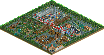
This is a park that I made for Roller Coasters & Friends' Narrow Challenge. The main rules are that each coaster should be 4 tiles wide, and that also includes the entrance and the exit as well as the queue line.
This was one of my favorite challenges.
I hope you like it! :D -
 No fans of this park
-
 Download Park
675
-
 Objects
1
-
 Tags
Tags
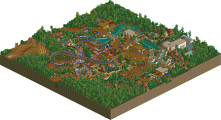
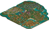
Damn, your NCSO is amazing in this park. What I love most in this park is the loopings interlocking in the center. I like the overall layout of the park, even though it's mostly a square. A park that's really pleasing to look at, despite the restrictions to the layout of your coasters.
I've always liked compact designs, since they are a little more abstracted to work with, and the designs here are very nice. In particular I love the interlocking loops of the wooden coaster and the Steel Twister, but my favorite coaster was actually by far the wooden wild mine coaster just near the front of the park.
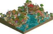
There was also some attractive scenery work, with the mega cinema being a blast to look at. Nice work!
This is good, but two 80% votes? Wow....
Nice job on this Supra, especially given the restrictions of the competition. I think you could've done more with the composition, in that everything is built on islands in a sea of path, and everything is on a grid. This made sense for the travelling fair (i assume) area in the one corner, but not so much for the others. The mountain area was the most well done in this regard, wish the other two were like it.
The archy was decent, the supports for the B&M were awesome, and the rides are pretty good given this 4-tile restriction.
Neat NCSO work. the 4 wide rides is an interesting restriction for sure. I think the steel coaster and the dueling mine car coasters are the better layouts. I do like the theming to the mine carts especially. The monster truck and ghost train rides were quite well done too. Just wasn't a big fan of the water coaster... looked undersupported, but thats mostly due to the base game's supports. Also, the fairground area is a little wonky in terms of scaling. Cool park all around!
All of the individual elements here are pretty good. Good archy, especially the wooden wild mouse entrance structure and those more modern buildings. The layouts were pretty solid given the constraints, and I like the interacting loops (but wish they could be timed to interact!) I think the whole park though suffers from the fact that every element is sort of its own island in the middle of path. Its a real shame coz it sucks any of the atmosphere out of the park and makes it feel much more rookie than it has any right to be, because you're pretty decent at this. I don't think thats a result of the contest limitations, you could easily work in narrow coasters in more organic park settings. working on that flow- having paths that move in curves/diagonals, breaking up spaces with foliage and planters, elevation changes, having blocks of scenery or rides to direct sight-lines- thats all really important for parks.
Aside from the things already been said...this had a pretty neat Coney Island kind of vibe. Both old school Coney and some of the new stuff they've been putting in. Shame about the huge amounts of path though; a bit less of that as Cocoa mentioned above would have helped the park elements work together a little more.
This is a pretty nice park, but I completely agree with Cocoa: the biggest holdback for this were the straight concrete paths. The paths were not flowing at all and didn't feel natural. Every ride was surrounded with a square of path. I hope you'll work on that. The architecture and rides themselves were pretty good, though. I especially like the mine train, the buildings around the cinema and the circus tent.
I think cocoa made a nice review over here that i totally agree with. I think looking at the constraints you had you did a solid job especially looking at the individual elements, but i'm not really sure how they work together as a park. The way how everything is composed and the path is designed is just too unnatural and simple and not organic enough. But if you work on this stuff, i still see a lot of potential in you and i think your work will definitely be a lot improved if you would change these things a little, cause the individual stuff you're building is definitely great. I knew your NCSO-style archy is quite good, but i didn't knew up to this that you're also quite good at ride design, which to conclude resulted to me thinking this is definitely accolade worthy and i think bronze is fitting here. Keep it up!
Edit: Looks like i was the last vote over here, congrats on bronze!
congrats on the bronze supra!
Congrats on the bronze!
This is really interesting. I sort of understand how the logical extension of the contest constraints end up giving you something that feels as sectioned-off as this does, and I admire what you've done with the space. The interlocking loops are a real highlight and both main coaster layouts are actually really solid. Also, doing those custom supports as full trackitecture? In RCT2?! Insane, but awesome. Congrats on the accolade.
Awesome, this got an accolade! Congrats dude.