Park / Maze Palace
-
 23-June 18
- Views 1,939
- Downloads 697
- Fans 2
- Comments 14
-
-
 52.50%(required: 65%)
 Design Submission

Camcorder22 60% CoasterCreator9 60% G Force 55% Jaguar 55% posix 55% Cocoa 50% Faas 50% inthemanual 50% Liampie 50% Sulakke 50% WhosLeon 50% Poke 45% 52.50% -
 Description
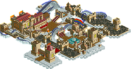
This is a park that I've made a while ago in the server Roller Coasters & Friends for the Maze Challenge. As you can see, the main focus is on the mazes, but the wooden roller coaster still takes a big place on the map.
I hope you like it. :D -
2 fans
 Fans of this park
-
 Download Park
697
-
 Objects
1
-
 Tags
Tags
![park_3128 [MM2014 R1] Earl Grey](https://www.nedesigns.com/uploads/parks/3128/aerialt2770.png)
![park_2401 [H2H6] R3 - Hurricanes - Avatar](https://www.nedesigns.com/uploads/parks/2401/aerialt2145.png)
I just love the supports of that woodie, and the castles also look really good. Wish you had chosen a different path type though, as it looks kinda weird with the railings in between everywhere. I would call this park a-maze-ing but I won't because that would be a lame pun. Good stuff!
its good, but it isn't great. The archy was nice, I've seen it before in your TP stuff so I wasn't very impressed by it, but I do rather like it. The station was lovely, and the rainbow was sufficiently gay so I approve.
The mazes themselves were ok, they didn't stand out much and didn't feel like the focus of the park, it felt more like a woody design I guess...? The archy around the mazes wasn't as good as the woody station, so it wasn't as eye-grabbing. I also wasn't a fan of how the loop interlocked with the maze like that, its just too much clipping for my liking. I also wasn't a fan of the woody layout much, it wasn't bad though, just... meh.
I loved how you did the clouds and the coaster supports, and the theme was cute and I enjoyed it. I rated it 55%, I think it definitely deserves to get a bronze and I hope the panel gives it at least a 50%, but it isn't particularly special.
Very cool castles.. just curious why theres a gap near the roof of the main castle building that houses the coaster station? Otherwise this is a really cool concept. The mazes are well done and so are the coaster supports as deurklink and shnupz pointed out!
bold move to not just import some actual blacktiles
not bad! i think the layout was maybe just a bit square and normal for such a fantasy park. the coaster building was definitely the highlight, I really liked the massive windows. I also liked the building on the right of the entrance where theres a second layer of clouds separating it, that sort of layering helps add depth and believability to the sort of floating shit.
seems to a resurgance of maze stuff?
Fun little NCSO park! Always fun to see what you're up to. I agree with Deurklink about how you handled the coaster supports, very clean. I am also a big fan of mazes, their creative potential is far from fully used on this site.
The buildings are nice and seem to fit the context but are kinda plain and boxy although I admit that's not very easy to fix with NCSO without resorting to trackitecture that looks messy very fast.
The layering was very effective and made sure I didn't get bored to fast watching this. Good job!
Love it...so so much.
Don't have much to say other than what others have said, so I'll just say good job!
Lol
I would have just used something else than the brick texture for the maze personally.
A-maze-ing park.
Worthy of bronze imo. Good use of objects and minimalism. I would have gone for a different coaster type though.
I voted 50%. Hope you'll get your final score soon...
This was quite nice. I really like the interaction between the coaster and the maze. The architecture is pretty good too, especially the coaster station castle.
Shame you submitted this as a design. The coaster is not good enough to win a design. The concept, however, is pretty cool and origional and could have won a bronze, I think.
I asked a few friends if I should release it as a Design or a Spotlight because I was not sure about it, and they suggested me Design, so I went with it. But looking at the comments, I should definitively have gone with Spotlight, and I totally agree that the coaster is not enough of a focus, or as you say, good enough to be a Design.