Park / [H2H8 R3] E.V.I.L.
-
 13-May 18
- Views 32,970
- Downloads 790
- Fans 4
- Comments 157
-
![Park_4103_[H2H8 R3] E.V.I.L.](https://www.nedesigns.com/uploads/parks/4103/logot.png)
-
 79.50%(required: 70%)
 Gold
Gold

Cocoa 85% Fisch 85% Xeccah 85% bigshootergill 80% chorkiel 80% G Force 80% Liampie 80% posix 80% CoasterCreator9 75% Faas 75% Poke 75% geewhzz 65% 79.50% -
 Description
Eccentric Villain's Insidious Lair
-
4 fans
 Fans of this park
-
 Full-Size Map
-
 Download Park
790
-
 Tags
Tags
![Park_4103 [H2H8 R3] E.V.I.L.](https://www.nedesigns.com/uploads/parks/4103/aerialm3847.png)

![park_4122 [H2H8 R4] Park Guell](https://www.nedesigns.com/uploads/parks/4122/aerialt3861.png)
![park_4133 [H2H8 R5] Mandala](https://www.nedesigns.com/uploads/parks/4133/aerialt3932.png)

![park_4074 [H2H8 R1] Wit's End](https://www.nedesigns.com/uploads/parks/4074/aerialt3814.png)

I never thought I'd see Castles n Coasters as a RCT2 park, let alone during H2H. Out of the maybe seven or eight parks that I've been to in my lifetime, this is the third one that has been recreated in some form as an H2H park.
For those who are complaining about CnC being too crammed, you're missing the whole point of recreating this particular park; the real version is already crammed, which makes for some lovely ride interaction, and the art of building it is packing it all together so that it fits perfectly. This one captures the general atmosphere and idea of the park without being a full-on recreation (which in this case was the right choice, since the real Castles n Coasters isn't exactly high-budget and definitely couldn't afford a GCI).
The attention to detail on CnC is unprecedented, especially within the arcade. Even the floor plan, with that odd lower middle section, was executed beautifully (though when I was there in 2006, that "crater" section held air hockey tables). Let's not overlook the presence of a working bowling alley. I haven't seen a more detailed realism park, and this one I could seriously look at all day. By far my favorite H2H park and probably my favorite RCT2 park that exists anywhere.
EVIL is good too.
Castles-n-Coasters
Again The Replacements with a realistic highly well executed park. What was there was very pleasing to look at. You've got lots of details hidden, especially with the inside view of the main building there's a lot of stuff going on. In general shape, the park feels quite small, it's because of its rather narrowness and the fact it is divided into two halfs by the coaster and the gokart track under it. I think the gokarts takes a too big portion of the park. Too much concrete in comparison to the path width for example, the scale is a bit off of it. The coaster there was ok, nothing special, I really liked the color accentuations on the supports. The look cool. The wooden coaster was better. Especially the support work was very nicely done and impressive. I also liked the minigolf set into that corner over there and how you incorporated the standard MT-objects into the theming of it. All the custom flat rides throughout the park were executed well. I especially liked the music express. although I missed a bit the inclination the ride normally has (I see though, that it's hard to do this in RCT).
Coming back to the interiors of the entrance building, there were maybe my favourite bits. I mean the bowling is just so clever, how lucky you are HG came up with the ball ride last week Also the laser tag hall was cool.
The outskirts of the park were also nicely done, the fast food restaurant was nice, but also nothing special, gas station the same, I liked the car wash. However, what it missed was life. Atm the surrounding is purely dead. We've seen already that you can that avoid nowadays.
My biggest concern with the park is that it's just purely generic stuff. Generic stuff extensively well done but I feel like I've seen this all before. The archy is the standard: lower level archways, upper level walls with windows, top some railing, black roof and air conditioning. It's always the same formula and it doesn't excite me anymore. I mean, I can still appreciate the very high technical level, but it doesn't wow me anymore. I'm missing the bits where I think "Well that's clever." There are some parts falling where you have this, like the minigolf or the bowling. But on the greater picture these were in the minority when viewing the park.
E.V.I.L.
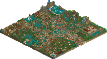
Now this park in comparison is exactly the one that goes into the opposite direction. It's unconventional and that's what makes it good. The overall archy is great. So fresh, well done and cool looking. Immediately reminded me of Christoph Waltz' base in the last James Bond (was it the last?). It's recognizable and does exactly what it is supposed to be: set the scene of the park. Next the pool area. I think the lift hill part coming out of the pool is my favourite thing in the whole park. It looks great, you understand it and the idea is funny. The coaster was ok, maybe the last corkscrew was a little.. strange? The green coaster I didn't like too much. I don't know the different parts were a little short on their own and somewhat unconnected. I liked how the train was running with the speed of the cogwheels into the fire though. The whole chemical plant looked convincing. Maybe one or two more details in terms of control panels or such would have added more. Other than that the vats and tanks were cool and wel executed, like the clear water on the right going through the machinery to end up as acid in the vat. Next to the "green"house. I liked the planting boxes in the entrance hall, the rest was rather generic "crazy foliage" but it fitted into the theme! Especially with the coaster breaking out and contamining he surrounding foliage. What did disturb me a little was that the monorail was running so freaking fast
The general landscaping didn't disturb me. Actually I liked that you sticked to only the LOTR rocks, as normally a mixture of these objects and normal RCT rockwork don't quite fit well together. So good call on that. I also like how you encoporated first the mesa village architecture into the rocks and then secondly the villain lair stuff like the missile stations into the village. It's totally believable. On top of that the missiles are looking really badass, great job. I must say, the golf scene I don't understand either for a golf hole it is quite small anyway isn't it? However the detail Cocoa already posted it just pure gold.
So this park runs on the formula less is more. You focus on the details, present them in the best way possible and let the viewer's imagination do the rest. And that is what makes this park so great. And I didn't even mention all of the details and little scenes, there are quite a few more that are actually even cooler than the ones I did mention (the helicopter for example).
In the end it's clear why I went with EVIL I think. C'n'C, while technically exceptionally well done doesn't reach the cleverness of EVIL in terms of ideas and depth. And additionally EVIL's execution is in no way inferior to the one of its competitor.
Interesting enough, I was expecting this to be a runaway when I first saw the parks. They're both excellent, but I enjoyed C&C far more.
I'll do a proper review soon, especially once I can go back to Evil and see if I can understand what everyone else is seeing.
Exciting to see it as close as it is, however. Good luck to both teams!
Yes.
EVIL is my favourite by quite a bit actually, great park
+ I love the architecture style. Bold choice for h2h,but it works so well in this setting in my opinion.
+ shark tank. The drop ride into it is clever and we'll done.
+ park works very well on a macro level. Maybe not so much when zoomed all the way out, but I love how it gave plenty of room to "breathe".
+ torture device was well done.
+ I like the laser room idea. Might have worked better with thinner objects though.
+ factory interior is sweet. Love the coaster and path interaction.
+ love the monorail pods. Reminds me of incredibles.
+toxic garden was a cool splash of color.
+concept for the coaster lift is very well done. So great.
- not a fan of the coaster layout. As others said, it's a bit too dominating.
- personal pet peeve - unnamed handymen. It's almost standard in h2h these days. But not a deal-breaker by any means.
- wish the rocket sculpture was bigger!
- new cacti looks like churros
Overall an amazing park and beautifully done. I don't think it was under detailed, rather just the right amount of detail.
75% for me.
Castles ñ Coasters
+ details details details. Holy tits there is so much detail.
+ custom rides are very well done. Particularly love the skycoaster with the water around the load platform.
+ The entrance to Adventure Golf is fantastic.
+ Chevron station looks very believable. Love the choice of the peach roofs.
+ I like how the park edge is bordered with the street. It's not smashed up against the map edge and adds context that I really enjoy. Gives an otherwise cramped park some breathing room.
+ custom support work on the GCI is amazing. Actually that entire layout is amazing. I'm not a coaster diehard like some, but it's easily one of my favorites. The on ride photo is great.
+ I love multi-use buildings, and the carousel is phenomenal. Very believable.
+ interiors were very well done. I love the custom ugly carpet texture.
- In & Out? Wish it was a Five Guys.
Id give this park a solid 85%
Honestly having trouble finding too much wrong with this park. It's executed very very well, and I think the only flaws that I would consider are due to the map size restrictions and the density - both of which aren't a huge issue given the limitations of this contest.
I really hate not being able to give my vote to the Ultra Realists, but I'm going to have to vote Replacements in their quest for (mostly) clean American realism.
Well done to both teams.
Josh
Evil, no question. Too much realism for me in the other park. Of course it was great, both are, but Evil adds an aesthetic value that we haven't seen in RCT2 in a way too long while, and looks and atmosphere are far more important to me than anything else.
This looks to be the first real nail biter match.
I don't even see how this is close, Castles-N-Coasters is simply incredible. The details are mind blowing and it is just an all around fun and amazing park, one of the best of the season so far. That's not to say Evil isn't good as it is a unique, fun park that I enjoyed viewing, but in comparison to CNC it is no contest for me.
Not voting, this was definitely too hard to vote on. I could make equally strong cases for both parks in my mind and it'd be unfair to vote for one over the over at that point. Both achieved their respective visions much too perfectly, hope to give a review eventually.
That, and I think votes count a lot at this stage and people who have stronger opinions for one over the other might be better suited to vote responsibly.
Time is up on the poll. It says 36-33, Replacements win. However, -our vote from Jag +our vote from Fred and +us/-them for the shnupz misvote vote = 35-34 being the final vote then them winning by 1.
Not going into detail here, but at least one of the votes for the Replacements is very suspect.
I suggest another vote to decide this match. Could be NE Awards style with privet voting or it could be public votes in a new topic which was done in H2H3, so there's precedence. I know people will argue that rules are rule, but last season's change to a 3-way final is precedence that any change can be made if deemed that it's in the best interest of the contest.
We could make changes to the format if it's in the contest's best interests. In which case we wouldn't go ahead and just do it, but also talk with the involved teams first. We would not make changes because you don't like the outcome of a match. That's not the contest's interest.
Close matches are tragic, but think about this: it's much better to lose with 49% than with 20%. Your percentage is going up and that's going to help you in the last two matches.
Will close this match in a bit but want to get breakfast first. Last moments to get your votes in, everyone!
I dislike this outcome because of all the late scrambling each team did to get votes. I really think we need to hide the votes in the future.
I agree
I disagree. Public voting keeps people honest, and keeps the playing field even. Private voting would have let 4 of this year's captains know all the scores, and keep the other 2 in the dark, which also doesn't seem fair.
Voting Closed

The Replacements beat Ultra Realists!
The Replacements vote count: 35 (50.72%)
Ultra Realists vote count: 34 (49.28%)
Castles-n-Coasters was made by Pacificoaster (95%) and djbrcase1234 (5%).
E.V.I.L. was made by alex (80%), Kumba (10%), Merzbow666 (5%), and zxbiohazardzx (5%).
Is it too late to change my vote?
hah