Park / [H2H8 R3] Castles-n-Coasters
-
 13-May 18
- Views 32,970
- Downloads 911
- Fans 7
- Comments 157
-
 82.50%(required: 70%)
 Gold
Gold

geewhzz 100% yes chorkiel 90% no G Force 90% no Cocoa 85% no Fisch 85% no Liampie 85% no bigshootergill 80% no CoasterCreator9 80% no Poke 80% no Faas 75% no Kumba 75% no Xeccah 75% no 82.50% 8.33% -
7 fans
 Fans of this park
-
 Full-Size Map
-
 Download Park
911
-
 Tags
Tags
![Park_4102 [H2H8 R3] Castles-n-Coasters](https://www.nedesigns.com/uploads/parks/4102/aerialm3848.png)


Kumba didn't your sister or someone like that come out of the wood-works like 4 H2H's ago to vote for your team?
I think Iris' mom should get the deciding vote
Kumba, youve done sketchy shit during H2H and you know it. Please stop harassing my teammates over their choice of park they prefer to build, or whether they enjoy building supports or not.
I didn't take H2H bingo seriously until this spicy discourse. Anybody got a copy of the sheet?
Kumba, on 21 May 2018 - 10:44 PM, said:
Potential Leak?Scoop, on 22 May 2018 - 1:47 PM, said:
Time to drop the banana hammer on him.
"Someone else was suppose to work on this but then I took his place"
Match has ended, so this is not a leak.
A second Kumba park means a second Kumba rant.
I want another Kumba rant so I can fill my bingo square.
nin, on 22 May 2018 - 10:33 AM, said:
And if you think the other team didn't do exactly the same then you're kidding yourself. I got one I'm sure others did. and like Nin said his teams were it was just a reminder to vote nothing more.
I agonized for ages over this choice and it could have gone either way. I ended up going CnC but by the finest of margins.
Congrats to both teams for outstanding parks and I'm only sad E.V.I.L couldn't also win but that's the way this contest goes.
As for UR chin up. I think We at the Rat Pack lost first 3 matches and ended up missing out on the finals by 1 vote in the end so it's still possible. (Liam must have the stats for that somewhere)
Castles and Coasters:
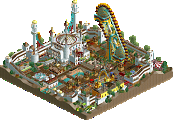
I thought this was absolutely a stupendous small park. It felt like relatively little was compromised to make it H2H-meta even though it's a very dense package. I love seeing the funkier coasters; hopkins loopers, family woodies, oddball kiddie coaster layouts. It's hard to point to one thing I really thought stood out here, but so much of the background detail sells it as a Dirty American park in all the best ways. All the standard americana park stuff is there; gokarts, minigolf (both excellent), round kiddie rides area, so on. You can almost smell the funnel cakes. It isn't a sprawling, could-be-anywhere asphaltfest; the sand and palms and the in-n-out give it the sense of place that really helps make a park memorable. The in-n-out, by the way, is outstanding. The other interior stuff is excellent as well, but actually almost unneeded. I found it really satisfying to peel back the roof on the in-n-out and find exactly what should be in there; the interior park stuff with the bowling and all those details was nice to have but didn't quite get the same reaction from me.
The layered gokarts/coaster/logflume is just on the knife edge of too much happening, but I think it works. I think pushing the park boundary all the way to the map edge would have been smart to give everything just that bit much more breathing room. Everything is legible and is so small-scale that it's not a huge roadblock to enjoying the park, and of course the cramped feel is part of this park's charm, but a few tiles of breathing room sprinkled around the park would really help out imho.
Best matchup of the contest? Maybe! I’d say it’s right up there at the top.
E.V.I.L
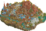
I’ll admit that this park took me longer to get in to than I would have thought. At first, I really couldn’t see what everyone else was raving about. But thankfully after spending some time enjoying the aesthetic, I’ve come around. This is a beautiful park. The peach rocks are a bit overwhelming at first, but they’re really necessary to give this kind of feel. I do get the early Connery era James Bond vibe out of this with the over the top set direction and exotic vistas. This is a great thematic idea executed super well.
The southwest mid-century modern type architecture is some of the best I’ve ever seen in the game. The steep slopes, triangular flat roofs, and curved walls come together so cleanly despite what I would imagine must have been a pain to build. It’s a nice reminder that sometimes cleanliness can look better than microdetailing. The mansion is just an incredible building and the best thing on the map for sure. The biosphere building too is really great. Excellent glasswork primarily on the diagonal and very nicely assembled interiors.
Speaking of interiors, the shark tank drop tower is super cool and a great use for those otherwise terrible shark trains. I like how subtle this ride is despite being a big drop tower. It’s very unassuming. The other big interior with the chemical lab is really nice too. It’s maybe a little messier than the other areas, but I love the big chemical vats as well as the catwalks everywhere. The ropes course type section with the hazardous waste barrels was a fun touch as well.
I’m a little mixed on the coaster. It’s nice and traditional and almost a classic feel I think. The same color for track and supports is nice—I always like that look. The first half of the layout is fabulous even if the loop is a bit slow. I’m less of a fan of the 2nd half with the brakes before the immelman which make that a bit too slow and the weird interaction with the corkscrew. It is a sort of neat element on the whole, but I think I would have preferred something in keeping with the rest of the layout. The Arsine coaster is also pretty cool—nice to see this type used. I love the reverse point theming. That looks great. I think most guests would lose their heads in the waterslide tunnels at the end, but I get what you’re going for.
I keep coming back to the overall aesthetic of this park. That’s what I love the most about it. Viewing it zoomed out gives such a different look to other parks, and zoomed in you probably have the most successful large scale use of rockwork that I’ve ever seen. It’s a very clean park and is very strong from a technical and architectural perspective. I wish we’d see more of this style and this look. I’m not sure I’d get tired of it.
Some of the many little things:
This isn’t a little thing at all, but I can’t get over how well this building is composed.
I love this little turret gun (and the others) dotted around the map in addition to the missiles.
This is a neat vignette and definitely gives a little of that Bond type eccentric villain feel.
I appreciate the hydraulic themed supports bringing this out of the pool.
Amazing work on the chopper.
Laser maze is fun.
This is cool entry icon for the coaster.
All of these buildings are super well done, even small ones like this.
The adobe structures dotted around the landscape are subtle, but nice. And I like the way the monorail works its way around the park.
Small details like the biohazard symbol are cool. And the crazy colors of the plants inside.
Barrels for the ropes course and the multi-colored vats.
Best use of these shark cars and a clever theme.
EVIL has slowly crept up to one of my favorite parks in the contest. It’s got a more subtle beauty and charm than some other maps, but I think it can stand on its own very well. Great work.
Castles and Coasters
It was going to take something special to win a vote over EVIL… and along came this park which is currently sitting tied with Tubiao as my favorite part of the contest. If there was a map to define the kind of style I really like, this is it. It’s a little messy perhaps, but the realistic detailing is just through the roof. Being very familiar with the source material got me excited for the map before even opening it. I love the take on this park with some creative license. These sorts of heavily inspired designs based off of obscure things always get me excited because I do like when the community highlights the fringes of the real life coaster world.
I’ll start with the coasters since those are the focus here. Hopkins is such a strange company with weird but strangely intriguing designs. You nailed the style here with the weird loops and the helixes. The supports do look like they were placed to avoid the existing kart track underneath, which is a nice touch. The lift truss is one of my favorite detail bits—spanning across the flume just like real life. The kids coaster has an awesome layout too. Very flowing for such a tiny ride. Lastly I love the White Lightning inspired wooden coaster. The layout is a masterpiece and my favorite in the park. One of the best of the contest as well. The way the return run weaves in and out of the structure and across the track is so nice. I can appreciate the dedication on the supports too. They look great.
What gets me on this park is how compact everything is without sacrificing the realistic details. There’s really not anywhere I would say feels cramped or too tight. Some paths are small, but it’s a tiny park so that’s appropriate. The kart track under Desert Storm is great and I love the shaping of the track around the station area. It doesn’t feel forced at all. The bumper boats have that great backdrop, and the miniature golf has the kind of theming I would expect from one at a park like this. With the miniature golf area especially (but other areas too), I was taken with how the standard prop objects were used. The western building there alongside the mine theming and the pirate ship over by the flume. It all blends really well and doesn’t feel out of place like those sometimes do.
The architecture is really solid on its own with the exception of that awful dome on the arcade. I understand that the real park has it, but it just looks really poor in-game. I wish you had tried something else. But that’s easily forgotten with cutaway view and the fact that every single building has some amazingly well built-out interiors. The arcade is the best I’ve ever seen in the game. From the games to the VR ride to the laser tag maze to the bowling with Roomie’s ball object—it’s one of my favorite parts on the whole map.
Here are a few of the little things I liked (I’m still finding more):
Lovely billboard.
Great use of the standard scenery in a way that actually fits. I like the waterfall with the rocks too. Nice blend of the Krypto rocks with the 1k ruins.
The whole composition of this ride is really good. Not the first to do it, of course, but it’s one of the best executions from structure to sign to loading.
The scenic on the bumper boats is top notch. The slide as a lighthouse especially.
This is a really cool entry icon for the miniature golf and a tastefully done theme as a whole. Also so many Texas Giant signs…
Great bus stop.
The wooden coaster is my favorite layout on the map and one of the best in the contest. This interaction is fantastic.
The ride facades are super detailed and feel very representative of the stock model off the shelf options.
The interaction of go kart to ride to scenic is very nice. There’s a fair bit of rockwork, but it works well. I like the striping on the supports too for that sort of tacky feel that you might expect in a park like this.
This isn’t so much little but it’s so good. So much thought went into this building form and it really shows.
The In and Out is very nice too. So clean. The drive through cars are a great touch as well.
I enjoyed even the small interiors like the car wash. This was a clever one.
The back of house equipment is very nice and the big sand filters right next to the bumper boats.
I know I’ve raved on about this park which a pretty much entirely glowing report, but I really like it. As I said, this is tied for my favorite park of the season and is one of my upper tier parks in all of RCT. There are so many great little parks out there which could translate well into RCT. I’d love to see this style and approach pop up more.
Rediscovering H2H8
It's been a while now. Time to re-view the H2H8 parks with a fresh eyes and not clouded with emotion. I'm going to view every H2H8 park and post one focused screenshot that stood out to me or that I think deserves more love.
Brilliant little layout, good realistic details that enable me to imagine that I'm there.
We don't see modernist architecture in RCT enough. Alex pretty much invented a brand new look here.