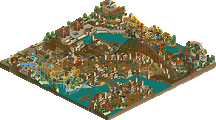
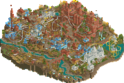
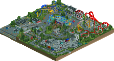
Park / [H2H8 R3] Castles-n-Coasters

Select your favourite park.

  1. Castles-n-Coasters by The Replacements 36 votes [52.17%]
    • Six Frags
    • trav
    • shnupz
    • Louis!
    • Coasterbill
    • G Force
    • Recurious
    • RWE
    • CedarPoint6
    • olddtfan51
    • ida
    • tce_k
    • RCThibo
    • Mr.Brightside711
    • SupraTheHedgehog
    • Ling
    • patch21
    • CoasterCreator9
    • Terry Inferno
    • Mattk48
    • Coupon
    • 111112oo
    • geewhzz
    • GeertD
    • Maverix
    • Faas
    • Battlerams
    • MorganFan
    • Stoksy
    • SensualEthiopianPolice
    • Quark
    • School_Jin
    • In:Cities
    • Roomie
    • Whitehawk
    • Danni
    Percentage of vote: 52.17%
  2. E.V.I.L. by the UltraRealists 33 votes [47.83%]
    • Liampie
    • Scoop
    • Cocoa
    • Version1
    • BelgianGuy
    • MCI
    • Kevin
    • bigshootergill
    • dr dirt
    • ultro
    • robbie92
    • chorkiel
    • Jaguar
    • voidnights
    • CHE
    • spacek531
    • Fisch
    • Lagom
    • Tolsimir
    • saxman1089
    • Dr_Dude
    • Lowenaldo
    • Milo
    • Steve
    • roygbiv
    • ottersalad
    • Jappy
    • Tom_Dj
    • Xtreme97
    • Camcorder22
    • thyeggman
    • posix
    • SupraSix
    Percentage of vote: 47.83%

157 Comments

This park shares comments with 1 other park(View Park)
  • saxman1089%s's Photo

    Yeah, wow Alex, great stuff. Match was super tough, but be happy that you and your teammates put together a great park!

  • Wanted%s's Photo

    Throw tension aside for a moment to appreciate and reflect on H2H8 Round 3.


    Three fantastic matches.


    There's no secret that I've been a self-professed-borderline-atheistical-fantasy-fanboy throughout the years, but RCT has evolved. "Ultra" Realism has evolved - looking at you UltraRealists - we have two fantastic H2H parks in this match.


    Do these two parks represent the peak of RCT realism vs. fantasy, respectively? No. Two fantastic parks, yes, but not the peak.


    80 CnC

    75 Evil

  • AvanineCommuter%s's Photo

    Yeah, I have no idea why Avanine wants to build this weird narrative here. He makes it sound like E.V.I.L. was the better park and only lost because some people can't deal with anything else than realism, which is absolutely not true. I voted for E.V.I.L., but it was a hard choice and in fact I voted for it despite being the weaker park, because I liked the concept and I wouldn't be surprised if other people did the same.

    I never said that - CnC is a fantastic park and deserves to win. CnC was better in some aspects and EVIL was better in others, hence the close call. But it is 100% true - some people cant deal with anything except realism. Fight me on it. The receipts are there.
  • Bubbsy41%s's Photo
    Will you two simmer down.

    Let’s take a moment and realize how great of a matchup this was. Two great parks that were neck and neck the entire way. By far the hardest match to decide this season. Shoutout to Alex and Co for producing a wonderful piece of rct. I actually really like Evil. The weapons were amazing. The archy was fantastic. Very unique and pulled off wonderfully. The atmosphere was truly spot on. Only gripes are the landscape (in spots) and the overall feeing I got. I felt that it was missing something to make a true h2h Park. It sort of seemed like a design to me. I can’t really put my thumb on it right now, will have to study it a bit more. Also pac made a park. Typical pac stuff. Super clean realism. At first I was skeptical about the idea but you pulled off the atmosphere very well. I wish it was a little more sketchy like in real life but whatever. Great round. Can we get a clap for both teams. Amazing work gentlemen
  • Turtle%s's Photo

    EVIL was robbed, it's so much more interesting to me. Unlucky. 

  • Casimir%s's Photo

    EVIL was robbed, it's so much more interesting to me. Unlucky. 


    Sorry Turtle, but that's bullshit. An incredibly strong park went up against another incredibly strong park. In a K.O. tournament, one of those incredibly strong parks is gonna lose. That's literally all there is to that story. 

  • RWE%s's Photo

    I don't like the trend of certain individuals trying to drift the opinion of the community into certain directions. People have opinions and that's what ends into poll results.

  • Scoop%s's Photo
    Just one clap bubbs
  • bigshootergill%s's Photo

    Love the H2H drama... :D

  • SSSammy%s's Photo
    Surely this is the result we should all strive for in a round of h2h? Neck and neck, one just inching out the other? Do we want more blowouts? Where one park doesn’t get the value all it’s hard work put forth? I’ve also noticed that a park is only robbed when it’s the park you prefer. Fucking odd that, innit? I’m sure all the people who voted for the OTHER park would feel the same? Tuck your cunts in and be Thankful there are still fuckers just as lame as you are still pioneering this art form. And noT a single forfiet thus far! 18(!!!!!!!) completed, high quality releases!!!!!! Get some perspective!!! You odd motherfuckers
  • Cocoa%s's Photo
    My cunts are all tucked in nicely, thank you
  • In:Cities%s's Photo
    I really appreciate your capitalization choices.

    noT
  • Camcorder22%s's Photo
    Now that I've gotten all the complaining out of my system...this was a lot closer for me than my tastes might indicate. I ended up voting for the more unique and memorable park.

    Castles n coasters was probably the best possible execution of this idea (an idea which didnt excite me much). Honestly, props for looking at the source material and saying "I could turn this into something" because I would've given up pretty fast. I agree with Liam that this is my favorite Pac park, and the most fun, since DAW. As a native Californian, have to admit the in n out almost won it for me. If it had been peepable and had an interior or a take out window, it just might have. As much as the center of the park with the looping coastrer and log flume matches the source material and was impressive in its execution, it still was a but unreadable to me. The mini golf was also a highlight for me.

    Interesting that this matchup had two southwest desert themes, but done in two very different ways. I visited Canyonlands/Arches last year and the setting of EVIL reminded me a lot of that. I've been wanting to make a park like that and you guys pulled it off better than I could have. What I liked about this park was that you guys took a few landscape and architecture motifs and stuck through it throughout, while still including a ton of ideas. The style of architecture was was in but you guys pulled it off great. Possibly my favorite part was the greenhouse thing. I honestly don't care a ton about interiors but that really made the cutaway view worth it for me.

    Great matchup as everyone else has said. I feel like I've put most of the parks in this contest in the 80-85 range but both of them were there for me too.
  • dr dirt%s's Photo
    The whole ‘robbed’ thing wasn’t an issue when Gee and Posix said Tahendo was robbed..
  • Liampie%s's Photo

    It's called a figure of speech. I don't think anyone thinks E.V.I.L. was actually robbed. That would be an impressive feat though, considering E.V.I.L.'s high-tech security system.

  • robbie92%s's Photo

    Now that I've gotten all the complaining out of my system...this was a lot closer for me than my tastes might indicate. I ended up voting for the more unique and memorable park.

    Castles n coasters was probably the best possible execution of this idea (an idea which didnt excite me much). Honestly, props for looking at the source material and saying "I could turn this into something" because I would've given up pretty fast. I agree with Liam that this is my favorite Pac park, and the most fun, since DAW. As a native Californian, have to admit the in n out almost won it for me. If it had been peepable and had an interior or a take out window, it just might have. As much as the center of the park with the looping coastrer and log flume matches the source material and was impressive in its execution, it still was a but unreadable to me. The mini golf was also a highlight for me.

    Interesting that this matchup had two southwest desert themes, but done in two very different ways. I visited Canyonlands/Arches last year and the setting of EVIL reminded me a lot of that. I've been wanting to make a park like that and you guys pulled it off better than I could have. What I liked about this park was that you guys took a few landscape and architecture motifs and stuck through it throughout, while still including a ton of ideas. The style of architecture was was in but you guys pulled it off great. Possibly my favorite part was the greenhouse thing. I honestly don't care a ton about interiors but that really made the cutaway view worth it for me.

    Great matchup as everyone else has said. I feel like I've put most of the parks in this contest in the 80-85 range but both of them were there for me too.


    The In-N-Out does have an interior if you use cutaway view. The whole In-N-Out and parking lot, along with the gas station, really hit uncanny valley for me when looking at my childhood growing up in suburban Southern California. I could have easily imagined myself hopping those hedges to get to the restaurant. 

  • G Force%s's Photo

    Both parks deserved to lose.


    There, is everyone happy now?

  • Jappy%s's Photo

    So we can tick off the realism VS fantasy debate on the bingo now right? Yeey!

  • Six Frags%s's Photo

    Yep, show's over everyone, now get out and go comment on the other 2 parks!

  • Louis!%s's Photo

    such much drama. i live for this. carry on.  :popcorn:

Similar Parks

Members Reading