Park / [H2H8 R3] Castles-n-Coasters
-
 13-May 18
- Views 32,970
- Downloads 911
- Fans 7
- Comments 157
-
 82.50%(required: 70%)
 Gold
Gold

geewhzz 100% yes chorkiel 90% no G Force 90% no Cocoa 85% no Fisch 85% no Liampie 85% no bigshootergill 80% no CoasterCreator9 80% no Poke 80% no Faas 75% no Kumba 75% no Xeccah 75% no 82.50% 8.33% -
7 fans
 Fans of this park
-
 Full-Size Map
-
 Download Park
911
-
 Tags
Tags
![Park_4102 [H2H8 R3] Castles-n-Coasters](https://www.nedesigns.com/uploads/parks/4102/aerialm3848.png)


agreed
Happens to both styles, and there's not much anyone can do about it.
That's a huge presumption in the first place.
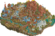
Ok, hadn't provided a full review of each park, so here goes.
It's so sad to see EVIL lose, I truly love the park. For one it's extremely cool - the bold geometric forms of the architecture, the desert setting, weapons, vehicles, really everything was just cool. It's other strength is its originality and creativity. Peach rocks? Modern architecture? The textural work? It's all fresh and it worked so well here. Here we didn't have something that was packed just to add content. A good amount of the park is just spent setting the scene itself and for me this was a strength. And I don't think it was lacking content either, there was lots to see in this one. The architecture was bold and phenomenal with some of the best use of curved shapes we've seen, and and the angular shapes were well done to complement it. Personally I thought the rock work was great, especially around the paths. Warhead was very cool, especially the first half but did get a little wonky at the end. I'm on the side of Arsine being awesome. That setting was perfect and had a major cool factor as well. From the main view of it I really enjoyed how it wasn't clear where the coaster would be going.
The inclusion of sensical details was used well in the park. All the rockets, helicopter, poison vats, interiors, lasers, etc were all well done. What's most impressive is none of the details felt forced or in your face, but simply flow into everything unobtrusively. This is something I'm working for in my own work as sometimes the little things try to take over. The little details that 'just make sense' are the best ones in my mind - like the cracked glass like it'd been hit with a golfball. These things didn't need to be stated or outlined for us, it all just fit in so logically. I don't really have too much negative to say about the park - maybe the monorail work/supports could've used a little more love? Not sure if it's even necessary to be honest. Overall, it was just so great to see something that's skirting the line of being off-meta and it working so well. Exceptional park, I hope to see more of this type of parkmaking in the contest.
Castles-n-Coasters is an excellent work in the realism field. I found it less pioneering than EVIL, which is one reason my vote went that way. The whole thing was incredibly well done, there's no denying that. The custom flats, coasters & their details, architecture, street work, back stage work, the landscaping that was there - each of these areas were truly great. My favorite areas were the back part with the adventure golf, sky coaster, bumper boats, etc and the front area especially with the kiddie coaster. These areas showed a lot of the character of the park for me that I think was aimed for here. The adventure golf and bumper boats were probably my favorite things in the park.
The one thing I found relatively lacking, in general but also in comparison to EVIL, was the atmosphere. That's why I loved the areas mentioned above so much; it's because they had all the excellence of everything else with that key ingredient as well. The other areas didn't quite reach that level. I wasn't getting all the fun factor and character out of the park as much around the middle section. I think some of the fun but tacky look was missed here and ventured into a clinical look with the purely just clean realism. I think for me what I was looking for was less cleanliness in the backstage stuff. Not in the construction of it but the actual content being clean, so it provides the park some atmosphere rather than trying to suck it away. I found myself wishing I could go in, scrape it up, and pour a bit of dust on it. I don't know, I think some areas got lost into being just really great clean realism work at the expense of building up the park's character. But I'll be damned if I'm not impressed with the skill put into this thing, if you're looking for a how-to on making good clean realism, look no further.
This was probably one of the best matchups I've seen in H2H, after exploring the parks they really are both great.
Like I said, either you’re too stupid to understand the actual point that was made or you’re intentionally being dense. Which one is it?
Spot on. And this is from a fantasy player who gave Tubiao a 95%.
isn't this all subjective in the end? I mean I have understood every single concept thus far in this contest. Have I liked them all? no. I vote for the park that hits all of the marks it was supposed to the best relative to the park. I didn't vote for things like gihbli, all coasters, and mictlan because of this. But in the end this conversation is dumb as hell. We all need to get lives instead of playing this game.
There are a lot of good reasons to vote or not vote for both parks highlighted in this thread. None of them had anything to do with "realism = good, not realism = bad". The vote was extremely close. Both teams should be proud.
Yeah, I have no idea why Avanine wants to build this weird narrative here. He makes it sound like E.V.I.L. was the better park and only lost because some people can't deal with anything else than realism, which is absolutely not true. I voted for E.V.I.L., but it was a hard choice and in fact I voted for it despite being the weaker park, because I liked the concept and I wouldn't be surprised if other people did the same.
What weird narrative? Literally the only point he's trying to make is that you shouldn't dismiss a park's merits just because it's not the type of park you most enjoy.
I don't really know what that has to do with this topic, since you can say the same for staunch opponents of the American Realism style, who also exist, might I remind you. Posix literally said he votes for EVIL because CnC has too much realism. Which obviously causes a weird situation, since Posix first says that and then says people should be able to appreciate parks in the style they don't like.
The narrative Avanine tries to build (IIRC he did it for the whole contest) is that Realism parks get an easy pass while Fantasy parks are at a disadvantage.
Welcome to NE circa 2005, everybody.
Posix didn't say that CnC had zero value tho, just that he's not personally a fan. It's ok to have preferences, it's not ok to dismiss others'.
It needs to be noted that I’ve finally voted for an Ultrarealists map. You did it boys! Well done. And it was a toughie. Seriously. Probably the hardest match for me to decide on ever (I don’t remember ever match ever, but I’m going with this anyway). Ultimately, both maps deserve the win in my eyes. In the end, it came down to something slightly more original edging out something that we’ve seen in some shape or another. I love Pac’s brand of “accessible and aesthically pleasing” realism, but EVIL just brought such a unique vibe that it was hard to ignore. Stick with this instead of your stupid fantasy maps, you weirdos.
Anyway. That’s like half a Steve Review. Sorry I can’t be more in the mood. I’m a busy man. I’m getting my haircut right now. Well, I’m waiting. Some kid is playing with trucks on a playmat area in the corner. Looks like a good time. I had a Tonka Truck once. Has Toys R Us closed yet? Gotta be some bonkers clearance sales.
Pretty sure nobody said E.V.I.L. has zero value either
edit: This post wasn't very necessary lol. Will post an actual review soon.
Congratulations on the win Replacements and especially Pacifcoaster on another excellent park.
Has a match been this close before? I could not take my eyes of this insane poll over the last few days. It sucks to loose, especially considering our position, but great to hear that it resonated strongly with so many of you. Thanks for the kind words.
I’ll give some background info:
The aim was to create a park which used common tropes/cliches of a villain’s lair- a luxury modernist mansion in an exotic location with all kinds of show-off leisure stuff but also of course hidden weapons and dangerous pets. I deliberately avoided any franchises or explicit references but of course it parodies James Bond villains in the same way Austin Powers or the Incredibles or many other things do. Thunderbirds/Tracey island was also an inspiration because of the use of mid-cent archy and missile launches that come out of swimming pools.
Originally I considered a tropical island setting but I’m really glad we went for the desert setting. An Island would’ve looked awfully traditional in comparison. There’s also a tonne of examples of mid-cent modernist architecture in American deserts (google img search "modernist homes in desert") so it was a perfect match and imo created a really striking mood. Spiky cacti and sharp triangular motifs throughout also helped to enhance the dangerous atmosphere.
The decision to add the pueblo ruins/architecture came mid-way through when we realised I needed more buildings and to add interest to the landscape without ruining the discreet vibe. I’m really happy with how it turned out as it adds a level of history and atmospheric storytelling; suggesting that at some point an indigenous population were turfed out. I love how the buildings look with the factory details and weapons growing out of it. I also enjoy that you get this aesthetic link between new and old since both the modernist structures and the pueblo villages share blocky, modular constructions.
The biomes are one of my favourite things I built. They are partly inspired by ‘Biosphere 2’. Interestingly enough Biosphere 2 was managed for a while by pantomime villain Steve Bannon. I’m glad I went with just the pyramid forms rather than going for domes as it allowed me to stick with the beautiful triangular construction. The concept here is that they house some kind of post-nuclear toxic ecology.
Big interior spaces aren’t really my thing usually so the chemical factory was a challenge. It’s maybe not up to the standard of the rest of the map IMO (or less to my tastes?) but it perhaps made up for it in crazy fun factor and I knew from the beginning it would have big H2H appeal. Plus it adds an interesting stylistic contrast. I’m glad it’s still fairly discreet from the outside and 3 other angles.
Despite getting pretty underwhelming reception I really love the coaster layout. In particular this spirally corkscrew ending. it took some flack but it's beautiful IMO:
There wasn’t any specific joke or reference behind the plane, since some of you asked. We just wanted this tactical landing scene with our team as spy-infiltrators. I thought shredding up the pristine golf course would be a nice touch.
Whodidwhat?
Instead of making a map I’ll just show in screens any work which wasn’t mine:
Kumba made this building and the server room, lasers room and torture device custom flat.
On the golf course he built the green and added the rough grass and tee-ing off spot.
He also made the armoured vehicle here:
Lily made all the rock work behind the biomes and along the edge of the map towards the entrance plus a couple of missile sites. She also did some of the toxic garden foliage. Bio made the room with the seedlings in and did parts of the contaminated area outside.
The whole team was really helpful in generating ideas and giving feedback of course.
I was stubborn about a few things like the amount of rockwork and not overfilling the map with “content”. I’m happy I was stubborn though as I see this park as a resistance towards the fill-everything-with-content pressure which is present in head-2-head. To be honest there is nothing I would’ve done differently in this park and that is a great feeling despite just missing out on a win.
Great post