Park / [H2H8 R2] Studio Ghibli
-
 03-May 18
- Views 22,094
- Downloads 806
- Fans 0
- Comments 62
-
 76.00%(required: 70%)
 Gold
Gold

chorkiel 85% Kumba 85% Faas 80% bigshootergill 75% CoasterCreator9 75% G Force 75% Liampie 75% Steve 75% trav 75% Xeccah 75% Cocoa 70% geewhzz 70% 76.00% -
 Description
Step boldly forward into the imaginative animated fantasy worlds of world-renowned Studio Ghibli! Live the adventures of your favorite captivating heroes, whether they're the simple pleasures of everyday life or the sweeping sagas of clashing nature and humanity.
-
 No fans of this park
-
 Full-Size Map
-
 Download Park
806
-
 Tags
Tags
![Park_4098 [H2H8 R2] Studio Ghibli](https://www.nedesigns.com/uploads/parks/4098/aerialm3844.png)
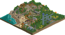
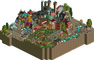
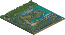
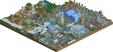
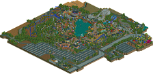
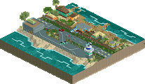
MIZIXIMA SPRANGS vs. STUDIO WHO-GHIBS-A-FUCK
Lets start with the worst team first, aka Team Kyle Fakenamepants. I have a hunch who did this, but Ill keep it to myself since last time Liam smacked me square in the sack when I guessed a name. Anyway, its a waterpark. Apparently we are excited because this has never happened before when it actually has. Its fine; Im always down for forgetting Liams work. RRP who? Bunch of nobodies. Neither of them have won member of the year. RRP has once called me a chav and Ill never forgive him because it has scarred me emotionally. Whatever.
This park is phenomenal. What an atmosphere. What a coaster. And water slides. Man. And look at all these desert-ish bushes. So dry yet so lush (the product I use on my hair also has this effect). How do you guys do it? I know for me, I typically use a quarter-size portion and run a comb through for volume but this is next level. Whos your comb guy? Also, whos your lawyer? I see several death machines on this map (is Fred on this team? Take notes, Freddo). Overall though I like the slides, especially the one with the loop. Is this a real thing that exists, like, in life? It looks like a YouTube thumbnail captioned as You Wont Believe This Waterslide!!! The Replacements have click baited us, yall. Not to mention a lot of these slides send the riders into a wall or directly underground going several thousand miles per hour. Its fine, though because fuck, its pretty. I will testify for you in your imminent lawsuit. Great park, though.
And now for the other park. I say this vaguely because I have no idea what is going on. What is Ghibli? Im glad you asked, Steve, because I took the liberty of doing some swift but lazy Googling only to find myself at square one. And square one is me still not knowing. Just kidding, its anime right? Just kidding, still not getting it. I know theres something about movies and flying trees and a giant Snorlax that spent a day at the spa. Its all good, because well done on crafting a heck of a park, here. Its not my jam, but still, wow. At least the Ultrarealists will be happy to know that your park also doesnt appeal to me much (but you are still in the lead for not using fucking PAPYRUS as your logo). The park is not very readable for me in the sense that there is just so much shit going on. I cant breathe. I am suffocated by critically acclaimed art house anime. Its all very impressive-looking but compositionally it just leaves me wanting more (and by more I mean an inhaler so I can catch my breath). I think others have touched on this in the thread but I didnt really read anything. I just caught the gist. Was I right? I think posix felt this way. I mostly agree with him. Honestly even the other park (the one with the slides, that one?) was pretty close to reaching this point. So no one is innocent here. Except me. My mom said so. Anyway. Great effort. I look forward to your eventual Wes Anderson theme park.
All right there we have it. Not bad. I could keep going but honestly, I dont know if I can. Maybe I could, but I dont want to get burnt out like with RCT. I actually havent built a thing in months. Liams been on my ass but I told him his username is stupid and now hes trying to replace me with Turtle again. Its fine, probably a good move on his part. Anyway.
I'm consulting other teams in order for them to produce the best death machines. Just to piss you off!
I should really make a death machine park. Or maybe you are just a bloke that only likes family coasters, you know, the type of guy that thinks the Seven Dwarfs Mine Train is the best coaster ever. I'm kidding btw. We all know Bobbejaanland's Oki Doki is the best.
Voting Closed

The Replacements beat Team Spacecrab!
The Replacements vote count: 32 (60.38%)
Team Spacecrab vote count: 21 (39.62%)
Mzima Springs was made by WhosLeon (59%), Casimir (20%), Bubbsy41 (20%), and GammaZero.
Studio Ghibli was made by Fisch (30%), ][ntamin22 (30%), dr dirt (25%), and saxman (15%).
what a strange spread for ghibli
there goes my picks for guess the builder. lol.
Congratulations to the Replacements and a job well done for both teams. I expected it to go either way honestly; surprised it wasn't even closer.
Good to see I'm apparently as mysterious as ever in 2, and I hope you all enjoyed the Dirty Curveball. Super proud of how much Dirt and Saxman have both stepped up in contributing to the team in these early rounds.
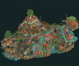
You can probably read between the lines of the Whodunit overlays (Fisch blue - ][ green - Dirt pink - Saxman red) and the deadline extension to guess how crucial having both of these guys hop on was to getting a quality entry with a decent level of polish in.
Here's my post-mortem (with apologies to Coco).
This park was Fisch's baby from the start. He came into the contest really excited to put together a Ghibli park based on the one piece of stylized overhead map concept art that everyone has seen, and it would be very silly of me to try and tell my #1 pick not to build the thing he was excited to build. At the early stages of building and planning Trav sent out word to the captains that there were a lot of potential "Bedroom Park" incidents on the horizon, and knowing how often Ghibli has been discussed among NE members we made the call that going r2 with a Ghibli park could be a great chance to snipe a RR win and maybe even derail another team's plans to do a bigger Ghibli in semis/finals with their heavy hitters.
Fisch was looking for someone from the team to do "structures," and I ended up stepping in myself as one of the crabs most familiar with the source material and with a maybe-not-so-secret talent for sculptural scenery block stuff. I ended doing almost all of the "hero" structures; Howl's castle, the Bathhouse, the Totoro and Kiki houses, the porco planes, the giant trees.
Fisch got off to a lightning-fast start with Howl's and the hyper layout and then we stumbled over area planning, with me working around the periphery on these movie locations. We relocated Porco Rosso to the middle, I pushed to move it again to the edge, but Fisch was confident in his ultimate vision for a sweet porco-dogfight-coaster. Fisch ended up going silent for a few weeks for irl stuff, which we knew about ahead of time, but the timing unfortunately left me with little guidance and only some half-hearted progress around the edges. Fisch came roaring back just in time to stop me from deleting the Porco area outright, and I made a judgement call to let him do what he wanted with the area. Obviously it's received some criticism. We were split inside the team on whether the coaster complex there added to the park or detracted, but I think it's safe to say that if not Porco then other areas would still have been targeted for being too dense and we were too busy bringing Dirt and Saxman into the effort to rework the masterplan. Both of them were great engines to push us into committing and it was awesome to see SpaceK's rides come online as the deadline approached. We knew it was dense - very dense - but I think that was in line with Fisch's original vision for the park and still leaves plenty of room for a more naturalistic interpretation of the Ghibli park setting. Ultimately I think we had a bad draw ending up against another r1 pick and a very safe park for voters, stylistically speaking, but we did deliver a park with some crucial flaws.
Train of thought review time!
Ghibli - Now. I fucking LOVE Ghibli. I haven't seen that many of them, but every one i've seen i've loved. So overall, I have to say I was slightly disappointed by this park. Which is super critical but hey.
There's just too much going on. I don't know whether it's composition, or clashing textures, but I'm just finding it really difficult to view this park and know what's going on. Which might be my fault, for not knowing enough Gibibhli movies.
I almost think you could have done away with a lot of them. Picked three or four movies and really gone to town on themed sections for those. As it is, there's so much crammed into such a small space that a lot of it gets lost. I honestly didn't look at this park for very long first time round, because it was difficult.
For example -
Can anyone tell me a single thing that's happening here? It's just so much, crazy angles, textures, not much harmony. Maybe too much Ghibhbliibili.
For the sake of balance, there was a lot I liked. The entrance area was really cool. The bathhouse looked great, and I loved the scenes inside it. Very recognisable. The Animator Express over water was really nice too. Irontown was really cute, and the windmills were great. I'd love to see these themes expanded over a full map, though.
Mixtape Water Park - Now. I must be honest. I dislike the concept of building waterparks in RCT. Maybe i've just never been to a good one, maybe something else, but I've never liked any i've seen.
Up until now. This thing is goddamn beautiful. The colours. The atmosphere. The brightness. It's brilliant.
A bold choice with the path choice, but it really works. The foliage and landscaping is excellent, the rides are brilliant and made me want to watch each one (which doesn't usually happen with slides), the common theme of wooden post structures works really well. There's little splashes (look at me go) of colour here and there to liven up the atmosphere, and a really earthy undertone that I love.
Overall, this thing just feels really well thought out, and very well executed. It's a fairly simple idea and theme, but everything in it is done so well that it outshines the other more ambitious park. Also hard to do a single theme over that size of map and not make it boring, so major props for that. Well done on the win. I've just looked at who made it, and honestly I don't know any of your work, which seems rude of me. Looking forward to more, though.
"This isn't my waterpark"
Built a little progress gif from the saves I have on my harddrive. It was such fun to build this with you guys, really an awesome experience all around. Except for maybe getting all the slides to work. If I ever have to build a slide again, I'm gonna cut a dude More in-depth later!
https://imgur.com/Wneykoz
Hello everyone! Soooo first of all, when I first opened studio Ghibli i was almost certain of taking the L here. On micro level this park is insane. My favourite area by far is the nausicaa area. Absolutely in love with the design of the windmills and the colors in that area in general. Fisch' style in general is one of my favourites in this site and in this park there's definitely a bunch of Fisch brilliance to find. The entrance is really really beautiful. What I like the most about your specific style is how you manage to come up with original ways to make things like dormers/windows etc. You bring an asthetic to the game that I think no one does better. The thing that kinda threw me off is the macro composition, but i'm sure you guys know that is the weaker spot of the park by now. I'm glad that Ghibli picked up some last minute votes as i thought 13 votes was way too less for a park of this caliber. You guys did a great job and definitely impressed me. Good matchup! This is why I love this site.
Now, for Mzima Springs. We built this park in approximately 30 days. The original concept wasn't really well planned to be honest. I just had an Idea of a waterpark packed with african buildings and landscape and just kinda started building from there. Building this park is probably the most fun i've ever had in RCT and i couldn't thank Bubbsy, Casimir and Gamma enough for this experience. Casimir has been brilliant from the start. He is the guy that truly made this park feel so lively by making all the slides peepable. I know that it was a pain at times but he just kept going and i can really admire that. Without him this park would be nothing. Bubbsy has been brilliant as always, and gamma a great help. Also our entire team as advisors have played a big part in making this what it is today. Last thing i want to share is a dot map of who built what, but keep in mind that almost every area is touched by the three of us, improving stuff everywhere daily as a team.
light blue = me
yellow = casimir
red = bubbsy
purple = gammazero
Attached Thumbnails
But Fisch is Fisch and Fisch has only Fisch's opinion
Ava, ][ discussed it a bit in his post about the Porco area, which almost got deleted a few times. We also considered reducing the density of the Castle in the Sky area by getting rid of some of the mine train, but we just ran out of time to do that and properly clean it up. I'm sure Fisch will pop over to discuss more eventually. =)
I'm also really glad that you guys got more votes in the end, you had an exceptionally strong park and you deserved every single vote you got for it.
Thank you very much for the kind words, saxman! Our focus at certain crossroads actually always was how it would look from our own perspective as a guest, we put a clear emphasis on peepability and cohesion. In the beginning, there even was the suggestion to not make the slides peepable, but I am happy to be able to take full credit for that maybe megalomaniacal decision of making them work, no matter what. It cost me my fair share of long evenings, but I'm really proud with how it all turned out. Leon and Bubbsy, I can't commend you two enough for the work you did on this. Gonna fondly remember every time that I logged onto the server and you would have just turned another spot up to 11 in the meantime - and in record time, that is. Gamma, it was a blessing to have you and to have you work out how to evolve that strange support scheme I came up with for the station helix and make it look THAT good all over.
P.S.: Multiplayer truly is a game changer this season. I can only imagine what would have been possible in the other seasons I was part of if we had it back then.
P.P.S.: I love the peeps. But fuck them and their queues. Really. And nin, of course.
Any reason Ghibli still doesn't have an aerial? or an accolade?Would've been nice to see both of these before R3 started.
Mzima Springs
Waterparks are still surprisingly uncommon in RCT… much less ones that are done well. I’m happy to see another one, especially one that looks as good as this. The park is super dense and the reliance on the chocolate brown color makes the park feel rather cozy. Where Mzima excels is in creating little relaxing spaces within the busyness of the overall park.
The biggest challenge I see with waterparks in RCT is the limited nature of the tools at your disposal to create a varied map. That does sort of hurt things here with the reliance on that bouncing raft scenery objects or just a number of reasonably similar slide types. The halfpipe slide is fantastic and the best attraction on the map. I would’ve loved to see some newer slide types or a more realistic attempt at the bowl slide perhaps. I’m also unsure where the 5 slides near the salt cave go. It looks like you ran out of room and then tried to hide it. The suspended monorail is great- one of my favorite rides here. I really like how the yellow track stands out against everything and brightens up the areas. The weaving layout at the front of the park really gives it a picturesque look.
The RMC seems to have gotten the most discussion in the topic. I’m of two opinions on this. First, it’s a really good layout. A very flowing course with a typically RMC looking layout, though the half roll/half cork elements still look stupid in the game. Nice work on the supports—they look great. The flipside is that I really don’t think it fits the park. It’s built into the landscape very well, but it’s sort of an oddity among the rest of the attractions. I would have much rather seen a big signature waterslide or perhaps a Vekoma Splash Battle. It kind of feels like an RMC for the sake of having an RMC.
Architecturally, I really like the mix of heavy rock and stone with the lightness of the colored stucco. The varied colors may be one of the best parts about all the buildings. The wood trim and detailing really brings the whole thing together. The minas tirith rock texture has the potential to be really ugly, but I do think it works here very well. The landscape also does wonders for the buildings (and the park as a whole). It frames some of the areas quite well and is a pretty thick screen for other areas including hiding some things that might have otherwise been hard to wrap up.
Here are the little things I enjoyed:
Lovely entrance area. The ride track as a curved architectural element is very nice.
Best ride on the map by far.
Laughed at this little detail with Liam protecting his graphs.
The salt caves were neat. Color-wise it’s a departure from the next of the park, but it helps it stand out.
This queue is really nice too. I like the doubling up on the bridge and how it interacts with the main path. Couldn’t figure out why only 1 set of stairs had an awning, though.
This kid’s play area under the monorail looks good.
These little secluded areas were my favorite. Between the rocks and the wood trellis, it has a lovely atmosphere.
Best looking supports on the ride. (Though those wood poles in chlorinated water won’t last long!!)
Swim up bar with the DJ booth stacked on top is very good.
Another great area hidden under the guest path with those waterfalls from above. Very nice.
The atmosphere is what I really liked about the park. It works really well from a macro level although there were multiple areas that weren’t super resolved at the micro range. The colors along with the combination of the blue water and green foliage added up to a color scheme that shows you don’t need a custom palette for a beautiful looking park.
Studio Ghibli
Intellectual property based parks are a tossup. In some cases they’re pretty universal, but in others you have to have some familiarity of the source material to get a true appreciation of what’s going on. I think this probably fell into the 2nd boat there, but luckily I’m already on board. The thing with this park is that it really needs like 2x the amount of space to *really* be able to appreciate all the stuff that’s in it. The details are so dense that it’s hard to pick one thing from another at times. In some spots that hurts the park. But in others it’s totally fine with a bit of exploration and pulling apart the various layers to get a real sense of what’s going on.
Architecturally it’s hard to make something cohesive when there are this many themes in such a tight spot. There’s really no room for transition. But that’s ok for the most part. Each area feels very defined in itself and is detailed and unique compared to the others. The entrance is especially nice with the steps up and into the park and the two levels of buildings. Compositionally, this is all excellent. I also love the little plaza for Kiki’s. It’s framed so nicely with the buildings and pedal monorail. Although here like some other spots, you have a hard time picking out some of the details as they’re blocked by other things or visible from only one angle. The Irontown complex has some great layering too, despite being very brown.
I can’t believe there are as many rides in this park as there are. A nice variety too. Abyss Engine is by far my favorite. It also has the most room to breathe on its own. That section is huge, but the stacking on the mine train layout is so good as is the way it works through the scenery high above just after the lift. Howl’s Eurofighter is a pretty impressive entrance feature though there’s so much layout crammed in there and it ends up being way too fast I think. The little diving corner near the end that wraps the drop is a really nice interactive piece. The little Porco Rosso Schwarzkopf is a bit of an awkward layout and almost feels too traditional compared to what else is going on with the map. But I LOVE the loop around the plane. Such a good interactive moment. On its own I’d be a huge fan of the B&M giga coaster. It has quite a nice layout and feels like it probably went in early because it’s not having to move to avoid things. The bright color and interference with the other area’s carefully crafted themes brings it down in the context of this map, however.
Little things:
This Fisch looking tower is quite nice, especially with the dark ride underneath.
Wonderful theater interior and that it’s not totally square.
This is a fantastic sculpture, but it’s so hidden by all the track… including the B&M being in the way.
Love the fence.
This is a fabulous interaction and overall composition. The two windmills at separate heights and the B&M sneaking right through it. The only area where I thought the B&M really helped to an area outside its own.
Great use of the airplanes for the Condor ride.
This is a big shot but the vertical design here is fantastic. There’s just so much going on.
While not a fan of the coaster, those planes are marvelous.
This was a nice cutaway. A bunch of detail squeezed in there and a coaster running through it that didn’t seem to totally jumble it all either.
Love this entrance.
Back to the Abyss once more for this wonderful cutaway shot.
Despite the compactness, this is an excellent park. I would love to see something similar done with spacing that allows each of the individual themes to shine without having to compete against one another for your attention. But from the architecture to the rides, there are so many ideas squeezed onto the map that I can’t help but really enjoy it. It doesn’t hurt that I also really like Ghibli. Great work!