Park / [H2H8 R2] Studio Ghibli
-
 03-May 18
- Views 22,094
- Downloads 806
- Fans 0
- Comments 62
-
 76.00%(required: 70%)
 Gold
Gold

chorkiel 85% Kumba 85% Faas 80% bigshootergill 75% CoasterCreator9 75% G Force 75% Liampie 75% Steve 75% trav 75% Xeccah 75% Cocoa 70% geewhzz 70% 76.00% -
 Description
Step boldly forward into the imaginative animated fantasy worlds of world-renowned Studio Ghibli! Live the adventures of your favorite captivating heroes, whether they're the simple pleasures of everyday life or the sweeping sagas of clashing nature and humanity.
-
 No fans of this park
-
 Full-Size Map
-
 Download Park
806
-
 Tags
Tags
![Park_4098 [H2H8 R2] Studio Ghibli](https://www.nedesigns.com/uploads/parks/4098/aerialm3844.png)
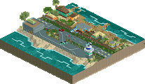
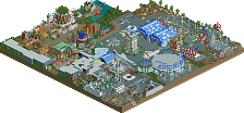
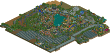
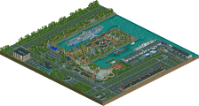
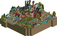
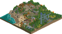
Round 2 | Match 3
Poll is Closed
Mzima Springs (RCT2)
VS
Studio Ghibli (RCT2)
^ One-time deadline extension used by Team Spacecrab ^
Voting Rules
- You should only vote if you have viewed both parks in game.
- Everyone but players belonging to either team in the match may vote.
- Voting will be monitored to improve fairness, and anyone found to be abusing votes in any way will be punished.
Download the Studio Ghibli Music Suite here. The two three-minute tracks would not fit in the zip.
Attached Files
downloads: 972
I'm gonna need some time to take in the ghibli park. Not sure if that's a good or bad thing. Also why the replacements didn't just call this Tehendo Waterworld is beyond me.
First impressions;
Wow, a waterpark actually finished in H2H? It's pretty good too.
and
Ghibli park is suuuuper crammed full of stuff. Need a second or third look to really take it all in without a doubt. Custom stuff is pretty great though.
First glance stuff:
When I first watched Ghibli, I was impressed by all of the content you put in. Like Scoop, I'm now not sure if the amount of content you put in and the chaos it created is a good or bad thing.
Then I opened Mzima and WOW. What a contrast to the chaos (either good or bad-I haven't figured out yet) I experienced in Ghibli. Such an aesthetic, atmospheric and relaxing atmosphere. Finally a waterpark done right. The hacks and custom rides aren't to impress but really serve a function and add depth to the park. The atmosphere is top notch and the park design and composition is out of this world.
Gonna dive more into both before making my decision, but I was like literally saying wow while watching Mzima Springs, and I only did that a few times watching parks all those years (/decades? )
)
Great match-up again guys, h2h8 really is bringing it on, like I expected. I hope we keep this up!
Wow this ones gonna be really tough
We did consider the name "All Waterslides go to Heaven" at one point...
First impressions, both parks will take multiple viewings for a proper review:
Mzima Springs
Its a cool park. I love the concept, I love the archy, I love the foliage, and I love how you did a waterpark. But the first thing I noticed? The colours. For me, they really really suck just because of how much the saturated brown does not work at all with all the bright and vibrant colours of the rides, and with all the other yellows and browns in the park. It also makes the walls and rooves blend in the with path and its hard to tell stuff apart sometimes.
I also have big issue with the slides. Layouts are pretty solid, and the concepts are cool, but there is absolutely no splashdown on some of them. On some, you get thrown out towards rocks and people on other rides, and on the 4 slides at the back of the park its just kind of shoved out of sight under the park (was unthemed when I looked with cut-away despite half of it being visible from one angle). The blue slide doesn't even have a splashdown at all.
Also not a fan of the RMC layout, its mostly ok but the three barrel/zero-g rolls facing the same way and being 3 out of the 4 inversions just felt cheap and uninspired, and the ending felt more like a gci. I loved the first drop and waterfall dive though.
I did, overall, really enjoy it. It just needs refining imo, I'd give it a mid/high silver vote in an accolade panel.
Ghibli
I loved it, I really did. I haven't seen Porco Rosso, Nausicaa, Kiki's or Mononoke. I'm now motivated to.
The park did, however, have a glaring fault in that density. At first I actually rather liked it, it felt like some of the more spaghetti intensive Japanese/Chinese parks out there, but it got harder and harder to make out details as I viewed the park over time, and I really felt like the individual areas needed a bit more space for better transitions and room to breath (like the water). The music overlapping for half the park was also annoying, but it really added to the atmosphere when it didn't. A lot of the time the ride interaction was really cool (Nightwalker/Flying Pig Maneuver) but things just got overly chaotic a bit much.
If you showed me each of these areas as standalone micros/miniparks I would have absolutely loved them, they are so well done. They captured the feel of their respective movies excellently. I felt that Laputa needed another cliff with shanty houses on the opposite side of the path, but it was all otherwise very well done. I think I prefer it to Mzima, but it is definitely a flawed park too.
Those custom rides were incredible as always, spaceK.
Wow.. what a waterpark.. damn. Only question is why do four of the slides just end underneath the path near the salt cave? Theoretically, guests disembark their boats and walk into the cave? Just curious.
Studio Ghibli is really fantastic. I like that it feels like what a real-life Studio Ghibli tribute park might actually be, even though it is cramped. Having most of the movies just being a ride name was probably the only way to cram in so much content into such a small park but I'm not sure it works for everything. Nausicaa and Kiki's Delivery Service in particular suffer from this. I think if you had just picked Howl's Moving Castle, Castle in the Sky, Porco Rosso, Spirited Away, and maybe My Neighbor Totoro (or Kiki for a city section to bridge everything else) it would have felt much more targeted. The technical skill to make something this complicated work at all is astonishing, I just don't know if it makes for a good park.
Mzima Springs feels so lively and warm. In any other matchup it might get blasted for being boring, but ironically it's in a situation where contrast against something that's too busy works out in its favor. The coaster is really solid but feels out of place. The functioning slides are all lovely but they run so rarely that even with all of these slides all functioning it's easy to forget that they're peepable.
I think I may prefer Studio Ghibli just for the Herculean effort on display of even trying to tackle something like that, and I adore the idea, even if the execution isn't what I would want from a Studio Ghibli homage.
Astonished by both parks. Two parks of a high caliber here.
Studio Ghibli is beyond hectic and chaotic, but that's what makes it so good. The Fury 325-inspired (did I spot that right?) was definetly the eyecatcher of the park, and just looked so amazingly good. Great job on that.
Secondly, holy shit, those custom cars! Freaking love em. It's amazing how much stuff can be cramped onto a small spot. Neat.
Mzima Springs had more space for everything to breathe a bit, which I liked. The RMC had maximum #datflow and I adored the supports. Kudos to the guy who made those. You understand why it's necessary.
The waterpark was beyond fantastic. It being functional brought it to a higher level. Possibly my favourite park from H2H8 so far, probably.
Both teams really did well, again. Man, this H2H really does live up to its hype.
alright, time for some reviews
Studio Ghibli
Wow, that music is amazing. It reminds me of all the things I love so much about Studio Ghibli, and makes me want to go watch some right now. I have a feeling that my love for ghibli may actually make me a bit harsher on this park than I would otherwise be, in a cruel twist of fate . So I definitely have some issues, but bear in mind I still think this park is really good. the caliber of parks this h2h has been pretty astonishing all up.
So yeah, the park is super packed and super busy. Some people can tolerate it, some less so. For me, its really hard because it seems the parkmakers here have really captured small bits and pieces that show me that you really know and care for the source material too. But also, around the park a bit of the magic is lost because no area has the space to really come alive and express itself. The worst exception is probably porco russo. Did the park really need another coaster? At the expense of all the beautiful scenery of this movie? But I felt the same around the smaller areas- Totoro and Nausicca felt the most shafted to me, and tbh i didn't even recognize naussica till I clicked on the rides. I think the rides just cover too much stuff and add too much clutter- the hyper and the nausicca rail coaster are particularly bad in my eyes. I sort of think a coaster should really have an real purpose to be in a park, not just to fill a sort of rct coaster-quota.
For me, the entrance is really the best part of the park- its a truly beautiful scene. There's a lot of good archy in the park, some which reminds me a lot of the movies, and some which felt less-inspired, or maybe even rushed. The spirited away area almost worked- the street was pretty good, and the bathhouse fell short for me. Thats my feeling all up- it almost got there, which is sort of more frustrating if you really love the material and want it done right. One really frustrating thing I found was you have all these awesome vehicles around the park, as you should with this theme, but they're all embedded strangely into buildings- the plane under laputa, the airship at the back of howls castle (thats an especially weird place), and the planes on rocks/rooves in porco russo. it really makes them, and the whole area around them, much less readable, which is a shame because they do look to be quite good.
So that was a wall of text, but it sounds like you guys knew I was keen on ghibli, so thats what you get from me. Its always a risk doing franchised parks- its hard to balance the fans and the clueless, and somehow not piss either off. I hope it doesn't come off as too harsh or that I'm expecting too much of these parks.
Other good stuff- all of spacek's trains are astounding. stealing them all immediately (so many too!). sunken train lines at the entrance. water train station + peeps queuing in shallow water. most of laputa and those mine trains
Mzima Springs
This park really clicks my ticket. Wow. The entrance building and surroundings are astonishing- the way it opens onto that pool sunken a bit below the path line with the foliage and blue accents and awesome brown paths. Just incredible atmosphere, and the archy there is brilliant (and most elsewhere too...). The RMC (is it actually an rmc or just a blue coaster with wooden supports? ) is pretty great and the first drop is stunning with that waterfall and paths elevated around it. Just a lovely lovely area and the waterpark elements are integrated stunningly into the lush african theme. salt caves- awesome. random waterfalls and waterpark-y bits are great, and theres always new angles to get great vibes from when you turn the camera. I have a lot less to say because its all just so good. really classy, tidy, atmospheric, lively, etc. Just a really good release. the yellow railcar is bold but it pays off, and the sort of pastel pink/yellow scheme throughout works wonders. It all just felt so well thought out, like a better version of those pristine dubai waterparks.
Another great matchup- this h2h season has absolutely delivered so far. Such a talented community we have here.
Mzima Springs:
All in all, this did not do much for me. It was technically good and all, but I did not really feel the atmosphere. Water parks just aren't my cup of tea, I guess. Really enjoyed Mfalme, though.
Studio Ghibli:
I feel very unfortunate that I have not seen a Ghibli movie as far as I can recall. This park makes me want to watch those movies to enjoy this park on an even deeper level. It's so colorful and lively. The rides are all telling stories in a wonderful way and this park keeps making me want to rewatch the rides (interact) in their surroundings. Beautiful!
Allow me to begin by noting one thing; both of these parks are remarkably dense. Absolutely packed full of stuff. Too much in certain places for both parks.
Ghibli
I really want to love this park. Like cocoa, I'm a big fan of Miyazaki films and am pretty familiar with the source material. That said, there's a decent amount of the little details that make parts of this park shine (Turnip-Head, the customized train line, Castle in the Sky's mine train). However, I found that these details got severely overshadowed by the sheer amount of "stuff" going on. Like cocoa, I think that this park would have benefited from breathing room. More of a focus on a few areas rather than as many as included here. Part of the problem was the amount of coasters; they (literally) step on each other and compete for attention, making it really hard to appreciate the work put in around and under them.
This was my absolute favorite part of the park. It's brimming with atmosphere in all the right ways, and it's not trying to blow me away with a crazy amount of stuff and things whenever I look at it. I would have loved to see more like this and the entrance across the park.
Mzima
Like Ghibli, I found that certain parts of this had the same kind of "there's so much on the screen" feel. As I looked at the park more, what I realized was that this was mostly due to the extensive rockwork. Certain parts felt a little overwhelming, other parts were really nice. Net neutral on that aspect. What I really loved was how everything pieced together. The various groupings of waterslides and waterpark features really seemed well thought out and fun to explore. The choice of a coaster in the middle of the waterpark struck me as a little strange; I don't think the park really needed it. Compared to Ghibli, which had certain parts with atmosphere, this park has a fairly consistent atmosphere throughout that reminded me of Typhoon Lagoon. Really nice.
Studio Ghibli
- Thanks for crashing my computer. I thought La Tierra was dense but this takes the cake.
- Having only seen half the films of the massive list that this park covers, I'm sure a lot of the subtle little ideas are lost on me.
- Architecture throughout is on point. Very nice work, gorgeous color combinations and some unique stuff I haven't seen before.
- The entry is beautifully made. Quaint and interesting. Entering to see Howl's Moving Castle is a sight to behold. The castle itself however wasn't very legible. The ride was okay, but there's too much covering it up. Some breathing room around the castle itself would have been great to allow it to shine as a centerpiece. Instead, it gets lost by the clutter.
- I love the custom trains!
- Totoro's tree is a highlight, really well crafted
- Wow @ Dola's Armada. Really cool ride. This whole area is really cool but I've never seen this film. I love the cutaway with the blue crystals in the mine, the dull industrial look of those tiny buildings attached to the castle in the sky. Abyss Engine is my favorite ride in the park. Really well done.
- Spirited away! The bath house is a nice scale, I like the execution of the town below and the bathhouse itself is beautiful. The dragon was exceptionally well made for how difficult I imagine it is to recreate.
- Flying Pig Maneuver is a waste of space. It clutters the whole area and the ride itself is a little boring. Imagine if this was removed and we had a nice pond with some breathing space?! Infinitely better.
- The domed building is great, as are all the guys in blue standing at attention. No idea what it means but I imagine it's a reference to a film.
- I loved Nausicaa as a film but this area did not do it justice. The Nausicaa ride was not very interesting and while I love the landscape variation with the windmills above and Nightwalker's turnaround (great interaction!) the area REALLY needed *again* more breathing space to let the oddly colored vegetation shine.
- The architecture of Iron town was the lease interesting of the park. Nightwalker looks great from two views but looks really awkward from the other two.
- Nice railroad crossing gates
The overall quality of the park is through the roof. The overall amount of content as well. But the overall composition is DREADFULLY dense. With the tile limitation, it would have been very wise to limit the park to three or four films and an entrance area. Instead, with this many films intersecting and criss-crossing every which way, you lose sense of the unique properties that makes each world so vibrant and interesting. It all begins to blend into a cacophony of (very high quality) colors and shapes, which isn't necessarily a good thing for a park based around very distinct and unique worlds. I think just by removing the red coaster the park would've been a LOT better, but I would have also suggested removing kiki's delivery service and given Nausicaa some very necessary breathing room. Beautiful park nonetheless with some really amazing atmosphere in some areas.
Score: 80%
Mzima Springs:
- Stunning entry. Gorgeous textures and beautiful composition overall! The backside of the entry is GORGEOUS. In general the architecture throughout is very effective.
- I love the pairing of the light path with the texture dark brown. Good contrast, and the whole park seems to have a nice organic nature about it.
- Mfalme might be the best coaster in the competition thus far. Beautiful layout, that stunning corkscrew element coming out of the waterfall is perfect, the supports are well done, the integration into the landscape is also great. Enjoyed seeing a full fledged RMC like this. Bravo.
- Wimbi is great, really loved watching the slide.
- The sunken sauna / spa is a great touch, but the white rocks stick out too much
- The water slides are all well made, but they weren't particularly interesting to follow. Coasters > Waterslides I guess.
- The queue behind the RMC's hill for the slides is beautiful
- The rockwork was a little excessive in places, what's wrong with the game's natural land?
A beautifully crafted park, with high execution but also such a beautiful atmosphere throughout. It just really works. The stunning blue RMC running through the brown landscape is great, and the height variation is superbly done. I really enjoyed this.
80%
Really difficult round. Love Ghibli and the films, and the park has amazing moments. Mzima was beautifully crafted, atmospheric, and had a cohesive theme....
Studio Ghibli
Spacecrabs
I expected this to be a more fantasy park, but I'm glad it isn't. The anime reference are completely lost to me, since I don't watch those at all. But that's a risk you take when you decide to go for building a park around an IP. Though I still have a good park to view.
The entrance area is really nice and for sure it's my favorite part of the park. Also, do I spot another submarine there?! .D The placement of the coaster's first drop and Immelman are great, nice view to see when entering a park. Going to the left side of the park it remains enjoyable with some nice looking buildings and fun themed rides. The castle with the favela-ish looking buildings around is looking good, and the mine train is also quite fun to watch.
Going to the other side of the park, it's a bit going down imo. The building with the spinner in is a bit too massive for my likings, also not a fan of the colors used in this area. I like the B&M hyper you guys put in, but this part is really too dense. There are three roller coasters pushed on one half of the map, it's just too much. I can see you had many ideas too put in but it's too much for me. This part is hard to read and looks messy to me.
This park clearly showed some skill but suffers from being to dense and in my case, not getting the references. I can still watch the park, there are good parts and there are less parts. But the references the anime fans will get and therefore strengthen their view on this park, I don't have. Still a good park, 75%
Replacements
I don't want to disrespect the rules by guessing the builder, but in this park one of the builders is so recognizable After a zoo the replacements come up with a water park huh. Next round a museum guys? I like water parks, I tried to build myself one too and therefore I know it's not that easy to pull off.
The archy is, however recognizable, very beautiful. The thing that's really stunning though, is the foliage and landscaping, and how everything is worked in it perfectly. I can see myself wandering around and having a blast. The RMC is great just as the many tubes. The wave swinger tube (or how it's called, the blue thing) is the best tube on the map.
Really immersive map you guys have send in. I like the theme and the atmosphere this whole park has. Therefore, I'm giving my vote on it. 80%