Park / [H2H8 R2] Forgotten Mekong
-
 29-April 18
- Views 19,449
- Downloads 918
- Fans 2
- Comments 62
-
![Park_4093_[H2H8 R2] Forgotten Mekong](https://www.nedesigns.com/uploads/parks/4093/logot.png)
-
 85.50%(required: 70%)
 Gold
Gold

trav 95% no Liampie 90% no Poke 90% no Xeccah 90% no bigshootergill 85% no CoasterCreator9 85% no Fisch 85% no G Force 85% no Kumba 85% no chorkiel 80% no Steve 80% no geewhzz 65% no 85.50% 0.00% -
 Description
-Strangelove
-
2 fans
 Fans of this park
-
 Full-Size Map
-
 Download Park
918
-
 Objects
495
-
 Tags
Tags
![Park_4093 [H2H8 R2] Forgotten Mekong](https://www.nedesigns.com/uploads/parks/4093/aerialm3831.png)
![park_3211 [MM2014 R3] Heart of Darkness](https://www.nedesigns.com/uploads/parks/3211/aerialt2825.png)
Great parks guys. Also cool little bunch of photos there Cocoa, thanks for sharing
Those sketches are great Cocoa.
https://www.youtube.com/watch?v=-xh9iI1bH6U&feature=youtu.be
I'll give Strangelove's park a full review later, but it's a great park and a deserved winner. Coco was a concept that I immediately fell in love with and wanted to build on. This park was simultaneously super fun to work on while also being extremely frustrating, I never want to build stuff that high in the air again. Avanine and inthemanual were great lead builder to work under, and I got to learn a lot from the building process. The park's macro composition received a lot of criticism during the voting process, but watching them painstakingly figure out how to support the upper levels was a pleasure to watch. This park probably was a bit too ambitious, but the vision of the park was something we strongly believed in. We all would have liked another day or two to polish up the park, but just finishing this was a battle. From the minute I was put on this park, we were behind schedule and I doubted we would finish, but Avanine especially built a massive amount the last weekend to help push it to the finish line. We also had a ton of help from the rest of our team the last few days, FK and MK were especially critical and we couldn't have done it without them.
On the stuff we did, the best way to break it down is this map ITM made. Most of my work went into support work on the arches and platforms which were an absolute nightmare. I also put a ton of work into the graveyard area, the church, all but one of the shanties by the log flume, and the back of the temple by the top spin.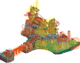
Mictlan
First of all I dont know the movie. Franchise parks always are a hit or miss. So for me surely some references might got lost. So I view the park as a normal fantasy park. Of course the readme helped a bit to understand it.
This is one of the parks that look from the overview holy because of the badass structure and layout but when you zoom into it everything gets lost a bit into repetiveness and overall loss of detail. The entrance island is very great. The church looks very good and everything has the right amount of detail. It's a nice welcoming shot for sure. Then the brigde didn't do much for me. Y was quite an eyesore.
The main island as a structure like I said was awesome! I really liked the different levels, the tall brick columns and the coasters/tramlines floating around all over the place. What lacked were the houses. The forms were cool with everything stacked on each other but the facades lacked details and everything packed with the flickering lights wasnt so cool. It was quite repetitive and a little boring after a while! On the ground level almost the same not a lot hold my interest for too long. I wish yiu would have kept the amount of detail and variation from the entrance area throughout the park. Really cool were the animals and stuff which brought the map to life as a counterpart. Also like I mentioned before, my favourite part were the tramlines which climbed their way between the different levels. This helped also a bit to add a bit more dimension and readability of the height changes! Cool stuff.
Forgotten Mekong
What a great park. What I like most about it was the believable scale which is exactly the one in which I want to build most of the time. The village os really cool. The restaurant at the entrance with the terrasse was my favourite of the buildings! The park has little scenes everywhere, tons of stuff to discover and moreover the little scenes really fit within the scope of the park and are not (always) just stereotype jokes but clever things. As an example what I mean: the frozen staff at the bus with tourist hunters promoting their tourist traps thats just a what I would call a stereotype joke/detail and what would everybody have come up with. On the other hand the monkeys on the CIA controls are a clever detail which made me really smile because its not the kind of thing you would expect. So the CIA base to me seems a little random actually. At the first viewing I caught myself not seeing the connection between laos/cambodia and the base. Because to me the park does seem to be set in our time so I didnt think of any vietnam war connection. Nonetheless this doesnt tale away from the point, that the base itself and the area around it are awesome. Love for detail and clever structures well composed ibto the landscape! The biggest letdown of the park was the central temple structure. It was repetetitve and same coloured. Only the buddha statue was cool. It is on pointand you could actually really see buddha's typical pose! Well done! Landscapingwise the park was great as was the lush foliage.
Forgotten Mekong is just solid parkmaking. Refreshing but still no tol experimental. Like I said, I couldnt connect 1/3 of the map to the rest conceptually but in the end it still worked.
In the end I went with FM because the detail level is much more elaborate than in Mictlan, which on the other hand was on the large scale sight in front.
Okay so Strangelove got me hooked from the first time i opened their park. The thing that really stands out is the incredible archi in the center of the map. The town was very well done too and has top tier atmosphere. I like how the park has so many different things to offer, it makes it a joy to look at. Great park overall. UltraRealists park is built in a style that isnt really my cup of tea most of the time. There were plenty things to like in this park though. Some of the coaster support work was done in a cool way that ive never really seen before. Also enjoyed all the colorful architecture. You guys nailed the vibe on that! Good job to all the builders involved, strong round!
Thanks so much for these parks, i'm going back and looking at them both quite a lot. Train of thought reviews...
Coco - Having literally watched Coco two days ago, I'm feeling a bit warmer towards this park. It's just a hell of a theme to tackle, and could have been so amazing. It's still got a lot of the same problems, though.
The entrance is awesome, great church and cemetery, and excellent bridge. I'd have liked to see the bridge arch slightly more but goddamn that is such a strong opening to the park. Really cool effect. I almost feel you could have completely done without the entrance booths and the staircase upwards after that, and just gone to a really awesome large train station. Like, twice as big as the one you have now, with a bit more space around it to really appreciate the glass roof and interiors. You could have had a few more lines coming out of it, and they could have guided the viewer to the rest of the park. As it is, by the time you hit the train station (which should be the centerpiece, really) you've already been completely overwhelmed by the rest of the park.
The colourful spirits are really cool, nicely done. I recognize a couple of the other places from the film, the dude's villa and the courtyard where he plays Poco Loco are great, but everything else is kinda lost on me, to be honest. There's just too much going on, on too many levels, with no space to breathe. The huge pillars are somehow underdetailed, i'd have liked to have seen them look more real, if you are going to have them at all.
What would have been cool would have been to have the ground-level slums on one side of the map, with nothing above them, so you could see them better. Then as you cross the map, the architecture gets higher and crazier. I know that's not true to the movie, but it would have separated the two worlds a bit better, and made for easier viewing.
Overall, a really cool concept that you've done pretty well on, but not quite hit the mark, for me.
Mekong - As I mentioned before, I LOVED this park. It's very me, I think. I think I skipped totally over the entrance village on first viewing, but second time around it's really great. Very charming, interesting, detailed, believable, the lot. I love it, great work!
What's great about this park, is at this point, I have NO idea that the theme is going to be anything more than traditional Thailand/Cambodia/wherever. It's already really nice, but discovering the true theme is really fun.
The mix of thatch and tile is working really well, and the wing coaster makes me want to go find it and watch it. Every little section of the park is framed so nicely, it's like a series of cute pictures. The middle section with the temple is simultaneously brilliant, detailed, and also kinda samey. However, there's enough around it, and a coaster going through, so it doesn't get too boring. Very brown though, which I get is the theme. The map's built in such a way that i'm constantly wanting to rotate the map to find all the little vistas, which is so clever, and a skill that not many people have.
Then, all of a sudden, I scroll a little too far and find a bloody rocket. This is brilliant. The two themes somehow fit together in such a way that feels organic. The colours work, the structures work, there's interesting stuff everywhere, there's little bits of story hidden away that I want to find, it's amazing. I realise that the wing coaster doesn't actually do too much for me, coaster wise, but then I find a small but brilliant invert, with some of the best snapshots i've seen in ages. The cobra roll with the walls and the lift around it, and the dual helix under the first drop with the diagonal brake run are personal highlights. That curved waterfall is the best waterfall i've ever seen, so organic and natural. And the temple on top overhanging is just excellent, really imposing. It gives the temple such a different feeling from this side of the map.
The secret base, the cutaways, the cool stuff, there's so much more but i'm babbling. I loved it. All of it.
Probably my favorite park now, sliiiiiiiiightly above Dig Site 4 (just because I like the theme slightly better).
Thanks to all those who voted for us, and all those who left a review! Im glad some of you were able to appreciate the ideas that were at play in La Tierra.
First off, I have to say that Ive been wanting to do a park inspired by Coco since I first saw the film when it came out. Its such a cool world that was built, with the colorful towers that reached into the skies. I knew it would be an Herculean task though, and that itll be very hard to translate into RCT. Im glad that ITM was super into the idea and was on board to go head first into this challenge, and it was a pleasure to work with him.
Our original inspiration was from the concept art attached. This tall tower built upon a heavy Aztec base, and we just wanted these colorful literally over-the-top towers that spiral up from there.
In terms of planning and execution... Lets just say that this was the most difficult park Ive ever had to build.
It became quite apparent after the base was planned that this thing would be too tall and too unwieldy but we forged ahead regardless. Its definitely easy to see the very fair critiques about the composition, but its always in hindsight that you realize we shouldve reduced the base and we shouldve had more towers built in, which I think are definitely points we wish we had done.
However, I think both Tim and I can attest to the fact that we still had a blast making this and loved the work we put out. We knew from the beginning that this wouldnt be everyones cup of tea
I think the coaster layout of El Vuelo was an issue that we couldnt fix - both Tim and I tinkered with it up until a couple days before the deadline but couldnt find a way to make it work as well as we wanted. However I really loved the layout for the giga, which was really fun to make and thought had some pretty good flow!
Thanks to Iron Rattler and Biohazard for their work put into the park, it was really a fight for the deadline and they really helped pull things together for us. And thanks to the entire team for their input / support throughout. La Tierra was an exhausting start to the competition, but were not done yet!
That said, I personally would have voted for Mekong as well
Very beautiful image, but when you replicate the fantasy of someone else, you're kind of like any other realism builder. You're losing on the necessary quality of a fantasy builder to be imaginative and resourceful yourself.
Hmm... not sure I agree with that Posix...
I think there's no way you could recreate that picture exactly. So you're definitely going to stylize it, emphasize some areas, do away with others - the craziness of the subject matter almost requires it. You don't have to do that with ultra-realism, as the subject matter isn't complex enough to require it.
Actually posix is correct, inthemanual street-viewed the whole thing.
Source doesn't matter. Turtle, I think you always need a degree of visual approximation, which is why CSO does away with creativity. I see your point how realism is "closer" to the game and thus possibly easier because there's less to approximate, but the principle of making something your subject you then replicate remains unchanged, and I'm not a great fan.
No scoop. We cannot just fucking build. What do you think this is? God
rct is a lifestyle you yeast infection
I get what you're saying, I think. Something that always gets taken out of the discussion though, is that there's a whole step before you start building. I know a ton of "realism" builders who would never even consider building something as crazy as this, even with a load of drawings/diagrams/concept art already made for it.
It's an interesting discussion.
Out of interest, where would you place something like Le Reve Parapluie? Lots of that is just combining ideas that already exist... a circus, french architecture etc. But most people would categorize that as Fantasy. Just as I would categorize this as Fantasy too.
Forgotten Mekong:
- first of all, the entrance was not just really atmospheric and also featured some unique content I havent seen before. Those long boats, the beautiful bus, overall atmosphere was great. What a nice way to enter into the park! I think one critique is that we couldve used more rough edges and character to the buildings, some of which felt too clean.
- same goes for the amazing temples in the center. As others have said, they were too clean for an ancient temple complex in the jungle. However, the exploration of the park and overall map composition really were top notch and the temples made a huge impact as a centerpiece. As everyone knows already, I love and appreciate outside of the box type thinking and I think the unique map layout here was a great choice. The temples themselves were beautifully constructed but it was the reveal as you scrolled across the map that made them really pop and create a wow moment.
- the wingrider was unique and different. Layout-wise, I thought the spikes were a great touch and made it fun to watch. However it did feel too spread out, and I wish there were more moments where you could see more of the layout in one view. The coasters vertical drop out of the temple was a highlight.
- the curved waterfall: stunning.
- the CIA base - I understand the concept that youre going for with the readme shedding light on the narrative here, but while it was well constructed, it felt really out of place. I didnt mind it so much overall and upon repeat viewings it provided a nice contrast to the southeast Asian theme, but it was my least favorite part of the park. I did enjoy the little things that you were able to come up with due to having this unusual theme, however, and it added a lot of enjoyment to the park seeing the creativity of those ideas.
- the invert was my favorite layout out of the two. Compact, fast, great flow, and had several great angles. The corkscrew and brake run were my favorite parts of the layout. The naming of the ride, as others may have pointed out, was a weak point in the narrative but it didnt detract much. I loved the overall flow and look of it, and reminded me a lot of Carreria da Indias invert which was similarly compact and nestled into its surrounding with good flow, good views, and a unique layout while still staying close to conventional ideas of inverted coasters. The custom supports were also really nicely done.
- the bridges and movement of peeps through the park was very enjoyable to watch.
- the reveal with cutaway view was hugely successful for me. I absolutely loved the shock of cutting away and seeing the hidden portion pop up! I anticipate this to be a popular idea for future parks. Unlike the revelation of expected interiors/ hidden portions or small Easter eggs, this was an unexpected reveal that elevated the park above all others in the competition for me. What a fantastically executed use of OpenRCTs new tools to produce an outstanding effect.
- the actual hidden portions werent amazing but the reveal was fantastic.
- didnt quite get the clockface Buddha........? But the Buddha itself was well made.
- the jungle boat ride was a nice surprise in how it traversed the entire back end of the park including the huge elevation changes.
Overall this was my favorite park of the contest thus far and Im not surprised that cocoa was a lead. As one of my favorite contemporary builders, you definitely went above and beyond and topped your best work to date. As I said previously, if I were a spectator to this round, I personally wouldve voted for Mekong easily.
I think this is also an example of a park that shows not just excellent execution and great atmosphere, but immense creativity paired with a strong concept. I am most impressed with the macro composition of the park. Like most of the parks I adore, this showed a strong, clear vision that focused on several wow moments that stood out above the competition. The way you utilized a unique map shape, extreme elevation changes, and the new OpenRCT tools to push the narrative of the Park is so admirable. The more I view it the more I love it and may even alter my 90% rating to 95 or 100%. I already have viewed this park many times and will be coming back to view it many more as a source of inspiration in what I can hope to achieve in future works. Kudos to Cocoa and Ziscor, as well as Ottersalad and WouterVL ( and postercreator...) for a fantastic park you should all be very proud of.
I think personally RCT has been reduced to a modeling tool to recreate things instead of as a tool to create new ideas and tell a story or narrative, to create atmospheres you cant find in any other sandbox tool. I really hope others will look deeper into and try exploring this style of park making which is more than what a lot of nitty gritty technical style NE focuses on nowadays, and that we see more parks with this kind of visionary scope and scale instead of retreads of stale ideas and concepts.
cheers ava, I owe you guys a review too actually. btw, the clockface is just because its a big circle, no other meaning than that! faces are hard
when the parks first came out, I was legitimately worried that ours would feel derivative and boring in comparison to yours. its lively, colorful, and totally new. I really appreciate that. The stacks of colorful archy is fresh and never-done-before, and theres some awesome details, like the entrance and lava bridge. I also really loved the sort of semi-aztec-semi-funfair second entrance. really vibey. I think people have already sort of picked apart the compositional issues but theres still tons to please your eye here, as long as you dont change your camera too much. I especially liked the colorful tower with the spinner, and the way the two sort of connect near where the hanging monorail was. neat stuff. Even if the first two matches went a bit disappointingly for UR I think the team has still been putting out awesome stuff, and i'm still excited for your future stuff more than most other teams.
Mictlan - La Tierra de los Muertos
Based on the vote and the general reception, it seems I liked this park a lot more than most did. While it may lack some overall refinement, I found it really impressive. The sheer height of the construction is a bit mind-boggling. I’m not sure I could stand trying to keep scenery aligned that far up in the air. My favorite view on this is zoomed all the way out to see how everything stands on top of each other so well. I’ve not seen Coco yet which means some of the theme is probably lost on me, but I feel like I don’t need to ‘get’ it to enjoy the park.
Upon reading the readme (which I did for the first time just now) I see that the fire bridge as I’ve been calling it is actually marigolds. Either way it’s pretty spectacular. The little church and graveyard in the real world creates a very nice ambiance to start. Sort of dark and maybe a little somber but with those hints of colors in the festoon flags. A sign of things to come. It’s a lot to take in once you cross the bridge, so I spent a majority of my time walking around as a guest would walk through the space.
My favorite section of the park is everything under the main plane of path. I love all the different pyramids coming out of the water and the little details that go with it. The brown stone and the brown wooden structures lead to a pretty muted area color-wise, but the water, plants, and all the little details help to brighten it up. I love all the things in the water. The above areas are impressive for the sheer build difficulty as I’ve already said, and they work well compositionally despite being kind of a mess. I appreciate the super in your face colors with all the flashing lights.
Coaster-wise I was a little less impressed, though they were still fun. I was a little confused seeing people say the invert needed supports—it absolutely does not and is fine without them. I feel like you’d create a lot more clutter if you did. What I do like is that while they are definitely not realistic (which I don’t expect), they did have a great flow for the most part. The invert especially--I think that was my favorite. The tram systems too were very neat. They give a nice indication of just how much grade change there is among all the areas. Good move on making the speed consistent too.
Here are the little things I liked in the park:
Very charming little graveyard with the added benefit of the peeps walking around it.
Not fire—flowers. Still cool.
Love the skull here and the floating platform in general.
The frogs are great. Gives some good movement to the area. I also really like the skulls like this that are scattered around.
Not sure why, but this section of queue is really great. I love how it pops out of the pyramid, circles around it, and goes right back in. I enjoy the varied wall texture as well to give it some dimension.
Dat flow. And those supports. It’s compositionally really nice.
I would’ve gone crazy building something like this. Credit to your patience. The structures work pretty well together.
Great frozen staff to make a statue.
I like how this ride is visible on this and nestled in and under the building structures above. This is one of those instances where I wish we could have a little more ability to see this game in 3-D. Would be cool to see this from the perspective of the ride platform.
Mictlan was a lot of fun. I enjoyed my time walking around the map and felt like there was a lot to look at across the board. The lower portion definitely stands out for me architecturally, but the top side has more show to it and is so impressive structurally. Great work.
Forgotten Mekong
Every time I view this park, my opinion of it goes up. Whereas Mictlan excelled with the macro, this knocks it out of the park with the micro. So many great details to find. The premise is fresh and clever and I appreciate the story that went along with it. I don’t even think a readme was necessary here. The theming and landscape convey things well enough. There were multiple wow moments while looking through everything. The first time I viewed it, I didn’t even use cutaway, but I’m glad I came back and did.
The French town has some nice Asian touches to it. It achieves the colonial feel very well I think. And all the little ships and carts and markets are just so well detailed. And I love the animated monkey objects that are everywhere. The first one I noticed was on a roof by the entrance and then I kept seeing them throughout which made for a little scavenger hunt.
I’ve always loved Angkor Wat and it’s pretty high on my list of places I want to go. So this temple feel is just perfect. I’m happy you went with the multiple shades of brown on the structure as it gives it some more depth and keeps the whole thing from being too monotonous. I like that the whole thing isn’t completely crumbling but instead has some subtle touches of plants taking over and a few 1k ruins to give it that aged look.
The military base is brilliant. Starting with the rocket which is maybe my favorite thing on the map, the quality continues through the airplane hangar and the cutaway facility in the corner. It’s almost like a preview to the EVIL park later in the contest—it has a great vibe. Among coasters, the invert had a nice layout with some very good flow through the landscape. It’s the ride I enjoyed most here. The wing coaster was ok, but also felt a bit forced and unnecessary when compared to the amazing atmosphere throughout. As I’ve had the park open for this review, it also got stuck on the vertical spike by the rocket and the next train crashed into it. Strange.
Lastly, the cutaway moments added another fun exploratory moment to the park on top of what already was a fantastic park. So many little details to see in there and a nice hint with the “cutaway canoes” ride. That leads into the little things that I enjoyed about this park:
These vehicles are some of the best in the game, especially the bus.
But the boats are fantastic too.
This architecture blends that French and Asian feel and the trellis with vines makes for a really cozy spot. Great micro detailing.
Again with a really nice market stall.
Compositionally I like the arches along the front of this larger architectural elements on either side.
Best shot of the park. Maybe one of the best shots of H2H. That rocket with the curved waterfall in the background is just so damn pretty.
Rock climbers. Jimmy is doing his best.
The recovered Russian missile and satellite look so good. And the patrolling staff with all the names help to explain the story in more depth. I like that that’s becoming a trend.
Cutaway view was put to excellent use here with the lab built into the ruins.
Indy!
These planes are super good.
I enjoy the little incense sticks all over and the effort that must have done into the sculpture.
Congratulations on a super atmospheric park that still lets me find something new on each viewing. I would love to see more parks like this with the quality of storyline and theming to go with it. Great work. I could absolutely get into building something like this. If I ever went a little more fantasy, this is how I’d want to build.