Park / [H2H8 R2] Forgotten Mekong
-
 29-April 18
- Views 19,520
- Downloads 921
- Fans 2
- Comments 62
-
![Park_4093_[H2H8 R2] Forgotten Mekong](https://www.nedesigns.com/uploads/parks/4093/logot.png)
-
 85.50%(required: 70%)
 Gold
Gold

trav 95% no Liampie 90% no Poke 90% no Xeccah 90% no bigshootergill 85% no CoasterCreator9 85% no Fisch 85% no G Force 85% no Kumba 85% no chorkiel 80% no Steve 80% no geewhzz 65% no 85.50% 0.00% -
 Description
-Strangelove
-
2 fans
 Fans of this park
-
 Full-Size Map
-
 Download Park
921
-
 Objects
495
-
 Tags
Tags
![Park_4093 [H2H8 R2] Forgotten Mekong](https://www.nedesigns.com/uploads/parks/4093/aerialm3831.png)
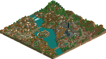
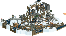
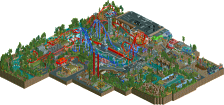
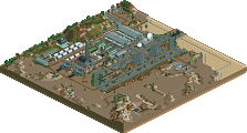
![park_3211 [MM2014 R3] Heart of Darkness](https://www.nedesigns.com/uploads/parks/3211/aerialt2825.png)
The Poll is up! It will remain open for 72 hours.
Only just worked out what Cutaway View is, goddamn that's very clever. Definitely opens up a whole new option for hiding things away.
Having said that, I LOVED Forgotten Mekong. Literally everything I want in a park. This and Dig Site 4 are my clear favourites so far, and they're about equal probably.
I wanted to love the other park but it's just so messy that it's really hard to view. There's no real composition which makes it really hard to notice anything. Pity, because the theme is fantastic. I expect to see this theme done again in the future, and done better. Having said that, I can definitely appreciate the work that's gone into it, so well done.
Full reviews later.
Finally got a chance to get a deep look into both of these parks.
Mictlan, as others have said, is a great idea, but the execution is lacking a bit. The church and flower bridge were great, and then it kinda went downhill from there. There isn't enough compositional flow between the levels, and because of that, each level kinda suffers. The bottom level was way too large, and the theme got really repetitive. Once you'd seen one pyramid, the rest were really similar. The top levels were much less repetitive, but its really hard to look at them without seeing the huge structural mess holding it all up, which isn't nearly as nice looking. I did like the colorful buildings and there were some really nice moments within (like the skull near the top, really cool!).
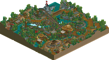
Forgotten Mekong was pretty awesome. Cool idea, and good execution. I found myself exploring the map, and finding the hidden base was a really cool moment. The waterfall was amazing, as others have said, and I really enjoyed following the wing coaster through the map. And of course, the amazing little scenes everywhere that make you hunt for more storylines (for example: "How are the wife and kids?" "Unhappy cause this post sucks.") I definitely see myself coming back to this park for inspiration in the future.
Forgotten Mekong by Strangelove
Mictlan
First of all, I loved Coco. It was one of my favorite movies of 2017. You can clearly see the inspiration the movie had on your park, but it's also clear that you very much did your own thing with it. That shook with my expectations but I got over it. Naming a character Mama Cocoa was priceless. Cutaway view brought this park to the next level. Overall a very good job. I loved this park a lot. Only gripe I can think of is that I'm not sure whether the palette change was necessary. Or maybe that the staff names weren't so organised, but when that becomes a criticism you know there aren't any real criticisms.
Forgotten Mekong
One of the most enjoyable Asian themes I've seen in a while. That temple was insane and Lan Xang was incredibly fun to watch. While I liked the idea of the military base - and the base itself - I did not find it fitting to the park. It worked in adding another layer to a theme that's been done plenty of times, but the contrast it provided to the rest of the park was possibly too much. The cutaway canoes were a really good way to get me to use cutaway view btw.
Forgotten Mekong:
Great park, showed great skill. I love the space rocket (of course). I also like the monkeys swinging from the support structure. I didn't really like the layout of the wing coaster, but I have a hard time liking wing coaster in RCT in general.
The boat ride was great to follow around and discover the park at peep level.
Edit: This park reminded me of the final battle scene of James Bond: Goldeneye, one of my favourite movies.
Mictlan:
I liked the church and bridge. I didn't like what followed. I had no idea what was happening and I had a hard time focusing on anything. I didn't enjoy this park at all, not my thing. The coaster layouts were also really awkward.
Therefore I voted Strangelove
For once I was actually able to open both parks on my ACTUAL computer and spend a decent amount of time looking at them. Was it worth it? Lets find out; its time for...
COCO VS. (PROBABLY) COCOA: A STEVE REVIEW SHOWDOWN
Liampie edit: NO NAME GUESSING
All right. Its all come down to this. The final park of the season (that I will actually still care about) and its a doozy. We have a park from Team Rusty Can I Get Another IPA G Force and The Ultrarealists, whos team name now looks even more ridiculous after viewing their park this round. Who will come out victorious? Probably Team Rusty, because its looking a little one-sided, to be honest. Suck it, alex (just kidding, kinda).
First up, we have GOOOOOOOD MORNING MEEKONG, and I gotta say, the initial reaction is strong with the force. Opening the park on this entrance(?) area was a good move. Great atmosphere, akin to that new Dominos that just opened up down the street from me. The details were all there and I really enjoy all these little storylines with the frozen staff scattered around (the monkey took that guys sandwich, what a dweeb). Overall composition of this area was successful much like myself in the member of the year category and the architecture was busy yet refined. Honestly, I wish the entire park was like this. As I move around the park towards the center I find myself in this temple area, and while its impressive I also find it incredibly unreadable. I enjoyed watching the boats though, and I laughed imagining an actual Jungle Cruise boat going down a drop like you had it doing (you would be sued, maybe). The opposite side with the rockets and hangars were all very cool but they just didnt appeal to me much. It was all very well done but I would prefer the class and atmosphere of the village area on a full map, I think. I had a hard time following the coasters through all this too, but they were well put together (you guys are really good at clicking the build buttons, I think). Overall a solid map, still, and in my eyes the better of this match just based on skill alone. WELL DONE (speaking of well done, I could use a burger).
And now, we have Mikeland feat. A Culturally Accurate Animated Film. If I can say one thing about this park, its that it really catches the viewer off guard. In a good way? Mostly. Or maybe a bad way, Im not sure. I usually have my wits about me and for you to fuck with me is uncalled for, so, fine. Catch these hands, alex. Anyway. Im looking at the church and its nice and atmospheric and oh, theres a cool fire bridge, man, Im really enjoying this journey and then theres an entrance and oh theres some really tall pillars and oh theres more and theres a lot of stairs and oh wow when is this going to end how high does this thing go holy shit what the fuck is happening to me I need a breather where is the escalator wow. I was overwhelmed, to say the least. In a mostly good way, again. Its all very impressive and I hate to this about your park AGAIN but this just isnt for me. Very rooted in fantasy and just so much going on and its so fucking tall. Jesus. Liam is right: how DO you make an aerial for this? This will take, I dont know, maybe minutes to complete. Anyway, there were some things I liked about the crazy tall place, and it was mostly around the blue giga coaster. Had some very classy moments and a nice atmosphere (brings me right back to that Dominos, Im telling you). Overall though, Im sorry, I just dont enjoy this kind of parkmaking regardless of the skill displayed. At the same time though, I do find your opponents work a bit more skillful still. Anywhoozle, a great effort.
All right, there we have it. Another Steve Review for the books. These are the kinds of things posix will ask Liam about years from now in hopes he will drudge through the way back machine and add them to their pointless imaginary history lessons. Right next to Louis review, which is basically him just voting for the park. Which I can respect; its a bold move. Perhaps too bold. Louis take a hike (and take me with you so we can run away together).
I'm impressed. You made it through without mentioning Ghoul once!
The scale of La Tierra is very impressive and at first blew me away. The concept was also cool and executed generally well. But the ride design was rather lacklustre and navigating the park was a bit of a nuisance. Also think it was lacking in a bit of having interesting details to keep me coming back.
Mekong was brilliantly solid and I struggle to find any flaws. It was just executed incredibly well, beautiful architecture, and does everything it was intended to do. The ride design was wild and incredibly exciting. Also the use of cut-away was very very cool.
Both strong parks but Mekong was far more refined in its qualities, in my opinion, and thus Mekong is my vote.
So we just had a bedroom incident matchup earlier. Now it's still funny how the concept of Mekong is actually a bit similar to the one of Dig Site 4 from round 1 (not a criticism obviously).
Let me just say that with these 4 parks from round 2 it's already becoming a crazy H2H with amazing ideas and real high quality parks. I loved the idea behind Mictlan and was sure it was going to be the cooler idea. Yet the Soviet base in Mekong evens it out again as it's really cool humor and feels like a great James Bond/Indiana Jones/Tomb Raider inspired underlying concept.
Mictlan's map entrance, the bridge, the gates are all really well done. You instantly got the idea that the theme was going to be special. I also love the audacity behind building such tall colorful structures on top of everything else. It looks really cool in my opinion and is my favorite aspect about the park. El Poco Loco was the nicest of the coasters for me actually. Adding the bell tower on one side and the music festival on the other was also interesting to look at. I just wish there'd have been even more standout scenes like those two, like the bridge, like the church with the graveyard. Overall it's a really great idea coupled with good execution. Some more highlight spots and scenes would've elevated this further for me.
Mekong became better the longer I looked at it. Some fantastic scenic views around the map, with great elevation changes and cool coaster integration. Obviously the cutaway view thing (even though we saw it before) was spectacularly well done. Initially I thought this was going to fade out behind the big temples and the Khmer archy, yet the Soviet stuff is definitely my favorite thing about this. So that was a huge wow effect when I ventured across the map to find all the cool ideas behind that. Some of the entertainers were quite well integrated, the planes are spectacular and the suspended bridge is very nice as well. The inverter is my #1 coaster for this park, although it's squeezed against the map edge. The interaction with the landscaping and scenery was very nice on all the rides in general.
In the end I went for Mekong because it just had so much to look at and I kept finding more and more stuff. While I love the idea and the crazy/colorful approach behind Mictlan and applaud that, Mekong also was technically a bit cleaner which is another factor for my vote. Both parks had great ideas behind them though and are certainly highlights in terms of surprise ideas for me.
I haven't seen Coco, but I've seen enough of the concept art and development process behind the movie to understand what's going on, and the entire bit was instantly recognizable. The flower bridge was a great touch and one of my favorite elements of the park, as well as the excellent sculptures scattered about the map. What lost me is the scale: while impressive, I don't think the scale of the park matches that of the film's setting, and I want to blame that mainly on the massive bottom portion of the map that takes too much vertical real estate compared to the top.

The film's depiction of the Land of the Dead features buildings on top of buildings, stacked indefinitely, and I don't think the park we received captured this as well as it could have. I feel like that if the bottom portion of the map weren't so emphasized, and the overall park "plane" lowered, we could have had far more stacks of buildings, even more lights and color, and a rather unique vertical park with architecture spanning in all directions. Even looking at the piece above, I see stretches of buildings and arches in all directions, and with the "park on tables" we got, that image was not captured.
Details like the music, the "dead" peeps, the aforementioned bridge and sculptures were all great details, but being that the overall image of the film was not captured, the park unfortunately fails in its mission. What we got is definitely cool, but since the most important mark was missed, everything else becomes a barrage of details trying to get the viewer to ignore it. Flying coasters, music, and ghost peeps are cool, sure, but they're just filler rather than icing on the cake.
The sculptures were cool tho. I had a fun time finding and dissecting them all.
The lower levels were cool, but I agree with previous sentiments they had repetition issues, and werent as badass as the top structures. Speaking of which, the conglomeration of buildings stacked at the top was the clear highlight for me. Very, very cool stuff. Im not one for absolutely bizarre coaster layouts kind of like this had, but I dont consider them negatively. I do think their location within the park was weak, as were the majority of the rides. For some reason, it felt like everything was more attached to the bottom side of the support structure than anything. These things considered I still consider it a really awesome and fun ass park, and the ambition is incredibly impressive.
Mekong was cool as hell, and appealed to what I like in H2H parks quite a great deal. This time Ill start from the backside of the park, as the missile base and airplanes, Russian cosmonaut base was just so cool. It fit in the landscape so well and the view with the waterfall backdrop was all sorts of badass. The underground and exposed sides scenes were also a highlight - really showed dedication to make all these so well done. The spec ops invert was pretty decent, but felt kind of after-thoughtish tucked into the corner so much. But hot damn, is that not a good name for it. Wouldve been a name for some kind of highly themed attraction instead, possibly. The wing coaster was cool running across the map like that. Im not sure if its the most amazing intrinsic layout, but it really does do the job of spanning the map and serving as a flagship coaster. I do wish we couldve seen more of it however, most was hidden away.
The huge temple was very cool - its incredibly difficult to execute these kind of things and I thought this was a great example of how to do it. Great work setting it into the waterfalls and landscape, though, its the kind of stuff I love in parks. Ill admit I wasnt immediately convinced by the front architecture as quite as cool as the rest, but it really did grow on me. After viewing it a few more times, I can appreciate the atmosphere its going for, and it does accomplish it. I loved the strapped up bus at the entrance too. Probably one of my favorites this season and can see this one being mentioned as one of the prominent parks across several seasons, well done.
Mictlan (I haven't seen Coco, just previews of it)
Top 5:
[1] I actually quite like the pre-entrance. I expect different things from H2H, and the little church and fire/flame/lava/orange walkway was fresh and well built considering it's uniqueness.
[2] The various rides you used simply for the sake of atmosphere was great, the dragon flies, the dragon coaster dodging in and around the actual coasters and architecture was cool.
[3] I think the sheer skill it took to build such a towering park, placing rides on top of rides on top of rides was well done... must have taken a lot of patience.
[4] Probably the highlight of all the archy on the map, I liked the lower levels around the water... temples, ride integration, waterfalls etc.
[5] Not much has been said on foliage much this H2H, but the bits and pieces that actually had shrubs, trees and bushes were well done.
- It seems this park was almost too big for H2H, I mean by that it was so tall that when I rotated the view I had to re-orient myself every time. But it was also too big in that I think a lot of quality was lost on execution due to the sheer volume of construction that needed to be done and the park suffered as whole because of it.
Forgotten Mekong
Top 5:
[1] I was sucked into this park right at the entrance, very cleanly built, great architecture but bustling and full of life. I sometimes feel like asian archy is overdone, but like Tubiao, this is a fresh take that was executed very well. The waterside was tastefully done, very quaint little dockside marina.
[2] I love that dense jungly, swampy, temple atmosphere at the heart of the park, with Lan Xang diving in and out, with the little tour boats meandering around the staggering structures.
[3] Heading the the park of the park brought a whole different dimension, with the hidden CIA base tucked in behind the scenic waterfall... great themeing with the rocket, satellite and base operations.
[4] Another park takes advantage of the cut-away view to add a new dimension to an already stellar park, to reveal more CIA stuff, hidden temples and statues. So cool.
[5] The strategy to use the height variations, descending lower to the park as you went further was very well executed... it wasn't just for the sake of doing it, but served a real purpose to add depth to the park.
- One area that annoyed me was the repetitive nature of the center temple structure... more variation could have made this great park even better.
Mictlan:
+ statues and that insect ride are amazing, really great work!
+ entrance island and graveyeard are lovely
+ that middle building of the upper part is great, might be my favorite archy from this, exactly my cup of tea!
- the archy felt much too random in some places in my opinon. I have no idea what coco is, so maybe that's the problem.
- coasters don't do much for me
- i've looked 2 minutes on this park, and somehow i don't want to explore more, maybe it feels a bit too repetitive in some places
All in all a strong concept, but the execution lacked some things for me. 65%
Forgotten Mekong:
+ opening the park and seeing the park entrance with this bus is just amazing!
+ city, boats, water infrastructure are all awesome
+ PLANES!!!
+ wing coaster flying through everything is so great!
+ invert is an awesome coaster too
- temple in the middle felt a bit too overdetailed in some places in my eyes
I'm not really sure what more to write about this. I think this might be my favorite park so far of this contest. I'm in love with this! 95%
I'm clearly voting for Forgotten Mekong.
Voting Closed

Strangelove beats Ultra Realists!
Strangelove vote count: 42 (72.41%)
Ultra Realists vote count: 16 (27.59%)
Forgotten Mekong was made by Cocoa (58%), Ziscor (35%), ottersalad (4%), and WouterVL(3%).
Mictlan - La Tierra de los Muertos was made by inthemanual(40%), AvanineCommuter(40%), Iron Rattler (15%), and zxbiohazardzx (5%).
Woo! When we submitted this, I honestly didn't know if it was going to do well, especially with all of itm's trash-talking
Here's a quick breakdown of who did what:
Ziscor absolutely smashed the town- I pretty much just told him "make it like Luang Prabang, here's some pictures" and he did such a good job. He also made the underground section so much bigger and better than I thought it would be- I just added the aliens based on Alien Encounters from disney (man I love defunctland). I really loved the comment that someone (sulakke maybe?) made where he said it reminded him of Luang Prabang, because it meant that we got it exactly right. Really great job Ziscor- once again all the best parts of a h2h map I make are not by me! (Shoutout to trevin). So many of the little nooks and crannies that add detail that people loved were from Ziscor- in the last week he added a huge amount of shine and polish to the map.
Wouter did the majority of the bomb silo/computer center cutaway. He'd also be annoyed if I didn't say that he added the little tower on the water in the Jungle Cruise station . Otter did most of the supports and tons of little touches here and there. Cheers to both of them, they helped add a lot of magic to the park.
Also credit to the rest of strangelove for giving feedback all the time and especially when I requested near the end that they give me thorough, harsh feedback, even though they mostly just said good things anyway. Especially Russ for pushing us to include the invert (or any layouts at all) in the map, and doing a bunch of hacks I didn't understand. Fuck coasters are so hard to make well... And of course In:cities for the incredible poster!
I did everything else, which was mostly more specific architecture and monuments I wanted to recreate. Patuxai arch from Vientienne (although we compressed one of its dimensions), the temple complex, the CIA base, waterfall, rocket, bus depot, Jungle Cruise station (one of my favorite buildings I've made actually), lots of foliage and landscaping and boring stuff. I regrettably did the layouts too, people should stop getting me to do them... I think my best single thing in the park was the writing and tiny american flag on the side of the rocket. I thought that was brilliant object usage
A bit of insight into the planning process:
Our park started with a trip that I took with a couple mates to Laos and Cambodia. Heres a bunch of photos I took of the trip with my friend's old film camera (for banter) and that we used as inspiration for much of the park. You can also have a quick gander at my true identity, which is always fun (dark brown hair guy). I put a few little details in that are just references for my friends at what we got up to. I think we didn't quite get the angkor feeling there but I'm not upset with anything we did make. It sort of turned into its own thing by the end.
Here's some concept art I drew up, that ended up being very close to the final product:
The sort of story that the park tells as the viewer moves through it was probably the most important part to me, and I was really pleased with people like Liampie narrating their sort of 'discovery' throughout the park. That kind of feeling was exactly what I wanted, and I think really justified the use of cutaway as this exciting discovery. I'm hesitant to set an interior-decorating precedent with that, but I think it made sense thematically here. I wanted the park to become more mysterious and atmospheric as you moved through it, sort of like working through a good video game. Probably the biggest influence for this park was Carrera (not really Lijiang, I intentionally avoided it) as well as literally anything by Turtle.
The CIA base was obviously a bit fanciful, but I did want to create reference to some real Lao history. Long Tieng was a military base operated in secret by the US in plainclothes during the Vietnam war period, because they officially weren't involved in Laos. They armed and trained one of the larger ethnic minorities in Laos (Hmong people) in a sort of proxy-civil-war but it sort of fizzled for them and Laos today is still communist, in name at least. At one point Long Tieng was one of the largest cities in the region, which I think is such a fascinating piece of history. Lan Xang is the name of the ancient Laos empire that was sort of a split-off from the Khmer empires IIRC. I wanted to try and be sort of mature with the culture/history, as much as you can when at the end of the day you're still making a theme park. The sort of geography of the park is inspired by Northern Laos, with lush waterfalls and spiky mountains. The Khmer empire didn't really make it in force that far north so you'd be a bit pressed to find a grand temple like this near Luang Prabang, so we took some creative license there.
Anyway, enough writing for now. I'm really pleased with the response and proud of my underdog team. I'll get a review up for Coco soon
Avanine was a surprise! Well done to everyone involved. I really love the park that our team came up with, and Ultrarealists put up a strong contender as well.
The underground cutaway was pretty much a last minute addition I at least didn't plan for, and I was worried it might not be up to mark compared to the other stuff on the park, especially cocoa's temple above it (which was a trip and a half to see being built gradually over time) so just want to express my gratitude to those that liked it, and cocoa for those last minute alien chambers additions. Making that underground work in such short time wouldn't have worked if the dude didn't build that.
In particular in:cities was massive help in providing us with ideas to create small points of interest across the map, like Andrew Zimmern in the market eating scorpion on a stick or the mountain climbers, or cocoa's idea to get monkeys in there (would have personally forgotten adding those in otherwise honestly).
We were up against great competition and I hope to hear the building process UR had for it. Planning and building Mictlan would have been quite tough.
[PS: Wouter also did exactly one building early on in the town. Is it easy to spot which one?