Park / [H2H8 R2] Forgotten Mekong
-
 29-April 18
- Views 17,745
- Downloads 810
- Fans 2
- Comments 62
-
![Park_4093_[H2H8 R2] Forgotten Mekong](https://www.nedesigns.com/uploads/parks/4093/logot.png)
-
 85.50%(required: 70%)
 Gold
Gold

trav 95% no Liampie 90% no Poke 90% no Xeccah 90% no bigshootergill 85% no CoasterCreator9 85% no Fisch 85% no G Force 85% no Kumba 85% no chorkiel 80% no Steve 80% no geewhzz 65% no 85.50% 0.00% -
 Description
-Strangelove
-
2 fans
 Fans of this park
-
 Full-Size Map
-
 Download Park
810
-
 Objects
495
-
 Tags
Tags
![Park_4093 [H2H8 R2] Forgotten Mekong](https://www.nedesigns.com/uploads/parks/4093/aerialm3831.png)
![park_3211 [MM2014 R3] Heart of Darkness](https://www.nedesigns.com/uploads/parks/3211/aerialt2825.png)
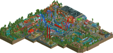
Round 2 | Match 2
--- POLL CLOSED ---
Mictlan - La Tierra de los Muertos (RCT2)
VS
Forgotten Mekong (RCT2)
Voting Rules
- You should only vote if you have viewed both parks in game.
- Everyone but players belonging to either team in the match may vote.
- Voting will be monitored to improve fairness, and anyone found to be abusing votes in any way will be punished.
Initial reaction is that the Strangelove park is great, but very reminiscent of previous parks, and Coco is very, very tall and perhaps a bit too ambitious.
I'll obviously continue looking before being able to choose.
Two cool parks. At a quick glance Mekong looks like the winner for me, maybe even my personal fav park of the contest so far. Plan on looking at them more later. Hopefully I'll be able to leave my thoughts in a video with scoop.
and maybe the ones we missed also
Strangelove's park is very good but Ultra Realists park is on another level for me...Simply an amazing park.
Zombie guests FTW!
I love the bright colourful nature of La Tierra. And the music is a great fit. Rarely does a park make me smile quite so much. There is something going on all over the place. Although perhaps held back a bit by some confusing ride design.
Mekong is also excellent technically and the temples amazing. There's a very different atmosphere to La Tierra and its certainly not as fun. Although any park with some space stuff in is automatically great for me.
It's too early for me to choose yet as i need a more detailed look later but all signs are to an interesting match up. .
Id hate to see alternate views of Mictlan had Julow built on it
I'm not much for reviews, but I just wanted to say I loved the treasure hunter easter egg in Mekong. Made me laugh hard.
Wow what a park Strangelove. Yet another fantastic round for you!
Another high quality match! One of the two parks isnt my cup of tea normally but im gonna take some time, who knows it will grow on me.
this is an interesting match up!
Two excellent parks, my favorite parks of the contest so far. They both have an offbeat atmosphere in their own way and feel larger than they actually are. There are some interesting rides too. I find this match a welcome break from the previous one where everything was grounded in reality, which is fine, however this H2H has had some nice contrasting matches so far. Great work to all involved.
Ultrarealists
The name of the park, the read-me and even the screenshot are promising. The concept of the park excites me, and seeing the screenshot reminds of Carreira da India, so I'm hoping for another 'journey park'. Which it kinda is in some way. The first view of the church and the lava bridge is amazing, really good and it sets a great vibe.
However, after the bridge I'm kinda lost. Don't get me wrong, I don't want to say it's bad archy or so, but this kind of stuff is just not my cup of tea. Like the lights on the buildings, it annoys me and drives me crazy. But that's personal. The coasters don't excite me really either, and I wonder why the spinning and the wing coaster are (kind of) supported but the inverted isn't at all?! El Vuelo most mean flight or so, guess that's the reason. But it kinda looks odd to me.
Overall this park didn't hold my attention very long. I think the concept is great, but the execution is not as good. Shame. Still want to congratulate the builders because I realize building this stuff is not easy. My review is a bit harsh, but it's just not my cup of tea. Please don't be mad, I can't really help it. 65%
Strangelove
We've seen Asian parks before, that is not so new. But yet again, the narrative written in the read-me is really good and did excite me to explore the park. That's something both of these parks in this match-up do really well. The first view on the village is nice, archy is really good and the town has a nice vibe to it.
The temple though, is phenomenal. Wow! Great job, kudos for the dude that built on this. The wing coaster going around/through it seems like a fun ride, bit too much hidden away for me but ok. When it came to coasters, I really enjoyed the invert, great lay-out! That's also the CIA base part and after reading the read-me I thought that this base isn't really hidden so well... but the read-me also mentioned tunnels etc which reminded me to use the open cut view... gladly the read-me reminded me of that (otherwise I never use it while viewing parks) and holy shit, glad I didn't miss out on the underground stuff! Really good stuff.
Also want to mention I really loved the dancing monkeys and the monkey hanging on the supports of the inverts! Who doesn't love monkeys anyways?! I really loved this park, it's definitely one of my favorite H2H8 parks so far! 90%
I think it's pretty clear my vote will go to team Strangelove.
Fred, your review makes it really obvious you didn't read the readme. It explains a lot of what you've had issue with, although I wouldn't expect it to sway your vote.
This is pretty funny, seeing as he was just talking on Discord about how he wished Wit's End had a readme.
I did read the read-me but clearly forgot about some stuff when viewing the park. The bridge seemed to be more like fire/lava than flowers but like I said, I have no problems with the bridge, I like it. It does however explain why the inverted isn't supported, oops. Sorry!
But it still isn't just my cup of tea, so yeah won't swing my vote. I'm sorry.
Yeahyeah I did read both read-me's, than opened both parks. Than re-opened the parks and gave my review. By that time I just forgot most of the stuff written in it.
Forgotten Mekong
 ). Great use of rusty walls in the waterfront area. There is a lot of detail in this area, a lot of little places and corners with character. Yet the area is very easy on the eyes and easy to read. Well done. The music is perfect to set the tone for what is to come...

Okay, first of all, great poster. Read-me is intriguing. Loving the theme already! Opening the park: entrance area is great. A lot of beautiful architecture like the gate and the Bamboo Bowls and Beyond building (
Which is, firstly, the temple complex. It's super well done, and the best archy in this style we have seen aside from Bayon Falls. However it was also a bit 'empty'. Very detailed, but all the details were purely ornamental. No 'little things' at all. Just a sea of brown. An exception to this is the side of the map where the fantastic giant buddha is (incredible job guys), and the enclosed cobra roll. That's the best bit on the map and perhaps my favourite H2H moment yet. When I view a park I sometimes toggle invisible scenery, invisible rides, and whatever, just to help me orientate. Doing that in this area reveals that the entire thing is built on water and there's a big hole in the middle. Okay? It's hidden so I don't mind but it's confusing.
Moving on... I knew it was coming but it still felt like I discovered something great. The base. It reminds me of the crater area in DisneySea, but way cooler. There's so much to see and it's all so well done... The waterfall is perfect. The rocket is top notch and in a beautiful spot. All the bridges (so good). The planes, the satellite dish, the bunker with the typewriter monkey's... Amazing. I wish I built this. The little scene with Chekov the lost tourist was also very nice. Again, the rusty walls are working wonders.
The coasters: Lan Xang, the wing coaster is way too fast in places. Layout doesn't flow too well, but I really appreciate some of the great interactions and also how it has reversed sections. Very classic RCT, something I was hoping to see this H2H. The spike at the rocket island is definitely the highlight of the ride. Love it. Long Tieng Spec Ops (what a shit name), the invert, is again a bit too fast in places like the corkscrew. However the layout looks super smooth. I already mentioned the cobra roll, but the two helices that sandwich the MCBR are another highlight.
Oh, and by the way, I figured out what the hole under the temple complex was. Incredible. Idea and execution. Pushes this park over the top! I love it, and I know I'll be coming back to this park a lot. I'm now ending this review because I've used every superlative in existence.
Mictlan
A Coco park! Parks based on movies or other things are usually reference heavy and therefore reliant on the viewer being familiar with the source material. Bold move. Luckily, I watched Coco only a couple of weeks ago! The entrance (church) is a good start. Even if you're not familiar with Coco you should be able to figure out what's going on here. Across the bridge, which is okay, there's another entrance. Again, looks good. The wacky combination of ancient temple architecture and modern features like the lights works very well here.
The main portion of the park: not what I expected. When I think of Coco and why it was so visually striking, I'm thinking the endless chaotically stacked colourful houses with neon lights, seemingly lacking a bottom or a ceiling. Instead I'm greeted with some giant stone tables, with on those tables a few clusters of indeed that archy I was hoping to see. The multi-level nature of the setting is so crucial that I think you should've taken more time to make a nice organic composition out of it, and to make the pillars and arches look better than they do here. Definitely a missed opportunity.
The clusters of the colourful Cocoa architecture were super cool in places. Un Poco Loco and that entire spike of buildings was top notch, and I'm impressed with how you managed to get paths to that height without it looking like shit. Since the park is so dense/layered it's hard to watch without lag, but these higher portions of the map could be fairly isolated and thus easy to watch. Is Un Poco Loco a masterpiece? No, but I loved watching it. Great job on the supports too.
El Vuelo de Pepita for the same reason was almost impossible to watch. The lack of supports was again a bold move, but I don't think it paid off here. Think the park may have been better without it. The station is incredible though. The tram line spike is another highlight. Looks great, and the tram ride itself is very unique. I'm surprised the tram ride has sprites for upward curves, nice find. The Intamin in the lower portion of the map was very unorthodox, but fun enough! I appreciate how creative you guys got with the supports.
Some random thoughts:
+ Dead peeps!
+ Station complex for the log flume, love it.
+ Frogs! Clever
+- The white building was well done but felt like it was directly transported out of another random park.
- Music was a bit annoying
- How the fuck are we supposed to make an aerial for this!?
Overall it's a good park with a lot to like, and I will come back to find more cool things that I haven't discovered yet. It also has a few significant problems I think. Great effort, but to me there's no doubt about which park should win here.
Unfortunately I don't have access to OpenRCT at the moment, but I would love to see Forgotten Mekong in-game as I've visited Vietnam and Laos last November. Looking at the preview screenshot, it reminds me immediately of Luang Prabang and makes me wanna go back there. It's one of the most pleasant cities I've ever been to. Great recreation.
The La Tierra de los Muertos preview looks fantastic too. I have no idea what to expect of this park!
Good luck, both teams.
UltraRealists
I'll start this off by saying I haven't seen Coco, so a lot of the references will be lost on me, even with the readme.
I think the park it's self is very much a tale of two worlds, as it's supposed to be, but I don't think it's been done quite to the highest standard. The bottom tier is fantastic. I really like the temples and all that good stuff, and enjoyed exploring around the bottom area. The turquoise serpent reminds me of Helios in the best of ways, and the log flume on the opposite side has some great moments to it as well.
The entrance island and bridge are also pretty nice and set the scene well, but as just a generic park without a narrative, don't really add anything to the park. Of course necessary to get the story across, but there was nothing there to blow me away.
The top tier of the park just isn't my cup of tea sadly. I can completely see what you were going for, but it's just a little underdetailed for me, and I don't see why it's so colourful to then have the colours muted by the palette. I'm also not keen on the bridge structure/supports. I really don't think the wooden coaster arches add anything at all, I think that could have been done much better. I love the white building/complex though, probably my overall favourite thing on the map.
Overall, I think it's a great park, just perhaps it's not aimed at me. The bottom tier is great, the top tier is good and I can see why people would like it, but I'd have like to have seen some more detail there to make the structure more interesting than 'here's a load of colours and lights'.
75%
Strangelove
Well, another park, another custom palette. We're going a bit over the top with these now haha.
I love it. This is easily my favourite park of the season so far. It's incredible, every part of it. The entrance area with the fantastic, authentic feeling Thai/Vietnam/Laos architecture that I've never seen pulled off as well as this; the central area with the awesome temple, not seen it done as well as this since 5Dave as Liam mentioned, and then the secret base area which again, I don't think I've ever seen it done this well.
I don't know where to really start with it, the little details throughout are incredible. The bus at the entrance, the clockface Buddha, the base underneath the temple using cutaway view - it's just out of this world.
I love the foliage, I love the landscaping, I love the architecture, I love the atmosphere, I love all the details. Do I need to go on?
One final thing; that scene with the waterfall looking out over the rocket from the temple is probably my favourite scene in Rct ever created. That waterfall is probably the best Rct waterfall I've seen, and it just makes it feel like something I'd see in a movie.
95%
Don't discount the use of cutaway view on both parks.