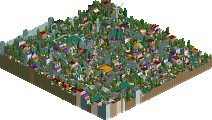
Park / [H2H8 R2] Tubiao Action Park
-
 29-April 18
- Views 28,723
- Downloads 1,009
- Fans 6
- Comments 107
-
 88.00%(required: 70%)
 Gold
Gold

geewhzz 100% yes Xeccah 95% no CoasterCreator9 90% no Cocoa 90% no Dr_Dude 90% yes G Force 90% no trav 90% no Coasterbill 85% no Fisch 85% no posix 85% no bigshootergill 80% no Kumba 80% no 88.00% 16.67% -
6 fans
 Fans of this park
-
 Full-Size Map
-
 Download Park
1,009
-
 Tags
Tags
![Park_4091 [H2H8 R2] Tubiao Action Park](https://www.nedesigns.com/uploads/parks/4091/aerialm3830.png)
![park_4111 [H2H8 R3] Arendelle](https://www.nedesigns.com/uploads/parks/4111/aerialt3851.png)
All these matches have been so hard to vote on! (my inability to use buttons aside...)
While I spent longer exploring Tubiao Action Park, I think I enjoyed Fiera de Flamenco a little bit more. Not only were the ideas in Fiera great and hilarious, but I also found the park very easy to digest overall. Maybe its just my ADD but I've found a lot of newer parks, especially in these contest to be extremely dense and difficult to read, leading the viewer to miss some of the little things until someone else mentions them. Something about the composition in Heaven's park lead me naturally to the little details that they obviously wanted the user to see. Few of my favorite details:
- For some reason the fact that the dancers looked at you from every angle cracked me up, I'm starting to laugh again thinking about it now.
- Loved the gang fight with the two teams as cowboy entertainers shooting themselves in the foot.
- The neighborhoods outside the park were executed very well and I loved the details like the graffiti.
- The swing ride, though fairly simple, just looks so well done. Great example of good execution without over detailing.
One of my few complaints was I guess I'm just personally not a big fan of those fairground looping coasters as a centerpiece, they don't really do much for me.
Tubiao was also full of great details and execution, but was overall slightly less lower on the fun scale for me. The smog palette definitely helped create the urban China atmosphere. I think the best part was the details that went into the buildings outside the park. There's so much chaos and so many textures on the buildings yet it doesn't feel disjointed. The power line jumble stresses me out to look at, but there's no misplaced pieces, which is an impressive feat in itself. Overall everything was technically well done but it was slightly less memorable to me, so Fiera got my vote.
Two great parks, really enjoyed both. Congrats to the builders on some great parkmaking.
As a result of both parks featuring similar themes (a theme park in an urban setting in a specific culture), a lot of my decision came down to execution. Tubiao was clearly the more meticulously constructed and executed, and as noted, showed a lot of creativity in use of existing objects and ride elements. Comparing, say, interiors to interors, Tubiao just felt more polished (noticed I said 'more' polished, both parks felt very polished and put together, but I think Tubiao shown brighter). I give props to some of the more fun cultural references of Feira, such as the football players and Rio-themed areas in the surrounding. Unfortunately, I think the theme park itself felt a bit lack luster. The woodies weren't particularly exciting to watch, and a lot of the other rides felt like traditional realism rather than Rio-specific realism.
By comparison, all the rides in Tubiao felt very China-specific, down to the extreme amount of catwalks on the corkscrew coaster and the bright, crazy colors and 80's-esque styling of the park itself. In general, it felt like there was more activity (particularly all the cars) and more to explore and look at in Tubiao, and that's what won me over, along with some of the best archy i've seen in awhile.
Vote to The Icons.
REALLY? Then everyone better revisit the last Micro Madness final cause TIME TRAVELER!
Incredible parks again, the standard is so high.
I voted for the Chinese one, reviews as soon as I can. Both very good though
Aw, man. This was probably the toughest one for me to vote on so far in H2H8. While viewing both parks, my mouth was open the whole time. It gave me that feeling of "damn. so this is H2H"; something I did experience when viewing DKS and Dig Site 4, but really hit me now due to the tough competition from both teams almost equally. I was stuck for the longest time on which park had more pros simply because after one point there weren't any real cons.
Heaven's Gallery's park is the one I opened first. Started wandering around the surroundings, which I had to fall in love with instantly. The football match was genius. How does one pull off something like that? Damn you, Liam! All the favelas thereafter was where I was truly impressed. The style is not at all what I expected, but charmed by nonetheless with its emphasis on atmosphere over precise recreation. The composition of the whole stack of houses was nothing short of perfection. One building out of place would have ruined the overall shot for me. Amazing. I already know I'm borrowing some of these hanging electric wire ideas for my own projects. Also the birds. Fucking genius. The cutaway detail on the haunted house was pretty neat, glad we're at the point where OpenRCT2's features can actually be exploited to do more than before, not just in how fast it has made things. Cool metro running underneath! Others have already pointed out the great use of hacks that make this park truly special and stand out: I feel the same way. Great archy in the park in general, just the kind that appeals to me.
Didn't want to go that much into small details but I guess we're here now. Already a little fatigued from reviewing R1M1, and that was a while ago!
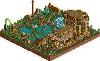
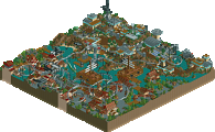
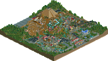
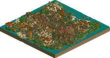
Tubiao Action Park. China. Pollution. Efficiency. Population. Colours. Tradition. Visibly evident to see one specific person's hands all over the park, safe to say. I didn't quite understand the need to use a smog palette at first (makes my terribly cheap monitor screen look even worse) but after a while it felt worth having. Could have easily made it look bad if the colours were chosen poorly, but the end result is just what one could ask for. I've never seen Chinese parks even on Google (didn't think I'd have to for this) but the surroundings painted a very specific picture in my mind, one that's extremely efficient in conveying its idea. I could practically take any screenshot from any angle of this park and it'd be worth having as a wallpaper. Thank you for creating this park. Any concepts done with great accuracy in the actual park are probably lost on me, but from what others here say, I don't doubt it.
In the end Tubiao edged out on a win for me even though both tried to charm me with similar aspects. Amazing effort from both teams, I'd say. I hope the players that worked on both are proud of what they ended up with!
I'm honestly surprised the vote is as one-sided as it is.
It's probably fine margins but if the majority apparently thinks the fine margins are better on one side, then this is how the vote turns out sadly.
Definitely two amazing parks here though.
Flamengo was just so much more fun to me. Lots of really memorable bits, and the custom rides were insane. The ghost ride on its own had me scratching my head. The futbol match in the street was one of my favorite parts as well.
The Chinese park was absolutely phenomenal, and would easily get my vote in almost any other match-up. It's technically perfect in execution, and very very impressive on all fronts. I just found myself enjoying the other park a little more, which is what I based my vote on.
Shame that the matches aren't getting more attention. These two parks alone are right up there with the best of the best from all past seasons, and it's only round two.
Nice work teams!
Flamengo:
+ custom rides were very cool. I spent a lot of time watching the ghost ride.. just a neat idea and the riders changing really caught me off guard.. awesome!
+ The favela was nicely done as well.. the trash and rundown-y vibe was cool. Provided some context to everything.
+ street soccer? awesome
- I didn't like the centerpiece of the racing wooden coaster.. just kinda stuck out. I think it would've been better off to the side? I don't know
- Wasn't a fan of the entrance area.. weakest bit of archy for me.
= I couldn't get the Pepsi Katapul to work right for me.. I saw screens on discord of the trains.. but I couldn't get it to work for me..
Tubiao:
+ Air powered coaster trackitecture for the entrances was well done
+ The surrounding archy was mindblowing.. wow.. just so well done. I agree with Ziscor that any screenshot is wallpaper worthy. Just great use of different objects too. Someone pointed out barrels for awnings? Amazing.
+ The layouts were wacky, yet made sense given the knock-off style of the rides and the readme. I'm not familiar with Chinese reproductions and stuff, but I got the idea very quickly.
+ Jet Star Super 3000.. great name.. great ride.
+ Bike tours around the perimeter added some more life to the sea of moving cars
- Ferris wheel was a bit big.. not a huge deal.
- the highway was too damn loud!
My vote went to Tubiao.. I think the voting should be closer.. both parks were great.. I loved both.. but I had to go with the one that wowed me the most.
This - I'm really surprised that it isn't closer to be honest.
both are p much the same idea, im an archy whore so im voting china. ride design was better in the other one tho ggs yall
Voting Closed

The Icons beat Heaven's Gallery!
Icons vote count: 45 (72.58%)
Heaven's Gallery vote count: 17 (27.42%)
Tubiao Action Park was made by Robbie (95%), Louis! (4%) and Version1(1%).
Feira do Flamengo was made by Cedarpoint6 (60%), Roomie (25%) and Ultro (15%).
I’m disappointed in our loss, but I have to hand it to Tubiao for being an absolutely stunning park. I can see why it beat us as it did. I’m still very proud of our park, however.
This is my first complete park in…. a while. But it was nice to shake off the cobwebs and turn out something I’m happy with. It was a pleasure to work with Roomie and ultro developing the map. I wanted to do a post about the development for those interested. First, here is how the work load broke down:
Essentially, I did the park proper and market, ultro was the favela master, and Roomie was the city and hacks extraordinaire. But there was a bunch of crossover between the different areas. The park concept is Mexico City’s La Feria Chapultepec Magico, if it were in Rio. The fair at Chapultepec is part of Mexico’s largest city park. Our park is meant to be a portion of a bigger area too, but the constraints of map size meant we couldn’t show all of what I wanted. The idea was that the market and football pitch would have led into a much larger park with other activities. Here are some of the inspiration pictures for the construction of the park:
The coasters are based off of Chapultepec, most notably the large Mobius wooden coaster in the center and the Schwarzkopf. The abandoned coaster is based on Parque de la Ciudad’s Vertigorama. This was an early Intamin which was erected, but never operated and is still sitting there rotting. That was the idea for our coaster as well, but park expansion has dictated that sections have been removed. Instead of a Schwarzkopf shuttle loop, I went with the Arrow because it felt a little more unique. I believe it was ultro or Ion’s idea to go with the suspended mouse for the small coaster. I don’t think I’ve ever seen a realistic one in game, so we modeled this after Reverchon’s Euro Coaster, which currently travels in Europe. The idea was that this park bought it and installed it here. The Schwarzkpof is definitely based on Quimera and is actually nearly a recreation, including a bunch of the support work. The ride can run 4 trains without stacking, but Chapultepec only runs 1 of the 2 they have, so I figured I should be realistic instead. The X-car is the park’s newest coaster and the first ‘brand new’ coaster bought for the park since the wooden. I chose that because it was compact, reasonably unique in the RCT world, and I could do the cool hack with it so it ran properly. (that was also sort of why the Arrow was chosen). The other rides are all pretty straightforward, though I want to make mention of the Dragster, which Roomie built and I made work. This is based of the G-Force ride which operated at Fun Spot Kissimmee for several years in the 2000s. There were a few others as well, but this was the most notable. The ride let riders control the start of an air pressurized launch which blasted vehicles up to 100mph.
The park layout is intentionally ride-heavy without much in the way of architecture. When the park first opened, it had some better themed structures in it like the entrance (which ultro first put together and I plussed up), the park shop, and the log flume station. After that, the park was operated more as a fairground, which meant less theming and more rides with only a smattering of carts and kiosks. This is why the stations on the newer coasters are so simple. The haunted mansion façade is Roomie’s with a graveyard entrance by me. It’s based on Chapultepec’s haunted house. Both this haunted house and the “House of Flying Rainbows” dark ride underneath the mouse have full interiors. The gift shop and restaurant next door also have full interiors. Roomie did a great job with the interiors along the street including a partially collapsed structure, a museum, and a library. I built the model for the façade on these buildings which Roomie adapted into a whole street. There’s a billboard telling you to use cutaway view on top of the mansion, but if you don’t see that, cutaway is the easiest option for viewing these spaces.
Roomie was absolutely amazing when it came to the custom rides. In case you missed them, here are all the things in the park:
- Roadway vehicles are new and move at a consistent speed without the need for a chain lift
- The dragster ride use a sports car made to perform like a coaster
- The haunted mansion dark ride is able to be customized to rotate in a certain direction
- There is a floating ghost in the haunted mansion ride
- The Samba dancers
- Slingshot ride
- Football players
- Football in the park, and a can in the favelas
- Rats
- Birds
- Observation balloon (passes overhead every few minutes)
A lot of the hacks are pretty standard stuff, but I was proud of the multi-station, single queue wooden coaster that was also synched with dispatches. The dragster is the same way with the added bonus of having split cars to control the operation above-ground. The Arrow and the dragster both use the same system to ensure a flat reverse point on the visible ride. CHE did the hack to reverse the cars on the Arrow. The operational hack on the Maurer breaks after like 40 runs, but it was as close as I could get it at the time before my patience ran out and I had to move on to other things.
Regarding the park name, Flamengo is a neighborhood within Rio. It was picked sort of at random though it happens to have a stop for both metro lines, which is reflected in the metro line naming and coloring in the park. Liam had suggested Jardim do Botafogo, but Roomie and I thought that sounded funny which led us to calling the map Rio Butt Park for a while.
Given some more time, I had a few other ideas and details to add, though I’m not sure anything would have been able to take down Rob’s park. It’s truly a masterpiece. Thank you to everyone who voted for us or even took the time to write a nice review!
So Icons used up their solo park?
Well done Robbie, my favorite park thus far. It kinda circumvents the whole idea of a team based contest like h2h, but it's quality work for sure!
CP6, what a great explanation of literally everything in the park! Really cool to see everything that went into it.
I love a good explanation post. Kudos on a great park and a solid matchup
Great job by both teams, congratulations to The Icons.
Roomie was a surprise!