Park / [H2H8 R2] Tubiao Action Park
-
 29-April 18
- Views 28,723
- Downloads 1,017
- Fans 6
- Comments 107
-
 88.00%(required: 70%)
 Gold
Gold

geewhzz 100% yes Xeccah 95% no CoasterCreator9 90% no Cocoa 90% no Dr_Dude 90% yes G Force 90% no trav 90% no Coasterbill 85% no Fisch 85% no posix 85% no bigshootergill 80% no Kumba 80% no 88.00% 16.67% -
6 fans
 Fans of this park
-
 Full-Size Map
-
 Download Park
1,017
-
 Tags
Tags
![Park_4091 [H2H8 R2] Tubiao Action Park](https://www.nedesigns.com/uploads/parks/4091/aerialm3830.png)
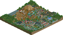
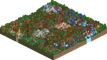


Heaven's Gallery
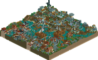
Pretty interesting parks here, first off. Two dense city parks that both manage to be unique. This park is super lively and rather fun to explore, as there sure is a lot of stuff hidden away. The cutaway scenes of the fun house under the mini inverted coaster and the entirety of the ghost train (with rotating cars!) was surprising to find, and I wonder how many people will miss the fun house ride. What this park did best was a lot of the detail that brought it to life; birds flying overhead, the occasional balloon, kick the can,
soccerfootball in the streets, etc. It brought the park to life a bit more than it otherwise would have. There are *so many* unique custom rides in this map. Some of them added a lot, others less so. I felt that the architecture fell short of what the Icons pulled off, but it was still a joy to explore and look through. It's going to be a tough decision, but I feel as though the park itself is slightly edged out by the Icons.Icons
This is a park style that I've wanted to build for about a year now. You guys nailed the theme. I went back to look at your inspiration (I recognized that bootleg SLC from a different, but similar park); and it's really fantastic what you were able to pull off. The ride selection is accurate with just the right amount of quirkyness to it. The slow lift hills and excessive amounts of catwalk on certain rides was a beautiful touch. I found the "NEPR" narrative to be quite humorous. The giant wheel will obviously appear out of scale to some, but this is an accurate touch. May not translate perfectly to RCT, but I'm glad you included it. One thing I noticed is that some of the staff had glitched through the paths and were walking around below them. Bit of a bummer, but in the end not the biggest issue. This park definitely aligns with the southeast Asian city parks that I really love but not many people are familiar with. The architecture surrounding the park and the infrastructure is also remarkable; the level of detail is pretty stunning, and that car crash is brilliant. I felt both of the actual parks (not including surroundings) this round were fairly even, with Tubiao slightly edging out Feira. Extremely well done, and I'm definitely using elements of this as inspiration in the future when I finally get around to making my own version of this park style.
Alright Reviews as promised
Tubaio Action Park
- I think this is the right way to use a palette, it has a clear purpose to help support the narrative by adding the smog.
- The surroundings are phenomenal. Its super clear who built these, and they are amazing architecturally. Super detailed, but they don't glitch too much. I don't use Open GL, so I won't get into that debate, but in normal open the park seems pretty clean to me.
- The high speed of the traffic and the business of the streets really made it feel like this park was right in the center of the city. The bike racks, number of shops, and the gritty details also supported this. The bike tours were a fun idea, however because they were never full of peeps, appeared more as family of ducks wandering the roads, just a minor nitpick I found funny.
- Everyone is talking about how funny the readme is, but I think that overlooks how good it is at conveying information. I don't know anything about these chinese parks, but the readme gave me information to appreciate lots of the little touches you put in the park. Great job.
- Into the actual park now, while I don't mind the size of the ferris wheel, its shape was a little awkward to look at , and kind of a negative for such a signature centerpiece.
- The park hit a nice balance of being rundown and poorly managed, but still being fun for the viewer to look at. I loved the coasters, and the mini helicopters giving the park some needed elevation.
- The ghost train seemed kind of generic and weak, especially in comparison with the one in HG's park.
- There was some distracting pathing errors, guests and handymen being stuck under the paths and in weird spots. But that's a minor detail.
Feira De Flamengo
- First thing I notice is peeps having sex. This is definitely Liam's team.
- The outskirts by the entrance seem a little off. The cars teleporting is weird, and the interiors are pretty generic. Moving clockwise though they rapidly improve, I love the market area over the dirty subway station.The soccer is a great detail, I spent way too much time watching that.
- I like the favela area a ton. I think these surroundings are a lot of fun, especially when they embrace the gritty side of things rather than being upscale. The team gang fight is just a nice fun little detail.
- Entering the park, the main thing to talk about here are all of the hacks and custom rides. They vary in their effectiveness, but for me the highlights were easily the dancing peeps and the dragster ride.
- I really liked all the cutaway sections you included, they made it a lot of fun to explore and look for hidden details in the park.
- I think one of the big things holding this park back, was its overall composition. Most of the individual elements were awesome, but they didn't mesh as well together for a great bigger picture.
I originally was torn on these two, but the more I looked at them the more I liked Tubaio and the less I liked Flamengo. Tubaio is definitely one of my favorite parks of the season so far, and Flamengo just can't quite match it for me. I'd probably vote the two parks 85% and 70%. Both parks are still great, but the comparisons just support Tubaio and help it shine for me.
Tubiao Action Park
- The architecture, first and foremost, is astounding in the level of clarity that you maintained while being so detailed I couldn't tell how you constructed some of the elements. The atmosphere perfectly captures the chaotic mess of urban China, and was pulled off incredibly well.
- Innovative use of objects and trackitecture. The station for the giant wheel is beautiful, as were the entrances to the park in general.
- Perfect use of custom filter to convey the smoggy atmosphere.
- Loved the highway and the entire urban environment.
- Not sure why half of the shops were closed? While I doubt this was an oversight, I can't understand why they wouldn't be open in the first place.
- Ride design was flawless. I thought each attraction was beautiful to look at and very fitting of the bootleg-vibe of these urban Chinese parks.
- The use of those round fisherman louvres were very effective throughout. Reminds me of a lot of the signs you see in China
- Lack of peep activity around some of the edges of the park was unusual. Not sure why we didn't have paths on the exterior of the park and why these shops weren't functional. It's strange to see such detailed architecture and environments but literally devoid of peeps.
- Loved the peeps taking pictures of the car crash, great detail.
- Read me was clever and appreciated
- use of trackitecture supports were next level - blended so seamlessly I almost didn't even realize they were tracks.
- The super slow lift hill was a perfect touch on Jet Star Super 3000, as are the names for all these rides
-level of detail was over the top - beanbag pillows on beds, interior elevators, loved the creative way you added AC units and bikes everywhere
- the ferris wheel is very well done, I don't know why people are complaining about it. Giant ferris wheels are hard to do well in RCT and this was nearly flawless IMO.
- for such a dense park with such small scaled details, I was pressed to find ANY mistakes or misplaced objects. The precision is astounding, and the cleanliness of such a messy and chaotic environment is beyond anything I've ever seen in the game.
Overall, this is the highest level of immersive realism you can achieve in my opinion. The narrative is so clear and so well executed and it elevated the park beyond the norm. I think the way you were able to achieve such a unique atmosphere while attempting a generic amusement park theme is incredible, and it is boundary pushing in the way that many other realistic parks aren't: the object usage, the little details, the scale, the colors, the way the park was laid out, the ride selection, everything. Absolutely stunning and the perfect example of innovative parkmaking that, for me, transcends personal biases of fantasy or realism.
Score: 95%
Feira do Flamengo
- Loved the music, really gave it a great atmosphere
- Also great detailing throughout with some very nice moments: the dilapidated interiors on one building, great Jesus mural, peeps making love...
- Some buildings were not as convincing, though, and looked more generic NE style than something I would expect in Rio (but perhaps that is just my lack of familiarity with the vernacular in Brazil?)
- cutaway view sign! the spinning cars are amazing, innovative use of game mechanics to open new boundaries in ride creation. The flying ghost object was great as well
- which segways into all of the flat rides in general: so many unique rides and such dedication and care to making them the best they can be in RCT. Top Fuel Dragster, the slingshot, sky loop, samba, etc.
- THE DANCING PEEPS, my personal favorite! SO HILARIOUS yet so clever in how you were able to make this an actual thing in RCT.
- Loved the colors overall, a very fun festive vibe that screams Brazil
- The entire middle section of the park is my favorite. The round pedestals and level changes are so well done and really beautiful. Clean and great composition that adds a welcome and unique touch to the overall park, which was something lacking in Tubiao which was mainly flat (but understandably so)
- Not sure how you hacked anything in this game, but I'm super impressed at the amount of technical prowess in pushing the limits of the actual game content itself
- Flying balloons, flying birds, flying ghosts, football, burned out cars, police blockage, just so much detail to see around the park. Keeps you looking and looking and always finding more details and little gems everywhere
- The use of candy as chimneys was a surprisingly nice use of in-game objects
- The slums were really well done in certain parts, and a little less so in others. But it didn't really detract from the park
- The trashed subway station was another great detail
Overall, this is another realism park that was amazing to explore and kept my interest for quite a long time. I can't even begin to try to figure out some of the hacks here, and I'm particularly impressed by them as this park really took such great care in the ride selection of these carnival / fair type rides, and then the execution was top notch. So many great little details and the atmosphere was very convincing as well. I think it's such a shame this went up against Tubiao because this park deserves so much praise in its innovation and overall execution just as much as the competitor.
Score: 90%
Definitely the best matchup so far with two amazing parks. Two top-notch realism parks in urban environments. Two parks that went above and beyond in bringing new refreshing never-before-seen content to the game, one in ride creation and the other in architecture. Two parks with immersive, creative, and highly detailed environments that pushed realism beyond the conventional boundaries of Six Flags / Cedar Fair / random mainstreet USA type genericism that typically bore me so much. Two parks both deserving of a win, but helas, Tubiao edged out Flamengo for me by a small margin. I think mainly it was my personal bias of having been to Chinese parks and knowing just how perfectly the park captured that atmosphere.
Fantastic work by both teams and I'm really beyond impressed by the level of work and the creativity involved in both. Congratulations to the parkmakers involved for an astounding round that sets the bar extremely high moving forward...
I lost my shit at the "Futebol" ride description
Sorry for the delay everyone, the Poll is now open!
I promised Liam a review of these two parks last night, so here goes.
Icons:
While I know the last matchup might have been disappointing, you've got nothing to be ashamed of now. My god this park is fun. I've been thinking about attempting one of these weird Asian parks for some time now (and looking at the comments I wasn't the only one!) but you've done it so much better then I would ever be able to do. Good job!
The outskirts must've been my favorite part. It's obvious who built it but we're not gonna play the guessing game here. I admire how quite a lot of the buildings are so similar yet still contain enough details to make each one of them different and have a purpose. All the signs, ac's, electric wires and all that really make the place come to life. This is the sort of detail I hope to achieve one day.
The park itself is pretty awesome as well, filled with typical Asian weirdness like the catwalks everywhere, awkward layouts and cheesy theming. I especially loved the corner around Jet Star Super 3000, that was a great piece of parkmaking. The devil is in the details they say and this park has tons. From the naming of the staff to the garbage on the path. Good work!
Some tuff I wasn't that big a fan of though. The palette change is interesting, it does represent the smoggy atmosphere well, but made IMO some stuff difficult to see. Combine this with the heavy level of detail, roadlines everywhere and the compactness of the park, I found the whole map sometimes difficult to read. This seems to be a theme in H2H, as I had the same problem with Dig Site 4. I know people said 'use OpenGL', but doing that makes everyhting neon and the blacktiles look like it's an electronic dance club. So no. Dunno if it would've made any difference whatsover. The ferris wheel, as some have pointed out already, though massive is quite awkward at some places. I know it's big irl but surely it could've been just a tad smaller to make it, well, rounder?
Heaven's Gallery:
Another crappy park but this time on the other side of the globe! Brazil! Gamma should be proud... Though slightly less detailed than the Icon's park, it can still boast some impressive hacks and cool park making skills. The dancing peeps is the thing everybody goes crazy for and yeah, that's really cool. I do have to admit I had to look at the park for a while before I found them... What I found the coolest was that you needed the cutaway view for the darkride. That's something I was waiting for somebody to use and I'm not disappointed.
I like the different styles of archy in the park. It does feel like South America, with the hispanic archy and the surrounding slums. The music adds a lot to the atmosphere and the addition of all the trash is a sad fact but loyal to the subject material. The park itself sorta reminded me of Budapleasure and that's because of the readme: an old park which has been in dire need of investment suddenly found it's groove again and is slowly adding new rides. Sounds good although I sorta had a bit of a difficulty discovering what the new rides were and which ones the old. This contrast could've been highlighted more IMO.
One last thing: I don't consider these match up to count for a bedroom park incident. They're similar yes, but not so similar that they're the same park. Far from. Both used different inspirations which on their own each had unique defining features you wouldn't find in the other park.
Congratulations both teams for building these incredible parks!
Why are votes anonymous this time? Last time they weren't. Any reason for that?
Icons:
Great park! Things I like:
+ The smoggy filter
+ The use of the ss power launch coaster top as entrance to the park
+ The use of monorail cars as ticket booths/walls for the ferris wheel
+ The archy in the city
Things I didn't like:
- The ferris wheel, I think it is ugly
Heaven's Gallery:
I liked this one more than the Icons park. Here is why:
+ I think the surroundings told more of a story than the other park.
+ I loved the use of custom rides, for the football, the dancing, the cannonball catapult, etc.
+ I liked the cutaway view for the dark ride. I only discovered the cutaway view now actually, what a handy tool!
I thought the skill shown in the Icons park was higher, but the fun factor in the Heaven's Gallery park more than made up for it.
Poll has been re-started to make votes public, please re-vote if you did already!
Ruyatax, you can't vote in your own team's match-up...
Both of these parks are incredible, it absolutely sucks that one of these has to lose.
Icons
+ The archy in this park is downright incredible. As others have said, so detailed and amazing, yet so clean. Pretty unbelievable that the builders were able to get both of those together.
+ The overall atmosphere. Smoggy palette was good, as was the readme. I am disappointed that no one on the crashed mini roller coaster was named Tony or Frank (or whatever the names in the readme were). That nitpick aside, really amazing job putting the viewer and peeps in the setting.
+ The urban environment. I felt the hustle and bustle of urban China as I was viewing. The highway bridge was pretty well done, and the car crash was excellent.
+/- The knockoff SLC is about as good as you can get when looking at various POVs/off-rides online. However, I think some of the pacing on your version may have been too good. IRL, these things look like they're gonna stop halfway through inversions and whatnot, and I thought this could've been done better.
- The gigantic ferris wheel was about as well-done as you could do within the limits of the game, but the limits of the game are really the issue with this thing. It could have been 50% smaller, still looked absolutely huge, and might've looked better in-game.
HG
+ Wow, these new rides! I lost my shit at the dark ride. Cars turning on command? Peep sprites turning into ghosts? So awesome. The birds, the slingshot (it will be wonderful to use that one in the future), the football/soccer, and others. Perfectly done imo.
+ The ride design itself was pretty awesome. Some interesting shoestrings, solid execution all around.
+ The atmosphere. Really immersive and fit the theme well.
+/- The archy was great in some places, and just okay in others. I thought it could have been better, not that it was bad in any way. Would've been awesome if not for the craziness on the other side of this match.
- The surroundings. Not as immersive as they could have been, but they were still good.
I'm leaning towards HG atm, but I could be leaning Icons in 10 minutes, so I'll not be voting until I give it some more thought.
Ruyatax, I removed your vote.
Now only trying to get the numbers to update...Feiro de flamengo keeps crashing on me when opening anyone else got that problem?
Tom_Dj, on 01 May 2018 - 4:06 PM, said:
Heard of others having the same issue. Are you on Mac? Talk to dr dirt, he was having the same issue.
Tom_Dj, on 01 May 2018 - 4:06 PM, said:
We had a similar problem on one of our team’s parks. It appeared to be a problem with a ride not being fully deleted, with an empty ride ID. Appears to be a Mac-specific problem as far as I’m aware. Spacek fixed the problem with the crab’s park, but we knew the ride that was the problem. If HG has an idea of what it might be, perhaps someone could delete it correctly and send out a fixed save.Yeah I'm on a mac so i guess thats the problem. Hope somebody can send me a fixed save so I can vote on this matchup!
this was a really tough one to vote on because I loved both parks and think they were both executed superbly. It came down to a matter of preferring the shitty chinese park theme on a personal level. Both teams should be really proud.
Will get around to viewing both of these more in depth tonight.
Absolutely love the futbol bits in the HG park. So well done.
Sadly I’m getting the mac-crash also on Feiro de Flamengo. Seems to be when I hover towards the Schwarzkopf. I could still see 3/4 of the map, but I won’t vote. Here’s my thoughts from what I saw:
Flamengo was impressive because of all the new hack tricks and ride cars (footballers, dancers, birds etc). Classic H2H ‘little thing’s. Fun, colourful and tastefully composed. Woodie layouts had a great flow and were scaled well to become centrepieces without being overpowering. My favourite part of the map was the hillside buildings behind the park - great execution of run-down-yet-colourful structures.
I was blown away by the architecture in Tubiao and this commitment to pushing the games aesthetic boundaries would’ve probably won it for me. The textures were like nothing I’d seen before and I’ve also never seen awkward/cheap/uglyness look this pretty before in RCT. The palette was great not only in fitting the narrative but in making the multicolour’s more cohesively pastel. Great work here I was really inspired.