Park / [H2H8 R2] Feira do Flamengo
-
 29-April 18
- Views 31,820
- Downloads 1,147
- Fans 5
- Comments 107
-
![Park_4090_[H2H8 R2] Feira do Flamengo](https://www.nedesigns.com/uploads/parks/4090/logot.png)
-
 80.50%(required: 70%)
 Gold
Gold

geewhzz 100% yes Fisch 85% no posix 85% no Steve 85% no Xeccah 85% no bigshootergill 80% no CoasterCreator9 80% no Kumba 80% no G Force 75% no Poke 75% no trav 75% no Cocoa 70% no 80.50% 8.33% -
 Description
From a small city park in 1960s, government-run Feira do Flamengo grew into a full-on amusement park in the 1980s with several major expansions. Though an economic downturn in the 1990s almost saw the park shut its gates, a new owner brought new life. Thanks to smart investment with 2nd hand rides, the park is once again a popular destination for Rio citizens looking for fun.
-
5 fans
 Fans of this park
-
 Full-Size Map
-
 Download Park
1,147
-
 Objects
557
-
 Tags
Tags
![Park_4090 [H2H8 R2] Feira do Flamengo](https://www.nedesigns.com/uploads/parks/4090/aerialm3829.png)
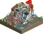
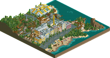
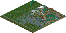
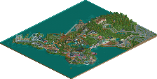
![park_2390 [H2H6] R2 - The Replacements - Tivoli Gardens](https://www.nedesigns.com/uploads/parks/2390/aerialt2133.png)
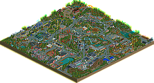
Good luck guys!
I've said what I wanted. I don't want to make this thread into a shitshow. Let's just enjoy the parks now.
time for some reviews
Heavens Gallery
Dang you guys keep using park names that I can't remember. Good park! I'll start with the outsides, which I think were possibly the weakest part. There were 3 really good facades I'd say- the white one with the portrait on the side, and the two it bordered. There was a lot of flatness and blockiness in the rest of the buildings, which wasn't made up for by being so colorful, and they felt a bit 'cartoonish', especially the interiors. the scale felt a bit all-over-the-place too. The slums were pretty good though- felt a bit small scale-wise but had more detail and cool things to look at.
In the park itself, there were some pretty impressive things. The rides were altogether pretty cool- neat hacks and all down really well. The woodie station was my favorite part, probably. I really like the abandoned coaster and the football players/ dancers- really cool custom rides there. I'd say it didn't all quite hold my attention for so long- the park was good, but not the most novel or amazing realism. Solid for sure, and stuck in a difficult matchup too. I'd probably give it somewhere around 65-70.
Icons
Incredible park. I was amazed from the moment I opened it and started navigating the ridiculously detailed buildings. (Thats a lie, I was hooked from the hilarious readme.) One neat trick I found was using the barrels as rolled up awnings. I have no idea how you (yes you, person who I'm sure worked on this) cram so much detail in without it being an unreadable glitchfest. Everything I make comes off as 'cartoonish' in comparison to your structures. Damn. I spent so long just reading all the shop names and being in awe of the structures. So crispy and so well done. Theres just so many details, I don't think I'll ever find them all...
The park is also amazing and the underlying TPR narrative is a brilliant touch. I love the slow lift hill and wonky layout, the broken kiddie, and the weird rides all around. The smoggy palette is brilliant. This is the sort of novel, interesting, and narrative-driven realism that I love to see. This park could easily exist somewhere- theres so many layers of details and awesome things to look at. Also, your traffic didn't glitch off the edge painfully like HG's did for some reason. How come some of the cars at at angles? Also, the curved monorail ferris wheel building is fantastic.
I hope someone at TPR sees this, its brilliant... I'd probably give it 90. I'm sure this will be remembered as one of the best of the contest
Best match yet. Uncertain what i'm gonna vote after looking at the parks for a while. Review and decision coming later.
Dayum. Both parks looking great.
Icons
+ Park entrance was looking very original and good, I loved it.
+ All of the coasters' layouts were great, especially that Chinese knockoff SLC.
+ Holy shit. The surroundings were out of this world. I think that's where this park will get its advantage over HG's park.
All in all, I had no complaints. What a park.
+ I probably laughed a bit too much about the trip review. Amazing and a great sense of humour.
Heaven's Gallery
+ Lots and lots of small details makes this park more and more enjoyable to look at, eventually. It takes some time to find some but it's totally worth your time.
+ The coasters felt great, realistic and had great pacing.
+ Like the Icons's, this park had great surroundings.
Summarized: I enjoyed both maps a lot, and I think a great park is going to lose here no matter what.
both parks were cool in their thematic dedication, but apart from the exterior city archy in The Icons park, the actual park I found pretty standard stuff. The HG's park was more consistent in quality I feel.
Icons park was technically impressive but clinical in a way I didn't personally enjoy. I honestly thought HG was far more fun and exciting. Love the wild colours.
both were pretty lacking in terms of ride design. Very boring, unfortunately. Also, the ferris wheel in Icons was a far too massive scale imo; I feel it looked really really silly.
gotta say I appreciate the focus on road design in both parks, the speed of the vehicles in icons park was very cool, and made it even more immersive. Yeah, the awkward transtions of the cars in HG was a bit irritating.
Overall, both very solid. It's a tough call for me, probs toughest round so far.
Still working on what I want to say about each park but I felt this was important to mention.
Having been to one, the Icon's park is an unbelievably well done representation of the typical "Asian park" - it's quite stunning. For clarity; this is a perfect example of how parks use these large wheels regardless of their physical area.
Two landmark stands up at the same round. this is a real hard choice.
Damn, what a matchup. Two incredible parks here!
I loved the circle motif with most of the park in Tubaio.
I wish the cars in both parks were done a bit more cleanly.
I definitely got more of a "cheap, rundown park" feeling from Tubaio than from Flamengo. Flamengo still felt clean and polished, despite the details signifying some turmoil.
Custom rides and such were interesting additions to Flamengo, but some looked a little awkward, like the moonwalking dancers. Kick the can vs soccer in different parts of the surroundings highlighted the contrast in that that I think was important for the setting, but I never got the feel that the park really fit into that setting.
I'd had an idea for a park that goes under a highway like Tubaio, but my idea spanned both sides of the highway, with some near-misses with the overpass, and such. I can't fault you for not having my idea though i did wish the highway had been more of a feature and less of a sideline. Impressive detailing, and I think the surroundings really sucked me in more than the park did.
Apologies for my erratic reviewing. I think both parks overall are rather impressive in concept and execution, but I think the choice between the two is now clear to me.
Not my favorite genre of park. Tough decision nonetheless as both parks are great.
Icons park has really great architecture and the better surroundings of the two. Overall the atmosphere kind of bummed me out. I understand that is the purpose but even if something is ugly on purpose, it is still ugly in my opinion. Still debating on whether I like the smog palette. The idea is certainly good, but the aesthetic does not seem to appeal to me.
Gallery had a very lively atmosphere and the better park of the two. This park let down a bit in terms of architecture in the surroundings but the park itself was great and really legible for how packed it was.
I think there is a big wrongdoing in generalising Japanese parks with huge ferris wheels into the type of Chinese/Taiwanese knock-off park at hand here. So within all its political incorrectness, perhaps the park could have benefited from better conceptual clarity.
Do you think this is a Chinese or Japanese park? Because it's supposed to be Chinese.
It's a mix of the two in practice; elements of both regions.
Edit: See below; my experiences visiting Japan have made me think what is more "Japanese" might be less so than I think based on experience.
Here is the Shanghai Wheel, a giant Ferris wheel located at Jinjiang Action Park in Shanghai, which was a heavy inspiration for our teams park. Its ridiculous that wed be accused of cultural insensitivity for a large Ferris wheel when thats hardly a Japanese-specific concept.
EDIT: Also, every ride and element of our park is based on real Chinese parks, and can be backed up with existing rides. There wasnt an intent to mix Chinese and Japanese influences for anything, the intent was to full emulate a Chinese park.
I actually forgot that Shanghai has one; my bad for not finding it as a better example.
I honestly think you guys really nailed what you intended; I'll give more in depth thoughts tonight.
I'll comment on what I can, but keeping in mind Heaven's park crashes near the Schwarzkopf for me, but I could see probably 70-75% of the park.
The Icons came out with one that has some serious work added into the architecture on the outskirts, as others have mentioned. Some look really cool, and 'bustling' while others are incredibly packed and I think conciseness and clarity was thrown out the window for building ornaments. It's impressive yes, but I'm not sure how much is actually necessary. Some things on the buildings I couldn't quite understand what they were supposed to be. The buildings that were more toned down were much stronger in my mind. But I'd predict the drooling over the architecture may carry this park to a victory.
I liked the ride choice in the park itself, and liked the invert layout. The front of the entrance gates were a great use of trackitecture, but the backsides of them didn't have as much love. I think the overall feeling of the amusement park was quite a bit above average for h2h I felt. The paths might have been a bit overdone for my tastes. And the biggest downfall for me is the enormous octagonal ferris wheel. I get it's hard to get a giant ferris wheels to look good, and you probably wanted a to-scale version, but it's hard for me to say it looks right and isn't a negative. Judgement call, I know, choosing to-scale or smoother & more beautiful. Unfortunately I think it suffers the intrinsic wonky look of giant ferris wheels in RCT, not to mention it's the dominating map element. The highway was really cool, and the surrounding streets and sidewalks were phenomenal with lots of cool city details to see. Overall, very strong park that for me suffers from the ferris wheel and some bits felt overdone.
Heaven's park stood out to me as going for a fun, punchy park. Again, I couldn't view everything, but where the icons highlights were the outskirts, here the highlight is the rides. In many ways it looks like it may be similar to a Tahendo vs. All Coasters match-up. Icons delivered incredibly strong technical work, which from what I've seen might not be matched here. Certain areas didn't have as strong construction as in the Icons, but some areas approached or matched it. However, the rides here I thought were great, with a superior assortment to the Icons - though I think both matched the themes. I liked the boldness of putting the Morgan racers right in the center, and from what I could see of the Schwarzkopf, it looked masterfully done. This had a lot more movement and fun-factor going on than its opposition, and this is accounting for the thematic differences.
Here, I think the weak point is comparing some of the technical skill with its rival. Admittedly this is in some ways limited to how much went into the Icon's surroundings, where I think the parks themselves looked to be similar in execution and ambition. It's hard to dive in and really give a solid review on a park that crashes for me, though, so consider this as beyond an impression but not the full shebang.
Anyways, unless I can fix the crashing, I feel it's most appropriate to null vote.
To say Icon's park isn't rooted in actual Chinese parks is a bit ridiculous, I'd say. It's pretty easy to see what they pulled all their inspiration from. I see Jin Jiang Action Park and several others in there. All very recognizably Chinese.
It's the same way how our team's park is rooted in real rides from real places.
I'll have some comments for their park shortly-- put simply, I really like it.
Its ok guys, as a team we collectively decided to try and offend as many nations as possible by building parks that are intentionally culturally sensitive and offensive to all.
Job well done IMO.