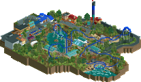
Park / [H2H8 R1] Tahendo Zoo
-
 18-April 18
- Views 25,787
- Downloads 861
- Fans 1
- Comments 91
-
![Park_4086_[H2H8 R1] Tahendo Zoo](https://www.nedesigns.com/uploads/parks/4086/logot.png)
-
 81.00%(required: 70%)
 Gold
Gold

geewhzz 90% no chorkiel 85% no Steve 85% no trav 85% no Xeccah 85% no Cocoa 80% no G Force 80% no posix 80% no ][ntamin22 80% no CoasterCreator9 75% no csw 75% no Liampie 70% no 81.00% 0.00% -
 Description
Please don't feed the animals.
-
1 fan
 Fans of this park
-
 Full-Size Map
-
 Download Park
861
-
 Tags
Tags
![Park_4086 [H2H8 R1] Tahendo Zoo](https://www.nedesigns.com/uploads/parks/4086/aerialm3817.png)

Somebody make Eros of America
Late review, but that's my style
Congrats to both on two great parks. Ultimately, I voted Tahendo.
Feels a bit ironic, coming from one of fantasy parkmaking's loudest shouters (though AVC is beating me by far right now), but in the end I felt like Tahendo was a more complete, polished, well executed package. It felt like a unified, realized vision for what the park would be, and it resulted in some beautiful and atmospheric parkmaking.
By comparison, I loved the concept of All Coasters and the creativity, but I felt like the atmosphere was disjointed by the simple fact that none of these coasters share a theme or visual appearance. In the end, All Coasters feels more like a shoehorn for realism. The concept, while super creative, was just a way to explain a bunch of rides from separate parks being recreated in the same space. A fun and, by many counts, refreshing take on realism, but still just a vehicle for realism to exist. As a result, I felt it lost some of the cohesion and atmosphere that is so central to the best parkmaking, and that turned out to be Tahendo's exact strength.
This was certainly a close call for me, so congrats to all builders, and to nin to finally making Tahendo a reality. Add a coaster and this would have been a far easier choice for me.
I find this rather interesting because the train of thought was the opposite way round.
I had planned to do a video review on these, but I haven’t gotten all that working and I’m afraid if I wait any longer, these will go un-reviewed. So I’m starting at the beginning and taking a look at the parks so far.
A lot of the matches these season have been a really tough decision for me. Two reasonably different concepts, both executed very well.
Tahendo Zoo:
I’m so happy to see this finally built. I wish you had more space to work with so all those original screenshots from way back when could have found a home here, but for the space, this is excellent. The park is dripping with atmosphere. One of the best so far. The architecture is cozy but not cramped, and the areas flow between each other really well. I appreciate that despite the map size, you managed to integrate from back of house areas that had amazing details (like the scissor lift and the cutaway to the animal hospital.
The Krypto and LOTR rocks were really instrumental in bringing home the theme here. I know they’re not always the most popular choices, but they were blended so well into the environment that I think it would have looked a little strange if it was just tried with 1k ruins. It’s a shame there aren’t better animal objects in the game, but I feel like that’s easy enough to look past despite the park being entirely about animals.
Cutting the savannah into 4 or 5 parts probably made the most sense from an ease of exhibit design standpoint, but I’d have loved to see a simpler pathing layout in favor of some more exhibit work. But the layout does feel like a zoo—lots of paths going lots of places with exhibits alongside. There’s a fair amount of open space which really helps with the park not feeling claustrophobic like I said earlier.
The coaster debate makes me laugh because I can pretty easily see both sides of it. I’m very happy that there wasn’t a large coaster in the park. In a zoo this size, it would have looked out of place and unnecessary. I could have done with a smaller one, but that also takes space you didn’t really have. Ride selection feels about right… checking all the major zoo boxes like a train and carousel alongside the skyride, which looked great. A little monorail might have been cool. But you picked a focus and went with it, so I can’t fault that thinking.
Here are some favorite little things:
Love the scissor lift (and the monkey hanging off of it!). Same goes for the forklift on the other side of the park.
Look at the detail on that schoolbus! And the rollcall shop rocked. Really nice little detail.
Lion tunnel above the path is cool. Reminds me of the little tiger crossing at Busch Tampa.
Similarly, the cables for the monkey’s to cross is neat. I’ve seen that at a few zoos and is a nice touch. Additionally, the torii gate looks great, though that’s Japan and not China. Forgiven though, because the area is awesome.
This is a great entrance plaza. I like the little planks of color surrounding the carousel. It’s a fun little touch and adds a lot of color.
I love that the vanilla pagoda fits so well here.
These signs are incredible. Points for using the vanilla totem and all the giraffes. The look is really wonderful.
More of the entrance plaza. This first vista is masterful. The layers of curves from path to exhibit to train as well as the height offsets make this super pleasing to the eye. I can absolutely picture myself standing here.
Crocodile feeding was great!
(Not pictured)
+1 for the “Jambo” ride. Just missing Simba 1.
Great details, fabulous atmosphere, and a really cohesive theme makes me want to see more zoos attempted in game. I would love to see a Tahendo 2 at some point. (Let me know if you want help!)
All Coasters Go To Heaven:
This park is conceptually very clever. I’m sort of surprised it hasn’t bene thought of and/or taken to a full park completed state before. It’s really fun. It appeals to my interest in real life coasters and also to my enjoyment of good coasters in-game. I feel like this concept must have been a lot of fun to put together in-game and would really have enjoyed being part of the brainstorming session for it.
The layouts were solid on the whole. You hit all the main points of the Dragon’s layout and did about as good as is possible in-game with it. This one hit close to him as I’m sad it’s gone! The “inspired” layout of Drachen Fire was an interesting choice when the others were more true to form recreated layouts. But it looks nice, especially using spacek’s trains on it. I remember when we used to see Drachen Fire clones and S&S thrust air’s everywhere in RCT, so it makes me happy to see these again. In the same way, it was nice to see an S&S Sky Swat which was about the most ubiquitous flat ride in-game when I was getting into things. I built so many of those.
A few people commented on the general US bias of the rides in the park and I’d typically agree. I’d have liked to have seen one of the major coasters off of another continent—whether that be Eagle Fortress or Alton’s corkscrew, or Cop Car Chase, or something more obscure. There’s a lot of good options in there. I’m sure there was also the option for more flats too, though I guess you really didn’t have a ton of space.
Outside of the ride stations themselves, there really wasn’t a whole lot in the way of architecture, but I don’t think it was specifically necessary on something like this. I like that each coaster carried a bit of theming with it out into the pathway. The clouds did a nice job of softening the edge of the map too though I’m glad they only come in sections. It could have easily been too overpowering.
Here are some favorite little things:
Sad time for SFNO. But that was clever.
These dragon statues are a great homage to the original (though still not as cool). Nice blockwork.
I really like the dome on Chiller. This building turned out great.
Nice detail with the room on top of the dragons building. While the structure was a little overpowering, this sort of detail helped it from becoming too much.
All the ‘hell’ coasters were hilarious, but Son of Kumba especially.
I appreciate that Chiller has the proper boost at the top to finish the layout.
This is super impressive. I like all the roots winding in and out of the ground at the bottom.
(Not Pictured)
+ “Generic Six Flags shop”
+ Mechanics named after coaster designers
Great map with a fun, unique theme that has a bunch of appeal. I really appreciate you guys taking this one on and I enjoyed watching all the old rides and maybe being a little sad that they were gone...
The torii gate bit definitely bugged me but it turned out too nice to scrap haha. Austin did make a few Chinese variants that didn’t make it in.
Oh look, it's another set of builder shares altered after the fact!
Rediscovering H2H8

It's been a while now. Time to re-view the H2H8 parks with a fresh eyes and not clouded with emotion. I'm going to view every H2H8 park and post one focused screenshot that stood out to me or that I think deserves more love.
Lovely dense little area.
Butterflies! Wonderful.
Yeah, the density of the supports kinda hurt the atmosphere a bit. Tahendo definitely had some lovely areas. I think my opinion of it at the time was due to it being up against one of my team's parks. Great atmosphere throughout.. I really enjoy the polar bear exhibit for some reason. Which is ironic because apparently I said the polar bear was a negative in my first review.. yikes.