Park / [H2H8 R1] Motherland
-
 18-April 18
- Views 19,558
- Downloads 715
- Fans 0
- Comments 71
-
![Park_4085_[H2H8 R1] Motherland](https://www.nedesigns.com/uploads/parks/4085/logot.png)
-
 64.00%(required: 60%)
 Silver

Kumba 75% bigshootergill 65% chorkiel 65% Coasterbill 65% CoasterCreator9 65% csw 65% G Force 65% Poke 65% Steve 65% Cocoa 60% Liampie 60% Xeccah 60% 64.00% -
 Description
Ask not what your country can do for you, ask what you can do for your country.
-
 No fans of this park
-
 Full-Size Map
-
 Download Park
715
-
 Objects
477
-
 Tags
Tags
![Park_4085 [H2H8 R1] Motherland](https://www.nedesigns.com/uploads/parks/4085/aerialm3815.png)


![park_2421 [H2H6] R4 - The Replacements - Kim Jong Il's Present To His People Park](https://www.nedesigns.com/uploads/parks/2421/aerialt2164.png)


This matchup is really tight! Love both of these.
Motherland has the strongest sense of theme. It's not so crowded, so it comes of as more put together in way. That being said, I found myself wandering and exploring a lot more in Dig Site 4. Heaps of little details, but still maintaining a strong thematic core. Only thing is wish for here would be a bit of breathing room somewhere. But then, some of the great details would have to go, so I understand the conflict.
I voted for... Dig Site 4 by Team Spacecrab
oof
This ended up being a pretty clear decision for me personally.
Dig Site 4
+ The detail is phenomenal. I think I'm still finding unique nooks and crannies that I haven't looked at yet. When I think of "H2H-style" details, this park really aligns with those thoughts. The density of the jungle works out and the rides are themed very well.
+ The ride design is fantastic; the layouts are great and even the smaller rides like the elevators fit in with the theme really nicely.
- It feels a little bit confused as to whether it's a theme park or an actual dig site. I'm not sure what the general intention was, but stuff like the inverted coaster (complete with transfer tracks) and the el loco seemed to be trying really hard to be part of the story of the park while obviously sticking out as though they're part of a theme park. I think you guys were trying to do the former, but it's hard to tell sometimes. I could be completely wrong.
- The detail (again); I found in some spots that, much like Wit's End, the level of detail made it hard to tell what was going on. While the density does contribute significantly to the theme, it got a bit overwhelming in certain areas.
Motherland
+ Architecture is good, and the rides fit in well with the rest of the park. It was cool to see a PAX coaster, and suits the Russian vibe well. A lot of the small details like the radio tower and the scenes inside the kremlin were well done.
+ The parody and humor in the park was a nice touch. The contrast between the Moscow scenes and the Siberian/stereotypical struggling community was good.
- Some of the architecture wasn't as strong. St. Basil's felt very squat in stature (Some added height would have done wonders) compared to the real thing, and the squareness of the central tower was tough to overlook given the structure's position as the centerpiece of the entire map. I also thought the Red October could have been done a little better, but that's the ship geek inside me talking.
- I felt as though a lot of the more "traditional" (a.k.a. the part that wasn't communist propaganda) Russian aspects were overlooked a little; it would have been fun to see more detail put into the rural features and somehow include a bit more personality to have it stand out as much as the rest of the park's features as it had a lot of potential that was somewhat lost.
Motherland
 Stall names were incredible here. Tsarbucks? Tchaikovtea? Class. Didn't understand the dead peeps on the altar thingy.

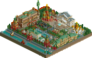
This strikes me as your average moderately awesome H2H park. We tend to associate the crazy dense parks like Wit's End and Dig Site 4 with H2H, but to me this may be an even more typical, traditional H2H park. Very H2H5-6-esque which is not a bad thing. I'll quickly review each area highlighting the pros and cons, ending with my overall impression.
Entrance: super atmospheric! It's good that you can hear the music well here, it sets the tone for the park excellently. The entrance building itself is the standout architecture here, some other buildings were overly messy and glitchy. Not sure how much sense it makes for the Russian flag to be on display side by side with the Soviet Union flag. I recognized the Faberge egg theme for the flat before I saw the name, so good job there. The central church has plenty of room for improvement, but despite not being great it's a great centerpiece and nice enough to look at!
Kremlin area: the Kremlin walls and towers look really good but maybe a bit too short, they end a bit abruptly. Not a huge fan of the building that holds the dark ride but it's not bothering me either. Serves its purpose well enough and the interior has some good details. The vote rides took me a few seconds to understand, but then I loved it. Russian Roulette is out of place but the sign is really good, overall I like it. Military parade and ferris wheel look great. Archy is very cozy here. Backstage area should've been cut. Smoking employee by now is one of the biggest cliches in RCT but I know it's tempting to add.
Mirny area: I wanted to write that I didn't understand the hole but that it looked really good, but then I googled Mirny and it made sense. Great job. The coaster is solid and fun but not memorable. The Soyuz drop looks great too, with the scaffolding and stuff. The drill looked like a drill but needed a better spot. Thematically this area was a bit of a mess I think. All the leftover ideas together?
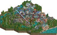
Gulag area: SUCH BAD TASTE! I'm kidding. I liked the ride. Theming was meh but the spotlights were a nice touch. The other two rides were fine I guess. Why was the sign for the car ride on the wrong side of the ride? Made no sense because the sign is in a different area too. I also spotted the firing squad executing someone. SUCH BAD TASTE1 But such a clever idea with the peep objects! I thought that was one of the best details in the park.
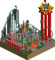
Urban area: my favourite bit of the park together with the entrance. The architecture is simple, but effective. I like clean because it makes details like the carriage and the signs stand out. Loved the burning tires and the flag burning, what a shithole this place is. Only thing missing was a queue for the food stalls. Some good names here again, and some awful ones (Commie Commodes, Communist Cocoa). The PAX coaster is awesome and I like how it resembles a hammer and sickle slightly, is that intentional? Vodka express looks good. What was the point of the driving school? That ride had no link to the theme.
Overall: I really like this park quite a bit. It's a lot of fun to look at. At the same time, the theme is kinda cringey and executed in a very shallow manner. All the worst cliches and stereotypes about Russia, usually converted into a random ride name. Vodka, Gulags, Rockets... Staff names are NE members but with -ov added at the end... I didn't enjoy that dimension of the park much. It was a bit boring and predictable. As I mentioned above I thought some things were funny but overall the sense of humour was not my thing. Contrary to other people I think the park did not suffer from the lack of large coasters. I think the ride line-up was good enough! The park kept me occupied for quite a bit and I had fun the entire time. Just the right amount of details. Very good job guys. The park may not win this match, it'll go up for an accolade and this should make a fine silver.
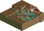
Dig Site 4
I'm going to keep this one a bit shorter than Motherland hopefully. Not because I don't have enough things to say, but because I don't want to burn myself out with reviewing things in round 1 already.
First impression: wow! Probably the best coaster in the contest so far, buried Pyramids, and History Channel shit. Loving the theme in this park. The landscaping and foliage is consistently fantastic. It's a great backdrop for the invert, but that coaster is also embedded in the landscape very well. So pretty. I mean, look at this:
The settlement in this corner of the map was beautiful, with some perfect details like the little elevator, the tents and 'banana monarchy'. The ruins had a nice presence everywhere. And again, very nicely integrated in the landscape.
Pit 4B: I thought the overall look was very messy here, and hardly readable. Lots of cool shit though. The pyramids looked great. Cool water ride with nice touches like the overflowing water, the crocodiles and the crane lifting a statue. The temple facade where the drop is coming out of looks amazing. Love all the random crap you guys buried in this park btw. The theme is also so nice because you take literally every odball objects like a satellite, a spider, a dinosaur or a coke truck, bury it, and it'd become a fun piece of content. Kukulkan was nice I guess, didn't do much for me. Also didn't care for the underground temple thingy, think the theme would've been stronger/more mysterious without it.
Pit 4A: another awesome pyramid! Another awesome coaster although for the viewer it had more value as a dark ride than as a coaster. The track style looked very good. The path textures in this pit were weird and messy. Double weird because you have a great path style on the upper levels that you could've continued throughout the whole park. I think this pit had a bit less to see but it was easier on the eyes. This pit has the superior cave.
Overall: best park of R1 no doubt... So much of this is perfect and there's so much to see. I know that I can come back to this park and find new things for the foreseeable future. I'm impressed that you guys got this together for week 1, in such a seemingly finished state. The park just has so much content and it feels huge too. Amazing. On the downside, the park is hard to read as I said before, and definitely glitchy in places too.
Fantastic job Crabs, you got my vote.
Try with the OpenGL drawing engine sometime; it seemed to fix a lot of the glitchiness for me; not that it'll (or should) change your opinion, but it's neat.
Yeah that crashes my game so no. Doesn't change that the Spacecrabs built a glitchy park. OpenGL is only a bandaid not one everyone has.
This is true and I'm not trying to make it any less true; but it's a feature of OpenRCT and OpenRCT could be considered a bandaid not everyone has.
Two very different parks this matchup. Clear winner for me is Dig Site 4 but both were good and deserve a review.
Dig Site 4
- Probably my favorite park of the contest thus far.
- Great elevation, really liked how the ruins were clearly being dug up. Also that scaffolding looks really good.
-El Loco is great especially those trains, however that barrel roll is super jank and way too fast.
- The invert is by far the best coaster we've seen so far, a little glitchy near the mid-course but that's just a nit pick. The other coaster is great as well. That last car being backwards is FIRE.
- Camp site is the best area in the park. Also the pyramids are great.
- Overall the park just comes off as messy to me. Rides are running into things constantly, and a lot of stuff just seems like filler and unreadable.
-I'd likely give this an 80. Great job by the builders. It was definitely a great park, something truly to be proud of even despite some of it's flaws.
Motherland
- I'm sorry but I didn't care for this park all that much. It would come in at around a 65 for me. Nothing to distraught over of course, but some changes would've helped this go a lot way.
- What I did like though is the diver. The drop into the hole is probably the best thing in the park IMO.
- The entrance building was actually really good. By far my favorite bit of archy in the park. The other buildings in the entrance plaza were unnecessarily detailed and quite frankly messy.
- The big orange thing isn't too bad. Sort of disappointed by it, but by no means is it an easy building to pull off. I think it's a bit out of scale and lacking in the upper parts of the structure.
- The rest of the archy is meh, silver quality IMO. Nothing special but not bad.
- The memes and jokes were quite good. Especially loved the voting towers.
- WHY, WHY would you not hide the track for the submarine ride. It looks so much better with it invisible.
- The soviet bloc section was neat. Feels sort of underdone to me. Could've done a lot of cool shit with that.
- Pax coaster is super unique. Actually a big fan of that.
- Overall this park was ok. You guys definitely had fun making it, however I just feel like its a lot of missed potential. Russia could've been so much better executed and this sort of fell short IMO. Also like Liam said it was a bit boring and predictable. Don't be discouraged though, this is a park that is not bad despite my unfavorable view of it. 65% for me.
https://www.youtube.com/watch?v=gchSjo3EyOU
I don't know what it is, but there's something about Motherland that just speaks to me. I really like it. It's clearly not as skillful as Dig Site 4, but that doesn't make it bad. I don't like the political/Russian humor and the propaganda isn't my preferred cup of RCT, but I definitely enjoyed parts of it. I'd love the to see the dive machine as part of a large Merlin park at some point, whoever built that has some nice theming skills.
Dig Site 4 was extremely well put together as mentioned by nearly everyone, and I do keep looking at. Everything about it is well done- the coasters, the theming, hacks.. I'd have expected this to get my vote in nearly any match-up, but for whatever reason I'm stuck here.
Both parks have strong points for sure! But for me there is only 1 park that is a clear winner here. The russian theme is definitely interesting but there are so many missed chances here. It's like you scratched the surface of what the theme has to offer. There were some really nice bits though. I think the entrance is the best building in the park by far, in the best area of the park by far. Driving school is probably my favourite ride idea in the park, thats a nice little ride for sure. I love Dig Sites concept and i really enjoyed 'digging' with the cut away tool. Very very clever. Loved all the layouts aswell. Although the park is a bit busy, if you take your time its actually very readable. I enjoyed both parks, good job to both teams. Voting Spacecrab.
Dig Site 4 keeps crashing my game, any thoughts?
Buy a new computer so you can check it out in-game Totally worth the $500.
Try a different version of OpenRCT2?
OK some thoughts -
Motherland - I feel like this whole park, this entire thing, came from the joke in the middle. Having a Crooked House inside the Kremlin. Which was actually the only really clever thing I liked about the park.
It's a good little park, no question, with obvious skill and ideas, but probably just not my cup of tea... it felt a little cheap. It came off as a park built in the USA to laugh at Communism and other countries, whereas I feel a park actually set in Communist Russia would have been a lot more interesting, and you could have used a lot of the same ideas.
There were a lot of little things I liked - the hole for the vert coaster is brilliant, some of the architecture looks great, the map feels busy with a lot of rides. But overall it just came off as really juvenile... hard to explain.
Dig Site 4 - Quite comfortably the best park of the round, and honestly i'd be surprised if I see anything better this H2H season. This is as close to perfect as i've seen for a long time.
I'll start with the coaster - you've managed to put a pretty realistic coaster nestled into the landscape so naturally it's crazy. It feels so organic... Obviously a great coaster, and I love the batwing over the edge, such a cool feature. Then there are actually 3 or 4 more rides that are interesting, but not intrusive, and again, feel natural. I really get the feeling that everything's been there for hundreds of years.
The flatness of the brown colouring in the pits themselves makes it slightly hard to see what's going on, but there's so much going on that I don't mind looking. The pyramids are incredible looking, and each has a really strong identity.
For some reason i'm finding it difficult to pick out things I liked, literally everything I see I love. It's a theme we've seen before but not like this, and it's incredible. This might go down as my favourite H2H park ever.
I'm obviously voting for Dig Site 4.
https://www.youtube.com/watch?v=eBigy1EehX4
"It has been explained before by [my] good friend Spacek who is a master of these OpenRCT2 things"
It just so happens to be that I had the privilege of applying that very hack. I also made the train use steel roller coaster sounds instead of wooden roller coaster sounds like it normally would have.
Hectic