Park / Kingdom of Winter
-
 23-June 18
- Views 1,848
- Downloads 571
- Fans 0
- Comments 9
-
 54.50%(required: 65%)
 Design Submission

bigshootergill 60% Cocoa 60% inthemanual 60% CoasterCreator9 55% Dr_Dude 55% G Force 55% Jaguar 55% Liampie 55% posix 55% Camcorder22 50% Faas 45% Poke 40% 54.50% -
 Description
This started as an entry to a Christmas contest ran by Roomie a few years ago. Recently picked up the game again and finished it. Enjoy.
-
 No fans of this park
-
 Download Park
571
-
 Objects
312
-
 Tags
Tags
![park_3167 [MM2014 R1] Europa Report](https://www.nedesigns.com/uploads/parks/3167/aerialt2725.png)
![park_4118 [H2H8 R4] Mount Haystack Ski Resort](https://www.nedesigns.com/uploads/parks/4118/aerialt3883.png)
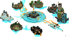
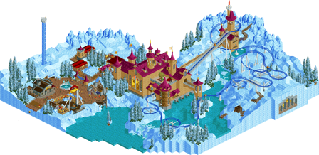
this was lovely! The layout is solid, big for a spinner, but its fantasy so who cares? The landscaping is great, but some of the foliage clumps are suspiciously similar in size to each other so it gets a bit repetive. The supporting rides were excellent, especially that screamin swing(...? I'm not very knowledgeable with flats) It was all rather charming and fun to explore.
I don't think it should get design, but its still really good! The things holding it back for me are:
- Awkward texture on the station building/castle stuff, and I disliked the large window object. A little but of brick deco would have gone a long way here too, to make the walls a little less plain.
- A lack of interaction (between rides, path or queue/coaster). I don't think it is necessary in a design, but it really helps make the ride feel special and adds to it a lot. Here the guests felt very disconnected in distance too, what parts of the rides were visible to them are pretty far away other then the final helix. The way the coaster flowed with the landscape was great however.
- Awkward, squashed scale of the town buildings,and a very bare and uninteresting tavern. Since there aren't many buildings on the map, I think they are important to get right
- It felt a little empty over by the mcbr, even with the treasure hoard, not a huge thing, but worth pointing out I guess.
Overall though an excellent atmosphere, good landscape, great layout and supporting rides. I liked how you added tiny details around the map, like the staff and the campsite etc etc
I like this, nice to see some conceptually fresh stuff around. Probably didn't need two releases because the 'frozen' one is much more interesting IMO. But I liked the castle, good layout with cool landscaping. Wish there was a bit more 'village' content, we get a tiny taste with the tavern but would have been neat to see a lot more. good stuff
The colors of the castle looked good and the design also, contrasted with the snow.
I liked the tavern
I think this park looks good. Not very good, but it has some cool things. The tavern and swinger were cool, I really enjoyed that part of the park. The shape of the castle is a bit weird. It's like some big square blocks with some towers on it, could also use some more details here and there.
The layout is cool and as Shnupz said a bit long, but who cares. That area was a bit empty tho, not very much content and with the iced textures it gets a bit boring pretty fast.
I'm on board with Cocoa's thoughts. More village content would have helped this out a lot! What's there is really cool, and there's actually a surprising amount to explore (the castle, in particular) - just wish there was a bit more to fully flesh out the experience.
55%
This is a pretty fun release. I think it falls just short of a design for me, probably a 60%. But overall I enjoyed it. I agree with the comments about the texture on the main building, definitely think it could have been improved somewhat. But overall you created a nice atmospheric entry.
Not sure why the staff is Arrested Development characters but I laughed at it a bunch
I quite liked it but I do have to admit it didn't hold my attention for very long just because there isn't that much there. I liked the coaster, I'm a sucker for spinning coasters so that's a plus. The castle itself was well made but kinda plain. The foliage was also too clean for me. A bit more weeds and dry grass stickung up from the snow would've helped. Perhaps a few rocks in different colours as well.
I did like however the little scenes dotted around the map and the fun little village, although the streets seemed to be magically clear of snow...
All in all a solid little release but I agree it's not really worthy of design, for that it lacks content.
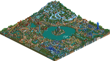
A wonderful little release here. I have a special soft spot for snow themes, and I think it was nicely done. I liked the two different maps, thought it was neat to see the "unfrozen" version. Everything on the map was good, but nothing really popped for me.
60% from me. I think some of the stuff Jappy mentioned (different colored rocks, some more foliage work, some more snow in the village and whatnot) would've brought it up to 65%.
Keep building, I can't wait to see your next project!
So weird, i remember i've already reviewed this, but i must have forgot to post it. This is a cool little thing, not much there,a nice little coaster, a castle that well... looks like a castle and some additional stuff. I really liked the overall scene and composition, going more in depth stuff got a little bit plain and boring, but it didn't washed the fun away for me during my viewing experience.
All in all it's a fun little release, probably no design for me, but that probably wasn't what you really built for anyway. Hope to see more from you in the future! 60%.