Park / [H2H8 R1] Durham, Knaresborough and Staithes
-
 16-April 18
-
 Durham, Knaresborough and Staithes
- Views 29,418
- Downloads 1,080
- Fans 3
- Comments 135
-
![Park_4075_[H2H8 R1] Durham, Knaresborough and Staithes](https://www.nedesigns.com/uploads/parks/4075/logot.png)
-
 79.50%(required: 70%)
 Gold
Gold

chorkiel 85% Cocoa 85% Steve 85% bigshootergill 80% Kumba 80% trav 80% Xeccah 80% ][ntamin22 80% CoasterCreator9 75% csw 75% G Force 75% Coasterbill 70% 79.50% -
 Description
England. The country of Shakespeare, Sherlock Holmes, Robin Hood, London, posh accents, medieval castles and knights and famous battles, timber framed townhouses, hooligans and chavs, and high tea with scones and clotted cream. The food is mostly terrible and it's always raining. This is the other England. The real England.
-
3 fans
 Fans of this park
-
 Full-Size Map
-
 Download Park
1,080
-
 Objects
477
-
 Tags
Tags
![Park_4075 [H2H8 R1] Durham, Knaresborough and Staithes](https://www.nedesigns.com/uploads/parks/4075/aerialm3813.png)
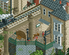
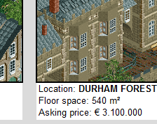
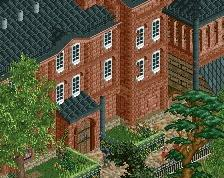
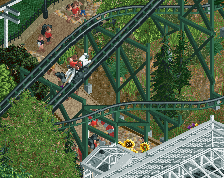
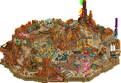
this looks like a face from this angle
dont think its intentional, just cool
First on Wit's End:
I'm a little torn on this park. It has great bits and some not so great parts. The castle and the area around it was on the great side. I really like the structure of it and how it overwatches the whole park from the cliff. Generally the landscaping is well done in this park with the said castle governing the rest. I also like the minetrain. It is the best thing in the whole park. Especially the unconventional support work is very well done. My favourite part of the whole park is the loop and its support. Very clever! Also the water coaster is great. The bad ass whirlpool and the inversed drop including splash are great ideas and pulled off nicely. Maybe the exit through the waterfall into the lake was a little "cheap" way to do the turnaround to the other side. The rest of the archy was rather lacking. I mean the shapes were in most parts good (invert's station) however the surfaces lacked in a lot of parts details and sometimes even actually anything (windows, doors etc.). Especially with the choice of the very steep roofs, which actually act like another wall. Speaking of the roofs.. To me the poop-brown choice is rather ugly, maybe the other shades would have been better. Of course apart from the castle there were some other cool buildings like the one with the clock tower on the entrance area. Another object choice I find bad is the trunk/stem for the mushrooms (do you call it this way?). The object is super ugly because of it unrct-ish graphics and the hidden alien face and taking it for a prominent part of the park is a downer for me. You could argument it belongs to the theme of the park. Not having mushrooms but having ugly "from another (game-)world" kind of mushrooms I mean. But then I'd say that it still ruins the aestethics. The hacks in the park are really cool. I like the blackholes, they add to the theme as does the invert's teleport. Well done! What I also liked was the little lake with the walkways around. Also the little brown building with the small dock in the ground floor acts as nice counterexample to the buildings with missing details and fits perfectly to the pond scene. Moreover on general I like the great use of slanted walls and fences which make some nice refreshing awnings.
So like I said, this park has highs and lows. However the lows are for me actually too much weighing to see an outstanding park with really long staying memorizable parts.
Now to Durham and co:
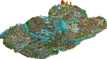
This park is so picturesque! It is actually the way of parkmaking of always try to pursue! And so well done. At first when zooming out I thought this park is rather small, but that's not true. Due to the small scale of everything you make yourself the space to squeeze in three villages. It is clear that you draw some conceptual inspiration from the three villages by Natelox, but that's not bad thing. I really like the notable difference in the architectural styles of the three villages. Of course also the new colors do their best and you make use of them to their best too. Only the washed grey/green that you took for the maison is a little strong/saturated and ruins a bit the textures of the objects. Parts I liked most were the area around the garage and the little tiny park. The cheese rolling and the meadow part around the cliff. Also the two brigdes were great, especially the doubledecker style for the woodie. It is notable to me that the quality decreases going from the shore to the back. Parts I didn't like too much were the lighthouse (I'm a sucker for small scale but that's even too small for me) the maison (for said reason above) and the tunnel below it, because of the reason that the train is really creeping visibly from underground through the rails, this one you could have solved better! The factory building looks cool, especially the chimneys. But I'm not sure if it's supposed to be a running factory or a shutdown one. In either case I think you could have cute the greenery here a bit to give a bit more of an industrial feeling. Now it gives too much an unrealistic overgrown feel to me. Moreover the hole in the roof needs explanation.
In total, what sells the park for me are the overall atmosphere and tranquility. The park really resembles the style that you don't need to squeeze every tile of the map with content to actually achieve something remarkable.
Great first matchup, although for me the vote is rather clear, what doesn't seem to be the case for a lot of other people. I'm stoked to see what will bring us the rest of the season!
Wit's end:
+ The trippy black hole shit was really cool, I don't really get how people did not understand how this park was about tripping, however a readme could have helped for people who did not understand.
+ The splash boat ride was really cool with the underwater park and the reverse splash.
+ Contrary to many other people, I actually kind of like the mine train and the castle.
+ Landscaping is great
+ Really like the castle and everything on that side of the park.
- The glitching on the suspended coaster was such a cool idea, but the execution was quite poor imo. This could have been done so much better.
- The building at the entrance is such a rip-off from Le Reve.
- The red mushrooms, although fitting, were not very aesthetically pleasing imo.
- I feel like the vertigo ride and the mushrooms make this park feel a bit ripped of from the hexenwald in Riverland.
In conclusion, I think this is a great park. I really like all the little details this park has. When I first opened this I felt like it was just a rip-off of Le Reve and Riverland, however when spending a bit more time looking at everything I have partially changed my mind. There are a lot of cool details in this park and also a lot of clever references which really set this apart from Le Reve and Riverland. I still feel like some parts were a bit too inspired by parks like Le Reve and Riverland though which really is a shame.
HG:
+ I fucking LOVE the cheese rolling competition.
+ I like the steep drop on the steeplechase, seems to fit in quite well here. I know this is very random, but for some reason this just stood out to me.
+ I like the green bridge on the woody coaster.
+ The custom palette was pretty cool, I also feel like it really adds to the atmosphere in this park and it is not just used as a gimmick.
+ I really like the rockwork on the cliffs, I'm going to steal that for a park I'm making (non H2H related).
+ The town with the orange roofs is really nice.
- Park name is too difficult to remember.
- The steeplechase was a cool idea but could have been executed better.
- Feels a bit more boring/empty than Wit's end
In conclusion, I love this park. The only thing that really bothers me about this park is that it is perhaps a little bit too subtle, you are not immediately amazed upon opening this park and you really have to look at the details to see how good this park is. Also the park name could have been better.
Overall I really liked both parks and I had a really tough time choosing. First I did not really know what park to choose, then I was leaning towards HG. However after opening Wit's End again the little details really drew me in and I changed my mind. However when I decided to open the HG park again one last time it just blew me away even though it's very subtle, and therefore I am voting for HG.
I felt that I saw everything in the HG park in a 5-10 minute glance at the park. I've been back to look at WE a couple times and there's more details I keep finding. I added a few screens of parts that I really enjoyed:
First, the insectorium area and the tall mushrooms were cool. The stone platform overhanging the cliff was well done as too. Aesthetically I enjoyed it alot.
Second, the tiny little bird house on Fly Amantia. Super cute little detail.
Third, the little plaza here. The building with the yellow sign was very nice. This area could've used a shop or something to give it more meaning.. but the archy was really nice.
Attached Thumbnails
Durham, Knaresborough, Staithes
I feel like Wit's End is the less in-my-face one because of how much beauty is hidden under its mess and requires uncovering, whereas with Durham, Knaresborough, Staithes I can see everything at its face value and appreciate it in first viewing. Nothing is hidden under the wraps and what you see is what you get. No hidden themes either. The park knows what it is, and it plays to that strength (which I also think applies to Wit's End a little). Easy to digest (which isn't a plus, so much as just an observation). Still, I'm coming back to this more and more because of how well it executes its atmosphere. Almost the new Skylands National Park for me and had a similar experience when first opening both. I just want to feel that atmosphere more every time someone mentions the park and so I'll end up reopening it. I'm also way too biased in favor of these kinds of parks just because of how much I really like mellow themes that are borderline non-parks so there's that.
I didn't like the scale of things in the park at an immediate glance just because of how different it was to what I'd just seen in Wit's End (and tried to appreciate) but it's a great fit for the theme itself. More or less every building had enough unique character to it (which is probably a must for small parks) to keep me engaged throughout. A lot of photogenic moments everywhere, but some of them also demanding a little more attention. Building a park like this in such short time must have been pretty hard, I wanna say.
Still, I can't help but wonder if stuff like this is just destined to work better as non-competitive long term projects where you can refine details and fix the park as you get more and more feedback and ideas. 3 people just working at it from at least a few months to a year and beyond.
The colour palette works waaay too well for the park to the point one has to wonder why colour palettes have been more or less hidden potential since whenever they were first used. Oh well, time to exploit their use! None of that filter shit, just pure color swaps for specific moods and themes.
Great round, and I'll ultimately be going for Heaven's Gallery. A fantastic entry that at least I will remember for a good long while. Wanna make a pure non-park on this so badly now. Can I live in this park?
Wow. Just, wow.
So i have been thinking long and hard about what to vote here, cause i think both parks are great. Wit's End has amazing parts, and some that i found a little bit lacking. For example, I love the huge center castle with the minetrain, although the pacing is a little fast. (not that it really matters in a fantasy park tho). Some of the other buildings, mainly on the edge on the map were lacking a bit to me. For some reason some structures just didnt really work and weren't pleasing to look at. This is only a small percentage though, there really is a lot to like. Durham, Knaresborough and Staithes got me hooked from the first second i opened it. I really love the oldschool vibe in a british setting and you guys nailed the atmosphere, especially in the little village! Definitely together with the wooden coaster the best things on this map. The steeplechase was a bit weaker imo, but still very charming. I've come to the conclusion that I prefer HG's effortless beauty over UR's clearly skillful and extravagant parkmaking. It was a close call in my head though. Big props to both teams.
https://www.youtube.com/watch?v=jfU_t0YDosU&feature=youtu.be
So I voted for the Durham park, probably because i'm English and missing home and it hit me a little harder than the other park. Here are a few thoughts...
Durham, Knightsbridge and Staines -
A ton of research has obviously gone into this, as there are a great many things I recognize from being English.. the beach by the entrance is one of the quaintest most perfect little areas i've seen in quite a while. I almost agree with what someone else said earlier - you could pretty much take the woodie out and still have a great park... however it is a really nice coaster and I like coasters, so could go either way. If you take the rides out you'd have to commit and go full Natelox's Earth on it, which could be a tad boring, so probably works better with rides for this contest.
The maypole was brilliant, as was Durham castle, although it could have been bigger possibly.. Loved the cheese rolling, that was excellent. Very tough to build on this smaller scale throughout a park and make it all look finished and perfect, so great work.
Wit's End -
I'm torn on this park, because it's so close to being incredible... Overall I felt like it was technically more impressive than the other, but also felt like the merging of two themes. It's actually really close to being an incredible fairytale/medieval park, just on face value. I think I would have really liked that, just by itself.
But then it seems that the main theme is meant to be tripping... in which case, i'd have liked to have seen you run with that even further. Go full Mala, make ridiculous things that shouldn't exist, stupid coasters, amazing landscapes, alien structures.. as it is there's always this undercurrent of really nice stone and wood buildings that don't really fit with my idea of that. Maybe that's just my feeling, though.
There was a lot of stuff I loved, the backwards splash boats were super clever, and the glitchy invert was mindblowing. No idea how you build around such ridiculous glitches like that. Like I said, overall I feel like this was the more technical park, it's just that the theme didn't feel fleshed out enough to make me fall in love with it.
Feel like i've been really harsh on Wit's End in what was actually a really close match. Not my intention, well done to all builders and can't wait to see what else you build! Very glad I didn't sign up seeing this level already...
Really? Is that necessary?
Mushrooms:
The architecture is impressive, but I didn't really understand this park. When it was explained to me that the theme was drugs, I didn't have a great epiphany that made me like the park, but it did explain why there were so many mushrooms and why the splash boats went up. The central focus of the park, the mine train and castle, was cool, but that was the only part of the park that I really understood from the get-go. Great RCT2, but the theme was a real head-scratcher and I wasn't able to get invested in exploring the park. It was a park and it had a lot of buildings and a few stood out. "What does this do/why is this here" was a prevalent question in my head.
+ architecture is nice
- aside from the castle there didn't seem to be any points of focus; objects behind presumed focus points had little contrast with the focus points themselves
- consequently, most of the park felt like filler
England:
I really liked this park. Everything felt like it was meant to be there and it all came together in a single unified park. Every fiber of the park was the English countryside, and no fibers of it were not. There didn't seem to be any repeat material, every area was a different facet of country life, or what I imagine country life is like in England as I do not live in the English countryside.
+ palette swap was well executed
+ the Gloucester cheese rolling and maypole were well done.
+ so much is good I'm having a hard time thinking of anything particularly amazing
- fox hunting dueler didn't have any duels and during the racing portion the fox was mostly in the rear
In my opinion it's unfair to the creators of the park, which have put tons of time and effort into that park, to give it only a '5-10 minute glance', and then claim you would've seen 'everything' in that park. Unless you have some kind of superpower that lets you photographically see everything there is created, I only believe you made that statement to put the park down in a very immature way.
Wow, what a first matchup.
DKS:
+ Classy use of a custom palette, colors worked really well
+ Architecture in general is very well done, especially in the orange-roofed village and Locomotion's station
+ Locomotion's layout is great, and that diagonal bridge is top-notch
+ Amazing landscaping and foliage, the beach and cliff look breathtaking
+ All the little details, such as the cheese rolling, maypole and telephone booths give life and character to the park
- Fox Hunt seems really out of place, and except for some clever track pieces, it doesn't fit in the park's context IMO
- Composition and pathing aren't bad per se, but all the single-wide paths and thin bridges make it seem like the whole park is just being held by a piece of string, and isn't "solid" enough.
Overall, an amazing display of architectural skill, coupled with landscaping and foliage wisdom and extensive research onto the theme. Unfortunately, due to the H2H size limit, it looks like the park lacks room to breathe, and a lot of that room was forfeited to the relatively unnecessary steeplechase. Still, an extremely strong H2H contender.
Wit's End:
+ Psilocybin Railway and Pareidolia both have great flowing layouts, and a nice support job
+ Crazy foliage! Crazy mushroom towers! What seems like an impossible theme was pulled off very well
+ Landscaping is a lot less "natural" than in its matchup counterpart, but still well done
+ Ride interaction as a whole is great for pretty much all coasters and supporting rides
+ Cool details and ideas all around the park (e.g. flying insects, floating islands, REVERSE SPLASH BOATS!)
+ Composition is a lot more solid than in DKS, with large paths and preserved sightlines
- Quite a bit of buildings look unfinished, or have textureless walls/interiors, while others look too overtextured
- Without a bit more research or looking at staff names, it would be a little hard to deduce the theme of this park, which could detract from the appreciation of all the crazy and fun stuff in it
My first reaction when opening this park was absolute hilarity, as in I literally burst out laughing at the aptly named "stoab hsalps" storming up the big drop. Wit's End is just jam packed with funny stuff, but that only makes it more impressive of a park. The staff names, the crazy glitched version (especially with OpenGL enabled) and the theme itself all help make this park a hilarious masterpiece, and even if it may lose out to DKS in terms of beauty and plain architectural skill, the composition paired with the insanity of this park is what makes it earn my vote.
I vote for the UltraRealists
(I know this isn't necessary, but I just wanted to make my post look nostalgic and professional )
)
Durham, Knaresborough & Staithes
Classic less than 5 word Louis post right here.
Sorry, wasn’t my intent to put down the park, and I especially don’t want to be viewed as immature. I left positive comments in my first review. I guess I didn’t explain well enough that I had more fun viewing Wits End again. I’ll try to word my reviews a little bit better with the intent of adding to the conversation.
I'm glad we have MCI reviews this H2H! Yours was fun to watch too Scoop
Wow. Heavens Gallery, great job guys. Absolutely amazing stuff!!!! All areas are superb, but the standout section to me is the area where the woody is snaking around this town that's cresting a ridge. A ton of fun interactions going on here that are just beautiful to me. Also the station for the old timey cars being an old timey gas station is great!
Wit's End was cool. I like the little dude being stuck in the jacuzzi thing. And that water ride is very interesting. Ultimately I think the themeing here was a little confusing, and I couldn't be quite sure what the central idea was.