Park / [H2H8 R1] Durham, Knaresborough and Staithes
-
 16-April 18
-
 Durham, Knaresborough and Staithes
- Views 29,343
- Downloads 1,079
- Fans 3
- Comments 135
-
![Park_4075_[H2H8 R1] Durham, Knaresborough and Staithes](https://www.nedesigns.com/uploads/parks/4075/logot.png)
-
 79.50%(required: 70%)
 Gold
Gold

chorkiel 85% Cocoa 85% Steve 85% bigshootergill 80% Kumba 80% trav 80% Xeccah 80% ][ntamin22 80% CoasterCreator9 75% csw 75% G Force 75% Coasterbill 70% 79.50% -
 Description
England. The country of Shakespeare, Sherlock Holmes, Robin Hood, London, posh accents, medieval castles and knights and famous battles, timber framed townhouses, hooligans and chavs, and high tea with scones and clotted cream. The food is mostly terrible and it's always raining. This is the other England. The real England.
-
3 fans
 Fans of this park
-
 Full-Size Map
-
 Download Park
1,079
-
 Objects
477
-
 Tags
Tags
![Park_4075 [H2H8 R1] Durham, Knaresborough and Staithes](https://www.nedesigns.com/uploads/parks/4075/aerialm3813.png)
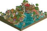
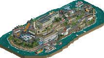
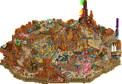
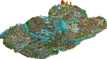
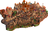
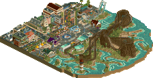
Ill refrain from giving my thoughts on our park whos name I can barely remember, but to be blunt: Wits End didnt do much for me. At a completely objective point of view, this kind of parkmaking just doesnt affect me. I cant deny its skill; its there, for sure. I just wish the skills were used differently. Im kind of over all of the fantasy-style parks that slap me in the face with huge ideas for the sake of impressing me. Im far more impressed with the restraint of the Heavens Gallery map and the beauty and atmosphere its created. Again, thats just me. Any other team could do the same (and Im sure they will) and I wouldnt feel differently. Still, a park to be proud of on both sides. I anticipate a close call when voting closes. Good luck, everyone!
#dadjoke
THE POLL IS LIVE
Vote on your favourite park in the poll at the top of the page. The poll wil remain open for roughly 72 hours. If you cannot vote, please use the 'null vote' option underneath the poll which will enable you to view the results like everyone else. Please take into account the rules stated in the first post!
I really enjoyed both parks.
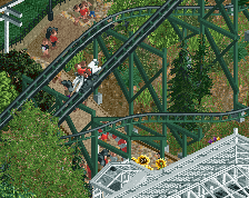
Durham, Knaresborough and Staithes is one of those parks that doesn't blow you away initially but really sucks you in the longer you look at it. The front half of the park with the cliffs and small town are masterful. I really, really enjoyed the boats stuck in the low tide. That whole area was really charm-overload. My one critique might be that the back half of the park seemed a bit less interesting and perhaps rushed. I'd be willing to bet that the area around the single rail coaster was a bit thrown together.
Overall though, this was excellent. There wasn't anything mind blowing here but it was well crafted and filled with the charm and character that you would expect from a "Heaven's..." park. Great work!
Wit's end on the other hand was meant to blow minds. The black holes were super cool (and a total mind-fuck), it's loaded with crazy shit and cool details, it's bursting with great color choices and the architecture (especially on that main castle) is great. As an added bonus, it also features an invert layout that's really solid for any style. This park was a ton of fun to view and pretty much sensory overload.
I loved both parks, but I have to go with Wit's end on this one. It was a tough call though. This is an awesome way to start H2H.
Okay, time for the moment you’ve all been waiting for: Jappy’s reviews of the first two H2H parks of this season! Yeeeeeeey!!
Let’s start with Wit’s End:
This park feels so H2H it hurts. It definitely has the grandeur and wow-factor only H2H seems to be able to create. So a mushroom theme huh? I didn’t notice that until later on tbh. I like the idea but it does has a similar feel to Le Rêve like most people here already said. But I’m not gonna let that deduce points. A new take on an old concept is done all the time in art, so why not RCT? I really like a lot in this park. The village is sweet, the mine train hugging the coaster walls is fucking awesome and the whirlpool is such a cool feature. I really like the way the colours are balanced in this park. At first glance it may seem too grey but every possible chance there was to add accents has been taken, hats off to you!
Now the things I’m less a fan of. Let’s address the elephant in the room, the glitching. No idea what you guys did but it’s distracting, in both parks. It’s not terrible but it is gonna cost you points with me I’m afraid. Another thing is the theme, drugs. I only knew this was the theme from reading the previous comments. I got the shrooms, but not the drugs. Wasn’t there more you could do with that?
Now: Durham, Knaresborough and Staithes
I love England. I’m an anglophile. I love Staithes. I have a model railway on which one of the villages is based on this Yorkshire fishing town. I love this park. So much.
Let’s start with the good things, and there are a lot to choose from. The little scenes, the life, the animation, the detail… It all works. You nailed the atmosphere and feel of each village you represented. Durham looks like Durham. Staithes looks like Staithes. There isn’t that much to say about the good stuff, it’s all good. As a railway and steam enthusiast, I can also appreciate the presence of England’s gift to the world and the prominent place it takes in the park.
Now the lesser things, and yes there are some. It feels a bit underwhelming at first and that might have to do with the scale. Though consistent, it feels small. The park relies on some great small scenes but I’m not sure if that alone is enough to make it work. Wit’s End suffers from the other problem: it has tons of grandeur and is bombastic, but doesn’t have the same life as this one does.
It’s really a dilemma and that in the first round of H2H…. Overwhelming or max detail? Decisions, decisions….!
I thought it was a pretty harmless observation to kick off the thread with, but I didn't mean to set the tone for the whole thing. Whoopsie daisies! Don't take it too seriously. As people mentioned before, Durham and neighbouring towns is not always subtle and Wit's End is not always in your face and lacking subtlety. You can view this match through other lenses too, in fact I'd love to hear some other paradigms.
Viewed these once in game and will give my first thoughts, though I want to take another look and do a more in depth review. I have no idea who I'm going to vote for and this match has spawned a lot of thoughts about rct as a creative medium, as it seems to with others. But, reviews first and philosophical rants later.
Heavens:
I tried to go into both parks with a clean slate and no expectations, but agree with the consensus that Heaven's strengths are in its subtle details, while the initial presentation itself wasn't as jaw dropping. Maybe I just have bad ADD but it took some effort to fully immerse myself in, but was rewarding once I did. As I viewed each section, I found myself saying "ehh this part isn't as good" but then warming up to it and finding lots of great details after viewing for longer. Each section I viewed became my "new favorite" by the time I was done with it. At a zoomed in level, I'd say this is one of the greatest parks ever made (take my opinions with a grain of salt as i've been inactive forever...). Each object placed in this park serves a distinct purpose, whether it be the detailing on the buildings or the landscaping. You guys were able to create a lot of life and immersion without the word "overdetailed" ever popping into my mind.
There's been a lot of fuss about the pallette (palate? pallet?!), and I'm hoping pallette changes can become as natural a part of parks as custom objects. Here it had a clear objective and pulled it off perfectly. I've complained countless times about the red color in rct not being right for brick, and finally we're getting closer to an actual brick color. Same with the roofs, as the game's peach or tan just doesn't cut it, yet the roof color in this park is present all throughout Europe and Britain.
The landscaping in the car ride area (and throughout the park) was beautiful, I'll probably keep coming back to that. Definitely gave me a great vibe and actually relaxed me to look at haha. I could imagine myself hanging out there on a sunny day and packing a fat bowl. The rides themselves didn't really hurt or help the park for me. The wooden coaster didn't have a particularly memorable layout, but the interaction with the buildings and landscape was nice, same would go for the steeplechase.
Wits End:
First of all, I have to say the whole narrative that this is some pandering Michael Bay of RCT type park completely sells it short. I also don't get what's hard to grasp about the theme as there's gigantic ass mushrooms and references to tripping everywhere? If you get past the fact that yes this park is intended to overwhelm and impress instantly upon opening, there are plenty of great little things here too, even if their execution is a slightly lower caliber than Heaven's park. Overview and macro composition are important too, and this park nails them both, better than few parks I can think of. 60x60 is not a very large space but in this park it felt absolutely enormous.
Looking at some individual buildings, I love the builder's integration of fantasy forms such as the mushrooms and glass structures into the buildings themselves, as they draw the eye and add a nice element of color. The overall structure of the buildings is on point as well. Where they come up a bit short is upon taking a closer look at some of the buildings, such as the church, there is a lack of depth that doesn't sell them as fully immersive, real buildings. Often times the buildings were just quarter blocks stacked without any sort of accenting details. Yet I can hardly fault the builders as the viewing scale of the park was obviously intended to be bigger than that, and due to how quickly they had to build this.
If you gave it a chance, there were plenty of well done atmospheric bits like the terraced monorail track mushroom garden. While people may see the repetition of objects such as the mushrooms as gimmicky, it tied the park together and I can't imagine how messy it would be without these sort of motifs. Each of the sections felt very fun to me too, from both a viewer and guest perspective, similar to some of Kumba's earlier stuff like DRC.
I thoroughly enjoyed/was legitimately bugging out at the trippy elements. I actually said "ex fucking scuse me" out loud when I saw the end of the invert because it was so unexpected. I also spent a lot of time going back to the glitches at the edges of the map trying to figure out how you pulled off the fading effect. Even without openGL on (sorry i'm lazy) it was still cool to look at. These sort of things captured a low level psychedelic trip well, where reality is largely still intact but things start to get weird if you stare for too long.
Overall:
Both these parks were mid 80s for me. Wits End effortlessly grabbed my attention but held it for shorter, where Heaven's park required a bit more investment but I eventually couldn't turn away. Heavens executed their concept to its fullest potential in my opinion. Had Wits End had an additional builder, such as one of the builders on Heavens park, to refine some of the architecture, it would've been a low 90's park for me.
Some ranting:
I know I have a lot of nerve waltzing in here after 69 years of inactivity to complain but oh well. I'm a bit bummed out by the cynicism towards these parks, and am preparing to walk on eggshells once something I've built on is released. There's nothing that makes building in rct different than composing a song/album, writing a book, or painting, and this site is the best in the world at its respective medium. Keeping that in perspective, the readme this and pallate that, ripoff of old parks, etc feel like petty complaints in comparison to the amazing art being produced. There's simultaneous complaints that anything vaguely resembling a previous park is a ripoff, yet any innovation is a gimmick. Don't want to continue piling on the complaint train, but I'm personally going to be mindful of using feedback to encourage creativity and not to stifle it and boost my own ego throughout this contest, and feel free to call me when I inevitably fuck that up. There's always a lot of hype and speculation and backstory to this competition, but ultimately voting based on the contents of a team's zip file and how much you enjoyed it in that moment does the most justice to the builder's work.
I can't wait for this match to be over because I think both teams will have a lot to say. Regardless of the outcome...
Wise words Cam, and food for thought.
I think the "shock value vs. subtlety" narrative and the structural comparisons to past parks based on who supposedly built on these parks are quite worn out at this point. Maybe going forward it'd be nice to talk about the parks for what they are. The amount of reviews has been great though, definitely keep those coming.
I checked out Heaven's Gallery park and thought it was definitely pleasant but checking out Wit's End, I realised that to me the Ultra Realists park was just far more impressive, in terms of scale and scope.
Aesthetically, conceptually, it really went all out there for me and whilst Heaven's Gallery has its charm, it's just too restrained and lacklustre for me.
The coasters in Wit's end were also far more interesting and daring. That word sums it up for me - wit's end was far more daring and that puts it over the edge for me.
After a few more viewings of each park, my thoughts are feeling more collected about both.
I think as a general rule this H2H I'm going to try to stick to three major positives and negatives for each park. I could go on about how something could have been done differently in x, y, and z; but that's boring.
Wit's End
+ It's a unique concept. Plenty of interesting hacks and cool features like the whirlpool. The castle courtyard and the whirlpool were by far my favorite parts of the park.
+ Rides; the rides in the park were generally pretty cool. Unique enough to stand out but fairly well polished. The trick with the invert (while not executed perfectly) was fun to see the first time it happened. The reverse water coaster was also rather fun; the whirlpool was fantastic, the reverse drop was pretty neat. I wasn't a huge fan of the mine train.
+ I was on the fence for awhile with the glitching black tiles, but after using OpenGL to check them out again, I was more impressed by how they were utilized.
= Again with the glitches; something I'm not as keen on was the fact that I never would have used OpenGL had nobody mentioned it.
- Composition in general was a little odd; though it doesn't feel nearly as cluttered as I first thought when I saw the park, it's still busy and leaves me not knowing where or what to look at. Parts of the park just seem to have too much "stuff" that could have just been left out. In addition to this, the castle area and the town felt like completely different styles to me. This may be the intent, but I found it detracted from my enjoyment of the park overall.
- Architecture was very hit or miss. Every building has one really good angle, and a lot of them have multiple really good angles. However, some buildings felt shoehorned in. I found myself noticing a lot of barren walls in certain parts of the map, which is really unfortunate because there's splashes of brilliance across the park that gets muted a bit by another building directly adjacent that feels like it's just there to be there.
- Shotguns likes saying that no park exists in a vacuum, so I can't help but draw parallels to Le Reve; it's quite apparent in some places - most notably the cups filling with water and the mushrooms. Intentional or not, I don't think this park as a whole is as effective as Le Reve was at telling its story. Le Reve almost has a clear narrative to it while still being a dream-like fantasy wonderland. I think the strange part of Wit's End to me is that it almost seems too real. I know it's meant to be a park on drugs, but the presentation just didn't do it for me. The layout and ride selection were both felt very much like a realistic park which I think lost some of the whimsy in my mind. THIS SIMILARITY IS NOT A BAD THING - I just don't think Wit's End was as effective when using one of my favorite pieces of fantasy as a benchmark.
DK&S
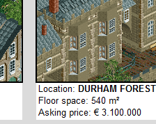
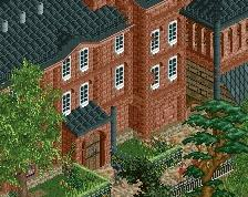
+ The atmosphere here is wonderful. I loved the seaside village and the cheese festival; the little details really made everything come to life, and I think DK&S actually accomplished this very well. Another highlight was the estate area; it felt very accurate to the location and was quite pleasing to look at.
+ The little details in this park added so much. The new palette was more effective than I expected it to be. The beachcombers, little rabbits wandering about, maypole, and detail put into the white cliffs were a real treat.
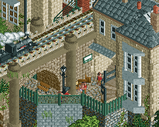
+ The architecture is fantastic. Each building stands out with personality and comes alive in the best way. Highlights for me include the lighthouse and the estate; the estate in particular felt as though it really belongs there. The wonderful architecture wasn't limited to buildings either; the train bridge was really well done.
- The park didn't exactly blow me away, but the dedication to accuracy and details make this a really solid contender. This probably seems like a bit of a weak criticism, but I don't have as much of a problem with this as others might.
- Maybe it's an unfamiliarity with the source material, but the Sunday drive through the hills felt a little lackluster. I'm not really sure what I'd have done otherwise, but something feels a little off.
- The coasters are not so great. The second half of Locomotion was rather nice, but the first half had some big time pacing issues as I watched it. The steeplechase was also a really cool concept, but I don't think it was executed perhaps as well as it could have been; more synchronization and having the hunters always chasing the foxes would have set it apart.
This is an interesting match between two parks that couldn't be more opposite of each other. I'm still not 100% decided as I try to weigh the strengths of ride design versus composition and how I enjoyed each park. In the end, the relative level of enjoyment is a bigger factor for me than anything being similar to anything else or too small or whatever. Both are very strong contenders, and I think this will be closer than expected.
It's funny to see how different groups in NE approach architecture differently. This isn't in defense of either parks, but I think there's certainly a group within NE that thinks and appreciates architecture only for its beauty- its detail and how "pretty" it looks- whereas others like to judge how *effective the architecture was. I bring this up because I think that both parks are equally as good in terms of structures. They both were very effective in creating the narrative and feel that both parks go for.
This is a fantastic way to start the competition, and makes it incredibly hard to choose a winner.
Heaven's Gallery
So, this is basically modeled on my homeland, and of course that strikes a chord with me. It's pulled off that small town classy British atmosphere better than anything I've seen on Rct before. I love the small scale of the architecture, and the colours (for the most part).
There's so many small details that add to the bigger picture as well. The cheese rolling is obviously great, but I much prefer the things that make this feel very authentic to me, like the drainpipes on the buildings, the red brick chimneys, and even the bay windows. To me, that is what sets this apart.
On the other hand, the back half of the park feels just too bare. I would like to have seen a bigger town with a real town square, maybe a market or car boot sale, just some more things that feel more authentic rather than cliches like the red phone box, which have been done a million times before.
The wooden coaster and the mill were also a bit of a damp spot for me. The coaster doesn't add much to the map for me personally, apart from in the Knaresborough helix around the blue building, and the station building doesn't feel particularly British to me. Longer windows and a more simple shape would have helped here massively I think.
Overall, I still love this park. It feels so homely and lovely, and the details are great on every level. I just wish that the back of the park was up to the same quality as the front!
I think I'd rate this 85%.
Wit's End
First things first, I much prefer the glitchless version here, so it's good you included that. I feel like this park is again almost a tale of two halves. The main castle area with the water coaster and the mine train are fantastic, really brilliant work. It feels epic, and fantasy, and the colours are on point.
The whirlpool is great and the craziness of the rides is awesome, launching the watercoaster up the hill to splash at the top is just a wtf kinda thing. The architecture for the most part across the map is beautiful, and really portrays a dark Bavarian kinda theme really well, almost a little too well for my liking, and it all feels suitably grand in scale.
However, parts of the architecture are very obviously much more inspired than others. The area around Vertigo is a very obvious step down from everything else on the map for me, and the big yellow building near the entrance is pretty ugly from 3 out of 4 views. I find this goes throughout the map; you'll have a fantastic building next to one which just looks a little rushed and underdetailed in comparison - the station for the invert again looks great from two views, but the other two look unfinished and underdetailed.
I don't think there are as many little details as in HG's park, but I feel like there's more content overall. I suppose the main negative I have to say about this park is that I just don't feel like the mushrooms add anything. I know it's meant to be the theme and be psychedelic and everything, but I think you could easily have released the park without the mushrooms and with something else in it's place and it would feel just as good, if not even better. Either that or you should have doubled up on the mushrooms and had them as much more of a main feature, rather than having this big grand architecture as the main feature and then having mushrooms to accent that.
The mushrooms, by the same logic, don't take away anything from how fantastic this is overall though. It's a beautifully crafted, dark fantasy park that we don't see enough of, and I'm a sucker for these dark atmospheres.
I think I'd rate Wit's End around 85% as well.
Which then puts me in a predicament. I look at one park for 10 minutes, and I'm like 'This is obviously the winner here', then I'll open up the other park and think 'No no, this is the winner!', before then going back to the first and the cycle continues.
It's interesting that the parks are so different as well, which makes it even harder. Do I prefer the authentic feel of HG, or do I prefer the dark fantasy atmosphere oozing from UR?
I think I'm gonna sit on my vote for now, but I'll edit this when I come to a decision.
Edit - Gone with Wits End. The dark fantasy atmosphere is just too much for me to say no to. On another day, it could have gone the other way.
Beautiful beginning and a very easy vote for me. The park from Liam's team has some immense aesthetic value here and there, but otherwise suffers the stereotypical H2H disorganised composition.
I know I said I was gonna write a review on both parks, but I think I'm just gonna do some video reviews tonight on twitch then make them youtube vids.
That'd be awesome. Not sure if MCI is around this time for those.
I left a review already but its time to justify a vote I guess
I'm gonna go with Heaven's Gallery on this one. I appreciate the fully-formed, mature park with all of its little details to find and superb atmosphere. Maybe I'll look back on this vote one day as silly if we retroactively vindicate Wit's End, which is always possible. I think I voted against red river valley...
One of the deciding factors for me was the inconsistency in wits end. There's so much good here. I love the glitchy things, and theres a scattering of really impressive architecture. I agree that the mushrooms could have been more "central" but for the most part I did like them a lot. My main gripe is that there are also a bunch of buildings are sections that just feel like "clutter" to me. Maybe it was rushed a bit or worked on by different people with different styles, but I found that not every angle was as good as others and some buildings just served to block my view and distract me with details that my eye couldn't figure out. For example, I love the waterside view of the castle, but the backside really doesn't do it for me- its busy in a bad way with details that don't add to the whole, but rather take me out of the picture. Its a good lesson for me and my parkmaking too, as I'm always subject to this sort of issue.
Don't get me wrong- wits end is a fantastic park that I would vote probably 80% to. I just need to have some factor to decide with, so I figured I'd articulate it and maybe we can all learn from that. IDK, don't let it get to the builders too much, seems like you may win anyway
anyone else reckon theres a strong correlation between parks voted for and team? like most of strangelove is on HG and most of replacements on wits end. Maybe thats just a random coincidence, or shows that teams were drafted cohesively, or maybe we're abusing our own discords for sneaky rants too much, which of course I am equally responsible for...
Strangelove's votes so far are HG:3/2:UR which is hard to draw conclusions from; it could still end up even or skewed the other way when voting is over. Replacements do have all three votes in the same spot, but also only three so far.